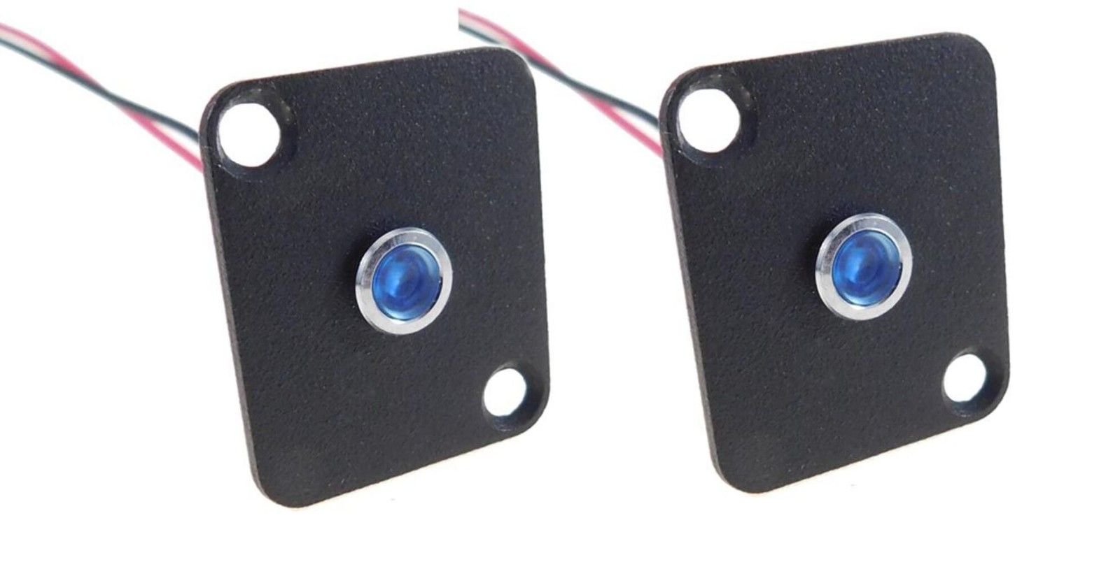
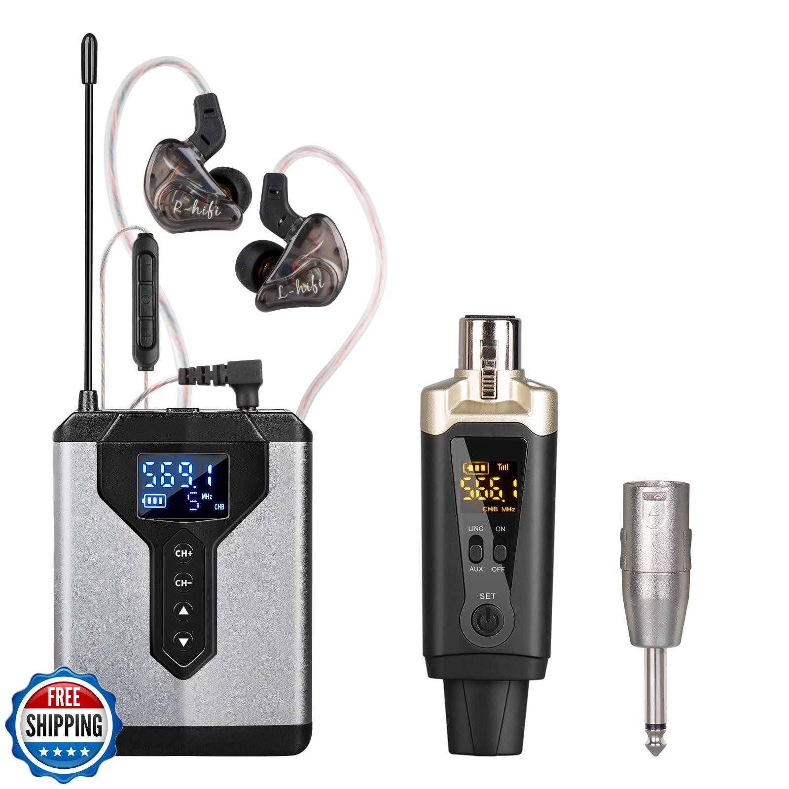
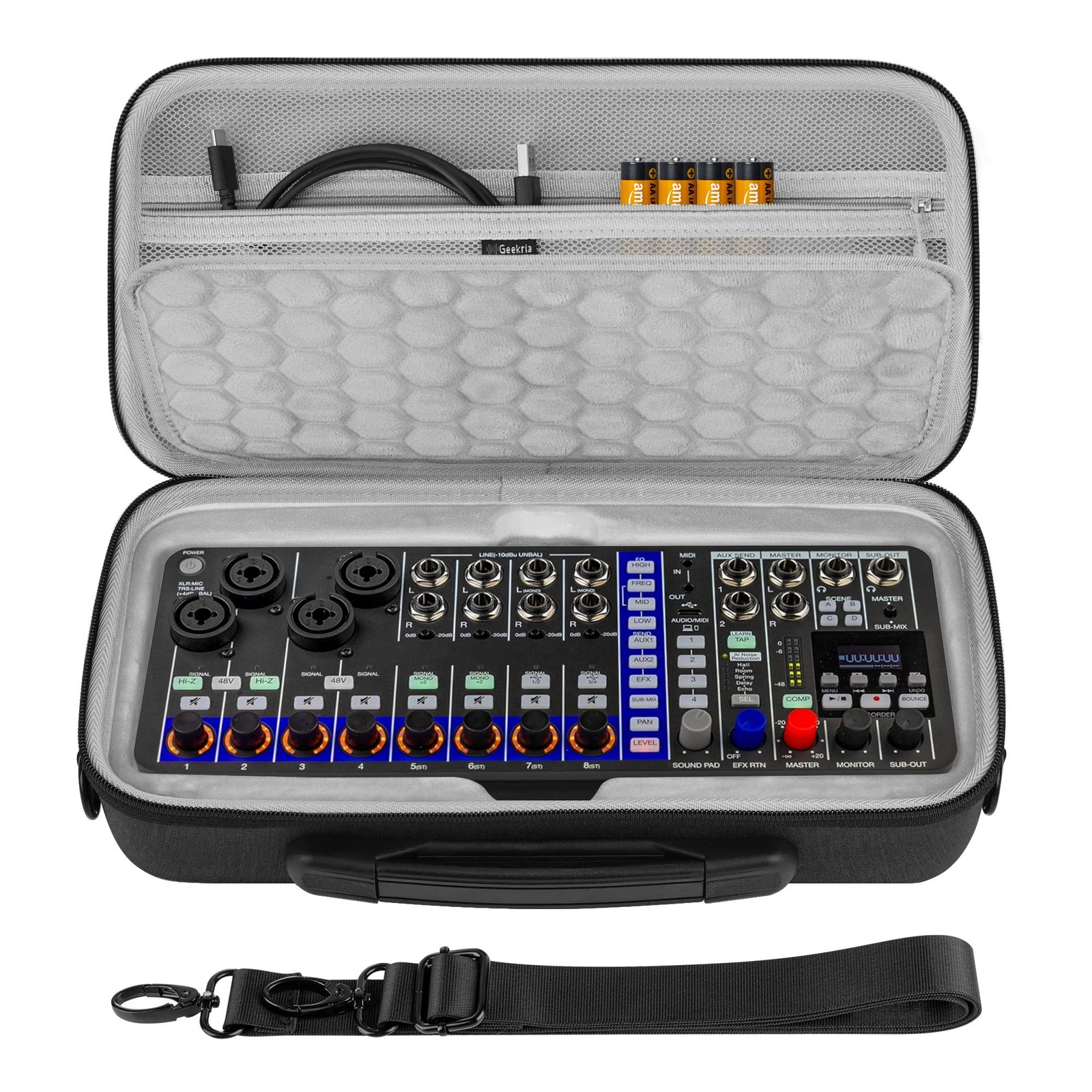
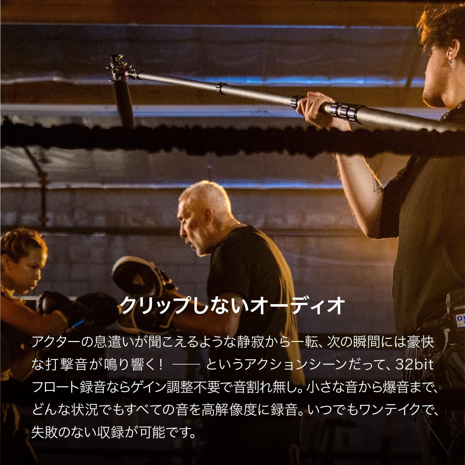
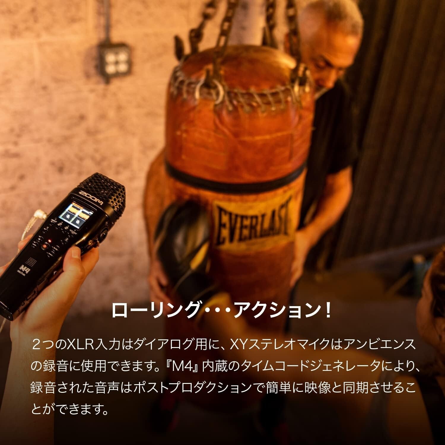
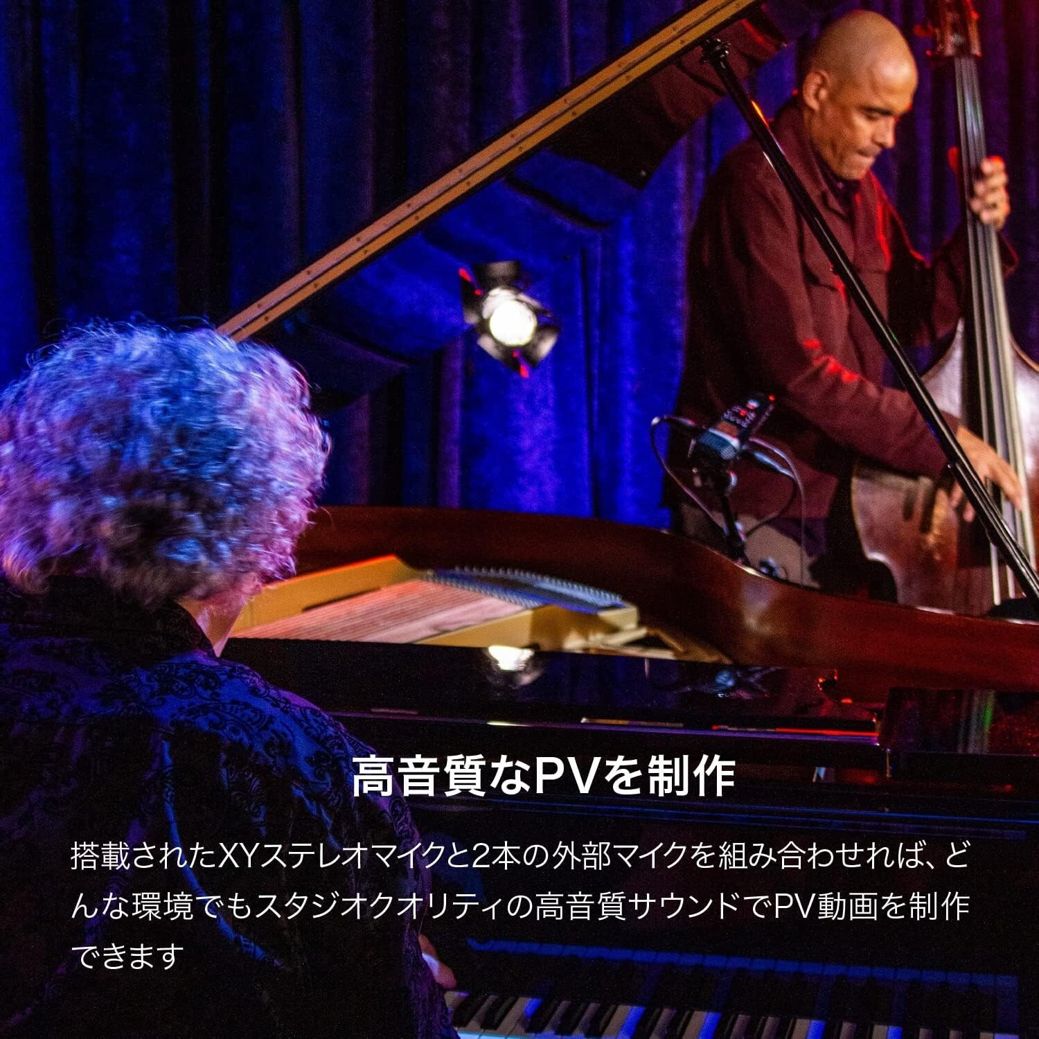
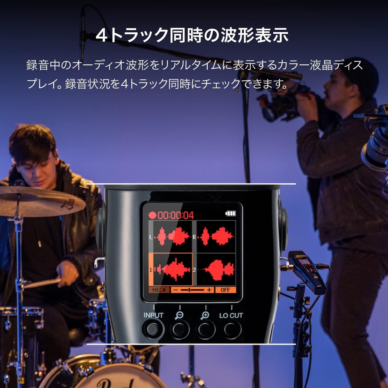
Zoom M4 4-track recorder with built-in timecode generator, 32-bit float support
4r8mLPt1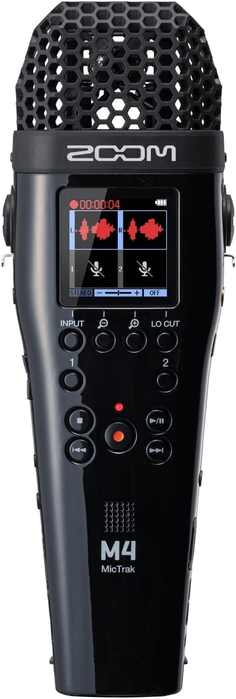
“`html
* {
margin: 0;
padding: 0;
box-sizing: border-box;
}
body {
background: #f5f7fa;
font-family: system-ui, -apple-system, ‘Segoe UI’, Roboto, ‘Helvetica Neue’, sans-serif;
display: flex;
justify-content: center;
padding: 2rem 1rem;
}
.product-card {
max-width: 1100px;
width: 100%;
background: #ffffff;
border-radius: 24px;
box-shadow: 0 20px 40px rgba(0,0,0,0.08), 0 6px 12px rgba(0,0,0,0.05);
padding: 2rem 2.5rem;
transition: all 0.2s ease;
}
@media (max-width: 600px) {
.product-card { padding: 1.5rem 1rem; }
}
h1 {
font-size: 2.2rem;
font-weight: 600;
color: #0b1a2e;
margin-bottom: 0.25rem;
letter-spacing: -0.02em;
}
.brand-tag {
display: inline-block;
background: #eef2f9;
padding: 0.2rem 1rem;
border-radius: 40px;
font-size: 0.9rem;
font-weight: 500;
color: #1f3a6b;
margin-bottom: 1rem;
}
.price-block {
display: flex;
align-items: baseline;
gap: 0.75rem;
margin: 1.2rem 0 1.8rem;
}
.price {
font-size: 2.4rem;
font-weight: 700;
color: #0f2b4b;
}
.currency {
font-size: 1.2rem;
font-weight: 500;
color: #3e5a7a;
}
.condition-badge {
background: #d4e2f0;
padding: 0.2rem 1rem;
border-radius: 40px;
font-size: 0.85rem;
font-weight: 500;
color: #1f3a6b;
}
.gallery-grid {
display: grid;
grid-template-columns: repeat(4, 1fr);
gap: 12px;
margin: 1.8rem 0 2rem;
}
.gallery-grid img {
width: 100%;
aspect-ratio: 1/1;
object-fit: cover;
border-radius: 16px;
background: #f0f3f8;
border: 1px solid #e9edf4;
transition: 0.2s;
}
.gallery-grid img:hover {
box-shadow: 0 8px 18px rgba(0,20,40,0.12);
transform: scale(