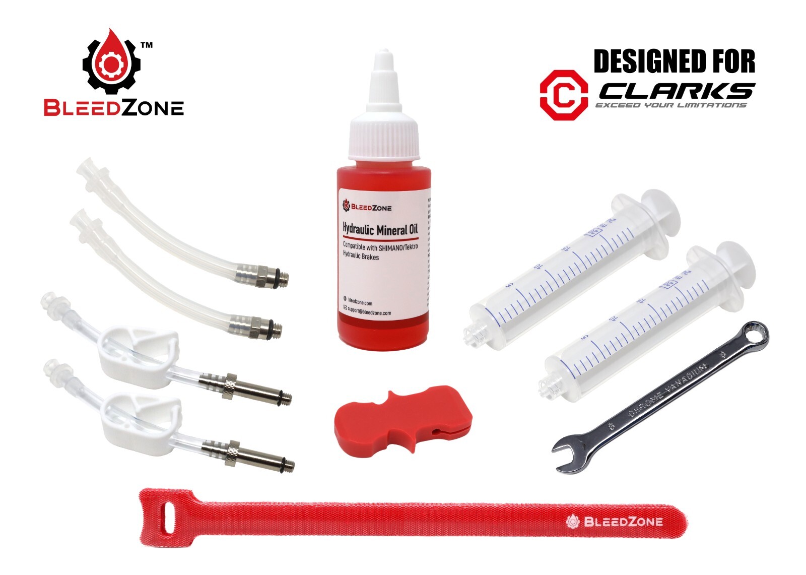
Sunlite Rivnut Installation Tool with M6, M5, M4 & M3 Mandrels
PXt2iQuF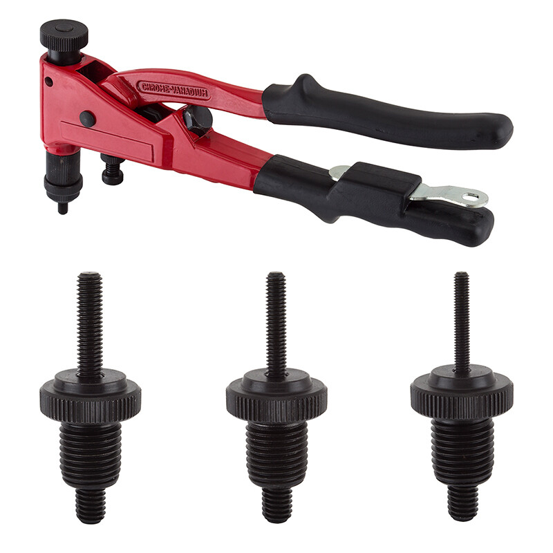
“`html
body {
font-family: ‘Segoe UI’, Roboto, Helvetica, Arial, sans-serif;
background: #f8f9fa;
margin: 0;
padding: 30px 20px;
display: flex;
justify-content: center;
}
.product-card {
max-width: 1100px;
width: 100%;
background: #ffffff;
border-radius: 20px;
box-shadow: 0 10px 30px rgba(0,0,0,0.08);
padding: 30px 35px;
box-sizing: border-box;
}
.zd-clear { clear: both; }
.zd-wrap { width: 100%; }
.zd-wrapcen { width: 100%; text-align: center; }
#zd-wrapper { background-color: transparent; }
/* image gallery */
.gallery {
display: flex;
flex-wrap: wrap;
gap: 15px;
margin: 20px 0 25px;
}
.gallery img {
max-width: 180px;
height: auto;
border-radius: 12px;
box-shadow: 0 4px 12px rgba(0,0,0,0.06);
transition: transform 0.2s ease;
border: 1px solid #e9ecef;
background: #fff;
}
.gallery img:hover {
transform: scale(1.02);
}
@media (max-width: 600px) {
.gallery img { max-width: 130px; }
}
h1 {
font-size: 2rem;
font-weight: 600;
margin: 0 0 8px 0;
color: #1e293b;
}
.brand-sub {
color: #475569;
font-size: 1rem;
margin-bottom: 15px;
display: flex;
flex-wrap: wrap;
gap: 20px;
}
.price {
font-size: 2.2rem;
font-weight: 700;
color: #0b5e42;
margin: 10px 0 20px;
}
.price small {
font-size: 1rem;
font-weight: 400;
color: #64748b;
}
.spec-table {
width: 100%;
border-collapse: collapse;
margin: 25px 0;
background: #f1f5f9;
border-radius: 16px;
overflow: hidden;
}
.spec-table td {
padding: 12px 18px;
border-bottom: 1px solid #dbe1e8;
vertical-align: top;
}
.spec-table tr:last-child td {
border-bottom: none;
}
.spec-table td:first-child {
font-weight: 600;
width: 140px;
color: #1e293b;
}
.spec-table td:last-child {
color: #1e293b;
}
.desc-section