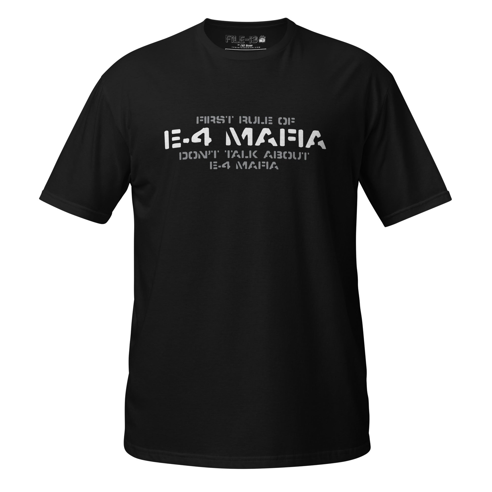
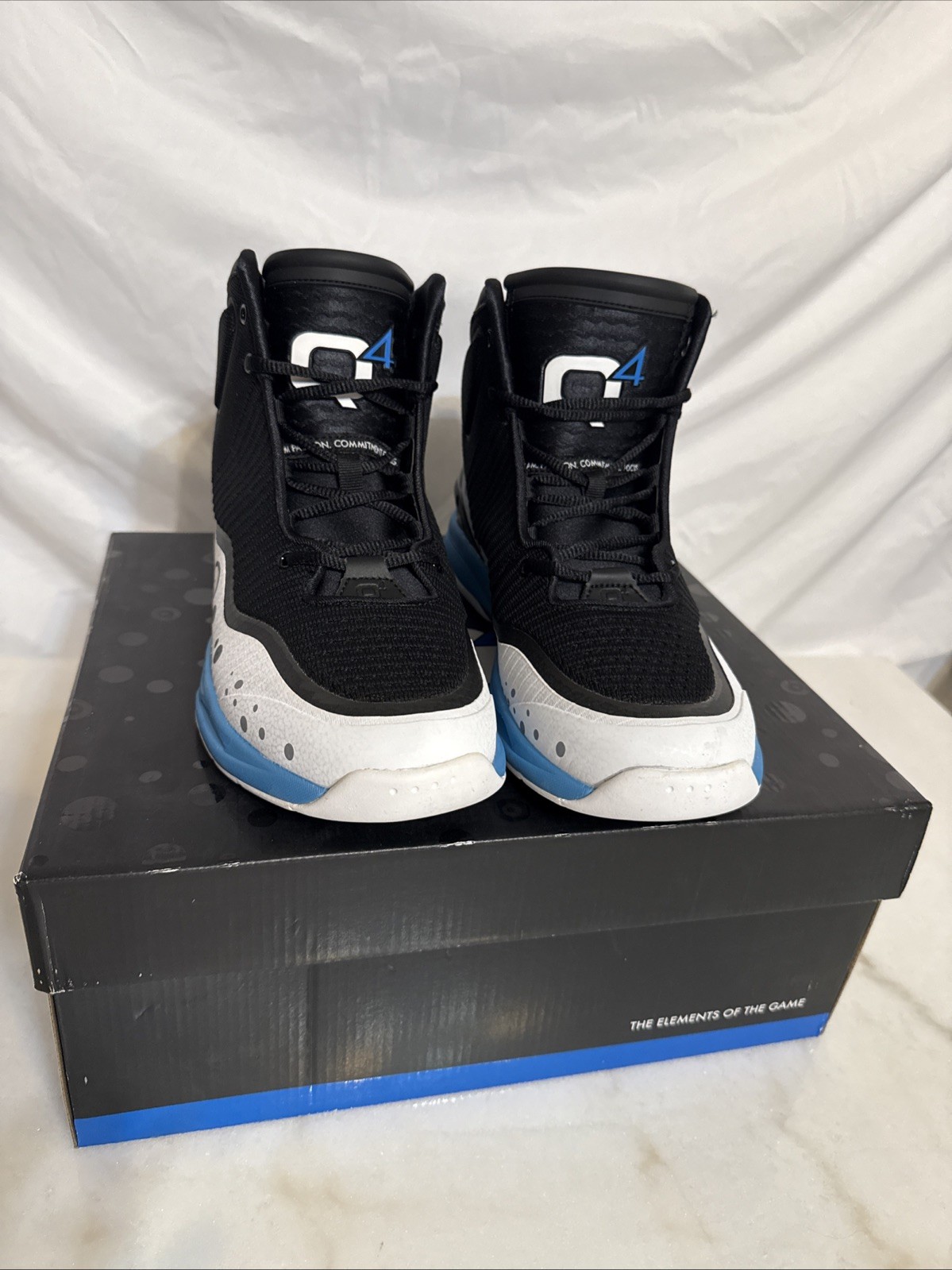
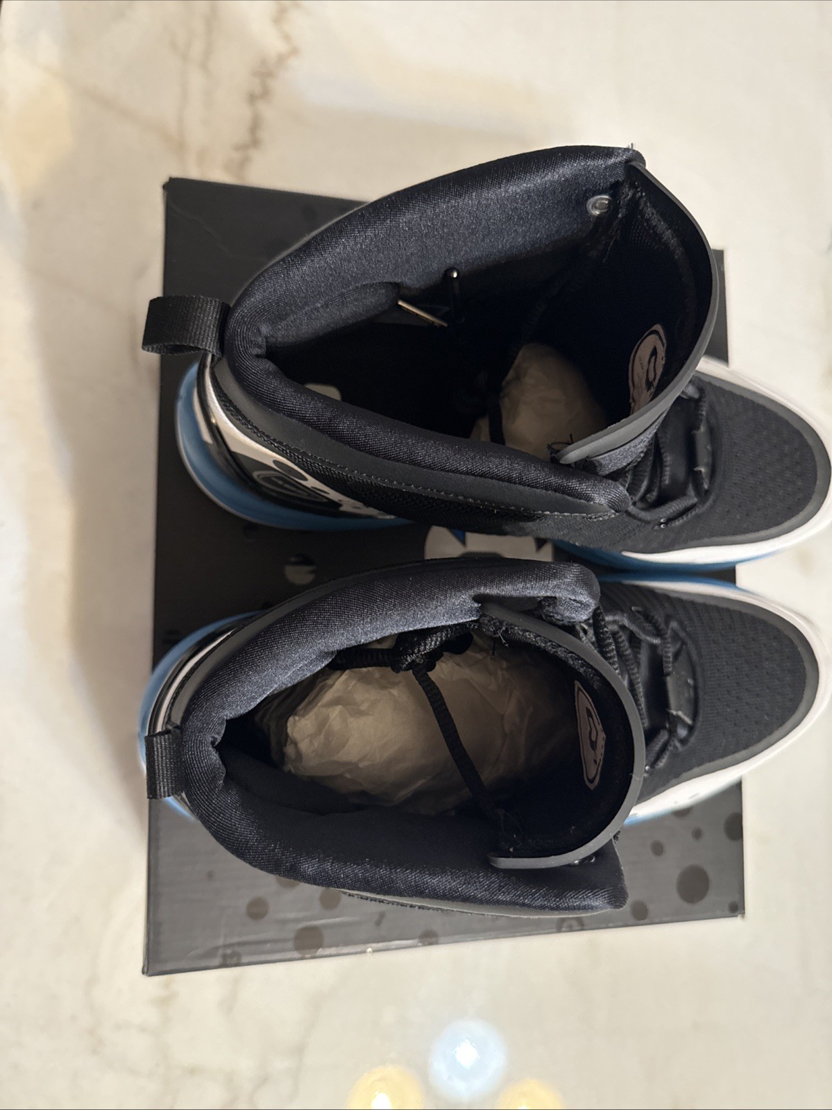
Q4 Sports Shoes Size 10.5 Aster White Q4 MB-015
qT7SqQtB


“`html
body {
font-family: ‘Segoe UI’, Roboto, Arial, sans-serif;
background: #f8f9fa;
margin: 0;
padding: 20px;
color: #1e1e1e;
}
.product-card {
max-width: 1100px;
margin: 0 auto;
background: #ffffff;
border-radius: 16px;
box-shadow: 0 8px 24px rgba(0,0,0,0.06);
padding: 30px 35px;
}
.product-title {
font-size: 28px;
font-weight: 700;
margin: 0 0 8px 0;
line-height: 1.2;
}
.brand-sub {
color: #5f6368;
font-size: 15px;
margin-bottom: 20px;
display: flex;
align-items: center;
gap: 12px;
}
.brand-sub span {
background: #e8f0fe;
padding: 2px 12px;
border-radius: 20px;
font-weight: 500;
color: #1a73e8;
}
.price-area {
font-size: 32px;
font-weight: 700;
color: #0d6e2d;
margin: 10px 0 20px 0;
}
.image-gallery {
display: flex;
flex-wrap: wrap;
gap: 16px;
margin: 20px 0 30px 0;
}
.image-gallery img {
width: 120px;
height: 120px;
object-fit: cover;
border-radius: 12px;
border: 1px solid #e0e0e0;
transition: 0.2s;
background: #fafafa;
}
.image-gallery img:hover {
border-color: #1a73e8;
box-shadow: 0 4px 12px rgba(0,0,0,0.08);
}
.grid-2col {
display: grid;
grid-template-columns: 1fr 1fr;
gap: 30px;
margin: 25px 0;
}
@media (max-width: 700px) {
.grid-2col { grid-template-columns: 1fr; }
.product-card { padding: 20px; }
}
.specs-table {
width: 100%;
border-collapse: collapse;
background: #f9fafb;
border-radius: 12px;
overflow: hidden;
}
.specs-table td {
padding: 10px 14px;
border-bottom: 1px solid #eaecef;
font-size: 14px;
}
.specs-table tr:last-child td { border-bottom: none; }
.specs-table td:first-child {
font-weight: 600;
color: #2c3e50;
width: 40%;
background: