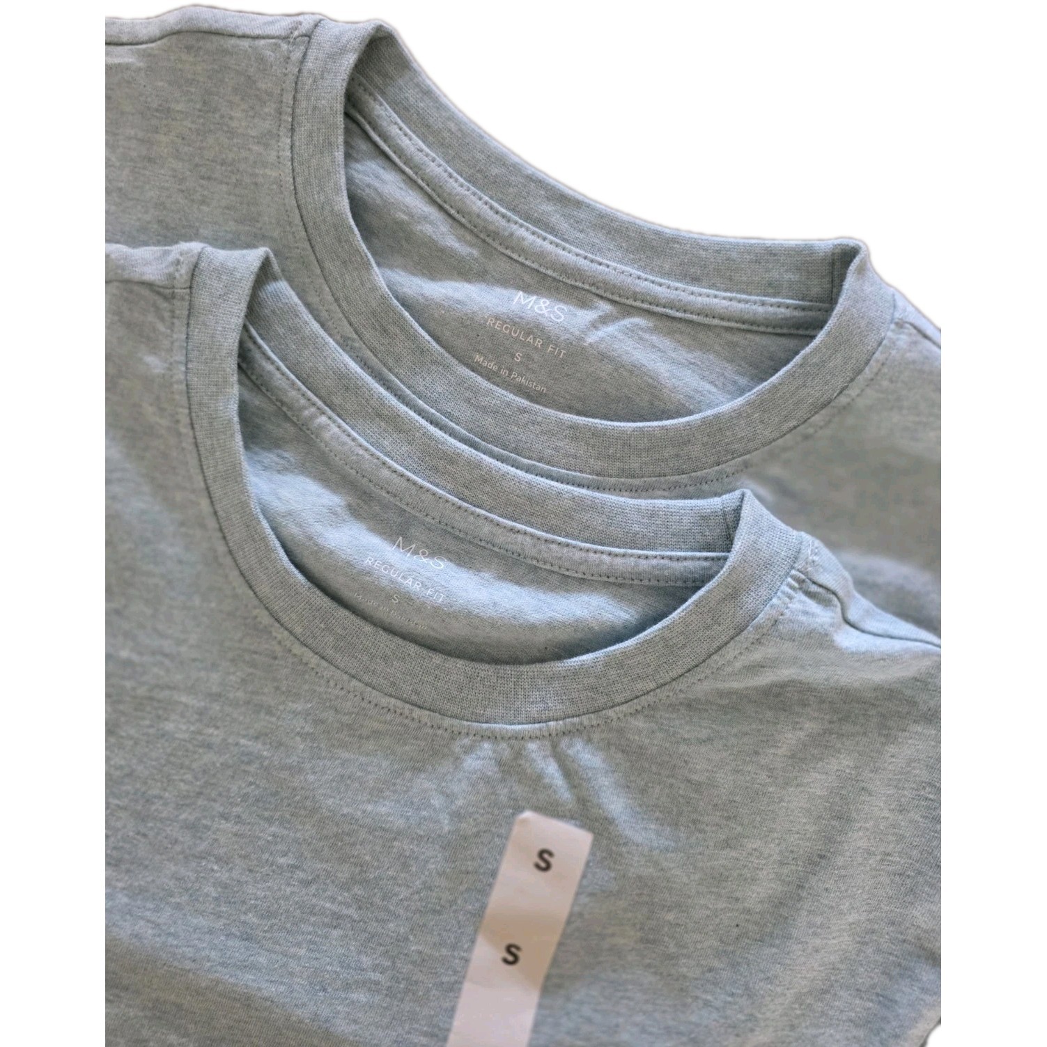
Nunata Apparel Unisex Classic Shirt Black/Navy/Grey/White T-Shirt Size S-5XL
EAlhPIuF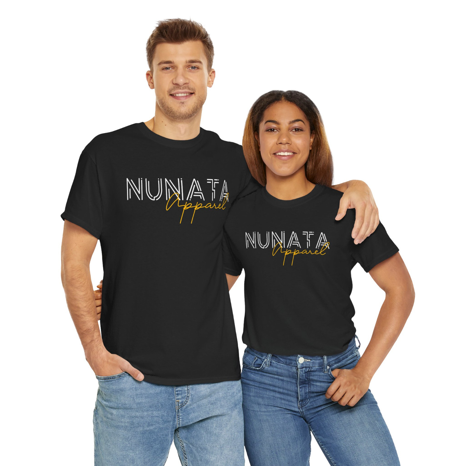
:root {
–primary: #2c3e50;
–accent: #e74c3c;
–light-bg: #f9f9f9;
–border: #e0e0e0;
–text: #333;
–muted: #777;
}
* { box-sizing: border-box; margin: 0; padding: 0; }
body {
font-family: ‘Segoe UI’, Roboto, ‘Helvetica Neue’, Arial, sans-serif;
color: var(–text);
line-height: 1.7;
background: #fff;
}
.container {
max-width: 1100px;
margin: 0 auto;
20px;
}
/* Breadcrumb */
.breadcrumb {
font-size: 0.85rem;
color: var(–muted);
padding: 15px 0;
border-bottom: 1px solid var(–border);
}
.breadcrumb a {
color: var(–muted);
text-decoration: none;
}
.breadcrumb a:hover { color: var(–accent); }
.breadcrumb span { margin: 0 6px; }
/* Product Section */
.product-section {
display: grid;
grid-template-columns: 1fr 1fr;
gap: 40px;
padding: 30px 0;
}
@media (max-width: 768px) {
.product-section { grid-template-columns: 1fr; }
}
/* Gallery */
.gallery {
display: flex;
flex-direction: column;
gap: 15px;
}
.gallery-main {
width: 100%;
aspect-r / 1;
background: var(–light-bg);
border: 1px solid var(–border);
border-radius: 10px;
overflow: hidden;
display: flex;
align-items: center;
justify-content: center;
}
.gallery-main img {
max-width: 90%;
max-height: 90%;
object-fit: contain;
}
.gallery-thumbs {
display: flex;
gap: 10px;
}
.gallery-thumbs img {
width: 75px;
height: 75px;
object-fit: cover;
border: 2px solid var(–border);
border-radius: