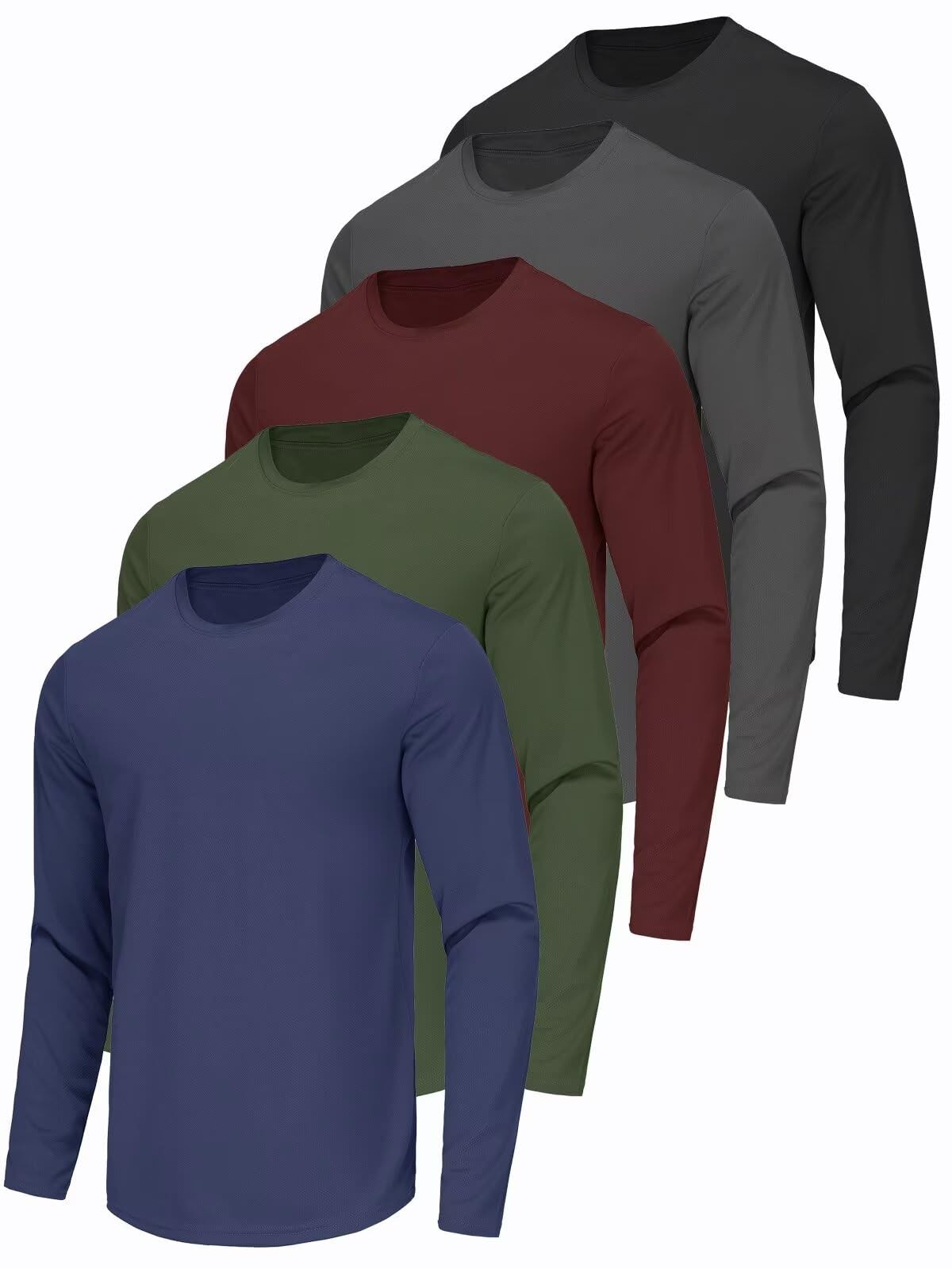
2 PCS Pack Unisex High Visibility Hoodie Reflective Safety Long Sleeve
t9Sr3Tu0
“`html
body {
font-family: ‘Segoe UI’, Roboto, Helvetica, Arial, sans-serif;
background: #f8f9fa;
margin: 0;
padding: 30px 20px;
display: flex;
justify-content: center;
}
.product-container {
max-width: 1100px;
background: #ffffff;
border-radius: 20px;
box-shadow: 0 10px 30px rgba(0,0,0,0.08);
padding: 30px 35px;
margin: 0 auto;
}
h1 { font-size: 28px; font-weight: 600; margin: 0 0 10px 0; color: #1e2a3a; }
.brand { font-size: 15px; color: #5e6f8d; margin-bottom: 20px; }
.price { font-size: 32px; font-weight: 700; color: #0b6e4f; margin: 15px 0 20px; }
.gallery {
display: flex;
flex-wrap: wrap;
gap: 15px;
margin: 25px 0 30px;
}
.gallery img {
width: 180px;
height: 180px;
object-fit: cover;
border-radius: 14px;
border: 1px solid #e9edf2;
transition: transform 0.2s;
}
.gallery img:hover { transform: scale(1.02); }
.grid-2 {
display: grid;
grid-template-columns: 1fr 1fr;
gap: 40px;
margin-top: 20px;
}
@media (max-width: 700px) {
.grid-2 { grid-template-columns: 1fr; gap: 25px; }
.gallery img { width: 140px; height: 140px; }
}
table.specs {
width: 100%;
border-collapse: collapse;
background: #f4f7fc;
border-radius: 16px;
overflow: hidden;
}
table.specs td {
padding: 12px 18px;
border-bottom: 1px solid #dce3ec;
font-size: 15px;
}
table.specs tr:last-child td { border-bottom: none; }
table.specs td:first-child { font-weight: 600; color: #1e2a3a; width: 40%; }
.description { line-height: 1.7; font-size: 16px; color: #2c3e50; margin: 20px 0; }
.why-buy ul, .faq ul { list-style: none; padding: 0; margin: 0; }
.why-buy li, .faq li {
padding: 12px 0 12px 28px;
position: relative;
border-bottom: 1px solid #eef2f6;