Cute Gnomes with Green leaves and dots Design Phone Case for iPhone 7 8 X XS XR
Check the listing for details.

| Location | Lakewood US |
| Shipping | Free shipping (check listing for details) |
| Seller |
picyourcase
100.0% positive · 1247 feedback
|
| Listing | FixedPrice · Active |
| Start time | 2022-12-02T06:37:30.000Z |
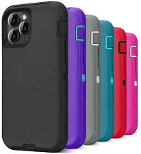
| Choose Your Device | iPhone SE 2020 |
| Choose Your Case | Slim Soft Jelly Case |
| Brand | PYC |
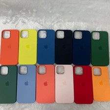
Cute Gnomes with Green leaves and dots Design Phone Case for iPhone 7 8 X XS XR SE 11 12 13 14 Pro Max Mini Note 10 20 s10 s10s s20 s21 20 Plus Ultra This form-fitting¬†custom designed case is a great way to add a little personality to your phone. Sleek and lightweight, this protective cover helps to avoid scratches, scuffs, chips and cracks, and can act as a good buffer should you accidentally drop your phone.¬† ¬† Soft Case is TPU material Hard Case is a dual layer case with soft inner liner and hard outer shell Notched for cord connections, speakers, camera and volume toggles Rubber button covers PLEASE NOTE: We are not responsible for any damage that may occur to the phone. We recommend avoiding excessive bending to the phone case to prolong its life. Imported; processed and printed in the U.S.A. elm.clearfix .clearfix:before,.clearfix:after .clearfix:after .hide-text .input-block-level article,aside,details,figcaption,figure,footer,header,hgroup,nav,section audio,canvas,video audio:not([controls]) html a:focus a:hover,a:active sub,sup sup sub img #map_canvas img,.google-maps img button,input,select,textarea button,input button::-moz-focus-inner,input::-moz-focus-inner button,html input[type="button"],input[type="reset"],input[type="submit"] label,select,button,input[type="button"],input[type="reset"],input[type="submit"],input[type="radio"],input[type="checkbox"] input[type="search"] input[type="search"]::-webkit-search-decoration,input[type="search"]::-webkit-search-cancel-button textarea @media print a,a:visited a[href]:after abbr[title]:after .ir a:after,a[href^="js:"]:after,a[href^="#"]:after pre,blockquote thead tr,img img @page p,h2,h3 h2,h3 }body a a:hover,a:focus .img-rounded .img-polaroid .img-circle .row .row:before,.row:after .row:after [class*="span"] .container,.navbar-static-top ,.navbar-fixed-top ,.navbar-fixed-bottom .span12 .span11 .span10 .span9 .span8 .span7 .span6 .span5 .span4 .span3 .span2 .span1 .offset12 .offset11 .offset10 .offset9 .offset8 .offset7 .offset6 .offset5 .offset4 .offset3 .offset2 .offset1 .row-fluid .row-fluid:before,.row-fluid:after .row-fluid:after .row-fluid [class*="span"] .row-fluid [class*="span"]:first-child .row-fluid [class*="span"]+[class*="span"] .row-fluid .row-fluid .row-fluid .row-fluid .row-fluid .row-fluid .row-fluid .row-fluid .row-fluid .row-fluid .row-fluid .row-fluid .row-fluid .row-fluid .row-fluid .row-fluid .row-fluid .row-fluid .row-fluid .row-fluid .row-fluid .row-fluid .row-fluid .row-fluid .row-fluid .row-fluid .row-fluid .row-fluid .row-fluid .row-fluid .row-fluid .row-fluid .row-fluid .row-fluid .row-fluid .row-fluid [class*="span"].hide,.row-fluid [class*="span"].hide [class*="span"].pull-right,.row-fluid [class*="span"].pull-right .container .container:before,.container:after .container:after .container-fluid .container-fluid:before,.container-fluid:after .container-fluid:after p .lead small strong em cite .muted a.muted:hover,a.muted:focus .text-warning a.text-warning:hover,a.text-warning:focus .text-error a.text-error:hover,a.text-error:focus .text-info a.text-info:hover,a.text-info:focus .text-success a.text-success:hover,a.text-success:focus .text-left .text-right .text-center h1,h2,h3,h4,h5,h6 h1 small,h2 small,h3 small,h4 small,h5 small,h6 small h1,h2,h3 h1 h2 h3 h4 h5 h6 h1 small h2 small h3 small h4 small .page-header ul,ol ul ul,ul ol,ol ol,ol ul li ul.unstyled,ol.unstyled ul.inline,ol.inline ul.inline>li,ol.inline>li dl dt,dd dt dd .dl-horizontal .dl-horizontal:before,.dl-horizontal:after .dl-horizontal:after .dl-horizontal dt .dl-horizontal dd hr abbr[title],abbr[data-original-title] abbr.initialism blockquote blockquote p blockquote small blockquote small:before blockquote.pull-right blockquote.pull-right p,blockquote.pull-right small blockquote.pull-right small:before blockquote.pull-right small:after q:before,q:after,blockquote:before,blockquote:after address code,pre code pre pre.prettyprint pre code .pre-scrollable form fieldset legend legend small label,input,button,select,textarea input,button,select,textarea label select,textarea,input[type="text"],input[type="password"],input[type="datetime"],input[type="datetime-local"],input[type="date"],input[type="month"],input[type="time"],input[type="week"],input[type="number"],input[type="email"],input[type="url"],input[type="search"],input[type="tel"],input[type="color"],.uneditable-input input,textarea,.uneditable-input textarea textarea,input[type="text"],input[type="password"],input[type="datetime"],input[type="datetime-local"],input[type="date"],input[type="month"],input[type="time"],input[type="week"],input[type="number"],input[type="email"],input[type="url"],input[type="search"],input[type="tel"],input[type="color"],.uneditable-input textarea:focus,input[type="text"]:focus,input[type="password"]:focus,input[type="datetime"]:focus,input[type="datetime-local"]:focus,input[type="date"]:focus,input[type="month"]:focus,input[type="time"]:focus,input[type="week"]:focus,input[type="number"]:focus,input[type="email"]:focus,input[type="url"]:focus,input[type="search"]:focus,input[type="tel"]:focus,input[type="color"]:focus,.uneditable-input:focus input[type="radio"],input[type="checkbox"] input[type="file"],input[type="image"],input[type="submit"],input[type="reset"],input[type="button"],input[type="radio"],input[type="checkbox"] select,input[type="file"] select select[multiple],select[size] select:focus,input[type="file"]:focus,input[type="radio"]:focus,input[type="checkbox"]:focus .uneditable-input,.uneditable-textarea .uneditable-input .uneditable-textarea input:-moz-placeholder,textarea:-moz-placeholder input:-ms-input-placeholder,textarea:-ms-input-placeholder input::-webkit-input-placeholder,textarea::-webkit-input-placeholder .radio,.checkbox .radio input[type="radio"],.checkbox input[type="checkbox"] .controls>.radio:first-child,.controls>.checkbox:first-child .radio.inline,.checkbox.inline .radio.inline+.radio.inline,.checkbox.inline+.checkbox.inline .input-mini .input-small .input-medium .input-large .input-xlarge .input-xxlarge input[class*="span"],select[class*="span"],textarea[class*="span"],.uneditable-input[class*="span"],.row-fluid input[class*="span"],.row-fluid select[class*="span"],.row-fluid textarea[class*="span"],.row-fluid [class*="span"] .input-append input[class*="span"],.input-append [class*="span"],.input-prepend input[class*="span"],.input-prepend [class*="span"],.row-fluid input[class*="span"],.row-fluid select[class*="span"],.row-fluid textarea[class*="span"],.row-fluid [class*="span"],.row-fluid [class*="span"],.row-fluid [class*="span"] input,textarea,.uneditable-input .controls-row [class*="span"]+[class*="span"] input.span12,textarea.span12,.uneditable-input.span12 input.span11,textarea.span11,.uneditable-input.span11 input.span10,textarea.span10,.uneditable-input.span10 input.span9,textarea.span9,.uneditable-input.span9 input.span8,textarea.span8,.uneditable-input.span8 input.span7,textarea.span7,.uneditable-input.span7 input.span6,textarea.span6,.uneditable-input.span6 input.span5,textarea.span5,.uneditable-input.span5 input.span4,textarea.span4,.uneditable-input.span4 input.span3,textarea.span3,.uneditable-input.span3 input.span2,textarea.span2,.uneditable-input.span2 input.span1,textarea.span1,.uneditable-input.span1 .controls-row .controls-row:before,.controls-row:after .controls-row:after .controls-row [class*="span"],.row-fluid [class*="span"] .controls-row [class*="span"],.controls-row [class*="span"] input[disabled],select[disabled],textarea[disabled],input[readonly],select[readonly],textarea[readonly] input[type="radio"][disabled],input[type="checkbox"][disabled],input[type="radio"][readonly],input[type="checkbox"][readonly] .control-group.warning ,.control-group.warning ,.control-group.warning .control-group.warning ,.control-group.warning ,.control-group.warning input,.control-group.warning select,.control-group.warning textarea .control-group.warning input,.control-group.warning select,.control-group.warning textarea .control-group.warning input:focus,.control-group.warning select:focus,.control-group.warning textarea:focus .control-group.warning ,.control-group.warning .control-group.error ,.control-group.error ,.control-group.error .control-group.error ,.control-group.error ,.control-group.error input,.control-group.error select,.control-group.error textarea .control-group.error input,.control-group.error select,.control-group.error textarea .control-group.error input:focus,.control-group.error select:focus,.control-group.error textarea:focus .control-group.error ,.control-group.error .control-group.success ,.control-group.success ,.control-group.success .control-group.success ,.control-group.success ,.control-group.success input,.control-group.success select,.control-group.success textarea .control-group.success input,.control-group.success select,.control-group.success textarea .control-group.success input:focus,.control-group.success select:focus,.control-group.success textarea:focus .control-group.success ,.control-group.success .control-group.info ,.control-group.info ,.control-group.info .control-group.info ,.control-group.info ,.control-group.info input,.control-group.info select,.control-group.info textarea .control-group.info input,.control-group.info select,.control-group.info textarea .control-group.info input:focus,.control-group.info select:focus,.control-group.info textarea:focus .control-group.info ,.control-group.info input:focus:invalid,textarea:focus:invalid,select:focus:invalid input:focus:invalid:focus,textarea:focus:invalid:focus,select:focus:invalid:focus .form-actions .form-actions:before,.form-actions:after .form-actions:after .help-block,.help-inline .help-block .help-inline .input-append,.input-prepend .input-append input,.input-prepend input,.input-append select,.input-prepend select,.input-append ,.input-prepend ,.input-append ,.input-prepend ,.input-append ,.input-prepend .input-append input,.input-prepend input,.input-append select,.input-prepend select,.input-append ,.input-prepend .input-append input:focus,.input-prepend input:focus,.input-append select:focus,.input-prepend select:focus,.input-append ,.input-prepend .input-append ,.input-prepend .input-append ,.input-prepend ,.input-append ,.input-prepend ,.input-append >.dropdown-toggle,.input-prepend >.dropdown-toggle .input-append ,.input-prepend .input-prepend ,.input-prepend .input-prepend ,.input-prepend .input-append input,.input-append select,.input-append .input-append input+.btn-group ,.input-append select+.btn-group ,.input-append +.btn-group .input-append ,.input-append ,.input-append .input-append ,.input-append ,.input-append >.dropdown-toggle .input-prepend.input-append input,.input-prepend.input-append select,.input-prepend.input-append .input-prepend.input-append input+.btn-group ,.input-prepend.input-append select+.btn-group ,.input-prepend.input-append +.btn-group .input-prepend.input-append ,.input-prepend.input-append .input-prepend.input-append ,.input-prepend.input-append .input-prepend.input-append input.search-query .form-search ,.form-search .form-search .form-search .form-search .form-search .form-search input,.form-inline input,.form-horizontal input,.form-search textarea,.form-inline textarea,.form-horizontal textarea,.form-search select,.form-inline select,.form-horizontal select,.form-search ,.form-inline ,.form-horizontal ,.form-search ,.form-inline ,.form-horizontal ,.form-search ,.form-inline ,.form-horizontal ,.form-search ,.form-inline ,.form-horizontal .form-search ,.form-inline ,.form-horizontal .form-search label,.form-inline label,.form-search ,.form-inline .form-search ,.form-inline ,.form-search ,.form-inline .form-search ,.form-search ,.form-inline ,.form-inline .form-search input[type="radio"],.form-search input[type="checkbox"],.form-inline input[type="radio"],.form-inline input[type="checkbox"] .control-group legend+.control-group .form-horizontal .form-horizontal ,.form-horizontal .form-horizontal .form-horizontal .form-horizontal .form-horizontal .form-horizontal .form-horizontal input+.help-block,.form-horizontal select+.help-block,.form-horizontal textarea+.help-block,.form-horizontal +.help-block,.form-horizontal +.help-block,.form-horizontal +.help-block .form-horizontal table .table .table th,.table td .table th .table thead th .table caption+thead tr:first-child th,.table caption+thead tr:first-child td,.table colgroup+thead tr:first-child th,.table colgroup+thead tr:first-child td,.table thead:first-child tr:first-child th,.table thead:first-child tr:first-child td .table tbody+tbody .table .table-condensed th,.table-condensed td .table-bordered .table-bordered th,.table-bordered td .table-bordered caption+thead tr:first-child th,.table-bordered caption+tbody tr:first-child th,.table-bordered caption+tbody tr:first-child td,.table-bordered colgroup+thead tr:first-child th,.table-bordered colgroup+tbody tr:first-child th,.table-bordered colgroup+tbody tr:first-child td,.table-bordered thead:first-child tr:first-child th,.table-bordered tbody:first-child tr:first-child th,.table-bordered tbody:first-child tr:first-child td .table-bordered thead:first-child tr:first-child>th:first-child,.table-bordered tbody:first-child tr:first-child>td:first-child,.table-bordered tbody:first-child tr:first-child>th:first-child .table-bordered thead:first-child tr:first-child>th:last-child,.table-bordered tbody:first-child tr:first-child>td:last-child,.table-bordered tbody:first-child tr:first-child>th:last-child .table-bordered thead:last-child tr:last-child>th:first-child,.table-bordered tbody:last-child tr:last-child>td:first-child,.table-bordered tbody:last-child tr:last-child>th:first-child,.table-bordered tfoot:last-child tr:last-child>td:first-child,.table-bordered tfoot:last-child tr:last-child>th:first-child .table-bordered thead:last-child tr:last-child>th:last-child,.table-bordered tbody:last-child tr:last-child>td:last-child,.table-bordered tbody:last-child tr:last-child>th:last-child,.table-bordered tfoot:last-child tr:last-child>td:last-child,.table-bordered tfoot:last-child tr:last-child>th:last-child .table-bordered tfoot+tbody:last-child tr:last-child td:first-child .table-bordered tfoot+tbody:last-child tr:last-child td:last-child .table-bordered caption+thead tr:first-child th:first-child,.table-bordered caption+tbody tr:first-child td:first-child,.table-bordered colgroup+thead tr:first-child th:first-child,.table-bordered colgroup+tbody tr:first-child td:first-child .table-bordered caption+thead tr:first-child th:last-child,.table-bordered caption+tbody tr:first-child td:last-child,.table-bordered colgroup+thead tr:first-child th:last-child,.table-bordered colgroup+tbody tr:first-child td:last-child .table-striped tbody>tr:nth-child(odd)>td,.table-striped tbody>tr:nth-child(odd)>th .table-hover tbody tr:hover>td,.table-hover tbody tr:hover>th table td[class*="span"],table th[class*="span"],.row-fluid table td[class*="span"],.row-fluid table th[class*="span"] .table td.span1,.table th.span1 .table td.span2,.table th.span2 .table td.span3,.table th.span3 .table td.span4,.table th.span4 .table td.span5,.table th.span5 .table td.span6,.table th.span6 .table td.span7,.table th.span7 .table td.span8,.table th.span8 .table td.span9,.table th.span9 .table td.span10,.table th.span10 .table td.span11,.table th.span11 .table td.span12,.table th.span12 .table tbody tr.success>td .table tbody tr.error>td .table tbody tr.warning>td .table tbody tr.info>td .table-hover tbody tr.success:hover>td .table-hover tbody tr.error:hover>td .table-hover tbody tr.warning:hover>td .table-hover tbody tr.info:hover>td [class^="icon-"],[class*=" icon-"] .icon-white,.nav-pills>.active>a>[class^="icon-"],.nav-pills>.active>a>[class*=" icon-"],.nav-list>.active>a>[class^="icon-"],.nav-list>.active>a>[class*=" icon-"],.navbar-inverse >.active>a>[class^="icon-"],.navbar-inverse >.active>a>[class*=" icon-"],.dropdown-menu>li>a:hover>[class^="icon-"],.dropdown-menu>li>a:focus>[class^="icon-"],.dropdown-menu>li>a:hover>[class*=" icon-"],.dropdown-menu>li>a:focus>[class*=" icon-"],.dropdown-menu>.active>a>[class^="icon-"],.dropdown-menu>.active>a>[class*=" icon-"],.dropdown-submenu:hover>a>[class^="icon-"],.dropdown-submenu:focus>a>[class^="icon-"],.dropdown-submenu:hover>a>[class*=" icon-"],.dropdown-submenu:focus>a>[class*=" icon-"] .icon-glass .icon-music .icon-search .icon-envelope .icon-heart .icon-star .icon-star-empty .icon-user .icon-film .icon-th-large .icon-th .icon-th-list .icon-ok .icon-remove .icon-zoom-in .icon-zoom-out .icon-off .icon-signal .icon-cog .icon-trash .icon-home .icon-file .icon-time .icon-road .icon-download-alt .icon-download .icon-upload .icon-inbox .icon-play-circle .icon-repeat .icon-refresh .icon-list-alt .icon-lock .icon-flag .icon-headphones .icon-volume-off .icon-volume-down .icon-volume-up .icon-qrcode .icon-barcode .icon-tag .icon-tags .icon-book .icon-bookmark .icon-print .icon-camera .icon-font .icon-bold .icon-italic .icon-text-height .icon-text-width .icon-align-left .icon-align-center .icon-align-right .icon-align-justify .icon-list .icon-indent-left .icon-indent-right .icon-facetime-video .icon-picture .icon-pencil .icon-map-marker .icon-adjust .icon-tint .icon-edit .icon-share .icon-check .icon-move .icon-step-backward .icon-fast-backward .icon-backward .icon-play .icon-pause .icon-stop .icon-forward .icon-fast-forward .icon-step-forward .icon-eject .icon-chevron-left .icon-chevron-right .icon-plus-sign .icon-minus-sign .icon-remove-sign .icon-ok-sign .icon-question-sign .icon-info-sign .icon-screenshot .icon-remove-circle .icon-ok-circle .icon-ban-circle .icon-arrow-left .icon-arrow-right .icon-arrow-up .icon-arrow-down .icon-share-alt .icon-resize-full .icon-resize-small .icon-plus .icon-minus .icon-asterisk .icon-exclamation-sign .icon-gift .icon-leaf .icon-fire .icon-eye-open .icon-eye-close .icon-warning-sign .icon-plane .icon-calendar .icon-random .icon-comment .icon-magnet .icon-chevron-up .icon-chevron-down .icon-retweet .icon-shopping-cart .icon-folder-close .icon-folder-open .icon-resize-vertical .icon-resize-horizontal .icon-hdd .icon-bullhorn .icon-bell .icon-certificate .icon-thumbs-up .icon-thumbs-down .icon-hand-right .icon-hand-left .icon-hand-up .icon-hand-down .icon-circle-arrow-right .icon-circle-arrow-left .icon-circle-arrow-up .icon-circle-arrow-down .icon-globe .icon-wrench .icon-tasks .icon-filter .icon-briefcase .icon-fullscreen .dropup,.dropdown .dropdown-toggle .dropdown-toggle:active,.open .caret .dropdown .dropdown-menu .dropdown-menu.pull-right .dropdown-menu .dropdown-menu>li>a .dropdown-menu>li>a:hover,.dropdown-menu>li>a:focus,.dropdown-submenu:hover>a,.dropdown-submenu:focus>a .dropdown-menu>.active>a,.dropdown-menu>.active>a:hover,.dropdown-menu>.active>a:focus .dropdown-menu>.disabled>a,.dropdown-menu>.disabled>a:hover,.dropdown-menu>.disabled>a:focus .dropdown-menu>.disabled>a:hover,.dropdown-menu>.disabled>a:focus .open .open>.dropdown-menu .dropdown-backdrop .pull-right>.dropdown-menu .dropup ,.navbar-fixed-bottom .dropup ,.navbar-fixed-bottom .dropdown-submenu .dropdown-submenu>.dropdown-menu .dropdown-submenu:hover>.dropdown-menu .dropup >.dropdown-menu .dropdown-submenu>a:after .dropdown-submenu:hover>a:after .dropdown-submenu.pull-left .dropdown-submenu.pull-left>.dropdown-menu .dropdown .typeahead .well .well blockquote .well-large .well-small .fade .fade.in .collapse .collapse.in .close .close:hover,.close:focus button.close .btn .btn:hover,.btn:focus,.btn:active,.btn.active,.btn.disabled,.btn[disabled] .btn:active,.btn.active .btn:first-child .btn:hover,.btn:focus .btn:focus .btn.active,.btn:active .btn.disabled,.btn[disabled] .btn-large .btn-large [class^="icon-"],.btn-large [class*=" icon-"] .btn-small .btn-small [class^="icon-"],.btn-small [class*=" icon-"] .btn-mini [class^="icon-"],.btn-mini [class*=" icon-"] .btn-mini .btn-block .btn-block+.btn-block input[type="submit"].btn-block,input[type="reset"].btn-block,input[type="button"].btn-block .btn-primary.active,.btn-warning.active,.btn-danger.active,.btn-success.active,.btn-info.active,.btn-inverse.active .btn-primary .btn-primary:hover,.btn-primary:focus,.btn-primary:active,.btn-primary.active,.btn-primary.disabled,.btn-primary[disabled] .btn-primary:active,.btn-primary.active .btn-warning .btn-warning:hover,.btn-warning:focus,.btn-warning:active,.btn-warning.active,.btn-warning.disabled,.btn-warning[disabled] .btn-warning:active,.btn-warning.active .btn-danger .btn-danger:hover,.btn-danger:focus,.btn-danger:active,.btn-danger.active,.btn-danger.disabled,.btn-danger[disabled] .btn-danger:active,.btn-danger.active .btn-success .btn-success:hover,.btn-success:focus,.btn-success:active,.btn-success.active,.btn-success.disabled,.btn-success[disabled] .btn-success:active,.btn-success.active .btn-info .btn-info:hover,.btn-info:focus,.btn-info:active,.btn-info.active,.btn-info.disabled,.btn-info[disabled] .btn-info:active,.btn-info.active .btn-inverse .btn-inverse:hover,.btn-inverse:focus,.btn-inverse:active,.btn-inverse.active,.btn-inverse.disabled,.btn-inverse[disabled] .btn-inverse:active,.btn-inverse.active button.btn,input[type="submit"].btn button.btn::-moz-focus-inner,input[type="submit"].btn::-moz-focus-inner button.btn.btn-large,input[type="submit"].btn.btn-large button.btn.btn-small,input[type="submit"].btn.btn-small button.btn.btn-mini,input[type="submit"].btn.btn-mini .btn-link,.btn-link:active,.btn-link[disabled] .btn-link .btn-link:hover,.btn-link:focus .btn-link[disabled]:hover,.btn-link[disabled]:focus .btn-group .btn-group:first-child .btn-group+.btn-group .btn-toolbar .btn-toolbar>.btn+.btn,.btn-toolbar>.btn-group+.btn,.btn-toolbar>.btn+.btn-group .btn-group>.btn .btn-group>.btn+.btn .btn-group>.btn,.btn-group>.dropdown-menu,.btn-group>.popover .btn-group>.btn-mini .btn-group>.btn-small .btn-group>.btn-large .btn-group>.btn:first-child .btn-group>.btn:last-child,.btn-group>.dropdown-toggle .btn-group>.btn.large:first-child .btn-group>.btn.large:last-child,.btn-group>.large.dropdown-toggle .btn-group>.btn:hover,.btn-group>.btn:focus,.btn-group>.btn:active,.btn-group>.btn.active .btn-group ,.btn-group.open .btn-group>.btn+.dropdown-toggle .btn-group>.btn-mini+.dropdown-toggle .btn-group>.btn-small+.dropdown-toggle .btn-group>.btn-large+.dropdown-toggle .btn-group.open .btn-group.open .dropdown-toggle .btn-group.open .dropdown-toggle .btn-group.open .dropdown-toggle .btn-group.open .dropdown-toggle .btn-group.open .dropdown-toggle .btn-group.open .dropdown-toggle .btn-group.open .dropdown-toggle .btn .btn-large .btn-large .btn-mini ,.btn-small .dropup .btn-primary ,.btn-warning ,.btn-danger ,.btn-info ,.btn-success ,.btn-inverse .btn-group-vertical .btn-group-vertical>.btn .btn-group-vertical>.btn+.btn .btn-group-vertical>.btn:first-child .btn-group-vertical>.btn:last-child .btn-group-vertical>.btn-large:first-child .btn-group-vertical>.btn-large:last-child .alert .alert,.alert h4 .alert h4 .alert .alert-success .alert-success h4 .alert-danger,.alert-error .alert-danger h4,.alert-error h4 .alert-info .alert-info h4 .alert-block .alert-block>p,.alert-block>ul .alert-block p+p .nav .nav>li>a .nav>li>a:hover,.nav>li>a:focus .nav>li>a>img .nav>.pull-right .nav-header .nav li+.nav-header .nav-list .nav-list>li>a,.nav-list .nav-list>li>a .nav-list>.active>a,.nav-list>.active>a:hover,.nav-list>.active>a:focus .nav-list [class^="icon-"],.nav-list [class*=" icon-"] .nav-list .nav-tabs,.nav-pills .nav-tabs:before,.nav-pills:before,.nav-tabs:after,.nav-pills:after .nav-tabs:after,.nav-pills:after .nav-tabs>li,.nav-pills>li .nav-tabs>li>a,.nav-pills>li>a .nav-tabs .nav-tabs>li .nav-tabs>li>a .nav-tabs>li>a:hover,.nav-tabs>li>a:focus .nav-tabs>.active>a,.nav-tabs>.active>a:hover,.nav-tabs>.active>a:focus .nav-pills>li>a .nav-pills>.active>a,.nav-pills>.active>a:hover,.nav-pills>.active>a:focus .nav-stacked>li .nav-stacked>li>a .nav-tabs.nav-stacked .nav-tabs.nav-stacked>li>a .nav-tabs.nav-stacked>li:first-child>a .nav-tabs.nav-stacked>li:last-child>a .nav-tabs.nav-stacked>li>a:hover,.nav-tabs.nav-stacked>li>a:focus .nav-pills.nav-stacked>li>a .nav-pills.nav-stacked>li:last-child>a .nav-tabs .nav-pills .nav .nav ,.nav .nav-tabs .nav .nav-tabs .nav>.dropdown.active>a:hover,.nav>.dropdown.active>a:focus .nav-tabs ,.nav-pills ,.nav>li.dropdown.open.active>a:hover,.nav>li.dropdown.open.active>a:focus .nav li.dropdown.open ,.nav li.dropdown.open.active ,.nav li.dropdown.open a:hover ,.nav li.dropdown.open a:focus .tabs-stacked >a:hover,.tabs-stacked >a:focus .tabbable .tabbable:before,.tabbable:after .tabbable:after .tab-content .tabs-below>.nav-tabs,.tabs-right>.nav-tabs,.tabs-left>.nav-tabs .tab-content>.tab-pane,.pill-content>.pill-pane .tab-content>.active,.pill-content>.active .tabs-below>.nav-tabs .tabs-below>.nav-tabs>li .tabs-below>.nav-tabs>li>a .tabs-below>.nav-tabs>li>a:hover,.tabs-below>.nav-tabs>li>a:focus .tabs-below>.nav-tabs>.active>a,.tabs-below>.nav-tabs>.active>a:hover,.tabs-below>.nav-tabs>.active>a:focus .tabs-left>.nav-tabs>li,.tabs-right>.nav-tabs>li .tabs-left>.nav-tabs>li>a,.tabs-right>.nav-tabs>li>a .tabs-left>.nav-tabs .tabs-left>.nav-tabs>li>a .tabs-left>.nav-tabs>li>a:hover,.tabs-left>.nav-tabs>li>a:focus .tabs-left>.nav-tabs >a,.tabs-left>.nav-tabs >a:hover,.tabs-left>.nav-tabs >a:focus .tabs-right>.nav-tabs .tabs-right>.nav-tabs>li>a .tabs-right>.nav-tabs>li>a:hover,.tabs-right>.nav-tabs>li>a:focus .tabs-right>.nav-tabs >a,.tabs-right>.nav-tabs >a:hover,.tabs-right>.nav-tabs >a:focus .nav>.disabled>a .nav>.disabled>a:hover,.nav>.disabled>a:focus .navbar .navbar-inner .navbar-inner:before,.navbar-inner:after .navbar-inner:after .navbar .nav-collapse.collapse .navbar .navbar ,.navbar .navbar-text .navbar-link .navbar-link:hover,.navbar-link:focus .navbar .navbar ,.navbar .navbar ,.navbar ,.navbar ,.navbar ,.navbar .navbar-form .navbar-form:before,.navbar-form:after .navbar-form:after .navbar-form input,.navbar-form select,.navbar-form ,.navbar-form .navbar-form input,.navbar-form select,.navbar-form .navbar-form input[type="image"],.navbar-form input[type="checkbox"],.navbar-form input[type="radio"] .navbar-form ,.navbar-form .navbar-form input,.navbar-form input .navbar-search .navbar-search .navbar-static-top .navbar-static-top .navbar-fixed-top,.navbar-fixed-bottom .navbar-fixed-top ,.navbar-static-top .navbar-fixed-bottom .navbar-fixed-top ,.navbar-fixed-bottom .navbar-static-top ,.navbar-fixed-top ,.navbar-fixed-bottom .navbar-fixed-top .navbar-fixed-top ,.navbar-static-top .navbar-fixed-bottom .navbar-fixed-bottom .navbar .navbar .pull-right .navbar >li .navbar >li>a .navbar .navbar >li>a:focus,.navbar >li>a:hover .navbar >.active>a,.navbar >.active>a:hover,.navbar >.active>a:focus .navbar .navbar ,.navbar ,.navbar ,.navbar .active,.navbar .disabled,.navbar [disabled] .navbar ,.navbar .active .navbar .btn-navbar +.icon-bar .navbar >li>.dropdown-menu:before .navbar >li>.dropdown-menu:after .navbar-fixed-bottom >li>.dropdown-menu:before .navbar-fixed-bottom >li>.dropdown-menu:after .navbar li.dropdown>a:hover ,.navbar li.dropdown>a:focus .navbar li.dropdown.open>.dropdown-toggle,.navbar li.dropdown.active>.dropdown-toggle,.navbar li.dropdown.open.active>.dropdown-toggle .navbar li.dropdown>.dropdown-toggle .navbar li.dropdown.open>.dropdown-toggle ,.navbar li.dropdown.active>.dropdown-toggle ,.navbar li.dropdown.open.active>.dropdown-toggle .navbar >li>.dropdown-menu,.navbar >li>.dropdown-menu.pull-right .navbar >li>.dropdown-menu:before,.navbar >li>.dropdown-menu.pull-right:before .navbar >li>.dropdown-menu:after,.navbar >li>.dropdown-menu.pull-right:after .navbar >li>.dropdown-menu ,.navbar >li>.dropdown-menu.pull-right .navbar-inverse .navbar-inverse ,.navbar-inverse >li>a .navbar-inverse ,.navbar-inverse >li>a:hover,.navbar-inverse ,.navbar-inverse >li>a:focus .navbar-inverse .navbar-inverse .navbar-inverse >li>a:focus,.navbar-inverse >li>a:hover .navbar-inverse >a,.navbar-inverse >a:hover,.navbar-inverse >a:focus .navbar-inverse .navbar-inverse ,.navbar-inverse .navbar-inverse .navbar-inverse li.dropdown.open>.dropdown-toggle,.navbar-inverse li.dropdown.active>.dropdown-toggle,.navbar-inverse li.dropdown.open.active>.dropdown-toggle .navbar-inverse li.dropdown>a:hover ,.navbar-inverse li.dropdown>a:focus .navbar-inverse li.dropdown>.dropdown-toggle .navbar-inverse li.dropdown.open>.dropdown-toggle ,.navbar-inverse li.dropdown.active>.dropdown-toggle ,.navbar-inverse li.dropdown.open.active>.dropdown-toggle .navbar-inverse .navbar-inverse .navbar-inverse .navbar-inverse .navbar-inverse ,.navbar-inverse .focused .navbar-inverse .navbar-inverse ,.navbar-inverse ,.navbar-inverse ,.navbar-inverse .active,.navbar-inverse .disabled,.navbar-inverse [disabled] .navbar-inverse ,.navbar-inverse .active .breadcrumb .breadcrumb>li .breadcrumb>li>.divider .breadcrumb>.active .pagination .pagination ul .pagination ul>li .pagination ul>li>a,.pagination ul>li>span .pagination ul>li>a:hover,.pagination ul>li>a:focus,.pagination ul>.active>a,.pagination ul>.active>span .pagination ul>.active>a,.pagination ul>.active>span .pagination ul>.disabled>span,.pagination ul>.disabled>a,.pagination ul>.disabled>a:hover,.pagination ul>.disabled>a:focus .pagination ul>li:first-child>a,.pagination ul>li:first-child>span .pagination ul>li:last-child>a,.pagination ul>li:last-child>span .pagination-centered .pagination-right .pagination-large ul>li>a,.pagination-large ul>li>span .pagination-large ul>li:first-child>a,.pagination-large ul>li:first-child>span .pagination-large ul>li:last-child>a,.pagination-large ul>li:last-child>span .pagination-mini ul>li:first-child>a,.pagination-small ul>li:first-child>a,.pagination-mini ul>li:first-child>span,.pagination-small ul>li:first-child>span .pagination-mini ul>li:last-child>a,.pagination-small ul>li:last-child>a,.pagination-mini ul>li:last-child>span,.pagination-small ul>li:last-child>span .pagination-small ul>li>a,.pagination-small ul>li>span .pagination-mini ul>li>a,.pagination-mini ul>li>span .pager .pager:before,.pager:after .pager:after .pager li .pager li>a,.pager li>span .pager li>a:hover,.pager li>a:focus .pager >a,.pager >span .pager >a,.pager >span .pager >a,.pager >a:hover,.pager >a:focus,.pager >span .modal-backdrop .modal-backdrop.fade .modal-backdrop,.modal-backdrop.fade.in .modal .modal.fade .modal.fade.in .modal-header .modal-header .modal-header h3 .modal-body .modal-form .modal-footer .modal-footer:before,.modal-footer:after .modal-footer:after .modal-footer +.btn .modal-footer +.btn .modal-footer +.btn-block .tooltip .tooltip.in .tooltip.top .tooltip.right .tooltip.bottom .tooltip.left .tooltip-inner .tooltip-arrow .tooltip.top .tooltip.right .tooltip.left .tooltip.bottom .popover .popover.top .popover.right .popover.bottom .popover.left .popover-title .popover-title:empty .popover-content .popover ,.popover .popover .popover .popover.top .popover.top .popover.right .popover.right .popover.bottom .popover.bottom .popover.left .popover.left .thumbnails .thumbnails:before,.thumbnails:after .thumbnails:after .row-fluid .thumbnails>li .thumbnail a.thumbnail:hover,a.thumbnail:focus .thumbnail>img .thumbnail .media,.media-body .media,.media .media:first-child .media-object .media-heading .media>.pull-left .media>.pull-right .media-list .label,.badge .label .badge .label:empty,.badge:empty a.label:hover,a.label:focus,a.badge:hover,a.badge:focus .label-important,.badge-important .label-important[href],.badge-important[href] .label-warning,.badge-warning .label-warning[href],.badge-warning[href] .label-success,.badge-success .label-success[href],.badge-success[href] .label-info,.badge-info .label-info[href],.badge-info[href] .label-inverse,.badge-inverse .label-inverse[href],.badge-inverse[href] .btn ,.btn .btn-mini ,.btn-mini @-webkit-keyframes progress-bar-stripes to }@-moz-keyframes progress-bar-stripes to }@-ms-keyframes progress-bar-stripes to }@-o-keyframes progress-bar-stripes to }@keyframes progress-bar-stripes to }.progress .progress .progress +.bar .progress-striped .progress.active .progress-danger ,.progress .progress-danger.progress-striped ,.progress-striped .progress-success ,.progress .progress-success.progress-striped ,.progress-striped .progress-info ,.progress .progress-info.progress-striped ,.progress-striped .progress-warning ,.progress .progress-warning.progress-striped ,.progress-striped .accordion .accordion-group .accordion-heading .accordion-heading .accordion-toggle .accordion-inner .carousel .carousel-inner .carousel-inner>.item .carousel-inner>.item>img,.carousel-inner>.item>a>img .carousel-inner>.active,.carousel-inner>.next,.carousel-inner>.prev .carousel-inner>.active .carousel-inner>.next,.carousel-inner>.prev .carousel-inner>.next .carousel-inner>.prev .carousel-inner>.next.left,.carousel-inner>.prev.right .carousel-inner>.active.left .carousel-inner>.active.right .carousel-control .carousel-control.right .carousel-control:hover,.carousel-control:focus .carousel-indicators .carousel-indicators li .carousel-indicators .carousel-caption .carousel-caption h4,.carousel-caption p .carousel-caption h4 .carousel-caption p .hero-unit .hero-unit h1 .hero-unit li .pull-right .pull-left .hide .show .invisible .affix .clearfix:before,.clearfix:after .clearfix:after .hide-text .input-block-level @-ms-viewport .hidden .visible-phone .visible-tablet .hidden-desktop .visible-desktop @media(min-width:768px) and (max-width:979px) .visible-desktop .visible-tablet .hidden-tablet }@media(max-width:767px) .visible-desktop .visible-phone .hidden-phone }.visible-print @media print .hidden-print }@media(min-width:1200px) .row:before,.row:after .row:after [class*="span"] .container,.navbar-static-top ,.navbar-fixed-top ,.navbar-fixed-bottom .span12 .span11 .span10 .span9 .span8 .span7 .span6 .span5 .span4 .span3 .span2 .span1 .offset12 .offset11 .offset10 .offset9 .offset8 .offset7 .offset6 .offset5 .offset4 .offset3 .offset2 .offset1 .row-fluid .row-fluid:before,.row-fluid:after .row-fluid:after .row-fluid [class*="span"] .row-fluid [class*="span"]:first-child .row-fluid [class*="span"]+[class*="span"] .row-fluid .row-fluid .row-fluid .row-fluid .row-fluid .row-fluid .row-fluid .row-fluid .row-fluid .row-fluid .row-fluid .row-fluid .row-fluid .row-fluid .row-fluid .row-fluid .row-fluid .row-fluid .row-fluid .row-fluid .row-fluid .row-fluid .row-fluid .row-fluid .row-fluid .row-fluid .row-fluid .row-fluid .row-fluid .row-fluid .row-fluid .row-fluid .row-fluid .row-fluid .row-fluid .row-fluid input,textarea,.uneditable-input .controls-row [class*="span"]+[class*="span"] input.span12,textarea.span12,.uneditable-input.span12 input.span11,textarea.span11,.uneditable-input.span11 input.span10,textarea.span10,.uneditable-input.span10 input.span9,textarea.span9,.uneditable-input.span9 input.span8,textarea.span8,.uneditable-input.span8 input.span7,textarea.span7,.uneditable-input.span7 input.span6,textarea.span6,.uneditable-input.span6 input.span5,textarea.span5,.uneditable-input.span5 input.span4,textarea.span4,.uneditable-input.span4 input.span3,textarea.span3,.uneditable-input.span3 input.span2,textarea.span2,.uneditable-input.span2 input.span1,textarea.span1,.uneditable-input.span1 .thumbnails .thumbnails>li .row-fluid }@media(min-width:768px) and (max-width:979px) .row:before,.row:after .row:after [class*="span"] .container,.navbar-static-top ,.navbar-fixed-top ,.navbar-fixed-bottom .span12 .span11 .span10 .span9 .span8 .span7 .span6 .span5 .span4 .span3 .span2 .span1 .offset12 .offset11 .offset10 .offset9 .offset8 .offset7 .offset6 .offset5 .offset4 .offset3 .offset2 .offset1 .row-fluid .row-fluid:before,.row-fluid:after .row-fluid:after .row-fluid [class*="span"] .row-fluid [class*="span"]:first-child .row-fluid [class*="span"]+[class*="span"] .row-fluid .row-fluid .row-fluid .row-fluid .row-fluid .row-fluid .row-fluid .row-fluid .row-fluid .row-fluid .row-fluid .row-fluid .row-fluid .row-fluid .row-fluid .row-fluid .row-fluid .row-fluid .row-fluid .row-fluid .row-fluid .row-fluid .row-fluid .row-fluid .row-fluid .row-fluid .row-fluid .row-fluid .row-fluid .row-fluid .row-fluid .row-fluid .row-fluid .row-fluid .row-fluid .row-fluid input,textarea,.uneditable-input .controls-row [class*="span"]+[class*="span"] input.span12,textarea.span12,.uneditable-input.span12 input.span11,textarea.span11,.uneditable-input.span11 input.span10,textarea.span10,.uneditable-input.span10 input.span9,textarea.span9,.uneditable-input.span9 input.span8,textarea.span8,.uneditable-input.span8 input.span7,textarea.span7,.uneditable-input.span7 input.span6,textarea.span6,.uneditable-input.span6 input.span5,textarea.span5,.uneditable-input.span5 input.span4,textarea.span4,.uneditable-input.span4 input.span3,textarea.span3,.uneditable-input.span3 input.span2,textarea.span2,.uneditable-input.span2 input.span1,textarea.span1,.uneditable-input.span1 }@media(max-width:767px) .navbar-fixed-top,.navbar-fixed-bottom,.navbar-static-top .container-fluid .dl-horizontal dt .dl-horizontal dd .container .row-fluid .row,.thumbnails .thumbnails>li [class*="span"],.uneditable-input[class*="span"],.row-fluid [class*="span"] .span12,.row-fluid .row-fluid [class*="offset"]:first-child .input-large,.input-xlarge,.input-xxlarge,input[class*="span"],select[class*="span"],textarea[class*="span"],.uneditable-input .input-prepend input,.input-append input,.input-prepend input[class*="span"],.input-append input[class*="span"] .controls-row [class*="span"]+[class*="span"] .modal .modal.fade .modal.fade.in }@media(max-width:480px) .page-header h1 small input[type="checkbox"],input[type="radio"] .form-horizontal .form-horizontal .form-horizontal .form-horizontal .media ,.media .media-object .modal .modal-header .carousel-caption }@media(max-width:979px) .navbar-fixed-top,.navbar-fixed-bottom .navbar-fixed-top .navbar-fixed-bottom .navbar-fixed-top ,.navbar-fixed-bottom .navbar .navbar .nav-collapse .nav-collapse .nav-collapse >li .nav-collapse >li>a .nav-collapse >.divider-vertical .nav-collapse .nav-collapse >li>a,.nav-collapse a .nav-collapse .nav-collapse li+li a .nav-collapse >li>a:hover,.nav-collapse >li>a:focus,.nav-collapse a:hover,.nav-collapse a:focus .navbar-inverse >li>a,.navbar-inverse a .navbar-inverse >li>a:hover,.navbar-inverse >li>a:focus,.navbar-inverse a:hover,.navbar-inverse a:focus .nav-collapse.in .nav-collapse .nav-collapse >.dropdown-menu .nav-collapse ,.nav-collapse .nav-collapse .nav-collapse >li>.dropdown-menu:before,.nav-collapse >li>.dropdown-menu:after .nav-collapse ,.nav-collapse .navbar-inverse ,.navbar-inverse .navbar .pull-right .nav-collapse,.nav-collapse.collapse .navbar .navbar-static }@media(min-width:980px) } elmh2 h3 body li input.input.freightinput img label label label:hover [type=radio] [type=radio]:checked ~ label [type=radio]:checked ~ label ~ a.image, a.image img p.price p.price small a.large h3.icon h3.icon img a.image h4 p a,.various a li li.active a:hover, a:hover input[type=text] hr @media (max-width: 767px) label , , , , body , .logo >li, >li, li >li, >li, li } Cute Gnomes with Green leaves and dots Design Phone Case for iPhone 7 8 X XS XR SE 11 12 13 14 Pro Max Mini Note 10 20 s10 s10s s20 s21 20 Plus Ultra This form-fitting¬†custom designed case is a great way to add a little personality to your phone. Sleek and lightweight, this protective cover helps to avoid scratches, scuffs, chips and cracks, and can act as a good buffer should you accidentally drop your phone.¬† ¬† Soft Case is TPU material Hard Case is a dual layer case with soft inner liner and hard outer shell Notched for cord connections, speakers, camera and volume toggles Rubber button covers PLEASE NOTE: We are not responsible for any damage that may occur to the phone. We recommend avoiding excessive bending to the phone case to prolong its life. Imported; processed and printed in the U.S.A. × Shipping info Click the Shipping & Payments tab above the listing description for more info FREE Shipping Click the Shipping & Payments tab above the listing description for more info! Additional delivery notes PICK UP OPTION Sorry, our items are NOT available for pick-up. PAYMENT Immediate payment is required upon selecting "Buy It Now" or upon checking out through the cart. We accept payment via U.S. PayPal accounts and all Major Credit Cards, Debit Cards & Google Pay. We are legally required to collect sales tax in those states and localities where we maintain a physical presence (nexus). The applicable amount of sales tax charged to an order will be calculated based on the shipment destination's state and local sales tax laws. Thank you for shopping with us on eBay! Additional Information No additional information at this time Ask seller a question You might also like Blue Eye Cheetah Phone Case Phone Case for Apple iPhone & Samsung Galaxy Blue Island Wave Phone Case Phone Case for Apple iPhone & Samsung Galaxy Breast Cancer Awareness Pink Ribbon Phone Case for Apple iPhone & Samsung Galaxy Inside Waves Sunset Phone Case for Apple iPhone & Samsung Galaxy Contact To contact our Customer Service Team, simply click the button here and our Customer Service team will be happy to assist. Ask seller a question © Picyourcase Shipping & Payments Shipping is FREE for this item Payment Accepted Payment Methods Immediate payment is required upon selecting "Buy It Now" or upon checking out through the cart. We accept payment via U.S. PayPal accounts and all Major Credit Cards, Debit Cards & Google Pay. We are legally required to collect sales tax in those states and localities where we maintain a physical presence (nexus). The applicable amount of sales tax charged to an order will be calculated based on the shipment destination's state and local sales tax laws. Thank you for shopping with us on eBay! Returns Returns are not accepted Buyer will pay for return shipping. eBay integration by