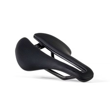
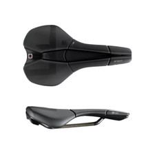
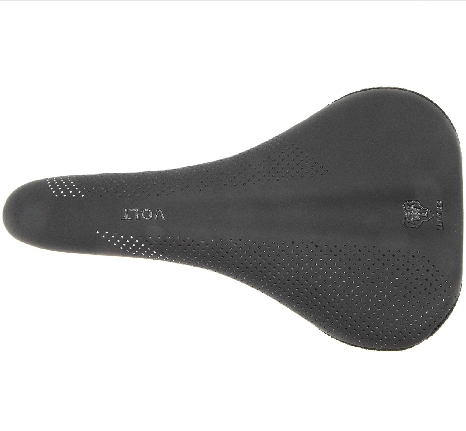
WTB Volt Pro Saddle - Chromoly Silver Medium
Check the listing for details.


| Location | Boca Raton US |
| Shipping | Free shipping (check listing for details) |
| Seller |
cyclelimitedllc
99.7% positive · 4445 feedback
|
| Listing | FixedPrice · Active |
| Start time | 2025-12-29T18:42:34.000Z |
| Brand | WTB |
WTB Volt Pro Saddle - Chromoly Silver Medium If you're the kind of rider that shimmies around on the saddle a great deal, the WTB Volt Pro Saddle might be your ticket to comfort. When you find yourself riding off the back of the saddle, the Volt features a raised 'whale' tail that tilts your pelvis forward and leverages pedaling efforts with greater efficiency. As you slowly migrate forward in preparation for a difficult climb, the front of the Volt offers greater support while you hammer. This versatility, as well as the center "Love Channel" and efficient but flexible Flex-Tuned Shell, makes it a solid choice for road and trail enthusiasts. elm.clearfix .clearfix:before,.clearfix:after .clearfix:after .hide-text .input-block-level article,aside,details,figcaption,figure,footer,header,hgroup,nav,section audio,canvas,video audio:not([controls]) html a:focus a:hover,a:active sub,sup sup sub img #map_canvas img,.google-maps img button,input,select,textarea button,input button::-moz-focus-inner,input::-moz-focus-inner button,html input[type="button"],input[type="reset"],input[type="submit"] label,select,button,input[type="button"],input[type="reset"],input[type="submit"],input[type="radio"],input[type="checkbox"] input[type="search"] input[type="search"]::-webkit-search-decoration,input[type="search"]::-webkit-search-cancel-button textarea @media print a,a:visited a[href]:after abbr[title]:after .ir a:after,a[href^="js:"]:after,a[href^="#"]:after pre,blockquote thead tr,img img @page p,h2,h3 h2,h3 }body a a:hover,a:focus .img-rounded .img-polaroid .img-circle .row .row:before,.row:after .row:after [class*="span"] .container,.navbar-static-top ,.navbar-fixed-top ,.navbar-fixed-bottom .span12 .span11 .span10 .span9 .span8 .span7 .span6 .span5 .span4 .span3 .span2 .span1 .offset12 .offset11 .offset10 .offset9 .offset8 .offset7 .offset6 .offset5 .offset4 .offset3 .offset2 .offset1 .row-fluid .row-fluid:before,.row-fluid:after .row-fluid:after .row-fluid [class*="span"] .row-fluid [class*="span"]:first-child .row-fluid [class*="span"]+[class*="span"] .row-fluid .row-fluid .row-fluid .row-fluid .row-fluid .row-fluid .row-fluid .row-fluid .row-fluid .row-fluid .row-fluid .row-fluid .row-fluid .row-fluid .row-fluid .row-fluid .row-fluid .row-fluid .row-fluid .row-fluid .row-fluid .row-fluid .row-fluid .row-fluid .row-fluid .row-fluid .row-fluid .row-fluid .row-fluid .row-fluid .row-fluid .row-fluid .row-fluid .row-fluid .row-fluid .row-fluid [class*="span"].hide,.row-fluid [class*="span"].hide [class*="span"].pull-right,.row-fluid [class*="span"].pull-right .container .container:before,.container:after .container:after .container-fluid .container-fluid:before,.container-fluid:after .container-fluid:after p .lead small strong em cite .muted a.muted:hover,a.muted:focus .text-warning a.text-warning:hover,a.text-warning:focus .text-error a.text-error:hover,a.text-error:focus .text-info a.text-info:hover,a.text-info:focus .text-success a.text-success:hover,a.text-success:focus .text-left .text-right .text-center h1,h2,h3,h4,h5,h6 h1 small,h2 small,h3 small,h4 small,h5 small,h6 small h1,h2,h3 h1 h2 h3 h4 h5 h6 h1 small h2 small h3 small h4 small .page-header ul,ol ul ul,ul ol,ol ol,ol ul li ul.unstyled,ol.unstyled ul.inline,ol.inline ul.inline>li,ol.inline>li dl dt,dd dt dd .dl-horizontal .dl-horizontal:before,.dl-horizontal:after .dl-horizontal:after .dl-horizontal dt .dl-horizontal dd hr abbr[title],abbr[data-original-title] abbr.initialism blockquote blockquote p blockquote small blockquote small:before blockquote.pull-right blockquote.pull-right p,blockquote.pull-right small blockquote.pull-right small:before blockquote.pull-right small:after q:before,q:after,blockquote:before,blockquote:after address code,pre code pre pre.prettyprint pre code .pre-scrollable form fieldset legend legend small label,input,button,select,textarea input,button,select,textarea label select,textarea,input[type="text"],input[type="password"],input[type="datetime"],input[type="datetime-local"],input[type="date"],input[type="month"],input[type="time"],input[type="week"],input[type="number"],input[type="email"],input[type="url"],input[type="search"],input[type="tel"],input[type="color"],.uneditable-input input,textarea,.uneditable-input textarea textarea,input[type="text"],input[type="password"],input[type="datetime"],input[type="datetime-local"],input[type="date"],input[type="month"],input[type="time"],input[type="week"],input[type="number"],input[type="email"],input[type="url"],input[type="search"],input[type="tel"],input[type="color"],.uneditable-input textarea:focus,input[type="text"]:focus,input[type="password"]:focus,input[type="datetime"]:focus,input[type="datetime-local"]:focus,input[type="date"]:focus,input[type="month"]:focus,input[type="time"]:focus,input[type="week"]:focus,input[type="number"]:focus,input[type="email"]:focus,input[type="url"]:focus,input[type="search"]:focus,input[type="tel"]:focus,input[type="color"]:focus,.uneditable-input:focus input[type="radio"],input[type="checkbox"] input[type="file"],input[type="image"],input[type="submit"],input[type="reset"],input[type="button"],input[type="radio"],input[type="checkbox"] select,input[type="file"] select select[multiple],select[size] select:focus,input[type="file"]:focus,input[type="radio"]:focus,input[type="checkbox"]:focus .uneditable-input,.uneditable-textarea .uneditable-input .uneditable-textarea input:-moz-placeholder,textarea:-moz-placeholder input:-ms-input-placeholder,textarea:-ms-input-placeholder input::-webkit-input-placeholder,textarea::-webkit-input-placeholder .radio,.checkbox .radio input[type="radio"],.checkbox input[type="checkbox"] .controls>.radio:first-child,.controls>.checkbox:first-child .radio.inline,.checkbox.inline .radio.inline+.radio.inline,.checkbox.inline+.checkbox.inline .input-mini .input-small .input-medium .input-large .input-xlarge .input-xxlarge input[class*="span"],select[class*="span"],textarea[class*="span"],.uneditable-input[class*="span"],.row-fluid input[class*="span"],.row-fluid select[class*="span"],.row-fluid textarea[class*="span"],.row-fluid [class*="span"] .input-append input[class*="span"],.input-append [class*="span"],.input-prepend input[class*="span"],.input-prepend [class*="span"],.row-fluid input[class*="span"],.row-fluid select[class*="span"],.row-fluid textarea[class*="span"],.row-fluid [class*="span"],.row-fluid [class*="span"],.row-fluid [class*="span"] input,textarea,.uneditable-input .controls-row [class*="span"]+[class*="span"] input.span12,textarea.span12,.uneditable-input.span12 input.span11,textarea.span11,.uneditable-input.span11 input.span10,textarea.span10,.uneditable-input.span10 input.span9,textarea.span9,.uneditable-input.span9 input.span8,textarea.span8,.uneditable-input.span8 input.span7,textarea.span7,.uneditable-input.span7 input.span6,textarea.span6,.uneditable-input.span6 input.span5,textarea.span5,.uneditable-input.span5 input.span4,textarea.span4,.uneditable-input.span4 input.span3,textarea.span3,.uneditable-input.span3 input.span2,textarea.span2,.uneditable-input.span2 input.span1,textarea.span1,.uneditable-input.span1 .controls-row .controls-row:before,.controls-row:after .controls-row:after .controls-row [class*="span"],.row-fluid [class*="span"] .controls-row [class*="span"],.controls-row [class*="span"] input[disabled],select[disabled],textarea[disabled],input[readonly],select[readonly],textarea[readonly] input[type="radio"][disabled],input[type="checkbox"][disabled],input[type="radio"][readonly],input[type="checkbox"][readonly] .control-group.warning ,.control-group.warning ,.control-group.warning .control-group.warning ,.control-group.warning ,.control-group.warning input,.control-group.warning select,.control-group.warning textarea .control-group.warning input,.control-group.warning select,.control-group.warning textarea .control-group.warning input:focus,.control-group.warning select:focus,.control-group.warning textarea:focus .control-group.warning ,.control-group.warning .control-group.error ,.control-group.error ,.control-group.error .control-group.error ,.control-group.error ,.control-group.error input,.control-group.error select,.control-group.error textarea .control-group.error input,.control-group.error select,.control-group.error textarea .control-group.error input:focus,.control-group.error select:focus,.control-group.error textarea:focus .control-group.error ,.control-group.error .control-group.success ,.control-group.success ,.control-group.success .control-group.success ,.control-group.success ,.control-group.success input,.control-group.success select,.control-group.success textarea .control-group.success input,.control-group.success select,.control-group.success textarea .control-group.success input:focus,.control-group.success select:focus,.control-group.success textarea:focus .control-group.success ,.control-group.success .control-group.info ,.control-group.info ,.control-group.info .control-group.info ,.control-group.info ,.control-group.info input,.control-group.info select,.control-group.info textarea .control-group.info input,.control-group.info select,.control-group.info textarea .control-group.info input:focus,.control-group.info select:focus,.control-group.info textarea:focus .control-group.info ,.control-group.info input:focus:invalid,textarea:focus:invalid,select:focus:invalid input:focus:invalid:focus,textarea:focus:invalid:focus,select:focus:invalid:focus .form-actions .form-actions:before,.form-actions:after .form-actions:after .help-block,.help-inline .help-block .help-inline .input-append,.input-prepend .input-append input,.input-prepend input,.input-append select,.input-prepend select,.input-append ,.input-prepend ,.input-append ,.input-prepend ,.input-append ,.input-prepend .input-append input,.input-prepend input,.input-append select,.input-prepend select,.input-append ,.input-prepend .input-append input:focus,.input-prepend input:focus,.input-append select:focus,.input-prepend select:focus,.input-append ,.input-prepend .input-append ,.input-prepend .input-append ,.input-prepend ,.input-append ,.input-prepend ,.input-append >.dropdown-toggle,.input-prepend >.dropdown-toggle .input-append ,.input-prepend .input-prepend ,.input-prepend .input-prepend ,.input-prepend .input-append input,.input-append select,.input-append .input-append input+.btn-group ,.input-append select+.btn-group ,.input-append +.btn-group .input-append ,.input-append ,.input-append .input-append ,.input-append ,.input-append >.dropdown-toggle .input-prepend.input-append input,.input-prepend.input-append select,.input-prepend.input-append .input-prepend.input-append input+.btn-group ,.input-prepend.input-append select+.btn-group ,.input-prepend.input-append +.btn-group .input-prepend.input-append ,.input-prepend.input-append .input-prepend.input-append ,.input-prepend.input-append .input-prepend.input-append input.search-query .form-search ,.form-search .form-search .form-search .form-search .form-search .form-search input,.form-inline input,.form-horizontal input,.form-search textarea,.form-inline textarea,.form-horizontal textarea,.form-search select,.form-inline select,.form-horizontal select,.form-search ,.form-inline ,.form-horizontal ,.form-search ,.form-inline ,.form-horizontal ,.form-search ,.form-inline ,.form-horizontal ,.form-search ,.form-inline ,.form-horizontal .form-search ,.form-inline ,.form-horizontal .form-search label,.form-inline label,.form-search ,.form-inline .form-search ,.form-inline ,.form-search ,.form-inline .form-search ,.form-search ,.form-inline ,.form-inline .form-search input[type="radio"],.form-search input[type="checkbox"],.form-inline input[type="radio"],.form-inline input[type="checkbox"] .control-group legend+.control-group .form-horizontal .form-horizontal ,.form-horizontal .form-horizontal .form-horizontal .form-horizontal .form-horizontal .form-horizontal .form-horizontal input+.help-block,.form-horizontal select+.help-block,.form-horizontal textarea+.help-block,.form-horizontal +.help-block,.form-horizontal +.help-block,.form-horizontal +.help-block .form-horizontal table .table .table th,.table td .table th .table thead th .table caption+thead tr:first-child th,.table caption+thead tr:first-child td,.table colgroup+thead tr:first-child th,.table colgroup+thead tr:first-child td,.table thead:first-child tr:first-child th,.table thead:first-child tr:first-child td .table tbody+tbody .table .table-condensed th,.table-condensed td .table-bordered .table-bordered th,.table-bordered td .table-bordered caption+thead tr:first-child th,.table-bordered caption+tbody tr:first-child th,.table-bordered caption+tbody tr:first-child td,.table-bordered colgroup+thead tr:first-child th,.table-bordered colgroup+tbody tr:first-child th,.table-bordered colgroup+tbody tr:first-child td,.table-bordered thead:first-child tr:first-child th,.table-bordered tbody:first-child tr:first-child th,.table-bordered tbody:first-child tr:first-child td .table-bordered thead:first-child tr:first-child>th:first-child,.table-bordered tbody:first-child tr:first-child>td:first-child,.table-bordered tbody:first-child tr:first-child>th:first-child .table-bordered thead:first-child tr:first-child>th:last-child,.table-bordered tbody:first-child tr:first-child>td:last-child,.table-bordered tbody:first-child tr:first-child>th:last-child .table-bordered thead:last-child tr:last-child>th:first-child,.table-bordered tbody:last-child tr:last-child>td:first-child,.table-bordered tbody:last-child tr:last-child>th:first-child,.table-bordered tfoot:last-child tr:last-child>td:first-child,.table-bordered tfoot:last-child tr:last-child>th:first-child .table-bordered thead:last-child tr:last-child>th:last-child,.table-bordered tbody:last-child tr:last-child>td:last-child,.table-bordered tbody:last-child tr:last-child>th:last-child,.table-bordered tfoot:last-child tr:last-child>td:last-child,.table-bordered tfoot:last-child tr:last-child>th:last-child .table-bordered tfoot+tbody:last-child tr:last-child td:first-child .table-bordered tfoot+tbody:last-child tr:last-child td:last-child .table-bordered caption+thead tr:first-child th:first-child,.table-bordered caption+tbody tr:first-child td:first-child,.table-bordered colgroup+thead tr:first-child th:first-child,.table-bordered colgroup+tbody tr:first-child td:first-child .table-bordered caption+thead tr:first-child th:last-child,.table-bordered caption+tbody tr:first-child td:last-child,.table-bordered colgroup+thead tr:first-child th:last-child,.table-bordered colgroup+tbody tr:first-child td:last-child .table-striped tbody>tr:nth-child(odd)>td,.table-striped tbody>tr:nth-child(odd)>th .table-hover tbody tr:hover>td,.table-hover tbody tr:hover>th table td[class*="span"],table th[class*="span"],.row-fluid table td[class*="span"],.row-fluid table th[class*="span"] .table td.span1,.table th.span1 .table td.span2,.table th.span2 .table td.span3,.table th.span3 .table td.span4,.table th.span4 .table td.span5,.table th.span5 .table td.span6,.table th.span6 .table td.span7,.table th.span7 .table td.span8,.table th.span8 .table td.span9,.table th.span9 .table td.span10,.table th.span10 .table td.span11,.table th.span11 .table td.span12,.table th.span12 .table tbody tr.success>td .table tbody tr.error>td .table tbody tr.warning>td .table tbody tr.info>td .table-hover tbody tr.success:hover>td .table-hover tbody tr.error:hover>td .table-hover tbody tr.warning:hover>td .table-hover tbody tr.info:hover>td [class^="icon-"],[class*=" icon-"] .icon-white,.nav-pills>.active>a>[class^="icon-"],.nav-pills>.active>a>[class*=" icon-"],.nav-list>.active>a>[class^="icon-"],.nav-list>.active>a>[class*=" icon-"],.navbar-inverse >.active>a>[class^="icon-"],.navbar-inverse >.active>a>[class*=" icon-"],.dropdown-menu>li>a:hover>[class^="icon-"],.dropdown-menu>li>a:focus>[class^="icon-"],.dropdown-menu>li>a:hover>[class*=" icon-"],.dropdown-menu>li>a:focus>[class*=" icon-"],.dropdown-menu>.active>a>[class^="icon-"],.dropdown-menu>.active>a>[class*=" icon-"],.dropdown-submenu:hover>a>[class^="icon-"],.dropdown-submenu:focus>a>[class^="icon-"],.dropdown-submenu:hover>a>[class*=" icon-"],.dropdown-submenu:focus>a>[class*=" icon-"] .icon-glass .icon-music .icon-search .icon-envelope .icon-heart .icon-star .icon-star-empty .icon-user .icon-film .icon-th-large .icon-th .icon-th-list .icon-ok .icon-remove .icon-zoom-in .icon-zoom-out .icon-off .icon-signal .icon-cog .icon-trash .icon-home .icon-file .icon-time .icon-road .icon-download-alt .icon-download .icon-upload .icon-inbox .icon-play-circle .icon-repeat .icon-refresh .icon-list-alt .icon-lock .icon-flag .icon-headphones .icon-volume-off .icon-volume-down .icon-volume-up .icon-qrcode .icon-barcode .icon-tag .icon-tags .icon-book .icon-bookmark .icon-print .icon-camera .icon-font .icon-bold .icon-italic .icon-text-height .icon-text-width .icon-align-left .icon-align-center .icon-align-right .icon-align-justify .icon-list .icon-indent-left .icon-indent-right .icon-facetime-video .icon-picture .icon-pencil .icon-map-marker .icon-adjust .icon-tint .icon-edit .icon-share .icon-check .icon-move .icon-step-backward .icon-fast-backward .icon-backward .icon-play .icon-pause .icon-stop .icon-forward .icon-fast-forward .icon-step-forward .icon-eject .icon-chevron-left .icon-chevron-right .icon-plus-sign .icon-minus-sign .icon-remove-sign .icon-ok-sign .icon-question-sign .icon-info-sign .icon-screenshot .icon-remove-circle .icon-ok-circle .icon-ban-circle .icon-arrow-left .icon-arrow-right .icon-arrow-up .icon-arrow-down .icon-share-alt .icon-resize-full .icon-resize-small .icon-plus .icon-minus .icon-asterisk .icon-exclamation-sign .icon-gift .icon-leaf .icon-fire .icon-eye-open .icon-eye-close .icon-warning-sign .icon-plane .icon-calendar .icon-random .icon-comment .icon-magnet .icon-chevron-up .icon-chevron-down .icon-retweet .icon-shopping-cart .icon-folder-close .icon-folder-open .icon-resize-vertical .icon-resize-horizontal .icon-hdd .icon-bullhorn .icon-bell .icon-certificate .icon-thumbs-up .icon-thumbs-down .icon-hand-right .icon-hand-left .icon-hand-up .icon-hand-down .icon-circle-arrow-right .icon-circle-arrow-left .icon-circle-arrow-up .icon-circle-arrow-down .icon-globe .icon-wrench .icon-tasks .icon-filter .icon-briefcase .icon-fullscreen .dropup,.dropdown .dropdown-toggle .dropdown-toggle:active,.open .caret .dropdown .dropdown-menu .dropdown-menu.pull-right .dropdown-menu .dropdown-menu>li>a .dropdown-menu>li>a:hover,.dropdown-menu>li>a:focus,.dropdown-submenu:hover>a,.dropdown-submenu:focus>a .dropdown-menu>.active>a,.dropdown-menu>.active>a:hover,.dropdown-menu>.active>a:focus .dropdown-menu>.disabled>a,.dropdown-menu>.disabled>a:hover,.dropdown-menu>.disabled>a:focus .dropdown-menu>.disabled>a:hover,.dropdown-menu>.disabled>a:focus .open .open>.dropdown-menu .dropdown-backdrop .pull-right>.dropdown-menu .dropup ,.navbar-fixed-bottom .dropup ,.navbar-fixed-bottom .dropdown-submenu .dropdown-submenu>.dropdown-menu .dropdown-submenu:hover>.dropdown-menu .dropup >.dropdown-menu .dropdown-submenu>a:after .dropdown-submenu:hover>a:after .dropdown-submenu.pull-left .dropdown-submenu.pull-left>.dropdown-menu .dropdown .typeahead .well .well blockquote .well-large .well-small .fade .fade.in .collapse .collapse.in .close .close:hover,.close:focus button.close .btn .btn:hover,.btn:focus,.btn:active,.btn.active,.btn.disabled,.btn[disabled] .btn:active,.btn.active .btn:first-child .btn:hover,.btn:focus .btn:focus .btn.active,.btn:active .btn.disabled,.btn[disabled] .btn-large .btn-large [class^="icon-"],.btn-large [class*=" icon-"] .btn-small .btn-small [class^="icon-"],.btn-small [class*=" icon-"] .btn-mini [class^="icon-"],.btn-mini [class*=" icon-"] .btn-mini .btn-block .btn-block+.btn-block input[type="submit"].btn-block,input[type="reset"].btn-block,input[type="button"].btn-block .btn-primary.active,.btn-warning.active,.btn-danger.active,.btn-success.active,.btn-info.active,.btn-inverse.active .btn-primary .btn-primary:hover,.btn-primary:focus,.btn-primary:active,.btn-primary.active,.btn-primary.disabled,.btn-primary[disabled] .btn-primary:active,.btn-primary.active .btn-warning .btn-warning:hover,.btn-warning:focus,.btn-warning:active,.btn-warning.active,.btn-warning.disabled,.btn-warning[disabled] .btn-warning:active,.btn-warning.active .btn-danger .btn-danger:hover,.btn-danger:focus,.btn-danger:active,.btn-danger.active,.btn-danger.disabled,.btn-danger[disabled] .btn-danger:active,.btn-danger.active .btn-success .btn-success:hover,.btn-success:focus,.btn-success:active,.btn-success.active,.btn-success.disabled,.btn-success[disabled] .btn-success:active,.btn-success.active .btn-info .btn-info:hover,.btn-info:focus,.btn-info:active,.btn-info.active,.btn-info.disabled,.btn-info[disabled] .btn-info:active,.btn-info.active .btn-inverse .btn-inverse:hover,.btn-inverse:focus,.btn-inverse:active,.btn-inverse.active,.btn-inverse.disabled,.btn-inverse[disabled] .btn-inverse:active,.btn-inverse.active button.btn,input[type="submit"].btn button.btn::-moz-focus-inner,input[type="submit"].btn::-moz-focus-inner button.btn.btn-large,input[type="submit"].btn.btn-large button.btn.btn-small,input[type="submit"].btn.btn-small button.btn.btn-mini,input[type="submit"].btn.btn-mini .btn-link,.btn-link:active,.btn-link[disabled] .btn-link .btn-link:hover,.btn-link:focus .btn-link[disabled]:hover,.btn-link[disabled]:focus .btn-group .btn-group:first-child .btn-group+.btn-group .btn-toolbar .btn-toolbar>.btn+.btn,.btn-toolbar>.btn-group+.btn,.btn-toolbar>.btn+.btn-group .btn-group>.btn .btn-group>.btn+.btn .btn-group>.btn,.btn-group>.dropdown-menu,.btn-group>.popover .btn-group>.btn-mini .btn-group>.btn-small .btn-group>.btn-large .btn-group>.btn:first-child .btn-group>.btn:last-child,.btn-group>.dropdown-toggle .btn-group>.btn.large:first-child .btn-group>.btn.large:last-child,.btn-group>.large.dropdown-toggle .btn-group>.btn:hover,.btn-group>.btn:focus,.btn-group>.btn:active,.btn-group>.btn.active .btn-group ,.btn-group.open .btn-group>.btn+.dropdown-toggle .btn-group>.btn-mini+.dropdown-toggle .btn-group>.btn-small+.dropdown-toggle .btn-group>.btn-large+.dropdown-toggle .btn-group.open .btn-group.open .dropdown-toggle .btn-group.open .dropdown-toggle .btn-group.open .dropdown-toggle .btn-group.open .dropdown-toggle .btn-group.open .dropdown-toggle .btn-group.open .dropdown-toggle .btn-group.open .dropdown-toggle .btn .btn-large .btn-large .btn-mini ,.btn-small .dropup .btn-primary ,.btn-warning ,.btn-danger ,.btn-info ,.btn-success ,.btn-inverse .btn-group-vertical .btn-group-vertical>.btn .btn-group-vertical>.btn+.btn .btn-group-vertical>.btn:first-child .btn-group-vertical>.btn:last-child .btn-group-vertical>.btn-large:first-child .btn-group-vertical>.btn-large:last-child .alert .alert,.alert h4 .alert h4 .alert .alert-success .alert-success h4 .alert-danger,.alert-error .alert-danger h4,.alert-error h4 .alert-info .alert-info h4 .alert-block .alert-block>p,.alert-block>ul .alert-block p+p .nav .nav>li>a .nav>li>a:hover,.nav>li>a:focus .nav>li>a>img .nav>.pull-right .nav-header .nav li+.nav-header .nav-list .nav-list>li>a,.nav-list .nav-list>li>a .nav-list>.active>a,.nav-list>.active>a:hover,.nav-list>.active>a:focus .nav-list [class^="icon-"],.nav-list [class*=" icon-"] .nav-list .nav-tabs,.nav-pills .nav-tabs:before,.nav-pills:before,.nav-tabs:after,.nav-pills:after .nav-tabs:after,.nav-pills:after .nav-tabs>li,.nav-pills>li .nav-tabs>li>a,.nav-pills>li>a .nav-tabs .nav-tabs>li .nav-tabs>li>a .nav-tabs>li>a:hover,.nav-tabs>li>a:focus .nav-tabs>.active>a,.nav-tabs>.active>a:hover,.nav-tabs>.active>a:focus .nav-pills>li>a .nav-pills>.active>a,.nav-pills>.active>a:hover,.nav-pills>.active>a:focus .nav-stacked>li .nav-stacked>li>a .nav-tabs.nav-stacked .nav-tabs.nav-stacked>li>a .nav-tabs.nav-stacked>li:first-child>a .nav-tabs.nav-stacked>li:last-child>a .nav-tabs.nav-stacked>li>a:hover,.nav-tabs.nav-stacked>li>a:focus .nav-pills.nav-stacked>li>a .nav-pills.nav-stacked>li:last-child>a .nav-tabs .nav-pills .nav .nav ,.nav .nav-tabs .nav .nav-tabs .nav>.dropdown.active>a:hover,.nav>.dropdown.active>a:focus .nav-tabs ,.nav-pills ,.nav>li.dropdown.open.active>a:hover,.nav>li.dropdown.open.active>a:focus .nav li.dropdown.open ,.nav li.dropdown.open.active ,.nav li.dropdown.open a:hover ,.nav li.dropdown.open a:focus .tabs-stacked >a:hover,.tabs-stacked >a:focus .tabbable .tabbable:before,.tabbable:after .tabbable:after .tab-content .tabs-below>.nav-tabs,.tabs-right>.nav-tabs,.tabs-left>.nav-tabs .tab-content>.tab-pane,.pill-content>.pill-pane .tab-content>.active,.pill-content>.active .tabs-below>.nav-tabs .tabs-below>.nav-tabs>li .tabs-below>.nav-tabs>li>a .tabs-below>.nav-tabs>li>a:hover,.tabs-below>.nav-tabs>li>a:focus .tabs-below>.nav-tabs>.active>a,.tabs-below>.nav-tabs>.active>a:hover,.tabs-below>.nav-tabs>.active>a:focus .tabs-left>.nav-tabs>li,.tabs-right>.nav-tabs>li .tabs-left>.nav-tabs>li>a,.tabs-right>.nav-tabs>li>a .tabs-left>.nav-tabs .tabs-left>.nav-tabs>li>a .tabs-left>.nav-tabs>li>a:hover,.tabs-left>.nav-tabs>li>a:focus .tabs-left>.nav-tabs >a,.tabs-left>.nav-tabs >a:hover,.tabs-left>.nav-tabs >a:focus .tabs-right>.nav-tabs .tabs-right>.nav-tabs>li>a .tabs-right>.nav-tabs>li>a:hover,.tabs-right>.nav-tabs>li>a:focus .tabs-right>.nav-tabs >a,.tabs-right>.nav-tabs >a:hover,.tabs-right>.nav-tabs >a:focus .nav>.disabled>a .nav>.disabled>a:hover,.nav>.disabled>a:focus .navbar .navbar-inner .navbar-inner:before,.navbar-inner:after .navbar-inner:after .navbar .nav-collapse.collapse .navbar .navbar ,.navbar .navbar-text .navbar-link .navbar-link:hover,.navbar-link:focus .navbar .navbar ,.navbar .navbar ,.navbar ,.navbar ,.navbar ,.navbar .navbar-form .navbar-form:before,.navbar-form:after .navbar-form:after .navbar-form input,.navbar-form select,.navbar-form ,.navbar-form .navbar-form input,.navbar-form select,.navbar-form .navbar-form input[type="image"],.navbar-form input[type="checkbox"],.navbar-form input[type="radio"] .navbar-form ,.navbar-form .navbar-form input,.navbar-form input .navbar-search .navbar-search .navbar-static-top .navbar-static-top .navbar-fixed-top,.navbar-fixed-bottom .navbar-fixed-top ,.navbar-static-top .navbar-fixed-bottom .navbar-fixed-top ,.navbar-fixed-bottom .navbar-static-top ,.navbar-fixed-top ,.navbar-fixed-bottom .navbar-fixed-top .navbar-fixed-top ,.navbar-static-top .navbar-fixed-bottom .navbar-fixed-bottom .navbar .navbar .pull-right .navbar >li .navbar >li>a .navbar .navbar >li>a:focus,.navbar >li>a:hover .navbar >.active>a,.navbar >.active>a:hover,.navbar >.active>a:focus .navbar .navbar ,.navbar ,.navbar ,.navbar .active,.navbar .disabled,.navbar [disabled] .navbar ,.navbar .active .navbar .btn-navbar +.icon-bar .navbar >li>.dropdown-menu:before .navbar >li>.dropdown-menu:after .navbar-fixed-bottom >li>.dropdown-menu:before .navbar-fixed-bottom >li>.dropdown-menu:after .navbar li.dropdown>a:hover ,.navbar li.dropdown>a:focus .navbar li.dropdown.open>.dropdown-toggle,.navbar li.dropdown.active>.dropdown-toggle,.navbar li.dropdown.open.active>.dropdown-toggle .navbar li.dropdown>.dropdown-toggle .navbar li.dropdown.open>.dropdown-toggle ,.navbar li.dropdown.active>.dropdown-toggle ,.navbar li.dropdown.open.active>.dropdown-toggle .navbar >li>.dropdown-menu,.navbar >li>.dropdown-menu.pull-right .navbar >li>.dropdown-menu:before,.navbar >li>.dropdown-menu.pull-right:before .navbar >li>.dropdown-menu:after,.navbar >li>.dropdown-menu.pull-right:after .navbar >li>.dropdown-menu ,.navbar >li>.dropdown-menu.pull-right .navbar-inverse .navbar-inverse ,.navbar-inverse >li>a .navbar-inverse ,.navbar-inverse >li>a:hover,.navbar-inverse ,.navbar-inverse >li>a:focus .navbar-inverse .navbar-inverse .navbar-inverse >li>a:focus,.navbar-inverse >li>a:hover .navbar-inverse >a,.navbar-inverse >a:hover,.navbar-inverse >a:focus .navbar-inverse .navbar-inverse ,.navbar-inverse .navbar-inverse .navbar-inverse li.dropdown.open>.dropdown-toggle,.navbar-inverse li.dropdown.active>.dropdown-toggle,.navbar-inverse li.dropdown.open.active>.dropdown-toggle .navbar-inverse li.dropdown>a:hover ,.navbar-inverse li.dropdown>a:focus .navbar-inverse li.dropdown>.dropdown-toggle .navbar-inverse li.dropdown.open>.dropdown-toggle ,.navbar-inverse li.dropdown.active>.dropdown-toggle ,.navbar-inverse li.dropdown.open.active>.dropdown-toggle .navbar-inverse .navbar-inverse .navbar-inverse .navbar-inverse .navbar-inverse ,.navbar-inverse .focused .navbar-inverse .navbar-inverse ,.navbar-inverse ,.navbar-inverse ,.navbar-inverse .active,.navbar-inverse .disabled,.navbar-inverse [disabled] .navbar-inverse ,.navbar-inverse .active .breadcrumb .breadcrumb>li .breadcrumb>li>.divider .breadcrumb>.active .pagination .pagination ul .pagination ul>li .pagination ul>li>a,.pagination ul>li>span .pagination ul>li>a:hover,.pagination ul>li>a:focus,.pagination ul>.active>a,.pagination ul>.active>span .pagination ul>.active>a,.pagination ul>.active>span .pagination ul>.disabled>span,.pagination ul>.disabled>a,.pagination ul>.disabled>a:hover,.pagination ul>.disabled>a:focus .pagination ul>li:first-child>a,.pagination ul>li:first-child>span .pagination ul>li:last-child>a,.pagination ul>li:last-child>span .pagination-centered .pagination-right .pagination-large ul>li>a,.pagination-large ul>li>span .pagination-large ul>li:first-child>a,.pagination-large ul>li:first-child>span .pagination-large ul>li:last-child>a,.pagination-large ul>li:last-child>span .pagination-mini ul>li:first-child>a,.pagination-small ul>li:first-child>a,.pagination-mini ul>li:first-child>span,.pagination-small ul>li:first-child>span .pagination-mini ul>li:last-child>a,.pagination-small ul>li:last-child>a,.pagination-mini ul>li:last-child>span,.pagination-small ul>li:last-child>span .pagination-small ul>li>a,.pagination-small ul>li>span .pagination-mini ul>li>a,.pagination-mini ul>li>span .pager .pager:before,.pager:after .pager:after .pager li .pager li>a,.pager li>span .pager li>a:hover,.pager li>a:focus .pager >a,.pager >span .pager >a,.pager >span .pager >a,.pager >a:hover,.pager >a:focus,.pager >span .modal-backdrop .modal-backdrop.fade .modal-backdrop,.modal-backdrop.fade.in .modal .modal.fade .modal.fade.in .modal-header .modal-header .modal-header h3 .modal-body .modal-form .modal-footer .modal-footer:before,.modal-footer:after .modal-footer:after .modal-footer +.btn .modal-footer +.btn .modal-footer +.btn-block .tooltip .tooltip.in .tooltip.top .tooltip.right .tooltip.bottom .tooltip.left .tooltip-inner .tooltip-arrow .tooltip.top .tooltip.right .tooltip.left .tooltip.bottom .popover .popover.top .popover.right .popover.bottom .popover.left .popover-title .popover-title:empty .popover-content .popover ,.popover .popover .popover .popover.top .popover.top .popover.right .popover.right .popover.bottom .popover.bottom .popover.left .popover.left .thumbnails .thumbnails:before,.thumbnails:after .thumbnails:after .row-fluid .thumbnails>li .thumbnail a.thumbnail:hover,a.thumbnail:focus .thumbnail>img .thumbnail .media,.media-body .media,.media .media:first-child .media-object .media-heading .media>.pull-left .media>.pull-right .media-list .label,.badge .label .badge .label:empty,.badge:empty a.label:hover,a.label:focus,a.badge:hover,a.badge:focus .label-important,.badge-important .label-important[href],.badge-important[href] .label-warning,.badge-warning .label-warning[href],.badge-warning[href] .label-success,.badge-success .label-success[href],.badge-success[href] .label-info,.badge-info .label-info[href],.badge-info[href] .label-inverse,.badge-inverse .label-inverse[href],.badge-inverse[href] .btn ,.btn .btn-mini ,.btn-mini @-webkit-keyframes progress-bar-stripes to }@-moz-keyframes progress-bar-stripes to }@-ms-keyframes progress-bar-stripes to }@-o-keyframes progress-bar-stripes to }@keyframes progress-bar-stripes to }.progress .progress .progress +.bar .progress-striped .progress.active .progress-danger ,.progress .progress-danger.progress-striped ,.progress-striped .progress-success ,.progress .progress-success.progress-striped ,.progress-striped .progress-info ,.progress .progress-info.progress-striped ,.progress-striped .progress-warning ,.progress .progress-warning.progress-striped ,.progress-striped .accordion .accordion-group .accordion-heading .accordion-heading .accordion-toggle .accordion-inner .carousel .carousel-inner .carousel-inner>.item .carousel-inner>.item>img,.carousel-inner>.item>a>img .carousel-inner>.active,.carousel-inner>.next,.carousel-inner>.prev .carousel-inner>.active .carousel-inner>.next,.carousel-inner>.prev .carousel-inner>.next .carousel-inner>.prev .carousel-inner>.next.left,.carousel-inner>.prev.right .carousel-inner>.active.left .carousel-inner>.active.right .carousel-control .carousel-control.right .carousel-control:hover,.carousel-control:focus .carousel-indicators .carousel-indicators li .carousel-indicators .carousel-caption .carousel-caption h4,.carousel-caption p .carousel-caption h4 .carousel-caption p .hero-unit .hero-unit h1 .hero-unit li .pull-right .pull-left .hide .show .invisible .affix .clearfix:before,.clearfix:after .clearfix:after .hide-text .input-block-level @-ms-viewport .hidden .visible-phone .visible-tablet .hidden-desktop .visible-desktop @media(min-width:768px) and (max-width:979px) .visible-desktop .visible-tablet .hidden-tablet }@media(max-width:767px) .visible-desktop .visible-phone .hidden-phone }.visible-print @media print .hidden-print }@media(min-width:1200px) .row:before,.row:after .row:after [class*="span"] .container,.navbar-static-top ,.navbar-fixed-top ,.navbar-fixed-bottom .span12 .span11 .span10 .span9 .span8 .span7 .span6 .span5 .span4 .span3 .span2 .span1 .offset12 .offset11 .offset10 .offset9 .offset8 .offset7 .offset6 .offset5 .offset4 .offset3 .offset2 .offset1 .row-fluid .row-fluid:before,.row-fluid:after .row-fluid:after .row-fluid [class*="span"] .row-fluid [class*="span"]:first-child .row-fluid [class*="span"]+[class*="span"] .row-fluid .row-fluid .row-fluid .row-fluid .row-fluid .row-fluid .row-fluid .row-fluid .row-fluid .row-fluid .row-fluid .row-fluid .row-fluid .row-fluid .row-fluid .row-fluid .row-fluid .row-fluid .row-fluid .row-fluid .row-fluid .row-fluid .row-fluid .row-fluid .row-fluid .row-fluid .row-fluid .row-fluid .row-fluid .row-fluid .row-fluid .row-fluid .row-fluid .row-fluid .row-fluid .row-fluid input,textarea,.uneditable-input .controls-row [class*="span"]+[class*="span"] input.span12,textarea.span12,.uneditable-input.span12 input.span11,textarea.span11,.uneditable-input.span11 input.span10,textarea.span10,.uneditable-input.span10 input.span9,textarea.span9,.uneditable-input.span9 input.span8,textarea.span8,.uneditable-input.span8 input.span7,textarea.span7,.uneditable-input.span7 input.span6,textarea.span6,.uneditable-input.span6 input.span5,textarea.span5,.uneditable-input.span5 input.span4,textarea.span4,.uneditable-input.span4 input.span3,textarea.span3,.uneditable-input.span3 input.span2,textarea.span2,.uneditable-input.span2 input.span1,textarea.span1,.uneditable-input.span1 .thumbnails .thumbnails>li .row-fluid }@media(min-width:768px) and (max-width:979px) .row:before,.row:after .row:after [class*="span"] .container,.navbar-static-top ,.navbar-fixed-top ,.navbar-fixed-bottom .span12 .span11 .span10 .span9 .span8 .span7 .span6 .span5 .span4 .span3 .span2 .span1 .offset12 .offset11 .offset10 .offset9 .offset8 .offset7 .offset6 .offset5 .offset4 .offset3 .offset2 .offset1 .row-fluid .row-fluid:before,.row-fluid:after .row-fluid:after .row-fluid [class*="span"] .row-fluid [class*="span"]:first-child .row-fluid [class*="span"]+[class*="span"] .row-fluid .row-fluid .row-fluid .row-fluid .row-fluid .row-fluid .row-fluid .row-fluid .row-fluid .row-fluid .row-fluid .row-fluid .row-fluid .row-fluid .row-fluid .row-fluid .row-fluid .row-fluid .row-fluid .row-fluid .row-fluid .row-fluid .row-fluid .row-fluid .row-fluid .row-fluid .row-fluid .row-fluid .row-fluid .row-fluid .row-fluid .row-fluid .row-fluid .row-fluid .row-fluid .row-fluid input,textarea,.uneditable-input .controls-row [class*="span"]+[class*="span"] input.span12,textarea.span12,.uneditable-input.span12 input.span11,textarea.span11,.uneditable-input.span11 input.span10,textarea.span10,.uneditable-input.span10 input.span9,textarea.span9,.uneditable-input.span9 input.span8,textarea.span8,.uneditable-input.span8 input.span7,textarea.span7,.uneditable-input.span7 input.span6,textarea.span6,.uneditable-input.span6 input.span5,textarea.span5,.uneditable-input.span5 input.span4,textarea.span4,.uneditable-input.span4 input.span3,textarea.span3,.uneditable-input.span3 input.span2,textarea.span2,.uneditable-input.span2 input.span1,textarea.span1,.uneditable-input.span1 }@media(max-width:767px) .navbar-fixed-top,.navbar-fixed-bottom,.navbar-static-top .container-fluid .dl-horizontal dt .dl-horizontal dd .container .row-fluid .row,.thumbnails .thumbnails>li [class*="span"],.uneditable-input[class*="span"],.row-fluid [class*="span"] .span12,.row-fluid .row-fluid [class*="offset"]:first-child .input-large,.input-xlarge,.input-xxlarge,input[class*="span"],select[class*="span"],textarea[class*="span"],.uneditable-input .input-prepend input,.input-append input,.input-prepend input[class*="span"],.input-append input[class*="span"] .controls-row [class*="span"]+[class*="span"] .modal .modal.fade .modal.fade.in }@media(max-width:480px) .page-header h1 small input[type="checkbox"],input[type="radio"] .form-horizontal .form-horizontal .form-horizontal .form-horizontal .media ,.media .media-object .modal .modal-header .carousel-caption }@media(max-width:979px) .navbar-fixed-top,.navbar-fixed-bottom .navbar-fixed-top .navbar-fixed-bottom .navbar-fixed-top ,.navbar-fixed-bottom .navbar .navbar .nav-collapse .nav-collapse .nav-collapse >li .nav-collapse >li>a .nav-collapse >.divider-vertical .nav-collapse .nav-collapse >li>a,.nav-collapse a .nav-collapse .nav-collapse li+li a .nav-collapse >li>a:hover,.nav-collapse >li>a:focus,.nav-collapse a:hover,.nav-collapse a:focus .navbar-inverse >li>a,.navbar-inverse a .navbar-inverse >li>a:hover,.navbar-inverse >li>a:focus,.navbar-inverse a:hover,.navbar-inverse a:focus .nav-collapse.in .nav-collapse .nav-collapse >.dropdown-menu .nav-collapse ,.nav-collapse .nav-collapse .nav-collapse >li>.dropdown-menu:before,.nav-collapse >li>.dropdown-menu:after .nav-collapse ,.nav-collapse .navbar-inverse ,.navbar-inverse .navbar .pull-right .nav-collapse,.nav-collapse.collapse .navbar .navbar-static }@media(min-width:980px) } elm.ebay_logo-wrap h2 h3 body li input.input.freightinput img label label label:hover [type=radio] [type=radio]:checked ~ label [type=radio]:checked ~ label ~ a.image, a.image img p.price p.price small a.large h3.icon h3.icon img a.image h4 p a,.various a li li.active a:hover, a:hover input[type=text] hr @media (max-width: 767px) label , , , , body , .logo >li, >li, li >li, >li, li } @media screen and (max-width:820px) } × × × × WTB Volt Pro Saddle - Chromoly Silver Medium Condition: New If you're the kind of rider that shimmies around on the saddle a great deal, the WTB Volt Pro Saddle might be your ticket to comfort. When you find yourself riding off the back of the saddle, the Volt features a raised 'whale' tail that tilts your pelvis forward and leverages pedaling efforts with greater efficiency. As you slowly migrate forward in preparation for a difficult climb, the front of the Volt offers greater support while you hammer. This versatility, as well as the center "Love Channel" and efficient but flexible Flex-Tuned Shell, makes it a solid choice for road and trail enthusiasts. All photos in this listing are of the actual item in its current condition. Our photographers document all components along with any scratches, cosmetic imperfections, or blemishes so you may confidently evaluate this items condition prior to your purchase. Every item listed for sale is currently in stock and ready to be shipped. This is a live listing; Once an sells it is automatically marked as out of stock out and removed. Specifications Product Category Components Condition New Weight 280g
Brand WTB Model Volt Pro Original MSRP 99.95 Mechanic Notes & Comments This WTB Volt Pro Saddle Silver is in new condition! Sold as OEM (Original Equipment Manufacturer) and may not include WTB-branded packaging Width: Medium (142mm) Weight: 280g Padding: Medium Cr-Mo Rails Color: Silver Shipping & Returns Shipped directly to your door Shipping for complete bikes is a $99 flat rate fee for the lower 48 states via UPS. International shipping is available and will be calculated upon checkout. Professionally packed and shipped Get riding within minutes. All bikes are shipped with the front wheel and handlebar disassembled. Select intricate bikes may require additional assembly. 14 day returns If this bike is not perfect for you, our team will help you find the right one! Choose between store credit in full or return the bike with a 10% restocking fee. We own our bikes Cycle Limited operates exclusively as a direct sellerânot a marketplace. Every bike we list is owned, inspected, and held by us; we donât consign or list for others. Our meticulous pre-purchase inspections and certification process ensures every bike meets our high standards, guaranteeing you quality and transparency in every purchase. Buy now and save! Tell a friend Visit store Watch now -- CYCLE LIMITED --