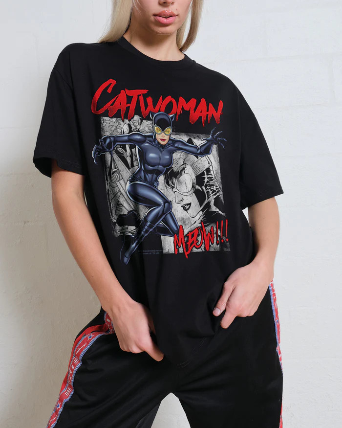
Gildan 2000T Mens Tall Tees XLT 2XLT 3XLT 100% Ultra Cotton T-Shirt 5 PACK
8ldlN1qw
“`html
body {
font-family: ‘Segoe UI’, Roboto, Arial, sans-serif;
background: #f5f7fa;
margin: 0;
padding: 30px 20px;
display: flex;
justify-content: center;
}
.product-card {
max-width: 1100px;
background: white;
border-radius: 20px;
box-shadow: 0 10px 30px rgba(0,0,0,0.08);
padding: 30px 35px;
transition: all 0.2s;
}
h1 {
font-size: 28px;
font-weight: 600;
color: #1e2a3a;
margin-top: 0;
margin-bottom: 8px;
}
.brand-sub {
color: #4a5b6e;
font-size: 15px;
letter-spacing: 0.3px;
margin-bottom: 20px;
}
.price-badge {
background: #eaf3ff;
color: #1a4b8c;
font-weight: 700;
font-size: 26px;
padding: 8px 20px;
border-radius: 40px;
display: inline-block;
margin: 10px 0 20px 0;
}
.gallery {
display: flex;
flex-wrap: wrap;
gap: 15px;
margin: 20px 0 25px 0;
}
.gallery img {
width: 100px;
height: 100px;
object-fit: cover;
border-radius: 12px;
border: 1px solid #e2e8f0;
transition: 0.2s;
cursor: default;
}
.gallery img:hover {
border-color: #2b6cb0;
box-shadow: 0 4px 12px rgba(0,0,0,0.1);
}
.grid-2 {
display: grid;
grid-template-columns: 1fr 1fr;
gap: 30px;
margin: 30px 0;
}
@media (max-width: 700px) {
.grid-2 { grid-template-columns: 1fr; }
}
.specs-table {
width: 100%;
border-collapse: collapse;
background: #f9fafc;
border-radius: 16px;
overflow: hidden;
}
.specs-table td {
padding: 12px 16px;
border-bottom: 1px solid #e9edf2;
font-size: 14px;
vertical-align: top;
}
.specs-table td:first-child {
font-weight: 600;
color: #1e2a3a;
width: 38%;
background: #f1f4f9;
}
.specs-table tr:last-child td {
border-bottom: none;
}
.desc-box {
background: #