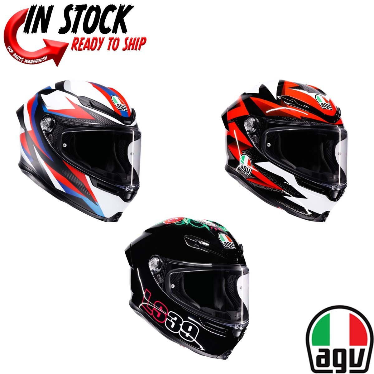
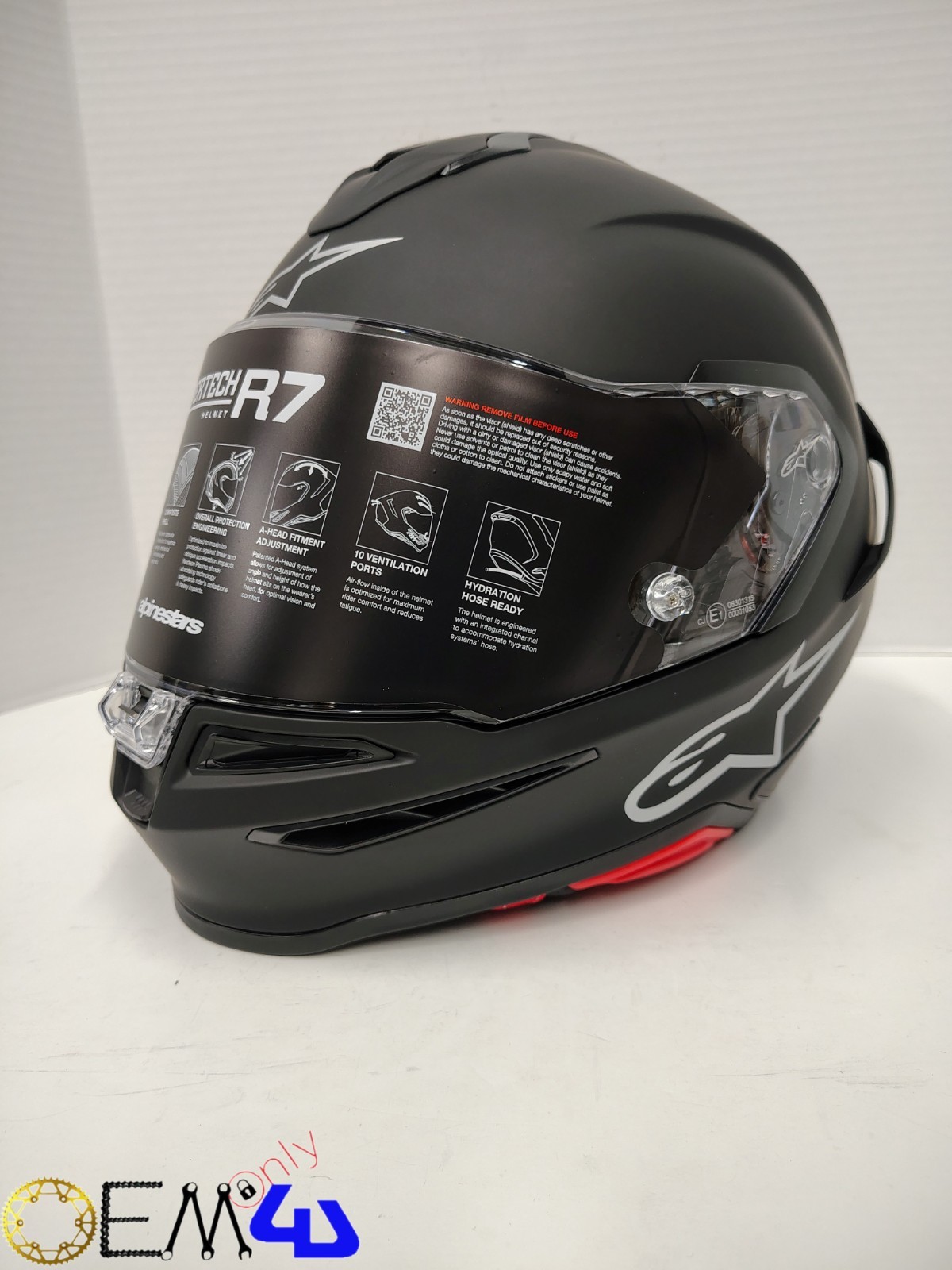
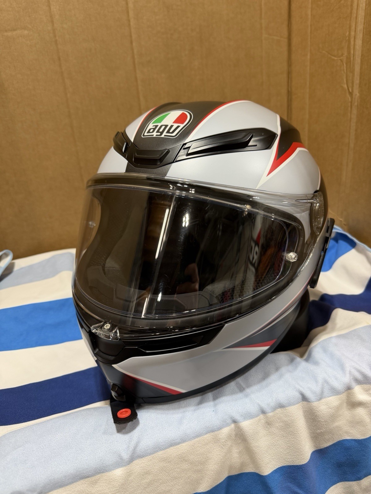
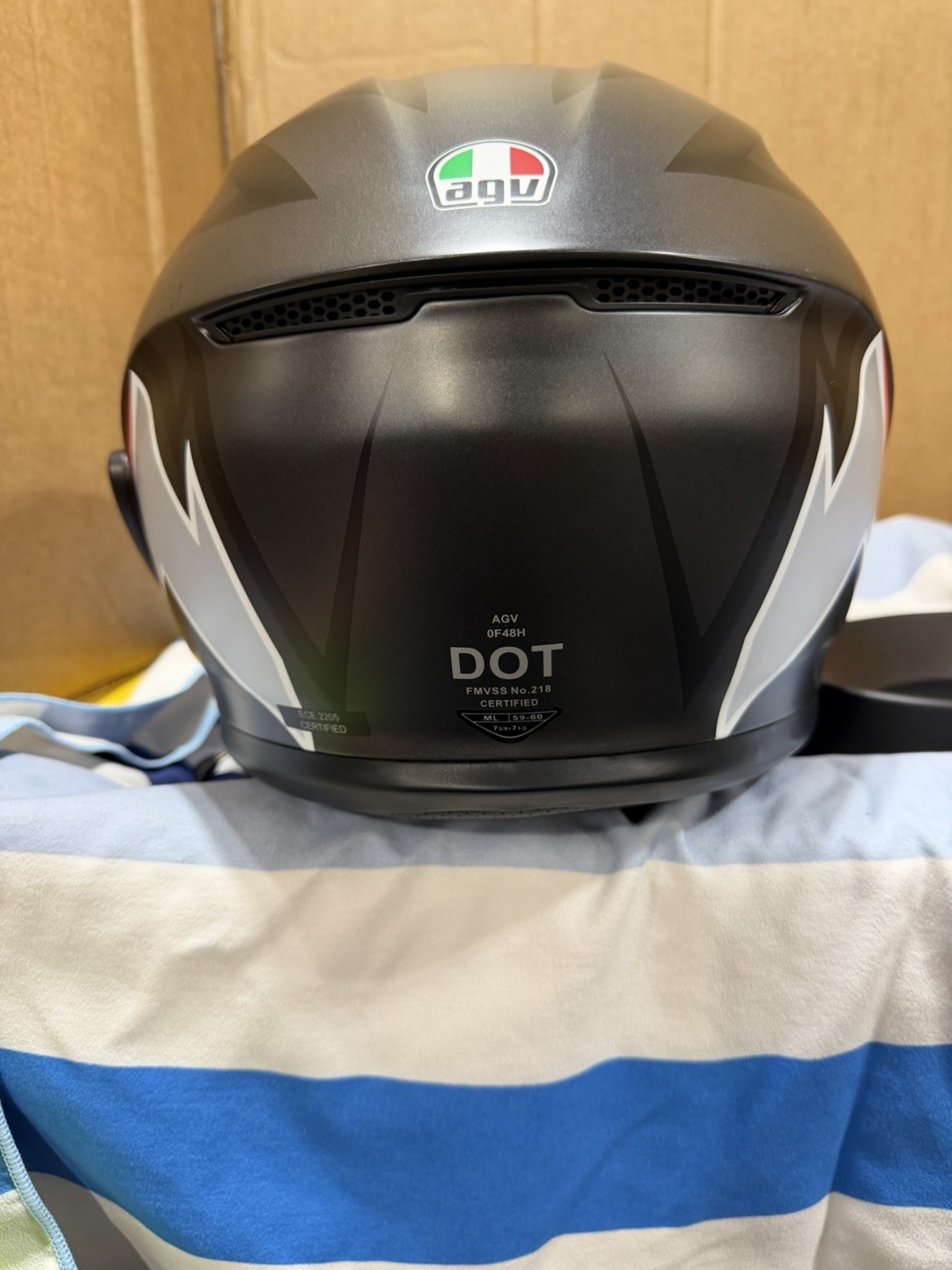
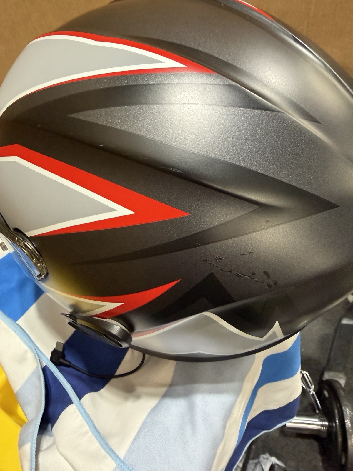
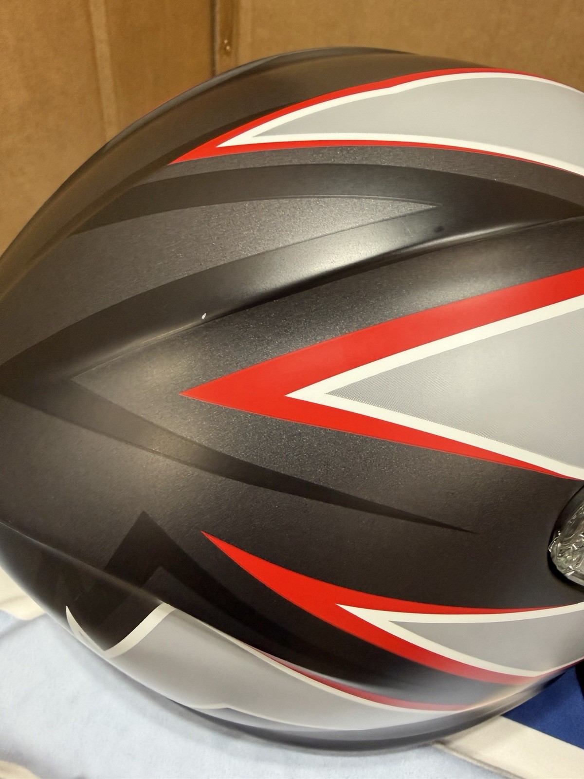
AGV K6 Size ML
haWsiLuR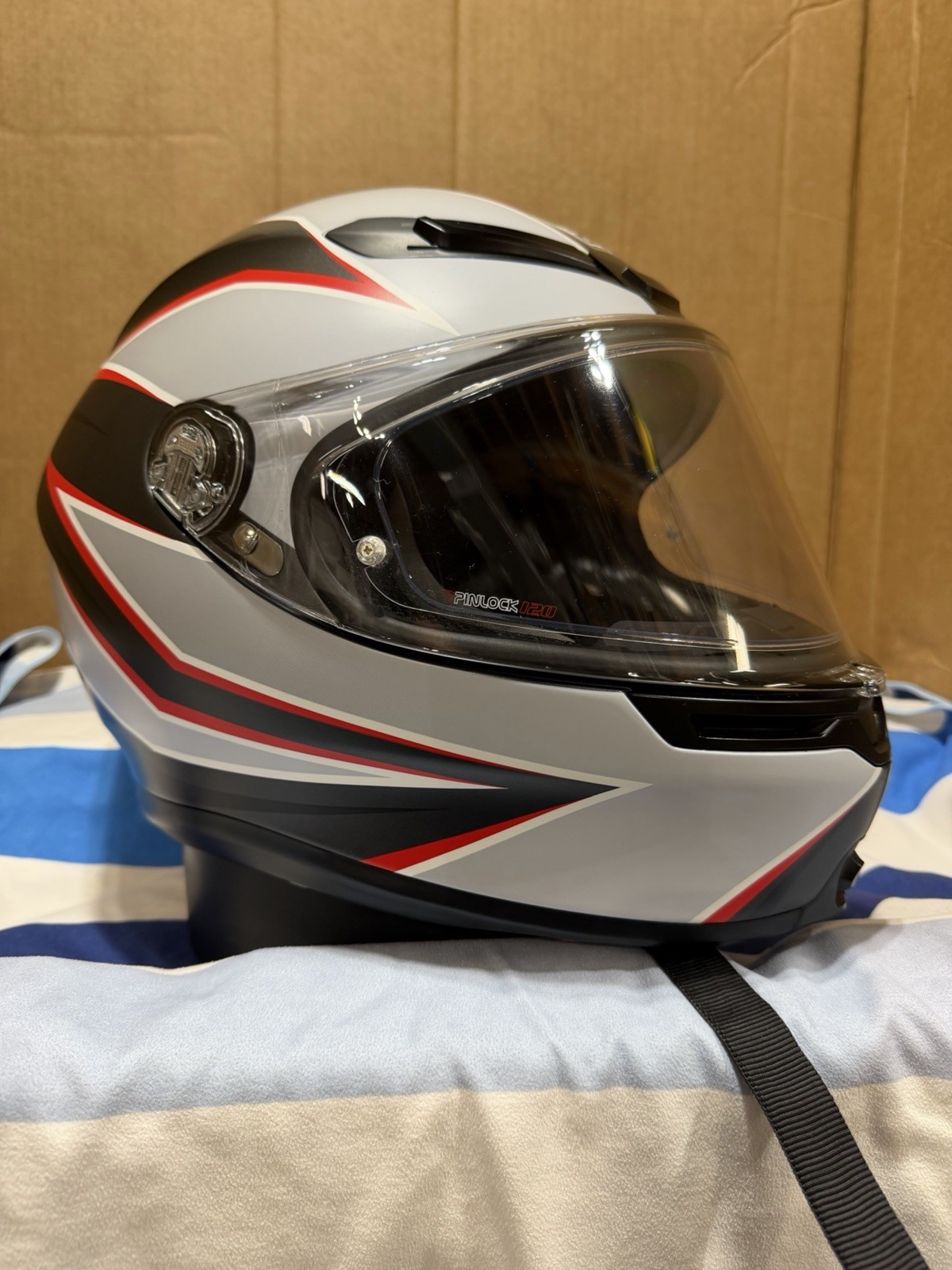
“`html
body {
font-family: -apple-system, BlinkMacSystemFont, ‘Segoe UI’, Roboto, Oxygen, Ubuntu, Cantarell, sans-serif;
background: #f4f6f8;
margin: 0;
padding: 20px;
color: #1a1a2e;
}
.product-card {
max-width: 1100px;
margin: 0 auto;
background: white;
border-radius: 24px;
box-shadow: 0 10px 30px rgba(0,0,0,0.08);
overflow: hidden;
padding: 30px;
}
.product-grid {
display: flex;
flex-wrap: wrap;
gap: 30px;
}
.product-gallery {
flex: 1 1 45%;
min-width: 280px;
}
.product-gallery img {
width: 100%;
height: auto;
border-radius: 16px;
display: block;
margin-bottom: 12px;
box-shadow: 0 4px 12px rgba(0,0,0,0.06);
}
.gallery-thumbs {
display: flex;
gap: 10px;
}
.gallery-thumbs img {
width: 80px;
height: 80px;
object-fit: cover;
border-radius: 12px;
cursor: pointer;
border: 2px solid transparent;
transition: 0.2s;
}
.gallery-thumbs img:hover {
border-color: #e63946;
}
.product-info {
flex: 1 1 50%;
}
h1 {
font-size: 28px;
margin: 0 0 8px;
font-weight: 700;
}
.brand-tag {
color: #e63946;
font-weight: 600;
letter-spacing: 0.5px;
font-size: 14px;
text-transform: uppercase;
}
.price {
font-size: 32px;
font-weight: 700;
color: #1a1a2e;
margin: 15px 0;
}
.price small {
font-size: 16px;
font-weight: 400;
color: #6c757d;
}
.condition-badge {
background: #f0f0f0;
padding: 6px 14px;
border-radius: 30px;
font-size: 14px;
font-weight: 500;
display: inline-block;
margin-bottom: 12px;
}
.specs-table {
width: 100%;
border-collapse: collapse;
margin: 20px 0;
}
.specs-table td {
padding: 10px 12px;
border-bottom: 1px solid #e9ecef;
font-size: 15px;
}
.specs-table td:first-child {
font-weight: 600;
color: #495057;
width: 40%;
}
.description {