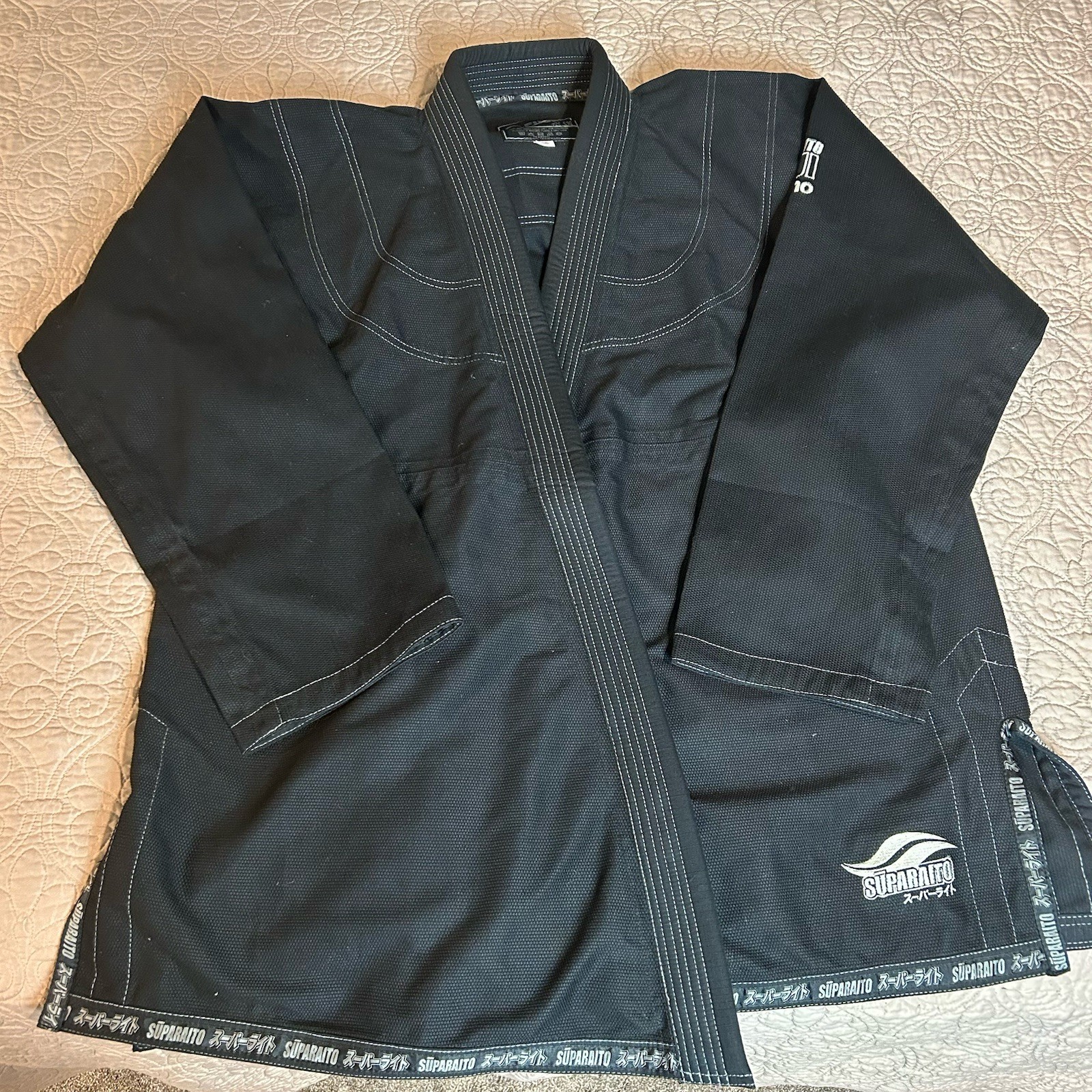
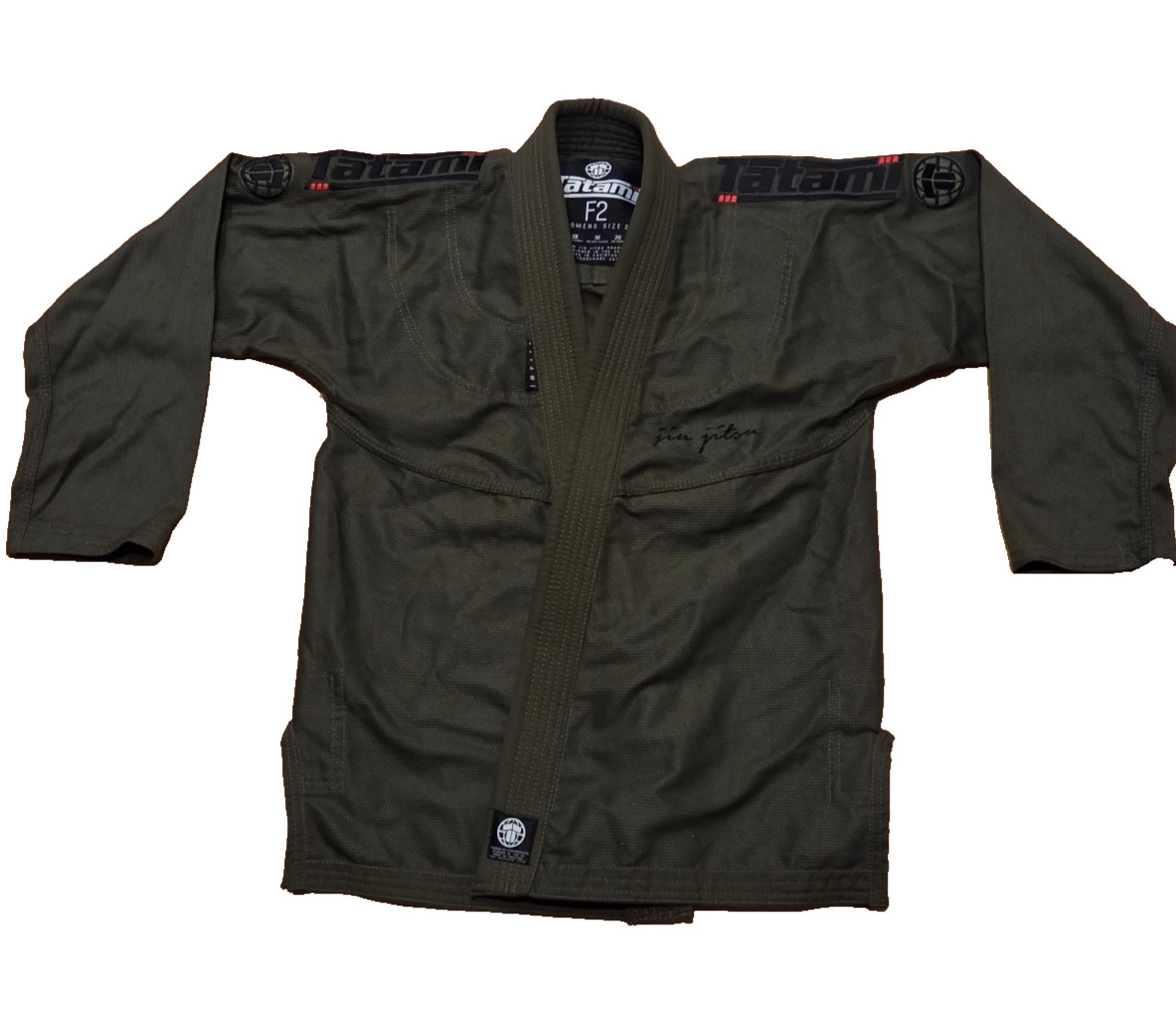
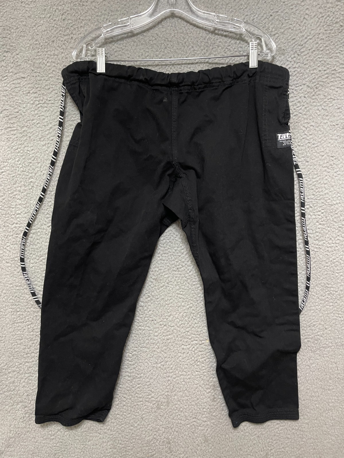
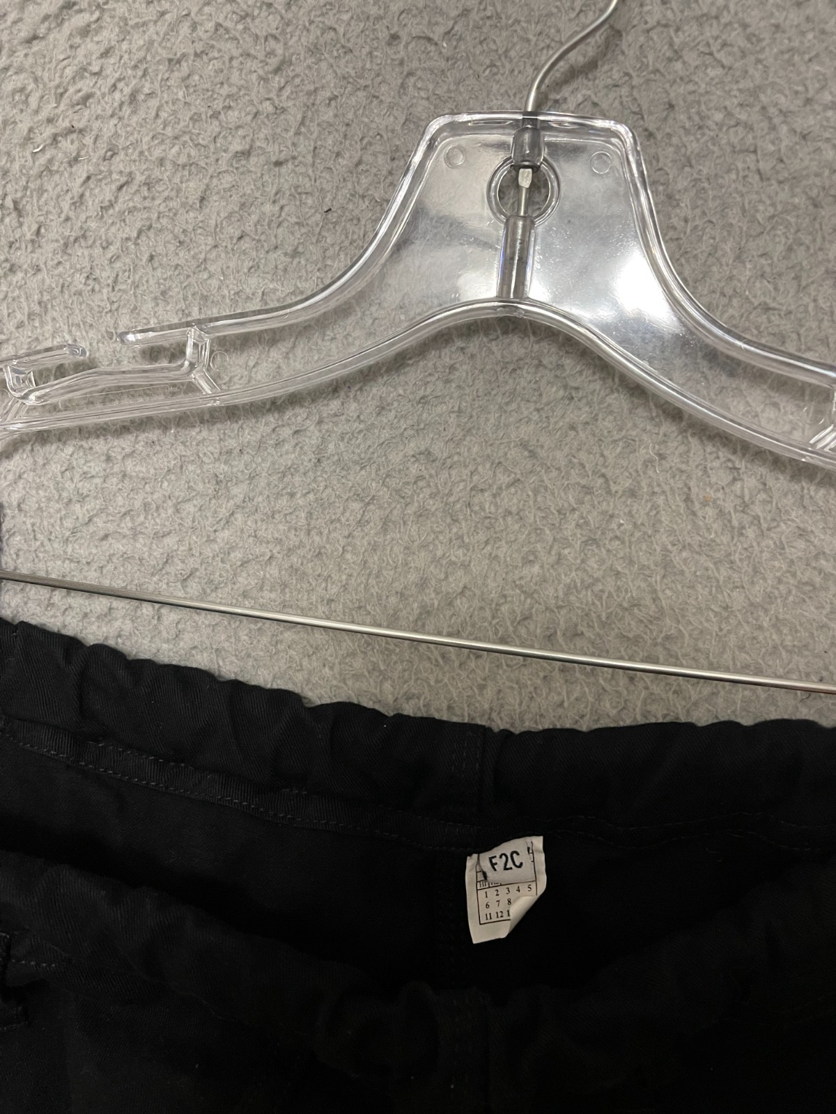
Tatami BJJ Black Gi Pants Size F2C Jiu Jitsu MMA
qL8ayvtb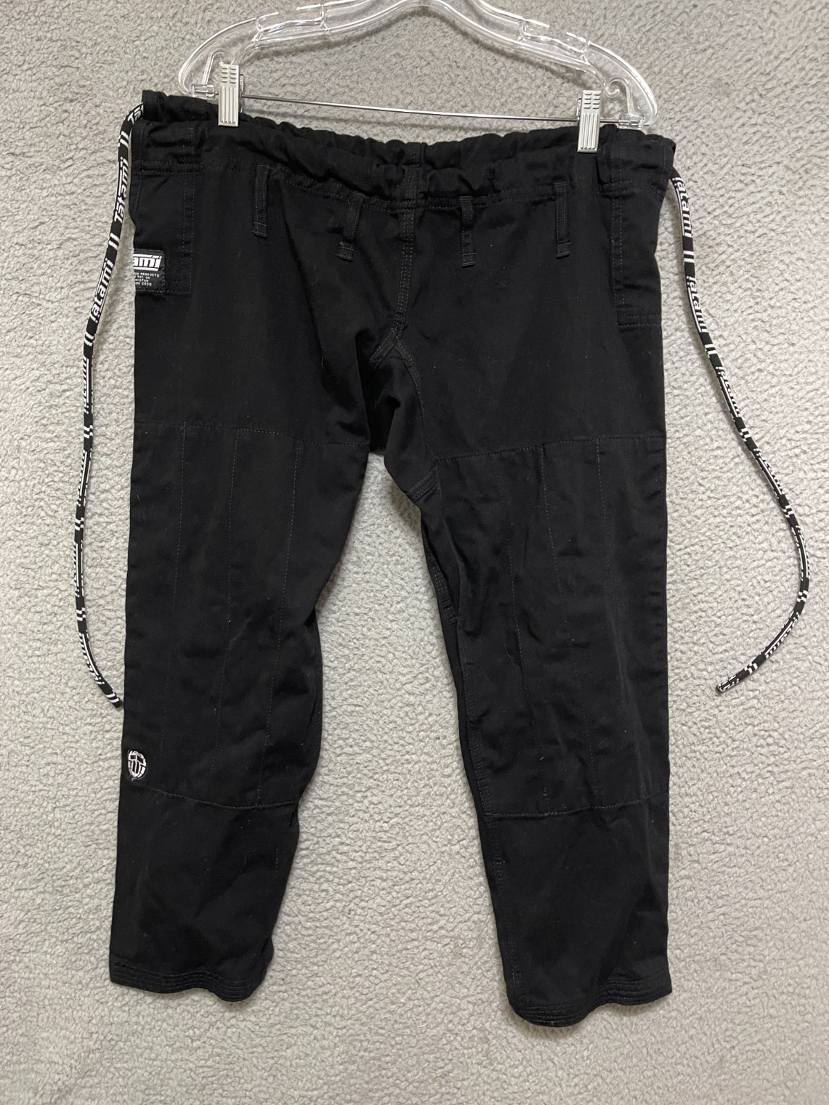
body {
font-family: ‘Segoe UI’, Roboto, Helvetica, Arial, sans-serif;
background: #f8f9fa;
margin: 0;
padding: 2rem 1rem;
display: flex;
justify-content: center;
}
.product-card {
max-width: 1100px;
width: 100%;
background: white;
border-radius: 24px;
box-shadow: 0 12px 30px rgba(0,0,0,0.08);
padding: 2rem 2.5rem;
transition: 0.2s;
}
@media (max-width: 600px) {
.product-card { padding: 1.5rem; }
}
.gallery {
display: flex;
flex-wrap: wrap;
gap: 1rem;
margin-bottom: 2rem;
}
.gallery img {
width: 100%;
max-width: 200px;
height: auto;
border-radius: 16px;
box-shadow: 0 4px 12px rgba(0,0,0,0.06);
object-fit: cover;
aspect-ratio: 3/4;
background: #f1f1f1;
}
.gallery img:first-child {
max-width: 280px;
flex: 1 1 100%;
}
h1 {
font-size: 2.2rem;
font-weight: 600;
margin: 0 0 0.25rem 0;
letter-spacing: -0.3px;
color: #111;
}
.price-badge {
font-size: 2rem;
font-weight: 700;
color: #1e3c4f;
background: #e9f0f5;
display: inline-block;
padding: 0.3rem 1.2rem;
border-radius: 40px;
margin: 0.5rem 0 1.2rem 0;
}
.specs-grid {
display: grid;
grid-template-columns: repeat(auto-fill, minmax(180px, 1fr));
gap: 0.8rem 1.5rem;
background: #f4f6f9;
padding: 1.2rem 1.8rem;
border-radius: 20px;
margin: 1.5rem 0;
}
.spec-item {
display: flex;
flex-direction: column;
}
.spec-label {
font-size: 0.7rem;
text-transform: uppercase;
letter-spacing: 0.4px;
color: #5e6f7e;
}
.spec-value {
font-weight: 500;
color: #0b1a26;
}
.description {
font-size: 1.05rem;
line-height: 1.6;
color: #1f2a36;
margin: 1.8rem 0 1.2rem;
padding-bottom: 0.5rem;
border-bottom: 1px solid #e2e8ed;
}
.why-buy {
background: #