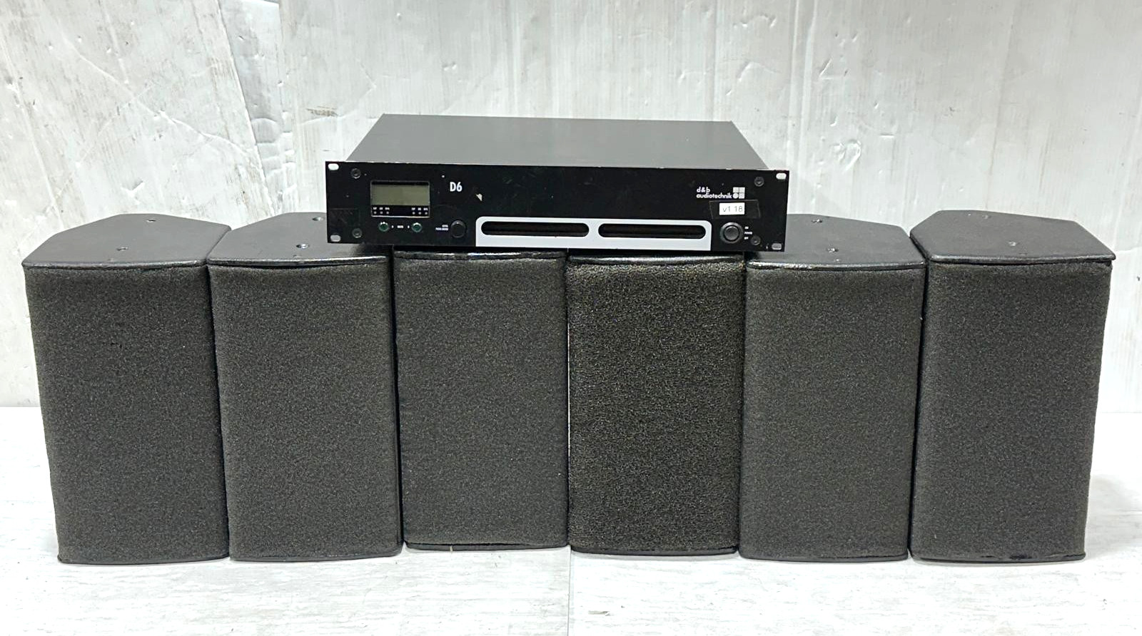
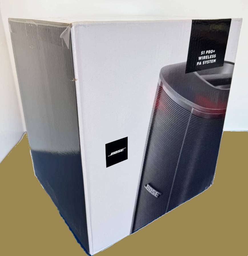
Bose S1 Pro Plus Multi-position PA System with Battery S1Pro+System Ships Fast!
Ry7KYZsU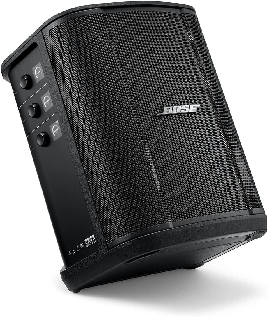
“`html
body {
font-family: ‘Segoe UI’, Roboto, Helvetica, Arial, sans-serif;
background: #f5f7fa;
margin: 0;
padding: 30px 20px;
display: flex;
justify-content: center;
}
.product-card {
max-width: 1100px;
background: #ffffff;
border-radius: 24px;
box-shadow: 0 12px 40px rgba(0,0,0,0.08);
padding: 30px 35px;
transition: all 0.2s ease;
}
h1 {
font-size: 2.1rem;
font-weight: 600;
color: #1e1e1e;
margin: 0 0 8px 0;
letter-spacing: -0.3px;
}
.brand-badge {
display: inline-block;
background: #000;
color: #fff;
font-weight: 500;
font-size: 0.8rem;
padding: 4px 14px;
border-radius: 30px;
letter-spacing: 0.5px;
margin-bottom: 12px;
}
.price-sku {
display: flex;
flex-wrap: wrap;
align-items: baseline;
gap: 20px;
margin: 15px 0 20px;
}
.price {
font-size: 2.2rem;
font-weight: 700;
color: #0a2540;
}
.condition {
background: #eef2f6;
padding: 6px 16px;
border-radius: 40px;
font-size: 0.9rem;
font-weight: 500;
color: #2c3e50;
}
.gallery {
display: flex;
flex-wrap: wrap;
gap: 20px;
margin: 25px 0 30px;
}
.gallery img {
max-width: 100%;
height: auto;
border-radius: 20px;
box-shadow: 0 4px 16px rgba(0,0,0,0.06);
transition: transform 0.2s;
}
.gallery img:hover {
transform: scale(1.01);
}
.gallery-main {
flex: 2;
min-width: 280px;
}
.gallery-thumbs {
flex: 1;
min-width: 120px;
display: flex;
flex-direction: column;
gap: 12px;
}
.gallery-thumbs img {
border-radius: 14px;
cursor: pointer;
border: 2px solid transparent;
}
.gallery-thumbs img:hover {
border-color: #0a2540;
}
.specs-table {
width: 100%;
border-collapse: collapse;
margin: 30px 0 25px;
background: #f9fafc;
border-radius: 18px;
overflow: hidden;
}
.specs-table td {
padding: