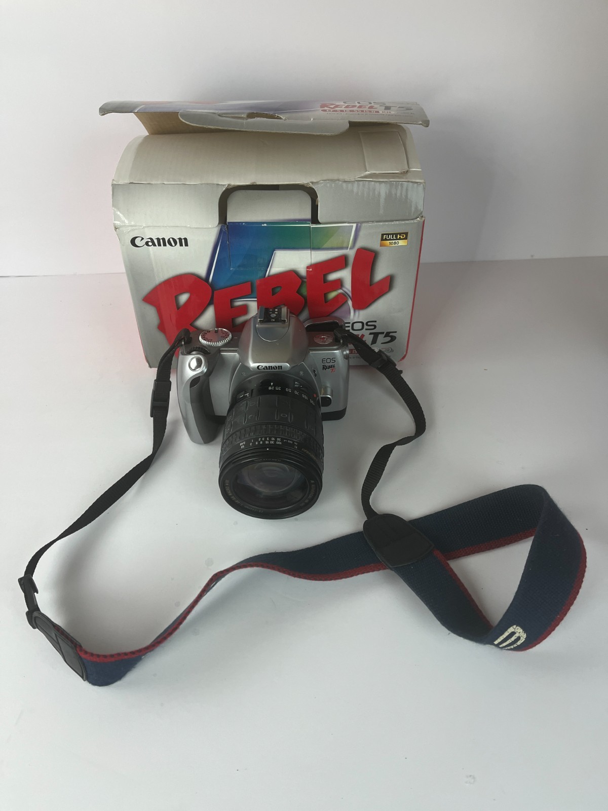
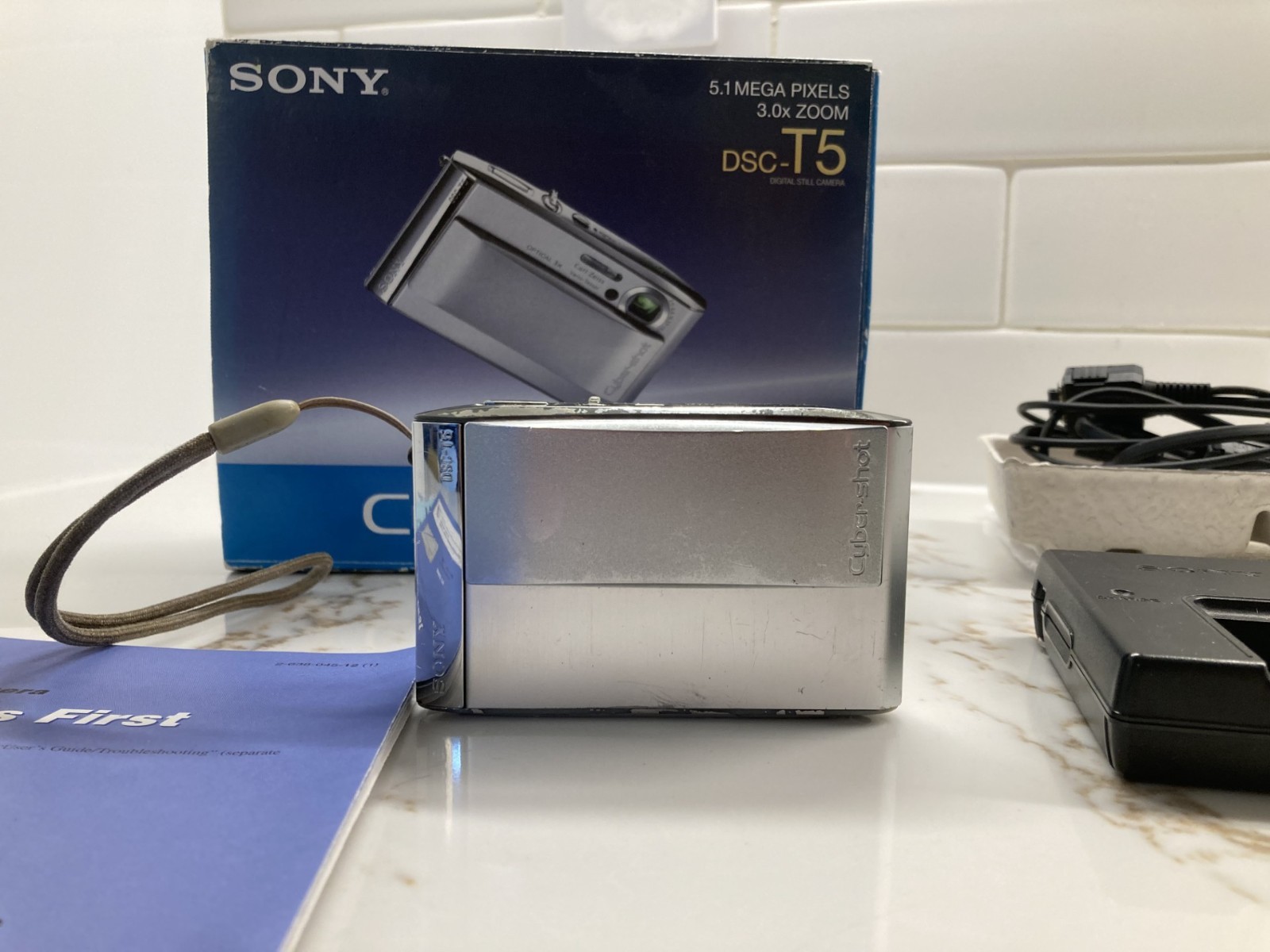
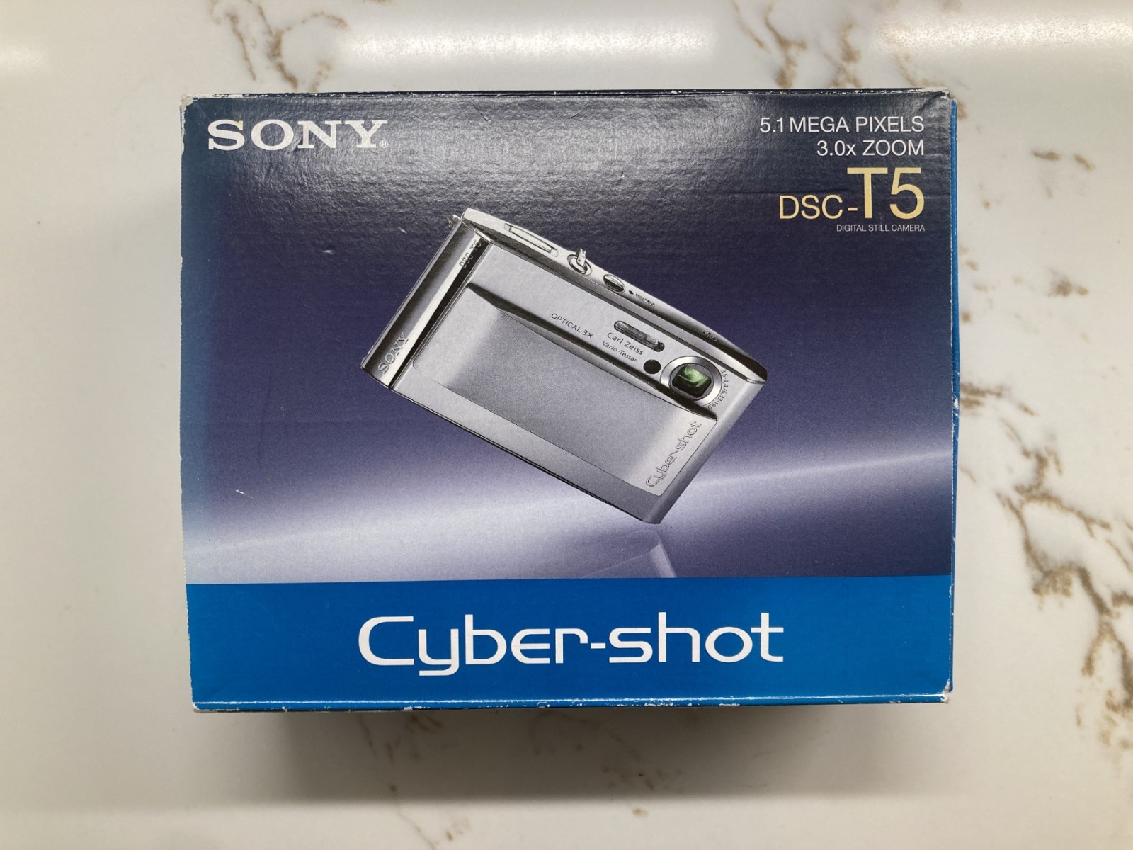
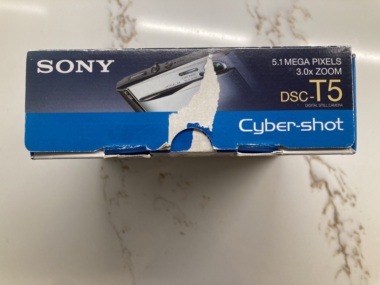
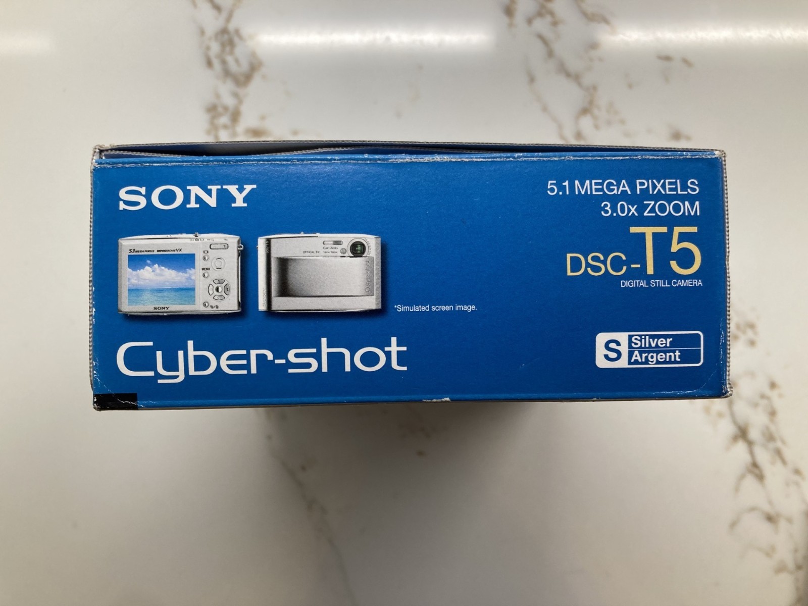
Sony DSC-T5 digital camera – tested and WORKING – with extras!
rtYdTdtU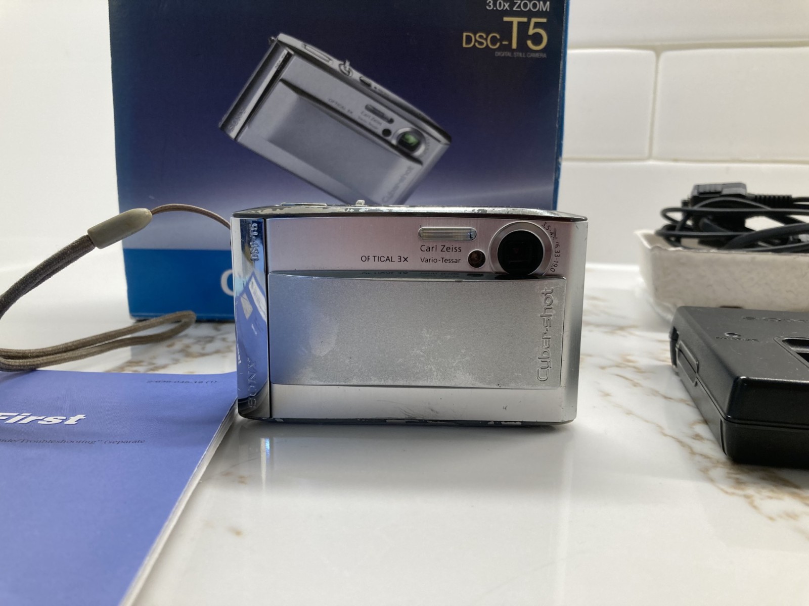
“`html
body {
font-family: ‘Segoe UI’, Roboto, Helvetica, Arial, sans-serif;
background: #f5f7fa;
margin: 0;
padding: 20px;
color: #1e1e2a;
}
.product-card {
max-width: 1100px;
margin: 0 auto;
background: #ffffff;
border-radius: 24px;
box-shadow: 0 10px 30px rgba(0,0,0,0.08);
padding: 30px 35px;
}
h1 {
font-size: 2.2rem;
font-weight: 600;
margin: 0 0 8px 0;
color: #111;
}
.brand-sub {
color: #555;
font-size: 1rem;
margin-bottom: 20px;
display: flex;
align-items: center;
gap: 12px;
}
.brand-sub span {
background: #eef2f7;
padding: 4px 12px;
border-radius: 30px;
font-weight: 500;
}
.price {
font-size: 2rem;
font-weight: 700;
color: #1f7a1f;
margin: 10px 0 20px 0;
}
.gallery {
display: flex;
flex-wrap: wrap;
gap: 15px;
margin: 25px 0;
}
.gallery img {
width: 100%;
max-width: 200px;
height: auto;
border-radius: 16px;
box-shadow: 0 4px 12px rgba(0,0,0,0.06);
object-fit: cover;
border: 1px solid #e9edf2;
transition: transform 0.2s;
}
.gallery img:hover {
transform: scale(1.02);
}
.gallery-note {
font-size: 0.85rem;
color: #777;
margin-top: -5px;
width: 100%;
}
.grid-2 {
display: grid;
grid-template-columns: 1fr 1fr;
gap: 30px;
margin: 30px 0;
}
@media (max-width: 700px) {
.grid-2 {
grid-template-columns: 1fr;
}
}
.specs-table {
width: 100%;
border-collapse: collapse;
background: #f9fafc;
border-radius: 16px;
overflow: hidden;
}
.specs-table th, .specs-table td {
padding: 12px 16px;
text-align: left;
border-bottom: 1px solid #e2e8f0;
}
.specs-table th {
background: #eef2f7;
font-weight: 600;
width: 40%;
}
.specs-table tr:last-child td, .specs-table tr:last-child