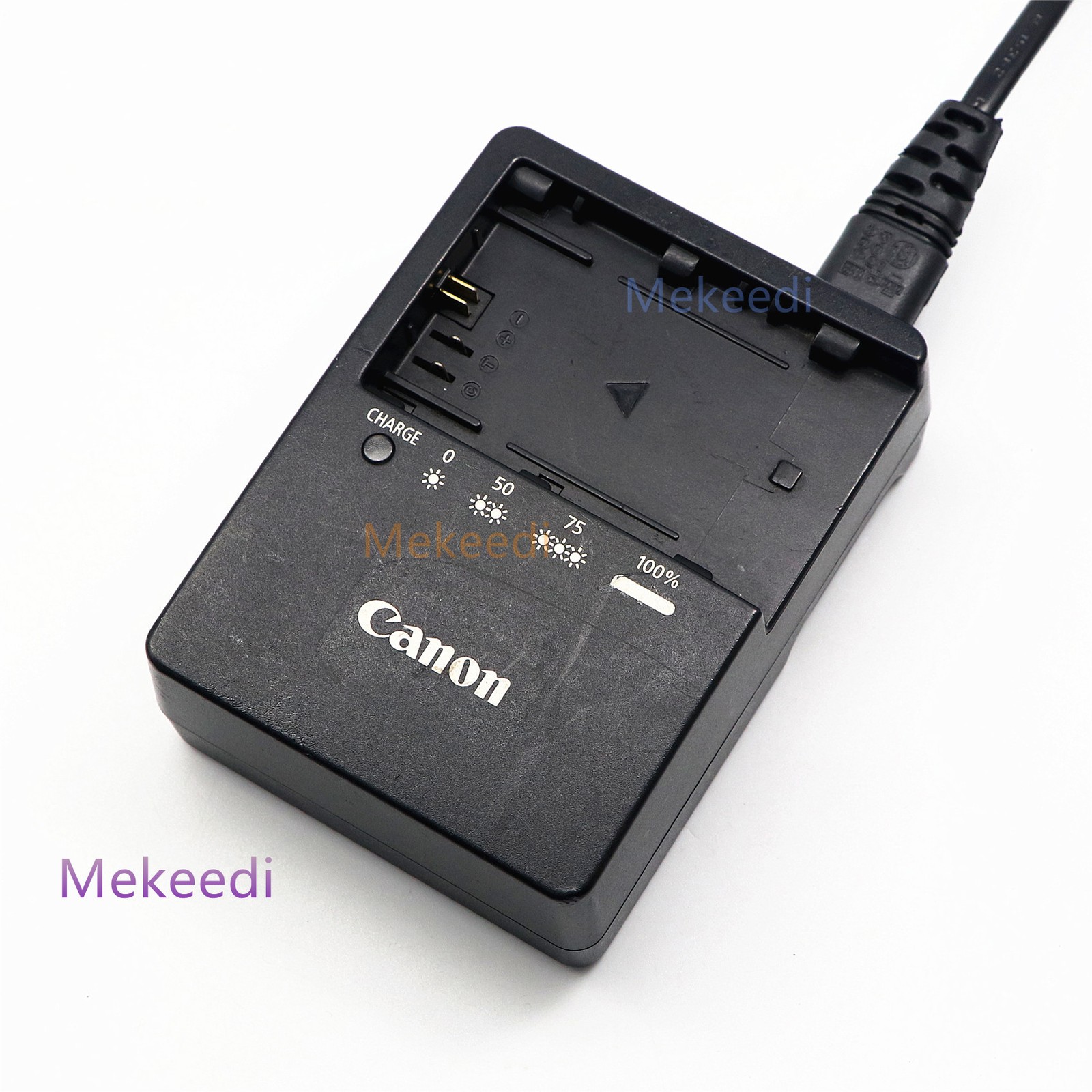
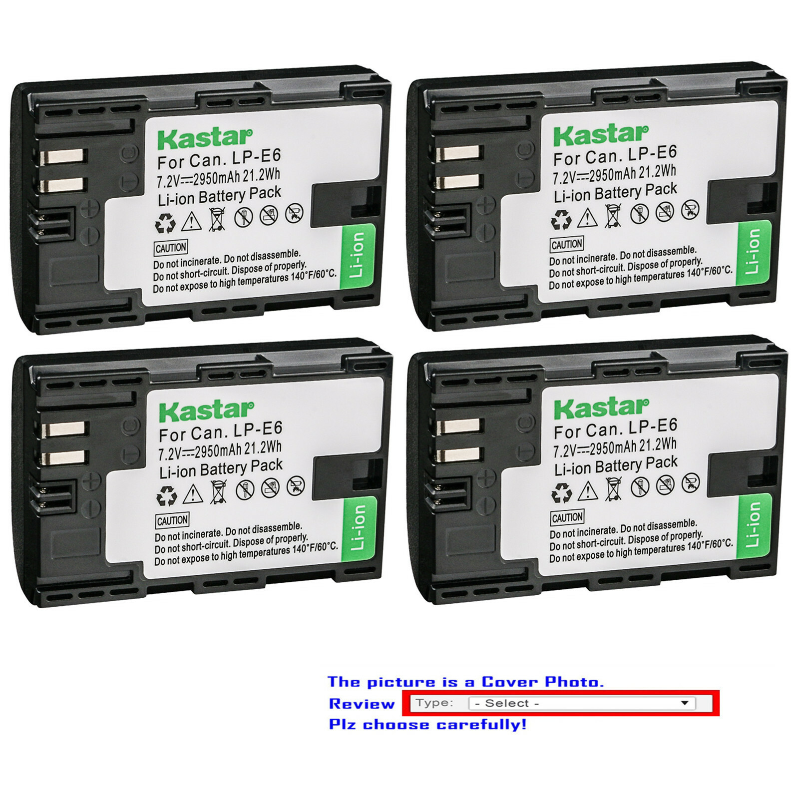
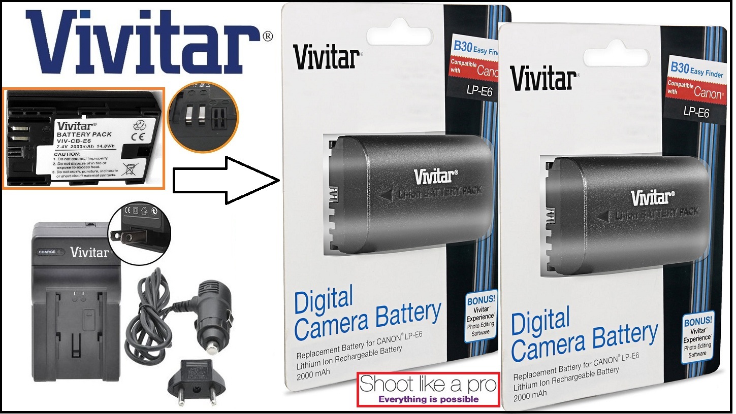
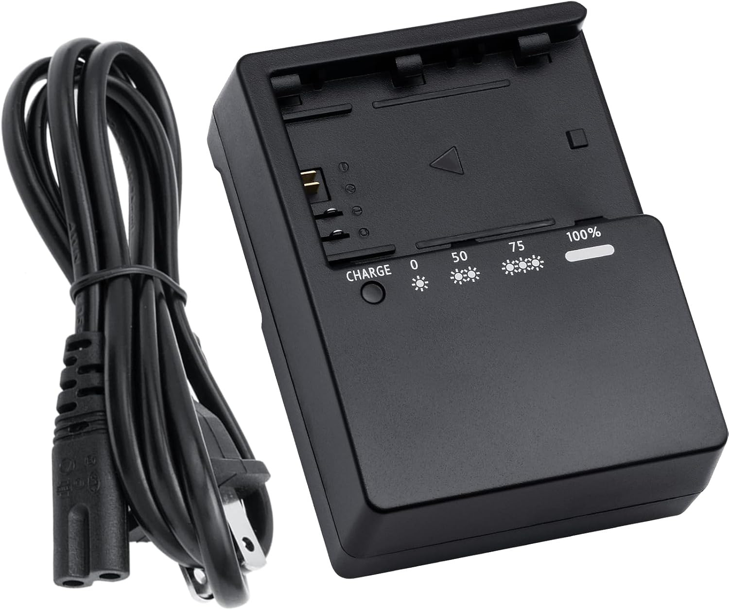
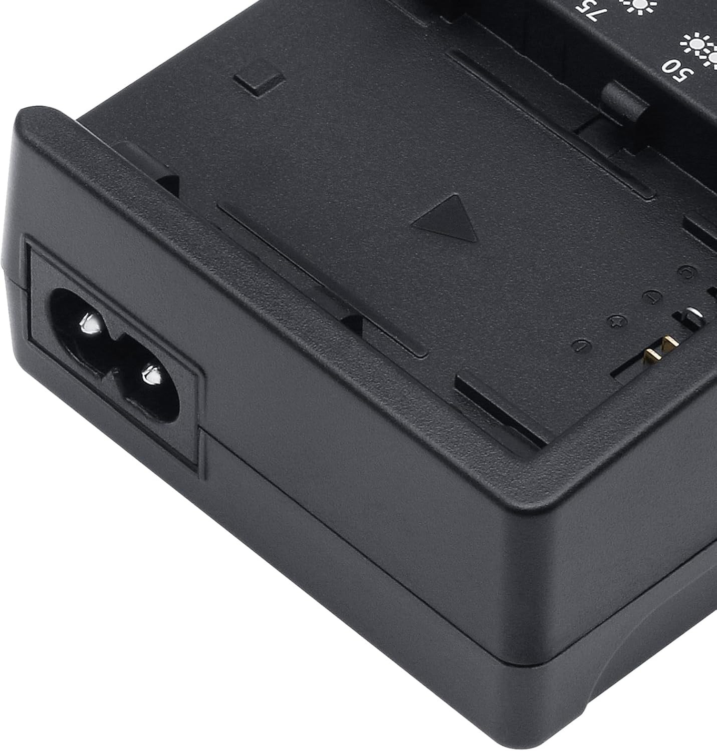
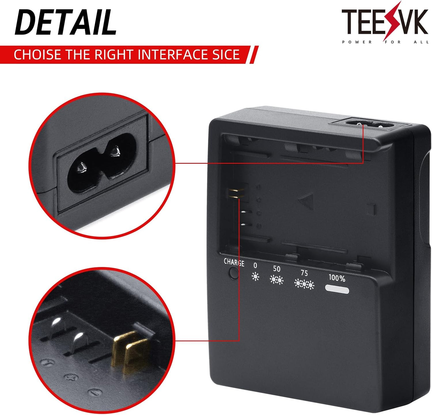
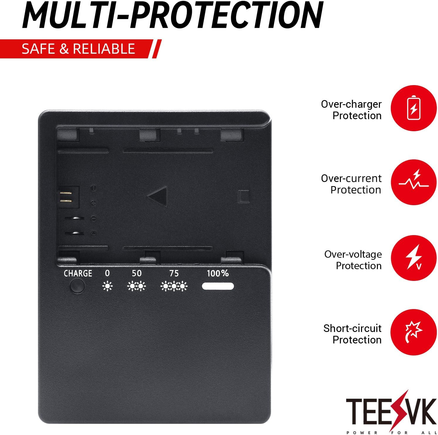
LP-E6 Battery Quick Charger for Canon: Compatible with LP-E6 LP-E6N LP-E6NH LC-E
ZLgr4HqR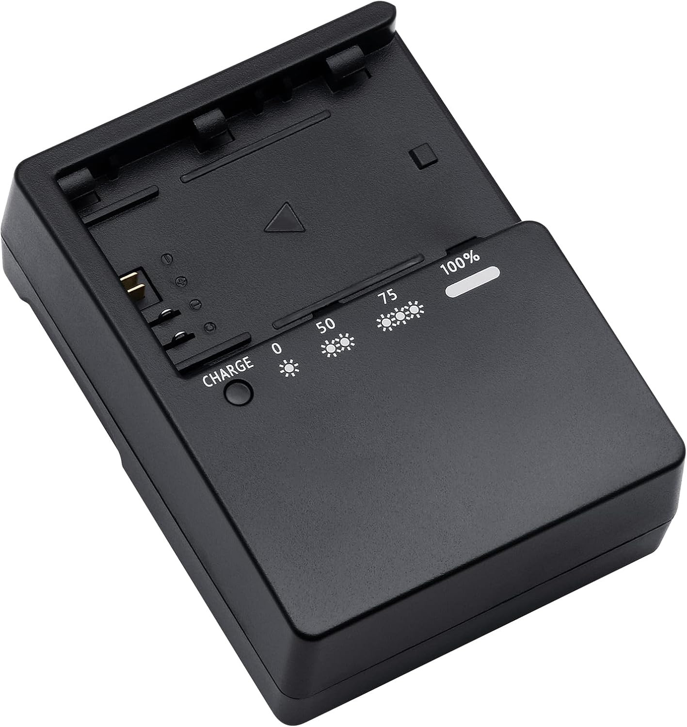
“`html
body {
font-family: ‘Segoe UI’, Roboto, Arial, sans-serif;
background: #f8f9fa;
margin: 0;
padding: 30px 20px;
color: #1e1e1e;
}
.product-card {
max-width: 1100px;
margin: 0 auto;
background: #ffffff;
border-radius: 24px;
box-shadow: 0 12px 40px rgba(0,0,0,0.08);
padding: 30px 35px;
}
.product-grid {
display: flex;
flex-wrap: wrap;
gap: 30px;
}
.gallery {
flex: 1 1 45%;
min-width: 280px;
}
.gallery-main {
background: #f2f4f7;
border-radius: 20px;
padding: 20px;
text-align: center;
margin-bottom: 15px;
}
.gallery-main img {
max-width: 100%;
height: auto;
border-radius: 12px;
}
.gallery-thumbs {
display: flex;
gap: 12px;
flex-wrap: wrap;
}
.gallery-thumbs img {
width: 80px;
height: 80px;
object-fit: cover;
border-radius: 12px;
border: 2px solid transparent;
background: #eef0f3;
padding: 6px;
cursor: default;
transition: border 0.2s;
}
.gallery-thumbs img:hover {
border-color: #2b6c94;
}
.product-info {
flex: 1 1 48%;
min-width: 280px;
}
.brand {
font-size: 0.9rem;
color: #5b6f82;
letter-spacing: 0.5px;
text-transform: uppercase;
margin-bottom: 4px;
}
h1 {
font-size: 1.9rem;
font-weight: 600;
margin: 0 0 10px 0;
line-height: 1.3;
}
.price {
font-size: 2.2rem;
font-weight: 700;
color: #1f3a4b;
margin: 18px 0 10px;
}
.price small {
font-size: 1rem;
font-weight: 400;
color: #5f6c7a;
margin-left: 8px;
}
.specs-table {
width: 100%;
border-collapse: collapse;
margin: 20px 0 18px;
font-size: 0.95rem;
}
.specs-table td {
padding: 10px 8px;
border-bottom: 1px solid #e9edf2;
}
.specs-table td:first-child {
font-weight: 500;
color: #2c3e50;
width: 40%;