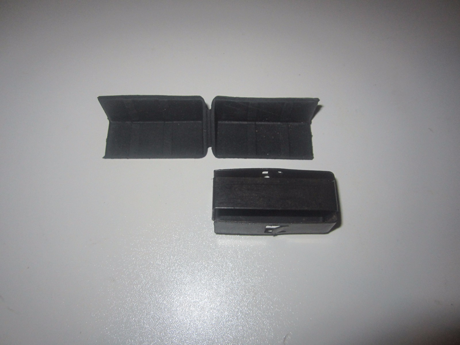
SHIFT ROD COUPLER WITH SCREW VOLKSWAGEN T2 TRANSPORTER BUS 1962-1979
5TSMLxrv
body {
font-family: ‘Segoe UI’, Roboto, Helvetica, Arial, sans-serif;
background: #f5f7fa;
margin: 0;
padding: 20px;
color: #1a1a2e;
}
.product-container {
max-width: 1100px;
margin: 0 auto;
background: white;
border-radius: 20px;
box-shadow: 0 10px 30px rgba(0,0,0,0.08);
padding: 30px 35px;
}
.product-title {
font-size: 1.9rem;
font-weight: 600;
margin: 0 0 10px 0;
color: #0b1d2e;
line-height: 1.2;
}
.price-block {
display: flex;
align-items: baseline;
gap: 12px;
margin: 15px 0 20px 0;
}
.price {
font-size: 2.2rem;
font-weight: 700;
color: #b12704;
}
.currency {
font-size: 1.2rem;
font-weight: 500;
color: #555;
}
.condition-badge {
background: #2e7d32;
color: white;
padding: 4px 14px;
border-radius: 30px;
font-size: 0.8rem;
font-weight: 600;
letter-spacing: 0.5px;
text-transform: uppercase;
}
.gallery {
display: flex;
flex-wrap: wrap;
gap: 15px;
margin: 25px 0;
}
.gallery img {
max-width: 100%;
height: auto;
border-radius: 16px;
box-shadow: 0 4px 12px rgba(0,0,0,0.06);
transition: transform 0.2s ease;
border: 1px solid #e9edf2;
}
.gallery img:hover {
transform: scale(1.02);
}
.gallery-main {
flex: 2 1 400px;
}
.gallery-thumbs {
flex: 1 1 180px;
display: flex;
flex-direction: column;
gap: 12px;
}
.gallery-thumbs img {
width: 100%;
max-height: 120px;
object-fit: cover;
cursor: pointer;
}
.specs-table {
width: 100%;
border-collapse: collapse;
margin: 25px 0 20px 0;
background: #f9fafc;
border-radius: 14px;
overflow: hidden;
}
.specs-table th, .specs-table td {
padding: 12px 18px;
text-align: left;
border-bottom: 1px solid #e2e8f0;
}
.specs-table th {
background: #eef2f7;
font-weight: 600;
color: #1e293b;
width: 40