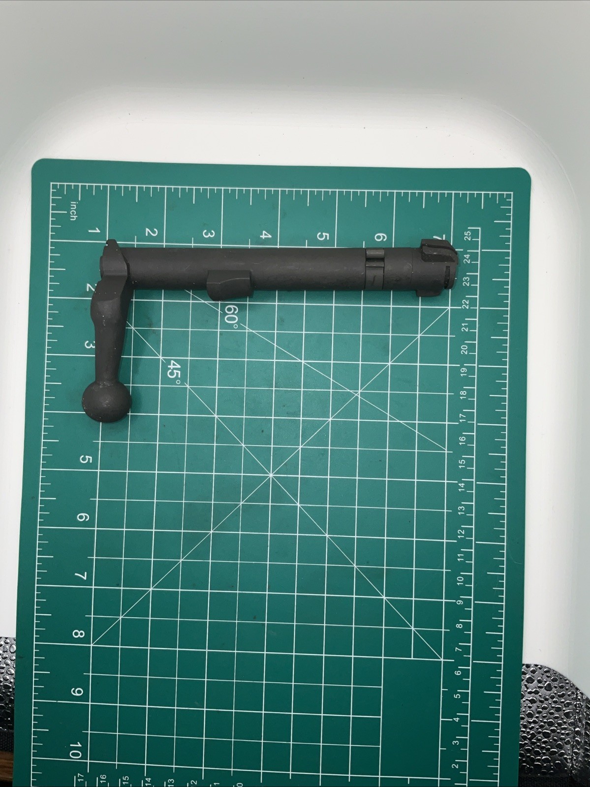
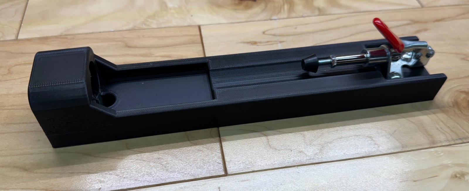
Tikka T1X bolt disassembly tool helps with, spring, firing pin, shims .22lr
H5lGaLr5
“`html
* {
margin: 0;
padding: 0;
box-sizing: border-box;
}
body {
font-family: ‘Segoe UI’, Roboto, system-ui, -apple-system, sans-serif;
background: #f5f7fa;
display: flex;
justify-content: center;
padding: 2rem 1rem;
line-height: 1.5;
color: #1e1e2a;
}
.product-card {
max-width: 1100px;
width: 100%;
background: white;
border-radius: 28px;
box-shadow: 0 20px 40px rgba(0,0,0,0.08), 0 8px 20px rgba(0,0,0,0.04);
padding: 2rem 2.5rem;
transition: all 0.2s;
}
@media (max-width: 700px) {
.product-card { padding: 1.5rem; }
}
h1, h2, h3 {
font-weight: 600;
letter-spacing: -0.02em;
}
h1 {
font-size: 2.2rem;
margin-bottom: 0.25rem;
color: #0b1a2e;
}
.brand-sub {
font-size: 1rem;
color: #4a5b6e;
margin-bottom: 1.5rem;
display: flex;
flex-wrap: wrap;
gap: 0.75rem;
align-items: center;
}
.brand-sub span {
background: #eef2f6;
padding: 0.2rem 0.9rem;
border-radius: 40px;
font-size: 0.85rem;
font-weight: 500;
color: #1f2a3f;
}
.price-area {
background: #f0f4fa;
padding: 0.75rem 1.5rem;
border-radius: 60px;
display: inline-block;
margin: 0.5rem 0 1.5rem 0;
font-size: 1.8rem;
font-weight: 700;
color: #0b2b4a;
border: 1px solid #dce3ec;
}
.price-area small {
font-size: 1rem;
font-weight: 400;
color: #3d5068;
margin-left: 0.3rem;
}
.gallery-grid {
display: grid;
grid-template-columns: repeat(4, 1fr);
gap: 1rem;
margin: 1.8rem 0 2rem;
}
.gallery-grid img {
width: 100%;
height: auto;
aspect-ratio: 1/1;
object-fit: cover;
border-radius: 20px;
background: #f1f4f9;
border: 1px solid #e2e8f0;
transition: transform 0.