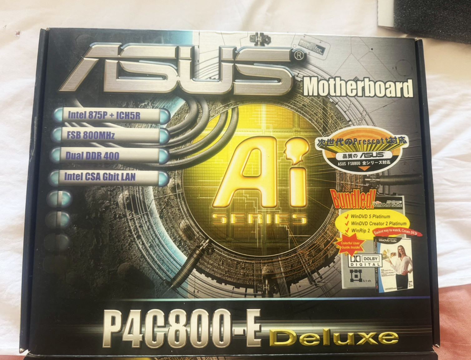
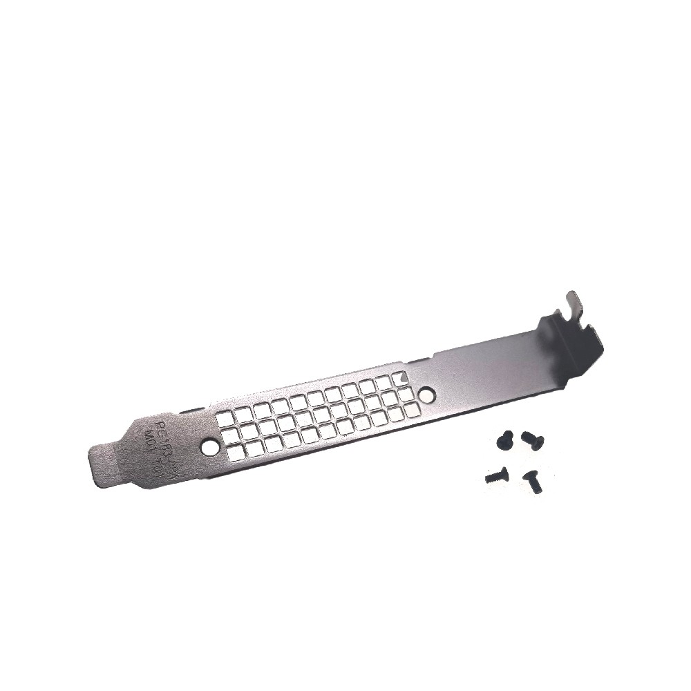
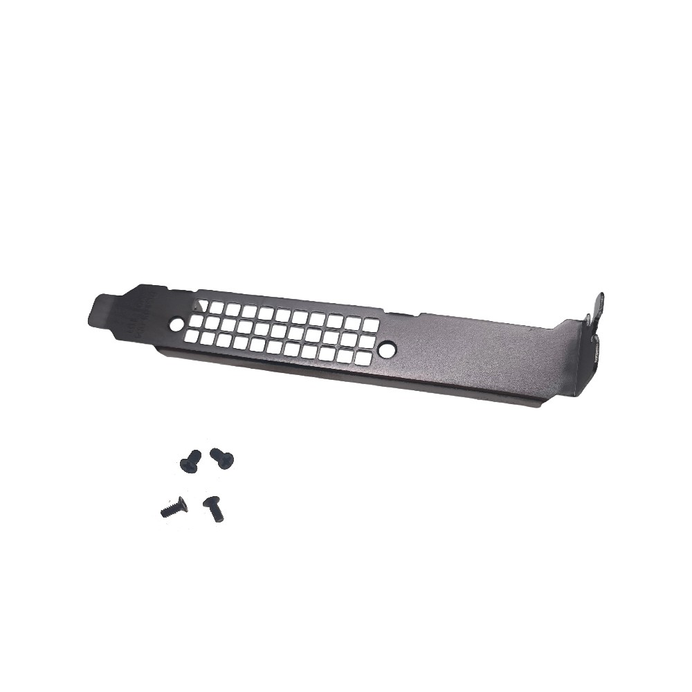
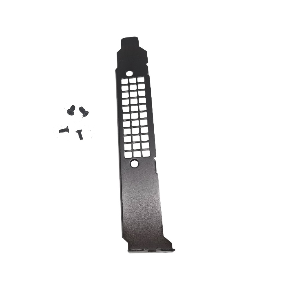
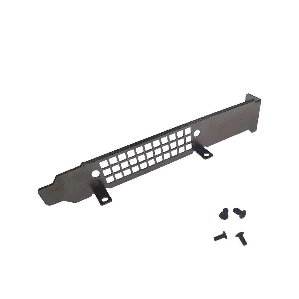
1pc Long Full Height Bracket with Screws for Nvidia T4 P4 M4 Graphics Card New
cBWu2ntd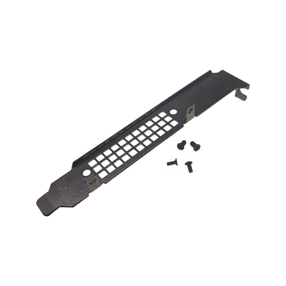
“`html
body {
font-family: ‘Segoe UI’, Roboto, Helvetica, Arial, sans-serif;
background: #f5f7fa;
margin: 0;
padding: 30px 20px;
display: flex;
justify-content: center;
}
.product-card {
max-width: 1100px;
width: 100%;
background: white;
border-radius: 24px;
box-shadow: 0 12px 30px rgba(0,0,0,0.08);
padding: 30px 35px;
transition: all 0.2s ease;
}
.product-title {
font-size: 28px;
font-weight: 600;
color: #0b1a2e;
margin: 0 0 10px 0;
line-height: 1.3;
}
.price-badge {
font-size: 26px;
font-weight: 700;
color: #1e6f3f;
background: #e6f3eb;
display: inline-block;
padding: 6px 18px;
border-radius: 40px;
margin: 8px 0 20px 0;
}
.gallery-grid {
display: flex;
flex-wrap: wrap;
gap: 18px;
margin: 25px 0 30px 0;
}
.gallery-grid img {
width: 100%;
max-width: 200px;
height: auto;
border-radius: 16px;
box-shadow: 0 4px 12px rgba(0,0,0,0.06);
border: 1px solid #eef2f6;
transition: transform 0.2s;
background: #fafbfc;
}
.gallery-grid img:hover {
transform: scale(1.02);
}
.flex-row {
display: flex;
flex-wrap: wrap;
gap: 30px;
margin: 25px 0;
}
.specs-table {
flex: 1 1 280px;
background: #f9fafc;
border-radius: 20px;
padding: 18px 22px;
border: 1px solid #e9edf2;
}
.specs-table h3 {
margin-top: 0;
font-weight: 600;
font-size: 18px;
color: #1f2a3f;
border-bottom: 2px solid #dce3ec;
padding-bottom: 10px;
}
.specs-table table {
width: 100%;
border-collapse: collapse;
}
.specs-table td {
padding: 10px 4px;
border-bottom: 1px solid #e6eaef;
font-size: 15px;
}
.specs-table td:first-child {
font-weight: 600;
color: #2c3e50;
width: