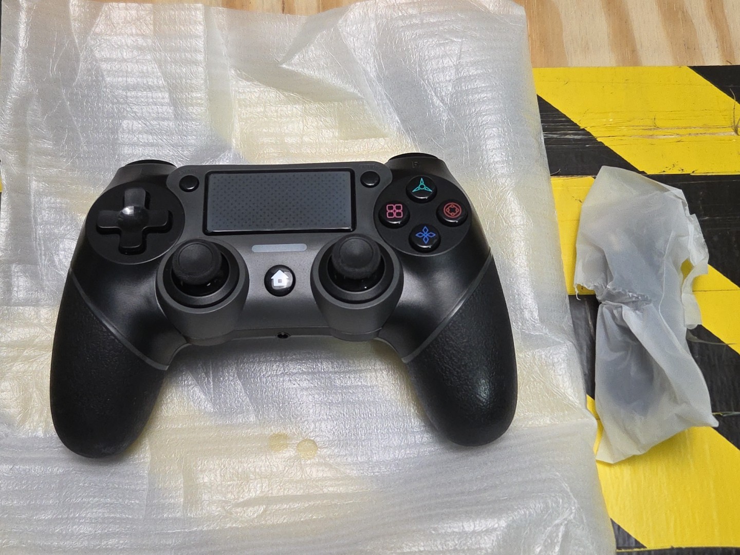
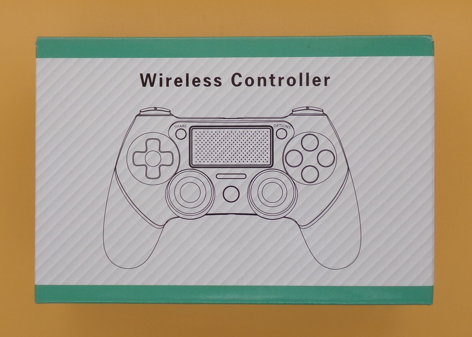
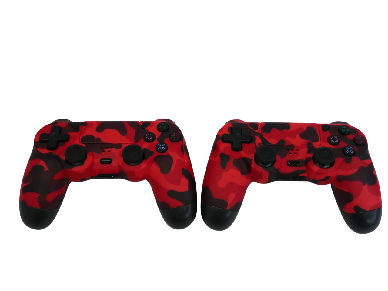
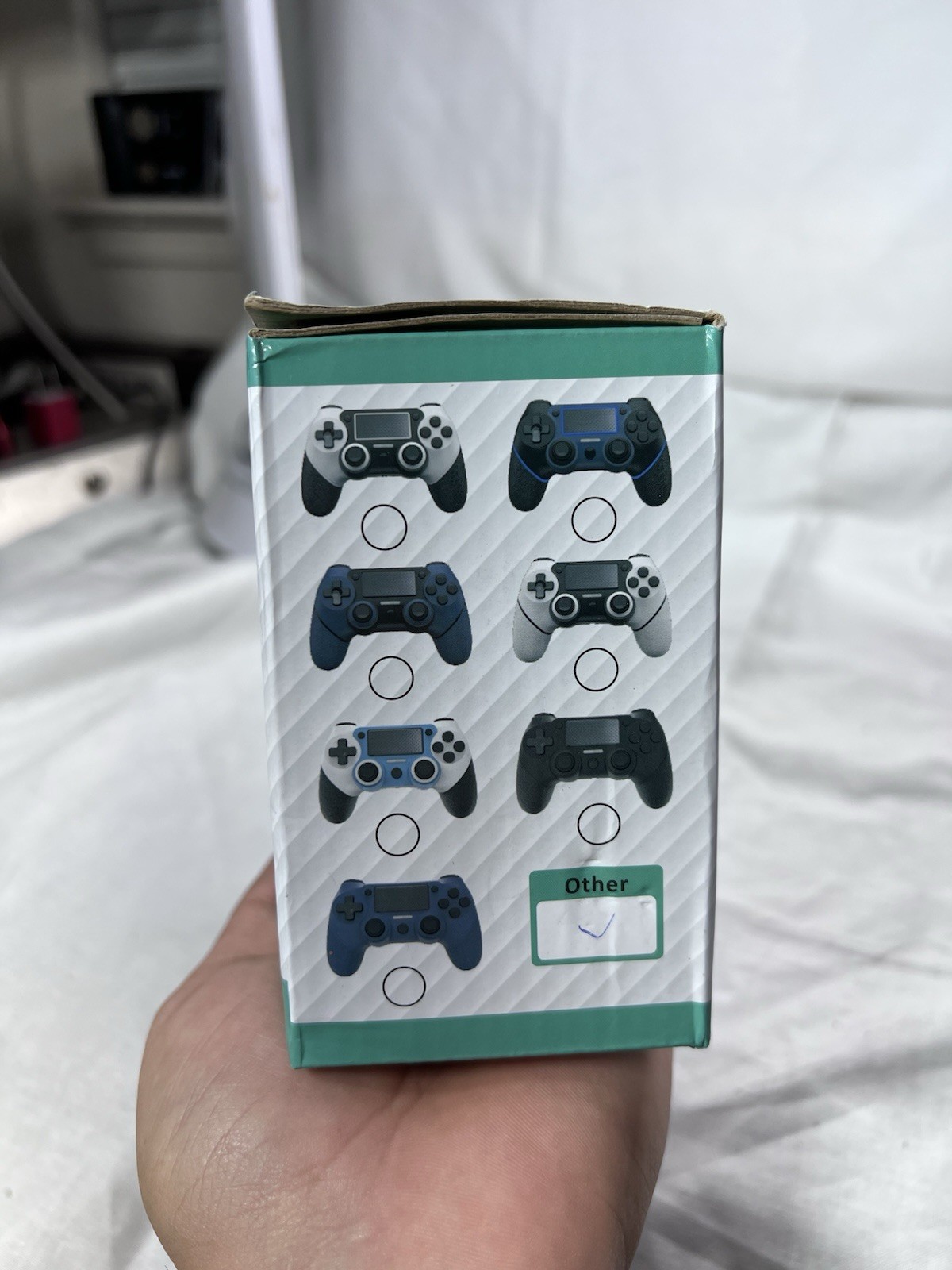
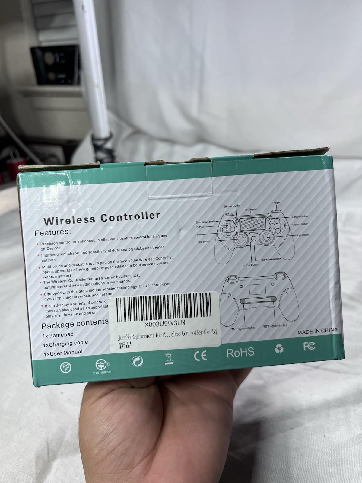
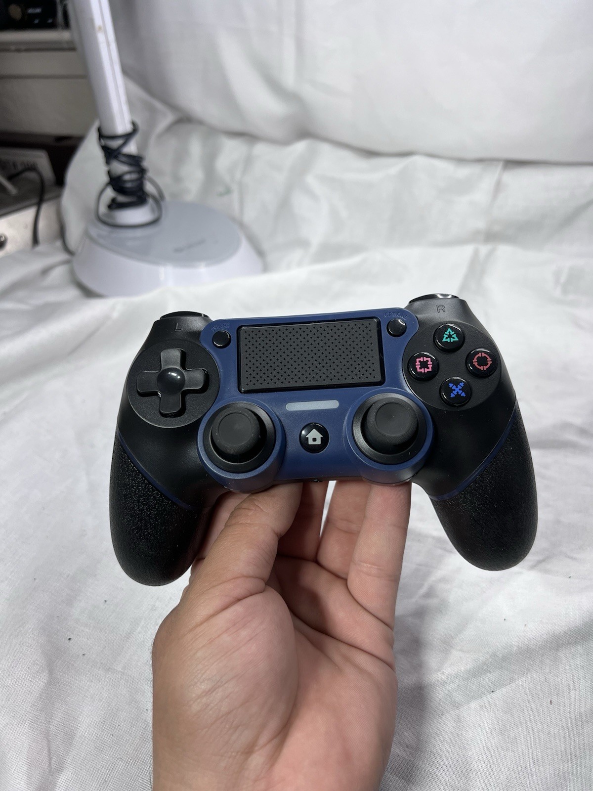
Wireless Controller for PS4, Wired P-4 Pro Controller with Paddles, Black P-4
3GsRmQq1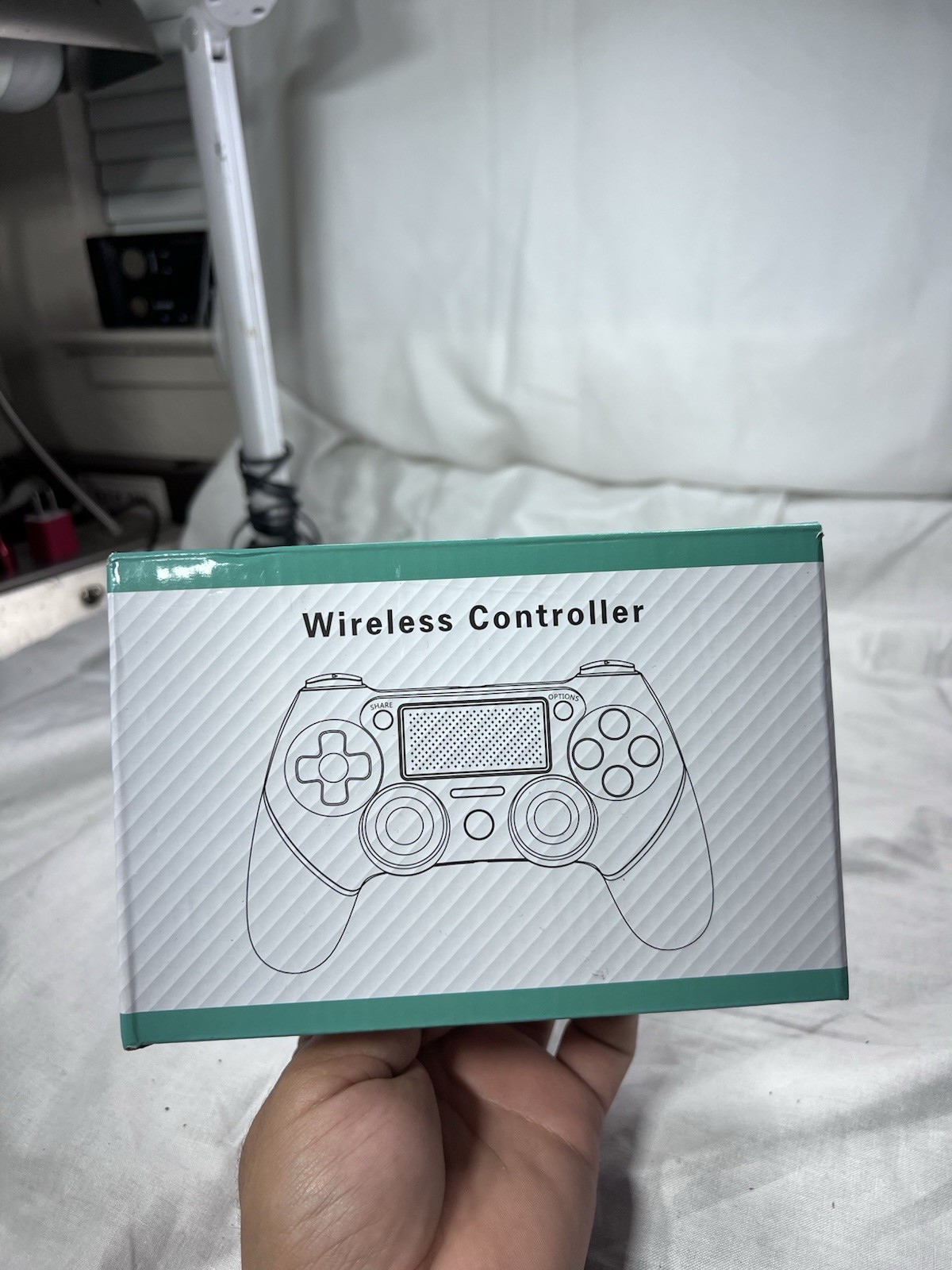
“`html
body {
font-family: ‘Segoe UI’, Roboto, Arial, sans-serif;
background: #f5f7fa;
margin: 0;
padding: 30px 20px;
display: flex;
justify-content: center;
}
.product-card {
max-width: 1100px;
width: 100%;
background: #ffffff;
border-radius: 24px;
box-shadow: 0 12px 40px rgba(0,0,0,0.08);
padding: 30px 35px;
transition: all 0.2s ease;
}
h1 {
font-size: 2rem;
font-weight: 600;
color: #1e293b;
margin: 0 0 8px 0;
line-height: 1.2;
}
.price-badge {
display: inline-block;
background: #eef2ff;
color: #1e3a8a;
font-weight: 700;
font-size: 1.8rem;
padding: 8px 22px;
border-radius: 40px;
margin: 12px 0 20px 0;
letter-spacing: -0.3px;
}
.image-gallery {
display: flex;
flex-wrap: wrap;
gap: 16px;
margin: 20px 0 30px 0;
}
.image-gallery img {
width: calc(25% – 12px);
min-width: 140px;
flex: 1 1 auto;
border-radius: 20px;
box-shadow: 0 4px 12px rgba(0,0,0,0.06);
border: 1px solid #e9edf2;
transition: transform 0.2s;
background: #fafbfc;
object-fit: cover;
aspect-ratio: 1/1;
}
.image-gallery img:hover {
transform: scale(1.02);
}
.desc-grid {
display: flex;
flex-wrap: wrap;
gap: 30px;
margin: 30px 0 20px;
}
.desc-text {
flex: 2;
min-width: 280px;
}
.desc-text p {
font-size: 1.05rem;
line-height: 1.6;
color: #2d3a4a;
margin: 0 0 18px 0;
}
.specs-side {
flex: 1.2;
min-width: 240px;
background: #f8fafc;
border-radius: 20px;
padding: 18px 20px;
border: 1px solid #e2e8f0;
}
.specs-side h3 {
font-size: 1.2rem;
font-weight: 600;
margin: 0 0 14px 0;
color: #0f172a;
border-bottom: 2px solid #dbe1e9;
padding-bottom: