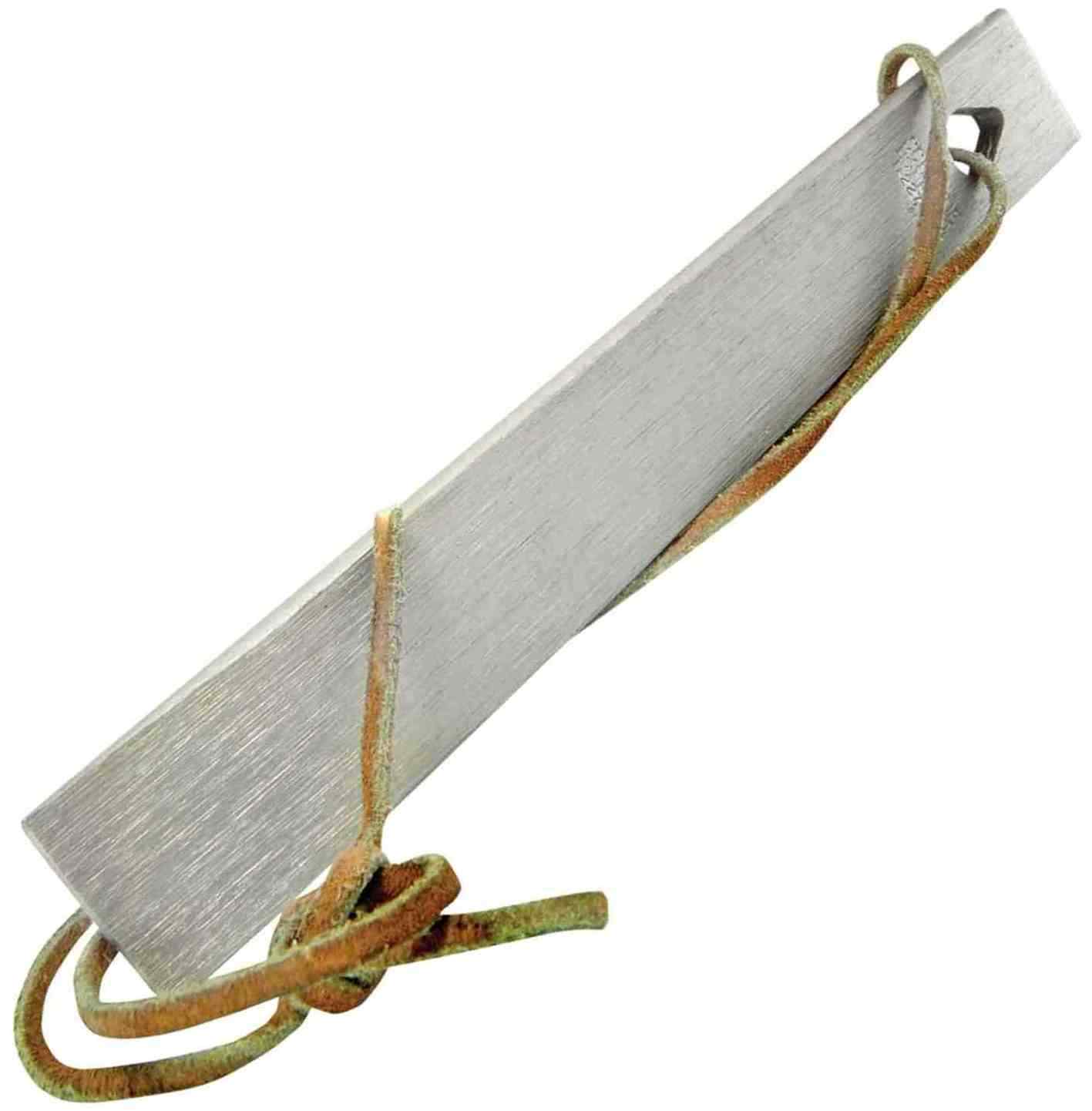
Leatherman SQUIRT P4 Multi-Tool with 7 tools – Various Colors
e1hHvKrc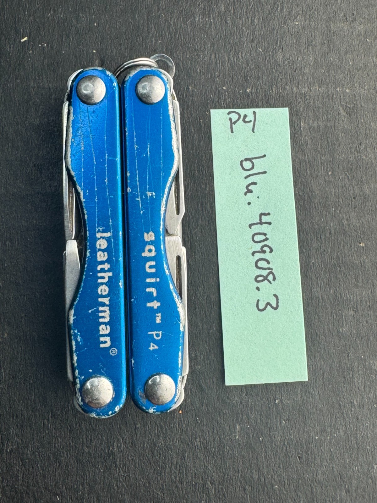


“`html
body {
font-family: ‘Segoe UI’, Roboto, Helvetica, Arial, sans-serif;
background: #f5f7fa;
margin: 0;
padding: 30px 20px;
display: flex;
justify-content: center;
}
.product-card {
max-width: 1100px;
width: 100%;
background: white;
border-radius: 24px;
box-shadow: 0 12px 30px rgba(0,0,0,0.08);
padding: 30px 35px;
transition: 0.2s;
}
h1 {
font-size: 2rem;
font-weight: 600;
margin: 0 0 8px 0;
color: #1e2a3a;
letter-spacing: -0.3px;
}
.brand-sub {
color: #4a5a6e;
font-size: 1rem;
margin-bottom: 20px;
display: flex;
align-items: center;
gap: 12px;
flex-wrap: wrap;
}
.brand-sub span {
background: #eef2f6;
padding: 4px 12px;
border-radius: 30px;
font-size: 0.85rem;
font-weight: 500;
}
.price-area {
font-size: 2rem;
font-weight: 700;
color: #0b2b3c;
margin: 10px 0 20px 0;
}
.price-area small {
font-weight: 400;
font-size: 1rem;
color: #5e6f82;
margin-left: 10px;
}
.gallery-grid {
display: flex;
flex-wrap: wrap;
gap: 15px;
margin: 25px 0 30px 0;
}
.gallery-grid img {
width: 100%;
max-width: 180px;
height: auto;
border-radius: 16px;
border: 1px solid #e2e8f0;
background: #fafcff;
padding: 8px;
object-fit: contain;
transition: 0.15s;
box-shadow: 0 2px 6px rgba(0,0,0,0.02);
}
.gallery-grid img:hover {
border-color: #9aaec2;
box-shadow: 0 6px 12px rgba(0,0,0,0.04);
}
.flex-row {
display: flex;
flex-wrap: wrap;
gap: 40px;
margin: 30px 0 20px;
}
.specs-table {
flex: 1 1 320px;
border-collapse: collapse;
background: #f9fbfd;
border-radius: 18px;
overflow: hidden;
height: fit-content;
}
.specs-table td {
padding: 12px 18