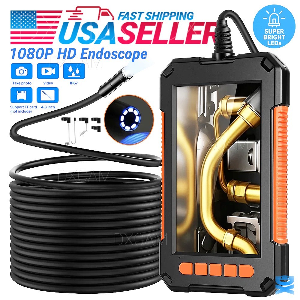
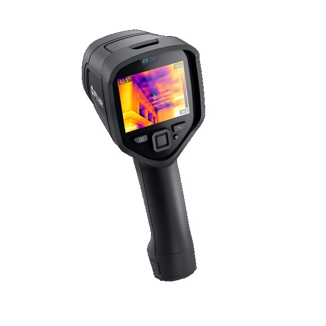
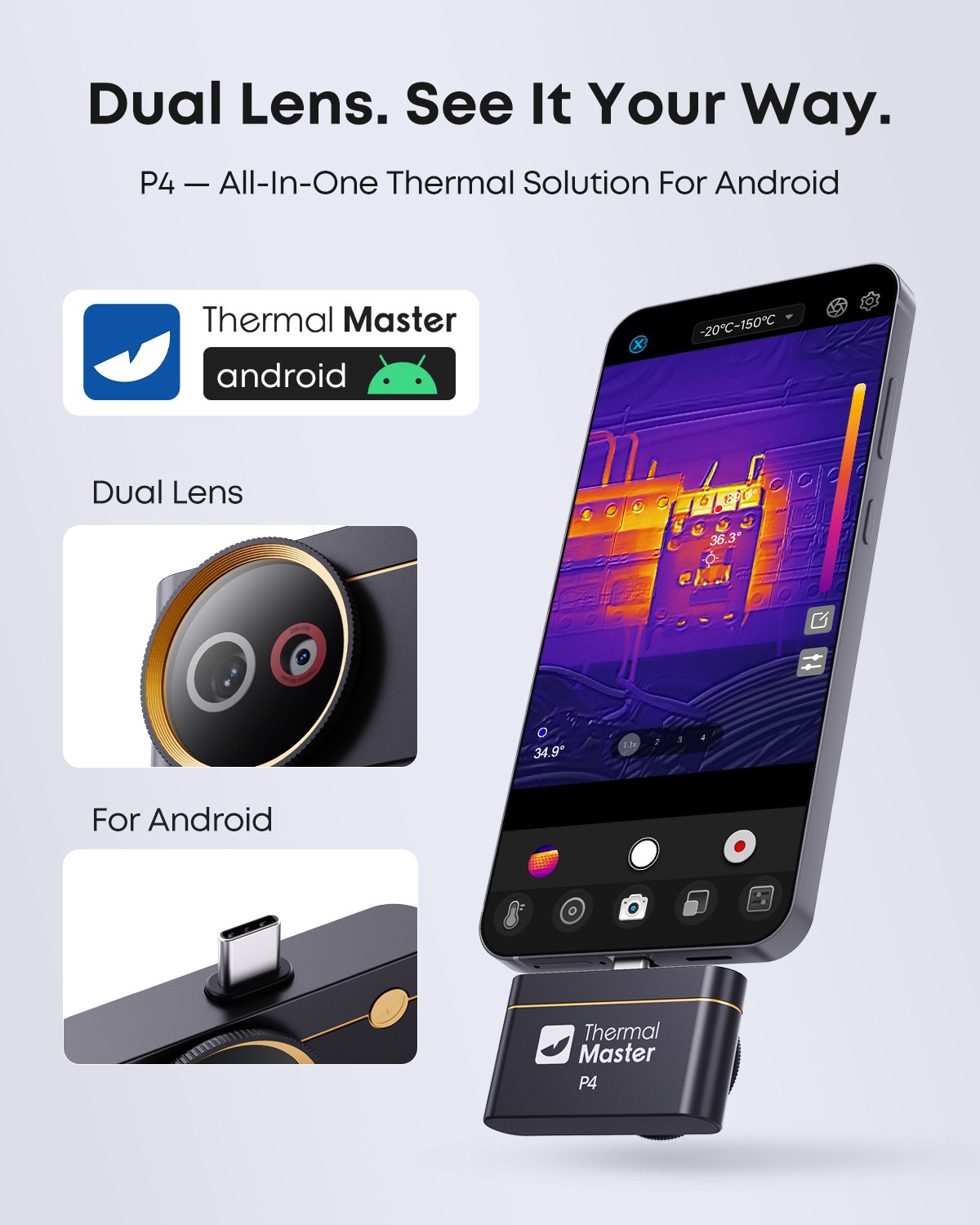
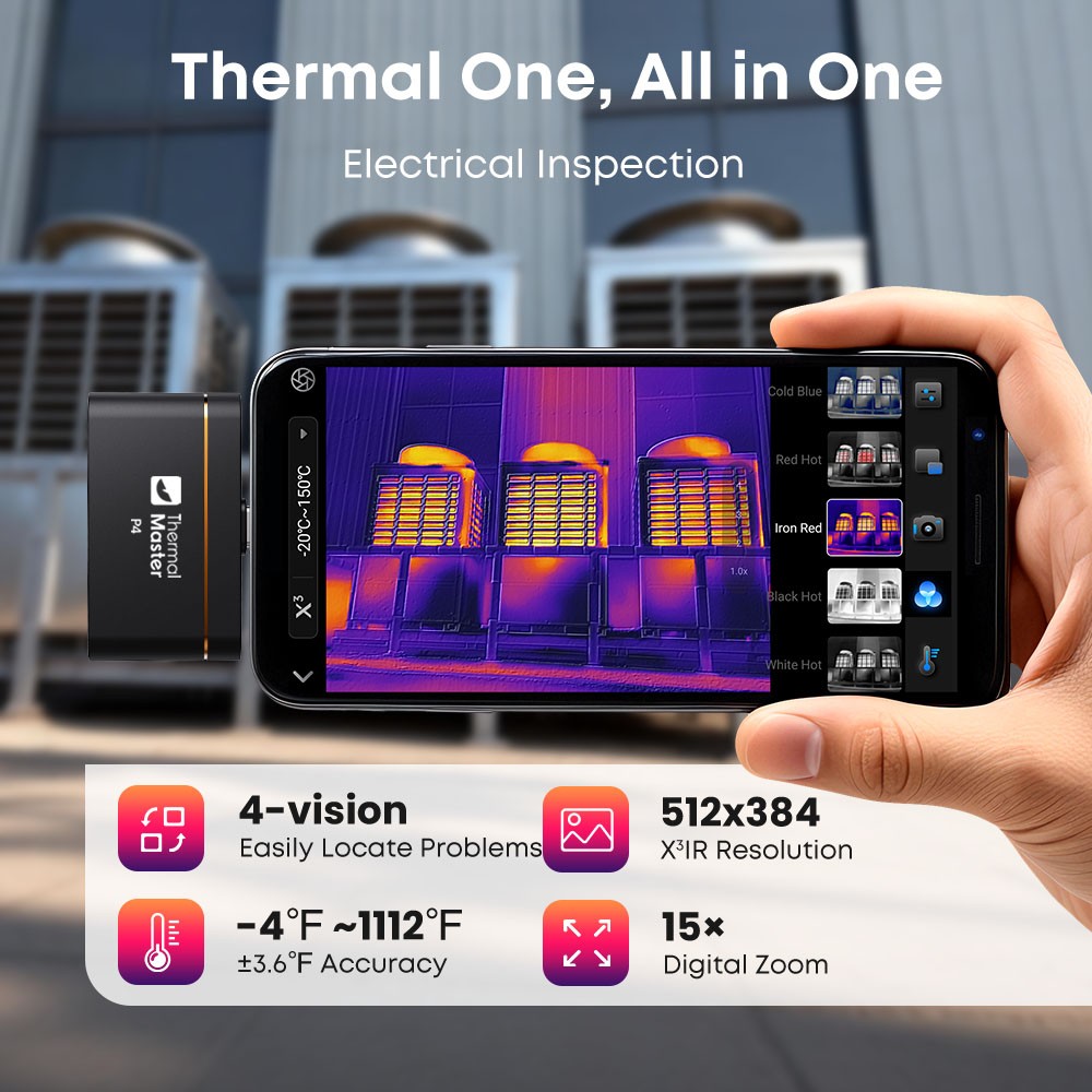
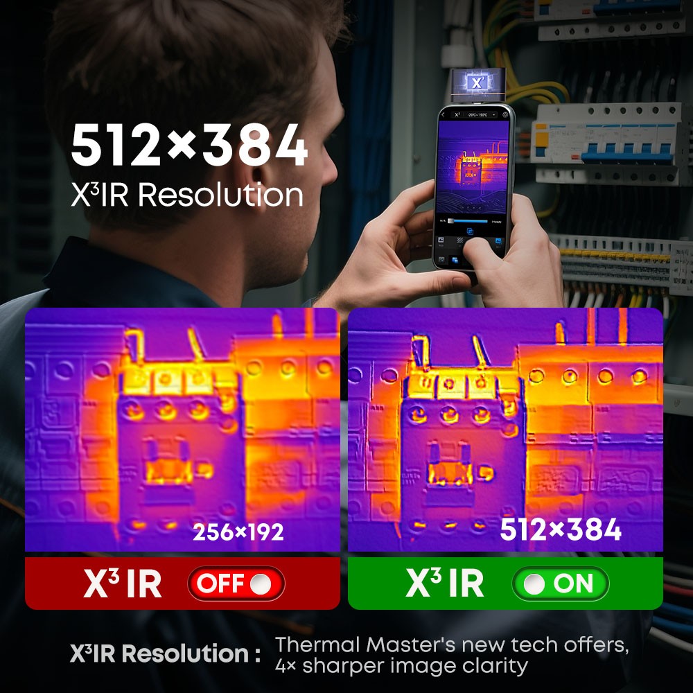
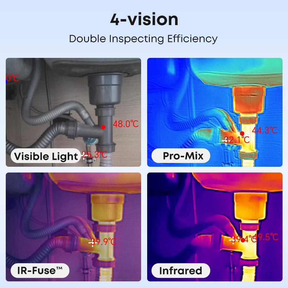
P4 Thermal Camera with Visual Camera for Android 512*384 X³IR Resolution 600℃
aXsoHTux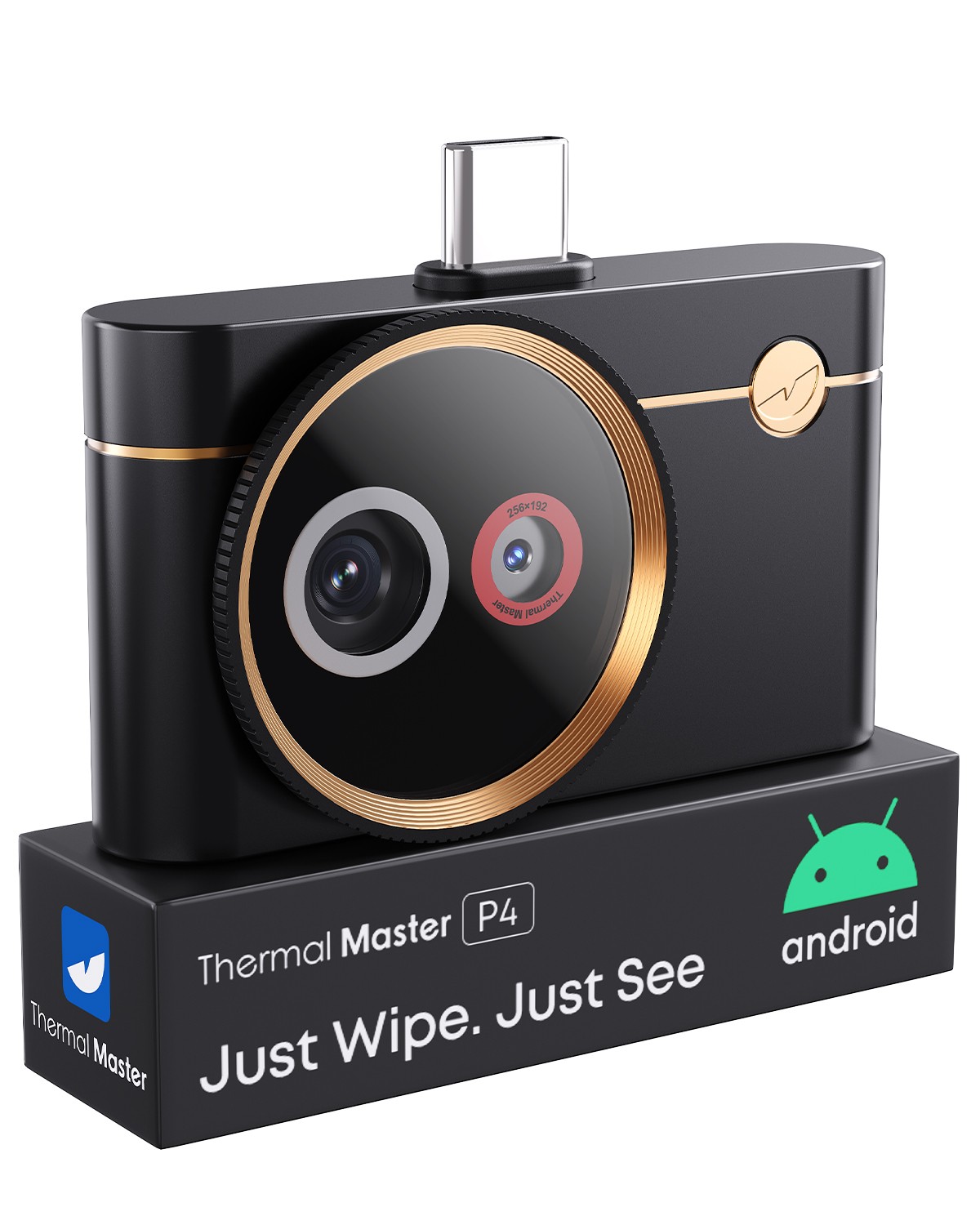
“`html
body {
font-family: ‘Segoe UI’, Roboto, Helvetica, Arial, sans-serif;
background: #f8f9fc;
margin: 0;
padding: 30px 20px;
color: #1e1e2a;
}
.product-card {
max-width: 1200px;
margin: 0 auto;
background: white;
border-radius: 28px;
box-shadow: 0 20px 40px rgba(0,0,0,0.08);
padding: 30px 35px;
transition: all 0.2s ease;
}
.product-title {
font-size: 2.2rem;
font-weight: 600;
line-height: 1.2;
margin: 0 0 10px 0;
color: #0b1a2e;
letter-spacing: -0.01em;
}
.brand-badge {
display: inline-block;
background: #eef2f7;
padding: 6px 16px;
border-radius: 40px;
font-size: 0.9rem;
font-weight: 500;
color: #1f3a5f;
margin-bottom: 12px;
}
.price-area {
display: flex;
align-items: baseline;
gap: 12px;
margin: 18px 0 20px 0;
}
.price {
font-size: 2.1rem;
font-weight: 700;
color: #0b2b4a;
}
.currency {
font-size: 1.2rem;
font-weight: 500;
color: #3a4d66;
}
.condition-badge {
background: #d0e2d4;
color: #1a4a2a;
padding: 4px 14px;
border-radius: 30px;
font-size: 0.8rem;
font-weight: 600;
text-transform: uppercase;
letter-spacing: 0.3px;
}
.gallery-grid {
display: flex;
flex-wrap: wrap;
gap: 18px;
margin: 25px 0 30px 0;
}
.gallery-grid img {
max-width: 100%;
height: auto;
border-radius: 20px;
box-shadow: 0 6px 14px rgba(0,0,0,0.04);
transition: transform 0.2s;
border: 1px solid #f0f2f6;
flex: 1 1 180px;
min-width: 140px;
object-fit: cover;
background: #fafbfc;
}
.gallery-grid img:hover {
transform: scale(1.01);
box-shadow: 0 10px 20px rgba(0,20,30,0.08);
}
.two-col {
display: flex;
flex-wrap: wrap;
gap: 40px;