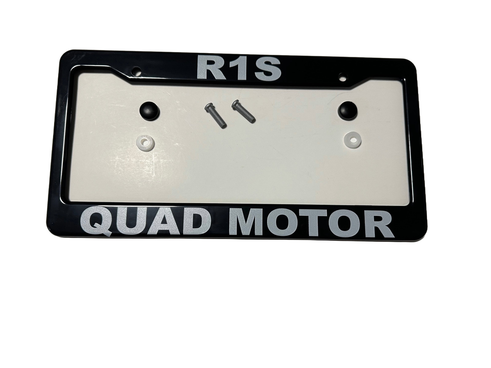
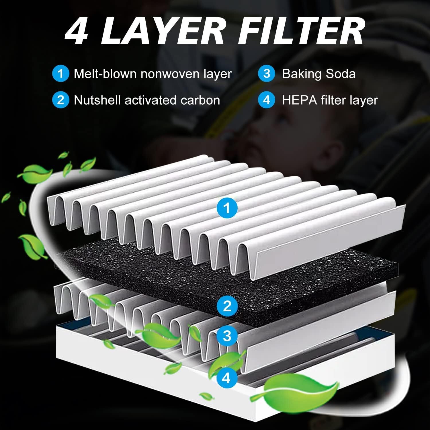
Cabin Air Filter Replacement with Activated Carbon, for Rivian R1T, R1S, 2022-20
wqspActn


“`html
body {
font-family: ‘Segoe UI’, Roboto, Helvetica, Arial, sans-serif;
background: #f4f6f9;
margin: 0;
padding: 20px;
color: #1a1a2e;
}
.product-card {
max-width: 1100px;
margin: 0 auto;
background: #ffffff;
border-radius: 20px;
box-shadow: 0 8px 30px rgba(0,0,0,0.08);
padding: 30px 35px;
}
.product-title {
font-size: 1.9rem;
font-weight: 700;
margin: 0 0 10px 0;
line-height: 1.3;
color: #0b1a2e;
}
.brand-badge {
display: inline-block;
background: #eef2f7;
padding: 6px 14px;
border-radius: 30px;
font-size: 0.85rem;
font-weight: 600;
color: #2c3e50;
margin-bottom: 15px;
}
.price-area {
font-size: 2rem;
font-weight: 700;
color: #1e8449;
margin: 15px 0 20px;
}
.gallery {
display: flex;
flex-wrap: wrap;
gap: 15px;
margin: 25px 0;
}
.gallery img {
max-width: 100%;
height: auto;
border-radius: 16px;
box-shadow: 0 4px 12px rgba(0,0,0,0.06);
transition: transform 0.2s ease;
width: calc(33.333% – 10px);
min-width: 200px;
flex: 1 1 auto;
object-fit: cover;
aspect-ratio: 4/3;
background: #f0f2f5;
}
.gallery img:hover {
transform: scale(1.01);
}
.grid-2 {
display: grid;
grid-template-columns: 1fr 1fr;
gap: 30px;
margin: 30px 0;
}
@media (max-width: 700px) {
.grid-2 {
grid-template-columns: 1fr;
}
.product-card {
padding: 20px;
}
.gallery img {
width: 100%;
}
}
.specs-table {
width: 100%;
border-collapse: collapse;
background: #f9fafc;
border-radius: 14px;
overflow: hidden;
}
.specs-table td {
padding: 12px 18px;
border-bottom: 1px solid #e6e9f0;
}
.specs-table tr:last-child td {
border-bottom: none;
}
.specs-table td:first-child {
font-weight: 600;
color: #2c3e