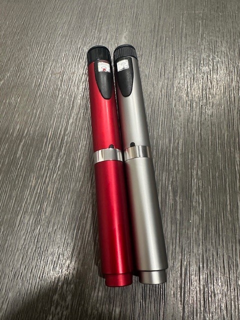
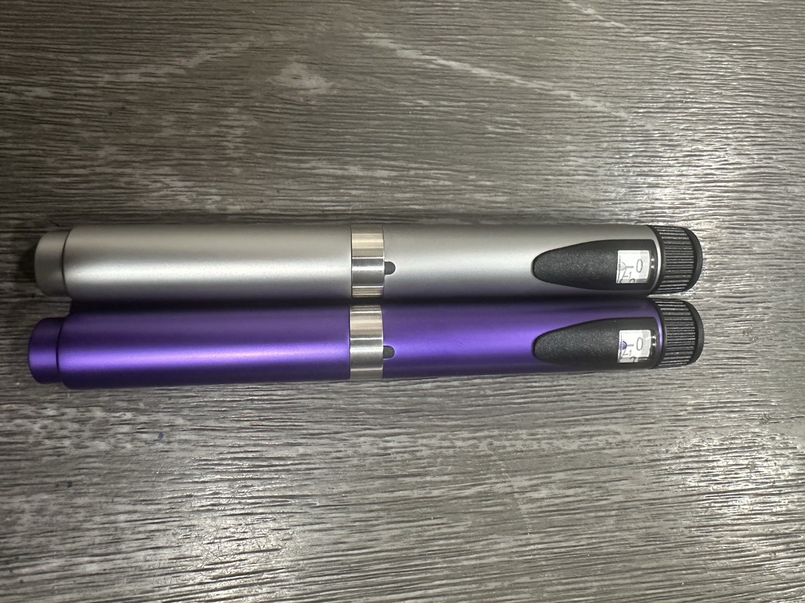
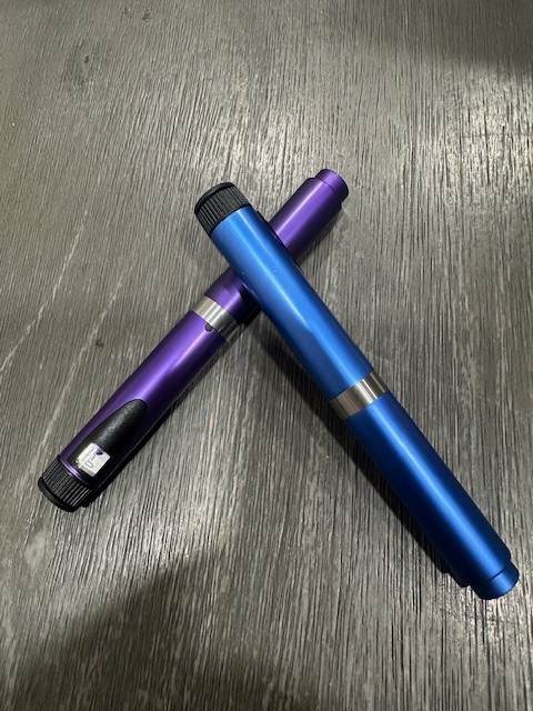
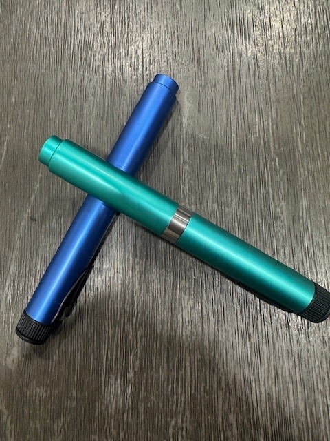
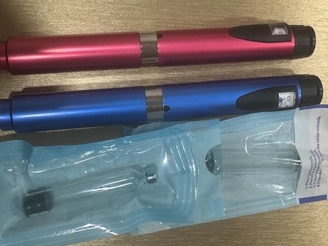
2 V2 Reusable Peptide Pen Pack With 5 Cartridges
BRXbLksO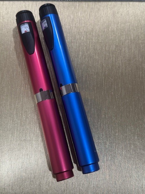
“`html
body {
font-family: ‘Segoe UI’, Roboto, Helvetica, Arial, sans-serif;
background: #f8f9fa;
margin: 0;
padding: 30px 20px;
display: flex;
justify-content: center;
}
.product-card {
max-width: 1100px;
width: 100%;
background: white;
border-radius: 24px;
box-shadow: 0 12px 40px rgba(0,0,0,0.08);
padding: 30px 35px;
transition: all 0.2s;
}
h1 {
font-size: 2rem;
font-weight: 600;
color: #1e293b;
margin-top: 0;
margin-bottom: 8px;
}
.brand-badge {
display: inline-block;
background: #eef2ff;
color: #4f46e5;
font-weight: 600;
font-size: 0.85rem;
padding: 4px 14px;
border-radius: 30px;
letter-spacing: 0.3px;
margin-bottom: 12px;
}
.price {
font-size: 2.2rem;
font-weight: 700;
color: #0f172a;
margin: 12px 0 20px 0;
}
.price small {
font-size: 1rem;
font-weight: 400;
color: #64748b;
margin-left: 8px;
}
.gallery {
display: flex;
flex-wrap: wrap;
gap: 18px;
margin: 25px 0 30px 0;
}
.gallery img {
max-width: 100%;
height: auto;
border-radius: 18px;
box-shadow: 0 4px 14px rgba(0,0,0,0.06);
transition: transform 0.2s;
border: 1px solid #f1f5f9;
}
.gallery img:hover {
transform: scale(1.01);
}
.gallery-item {
flex: 1 1 200px;
min-width: 160px;
}
.gallery-item img {
width: 100%;
display: block;
}
.specs-table {
width: 100%;
border-collapse: collapse;
margin: 30px 0 25px 0;
background: #fafcff;
border-radius: 16px;
overflow: hidden;
}
.specs-table td {
padding: 14px 18px;
border-bottom: 1px solid #e9edf2;
vertical-align: top;
}
.specs-table tr:last-child td {
border-bottom: none;
}
.specs-table td:first-child {
font-weight: 600;
color: #1e293b;
width: 38%;
background: #f4f7fc;