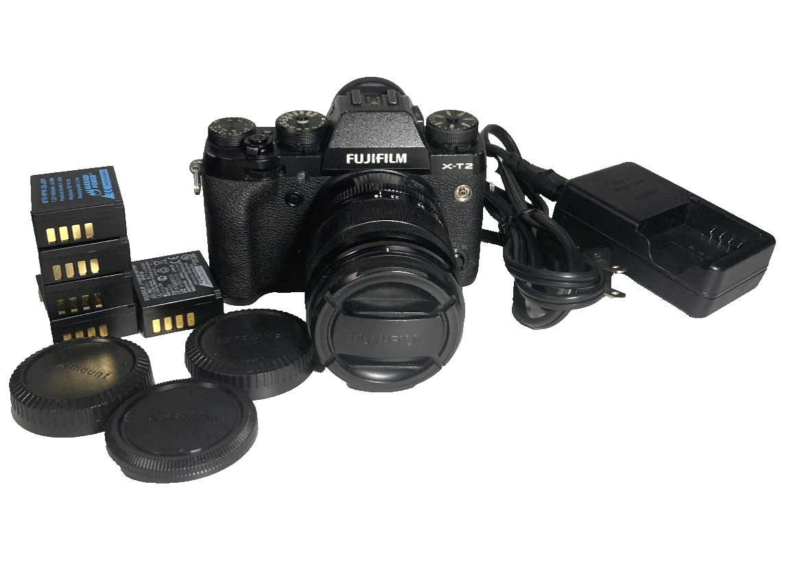
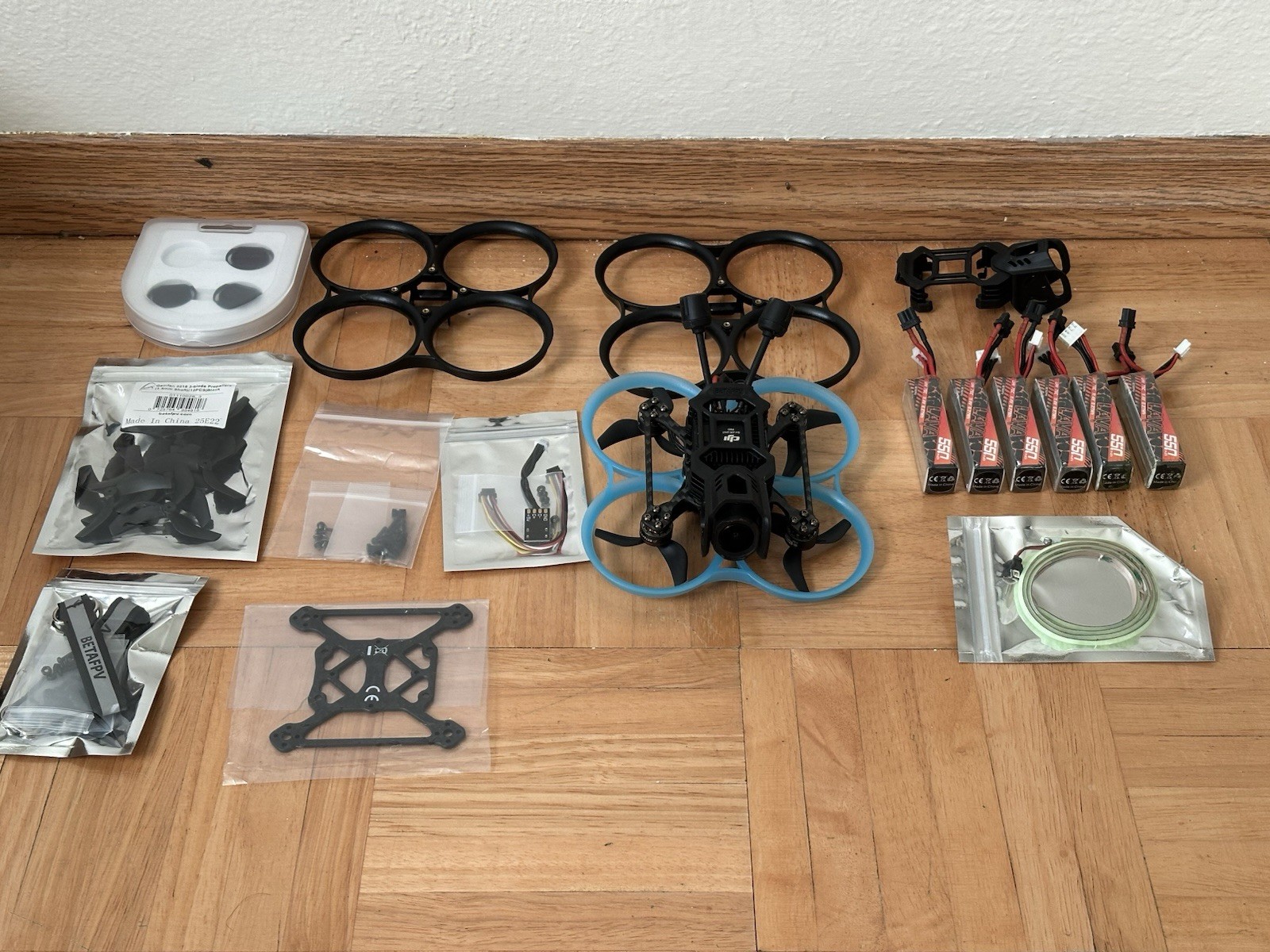
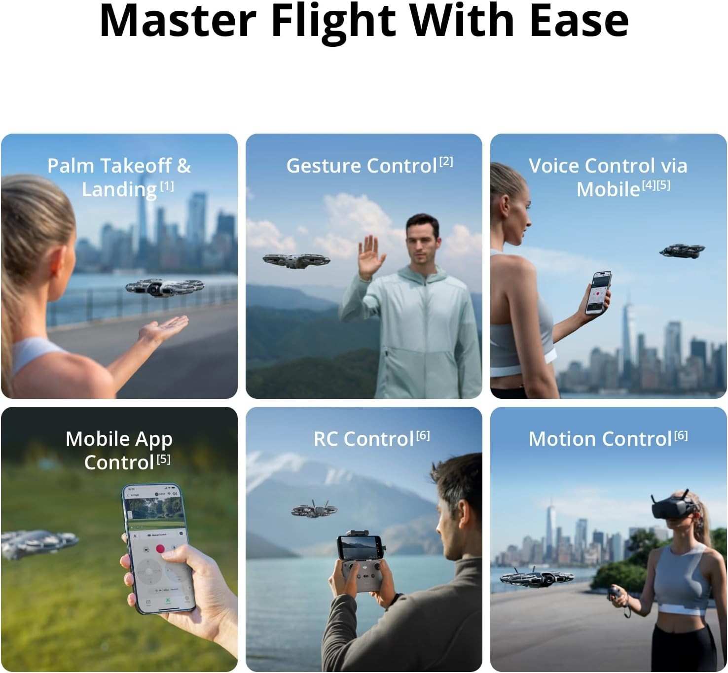
DJI Neo 2 Fly More Combo With RC-N3 Remote Controller
psJpKQtj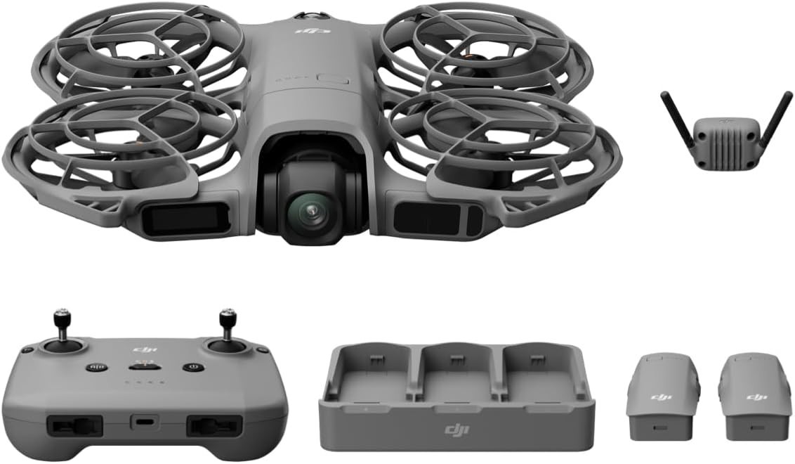
“`html
* {
margin: 0;
padding: 0;
box-sizing: border-box;
}
body {
font-family: system-ui, -apple-system, ‘Segoe UI’, Roboto, ‘Helvetica Neue’, sans-serif;
background: #f5f7fa;
display: flex;
justify-content: center;
padding: 2rem 1rem;
line-height: 1.5;
color: #1e293b;
}
.product-card {
max-width: 1120px;
width: 100%;
background: white;
border-radius: 28px;
box-shadow: 0 20px 40px -12px rgba(0,0,0,0.12);
padding: 2rem 2.5rem;
transition: all 0.2s;
}
@media (max-width: 700px) {
.product-card { padding: 1.5rem; }
}
h1, h2, h3 {
font-weight: 600;
letter-spacing: -0.01em;
}
h1 {
font-size: 2rem;
margin-bottom: 0.25rem;
}
.brand-sub {
color: #475569;
font-size: 1rem;
font-weight: 400;
margin-bottom: 1.5rem;
border-bottom: 1px solid #e9edf2;
padding-bottom: 0.75rem;
}
.price-block {
font-size: 2rem;
font-weight: 700;
color: #0b2b4a;
background: #f0f4fe;
display: inline-block;
padding: 0.3rem 1.2rem;
border-radius: 40px;
margin: 0.5rem 0 1.8rem 0;
}
.gallery-grid {
display: grid;
grid-template-columns: repeat(4, 1fr);
gap: 1rem;
margin: 1.8rem 0 2.5rem;
}
.gallery-grid img {
width: 100%;
height: auto;
aspect-ratio: 1/1;
object-fit: cover;
border-radius: 20px;
background: #f1f5f9;
border: 1px solid #eef2f6;
transition: transform 0.15s;
}
.gallery-grid img:hover {
transform: scale(1.02);
box-shadow: 0 8px 18px rgba(0,0,0,0.08);
}
@media (max-width: 600px) {
.gallery-grid { grid-template-columns: repeat(2, 1fr); }
}
.desc-section {
background: #f8fafc;
padding: 1.8rem 2rem;
border-radius: 24px;
margin: 2rem 0;
}
.desc-section p {
font-size: 1.1rem;
max-width: