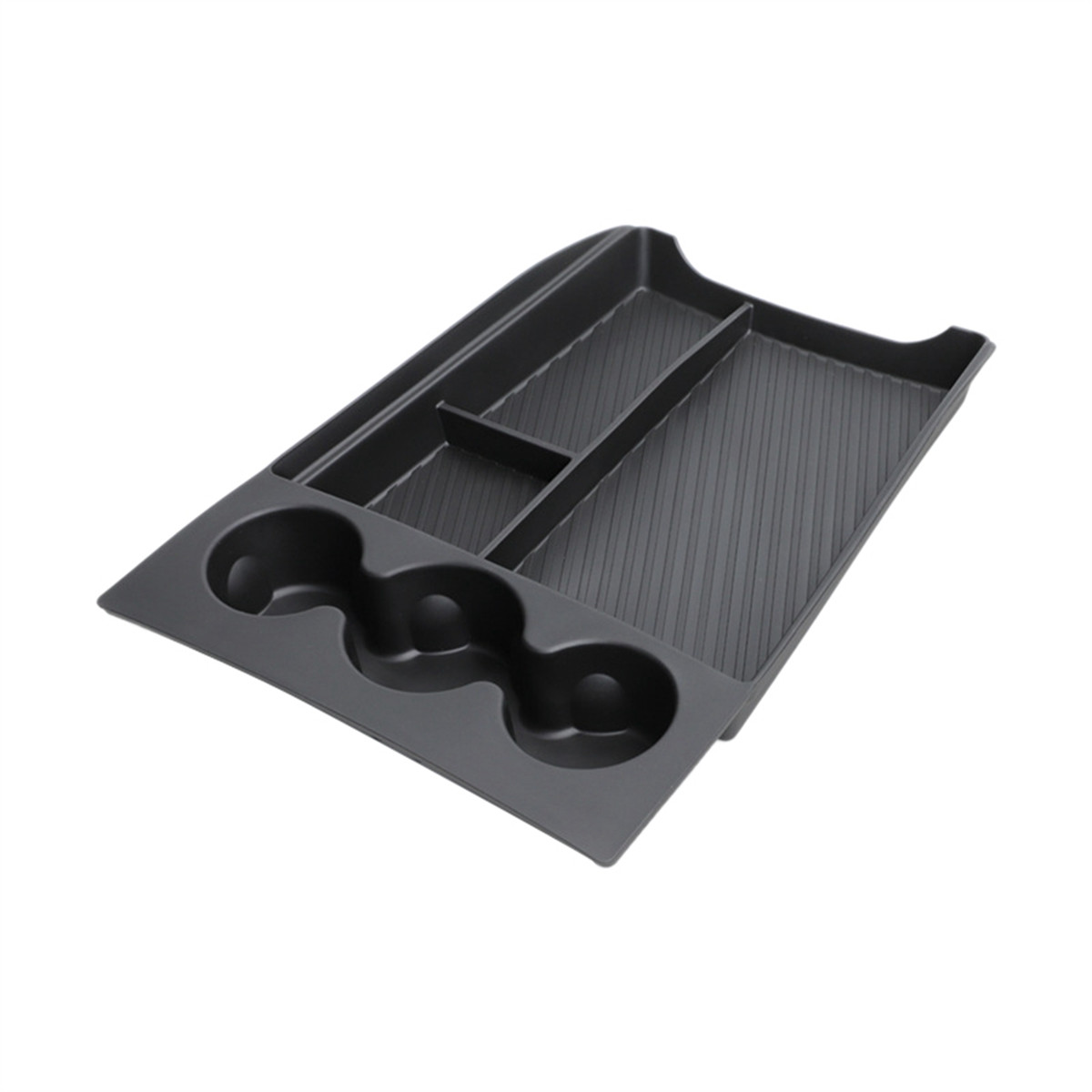
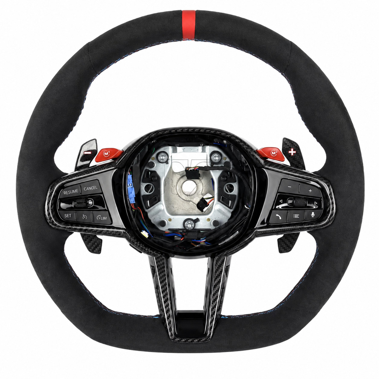
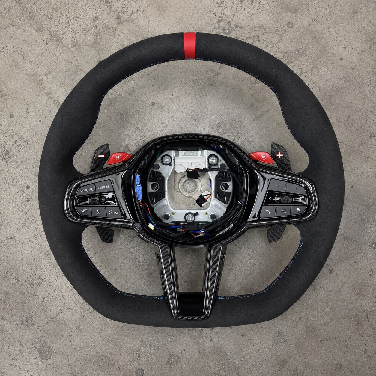
2024 M4 Alcantara Steering Wheel with heating virbate and m button functionality
5JbvdxCR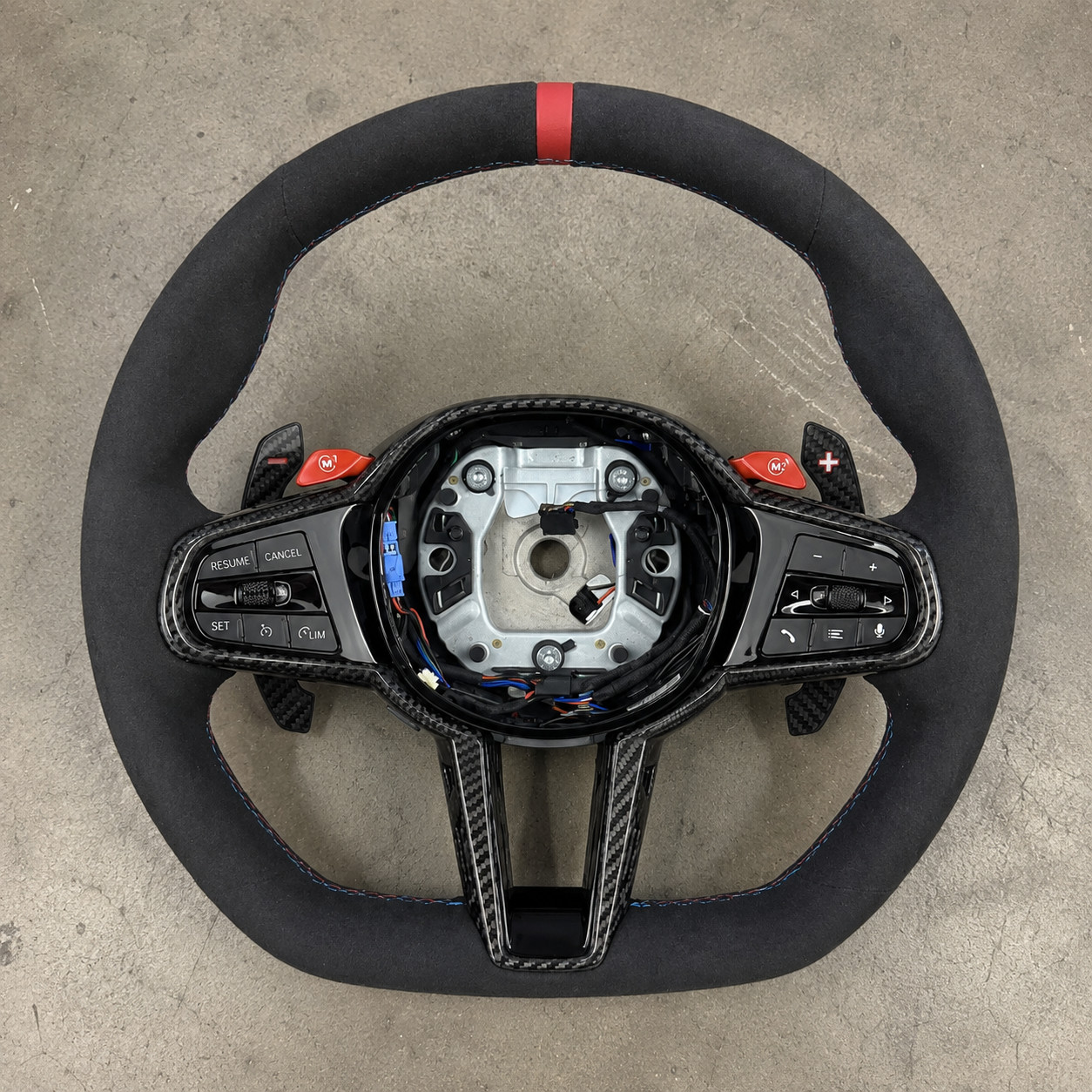
“`html
body {
font-family: ‘Segoe UI’, Roboto, Helvetica, Arial, sans-serif;
background: #f5f7fa;
margin: 0;
padding: 20px;
color: #1e1e2a;
}
.product-card {
max-width: 1200px;
margin: 0 auto;
background: white;
border-radius: 24px;
box-shadow: 0 12px 40px rgba(0,0,0,0.08);
padding: 30px 35px;
}
.product-title {
font-size: 2rem;
font-weight: 600;
margin: 0 0 8px 0;
line-height: 1.2;
color: #111;
}
.brand-sub {
display: flex;
align-items: center;
gap: 12px;
margin-bottom: 20px;
flex-wrap: wrap;
}
.brand-badge {
background: #1e1e2a;
color: white;
padding: 4px 14px;
border-radius: 40px;
font-size: 0.85rem;
font-weight: 500;
}
.price {
font-size: 2.2rem;
font-weight: 700;
color: #0a7e3c;
margin: 10px 0 20px 0;
}
.gallery {
display: flex;
flex-wrap: wrap;
gap: 16px;
margin: 25px 0 30px 0;
}
.gallery img {
width: 100%;
max-width: 280px;
height: auto;
border-radius: 16px;
box-shadow: 0 4px 12px rgba(0,0,0,0.06);
transition: transform 0.2s ease;
border: 1px solid #eaeef2;
}
.gallery img:hover {
transform: scale(1.02);
}
.grid-2 {
display: grid;
grid-template-columns: 1fr 1fr;
gap: 40px;
margin: 30px 0;
}
@media (max-width: 700px) {
.grid-2 {
grid-template-columns: 1fr;
gap: 20px;
}
.product-card {
padding: 20px;
}
}
.specs-table {
width: 100%;
border-collapse: collapse;
background: #f9fafc;
border-radius: 16px;
overflow: hidden;
}
.specs-table td, .specs-table th {
padding: 12px 18px;
border-bottom: 1px solid #e2e8f0;
vertical-align: top;
}
.specs-table tr:last-child td {
border-bottom: none;
}
.specs-table td:first-child {
font-weight: 600;
color: #2d3a4a;
width: 40%;