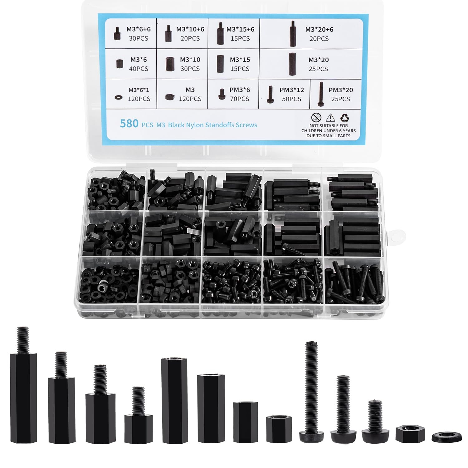
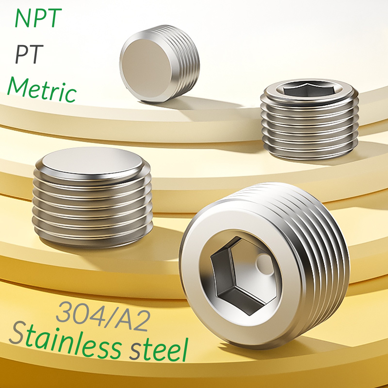
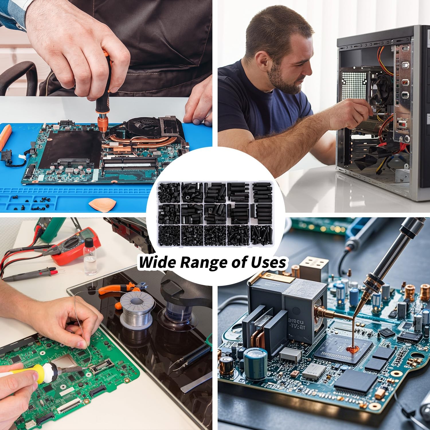
580 PCS M3 Black Nylon Standoff Kit with Spacers, Screws, and Nuts M3, black…
CoPE5Lue


body {
font-family: ‘Segoe UI’, Roboto, Arial, sans-serif;
background: #f5f7fa;
margin: 0;
padding: 20px;
color: #1e1e2f;
}
.product-card {
max-width: 1100px;
margin: 0 auto;
background: white;
border-radius: 24px;
box-shadow: 0 12px 30px rgba(0,0,0,0.08);
padding: 30px 35px;
}
.gallery {
display: flex;
flex-wrap: wrap;
gap: 20px;
margin-bottom: 30px;
align-items: center;
}
.gallery img {
max-width: 100%;
height: auto;
border-radius: 16px;
box-shadow: 0 4px 12px rgba(0,0,0,0.05);
transition: 0.2s;
}
.gallery img:hover {
transform: scale(1.01);
}
.gallery-main {
flex: 2 1 300px;
}
.gallery-thumbs {
flex: 1 1 140px;
display: flex;
flex-direction: column;
gap: 12px;
}
.gallery-thumbs img {
border-radius: 12px;
cursor: pointer;
border: 2px solid transparent;
}
.gallery-thumbs img:hover {
border-color: #2a7de1;
}
h1 {
font-size: 2rem;
font-weight: 600;
margin: 0 0 8px 0;
color: #0b1a2e;
}
.price-brand {
display: flex;
flex-wrap: wrap;
align-items: baseline;
gap: 20px;
margin: 10px 0 20px 0;
}
.price {
font-size: 2.2rem;
font-weight: 700;
color: #1f7b4d;
}
.brand {
background: #eef2f7;
padding: 6px 16px;
border-radius: 40px;
font-size: 0.9rem;
color: #2c3e50;
}
.specs-table {
width: 100%;
border-collapse: collapse;
margin: 25px 0 30px;
background: #f9fafc;
border-radius: 16px;
overflow: hidden;
}
.specs-table td, .specs-table th {
padding: 12px 18px;
border-bottom: 1px solid #e2e8f0;
text-align: left;
}
.specs-table tr:last-child td {
border-bottom: none;
}
.specs-table td:first-child {
font-weight: 600;
width: 40%;
color: #1e293b;
}
.specs-table td:last-child {
color: #334155;
}
.description {
background: #f1f5f9;