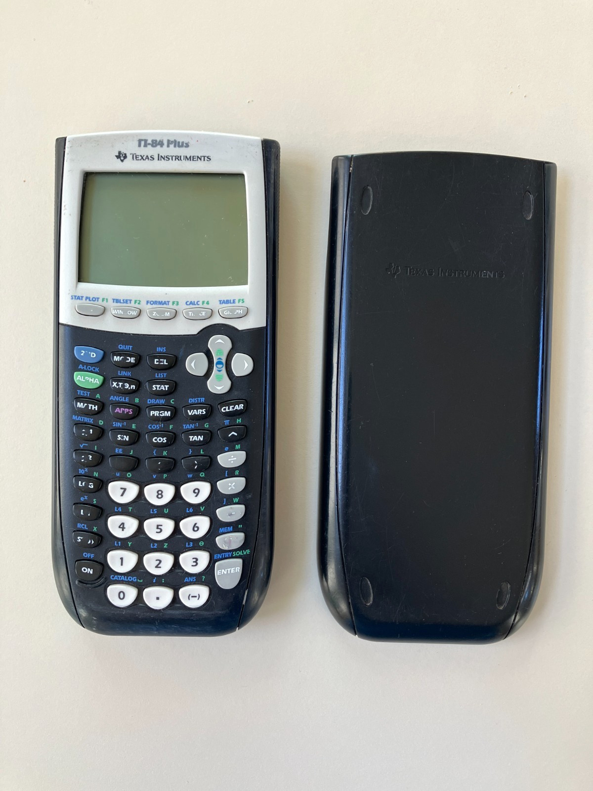
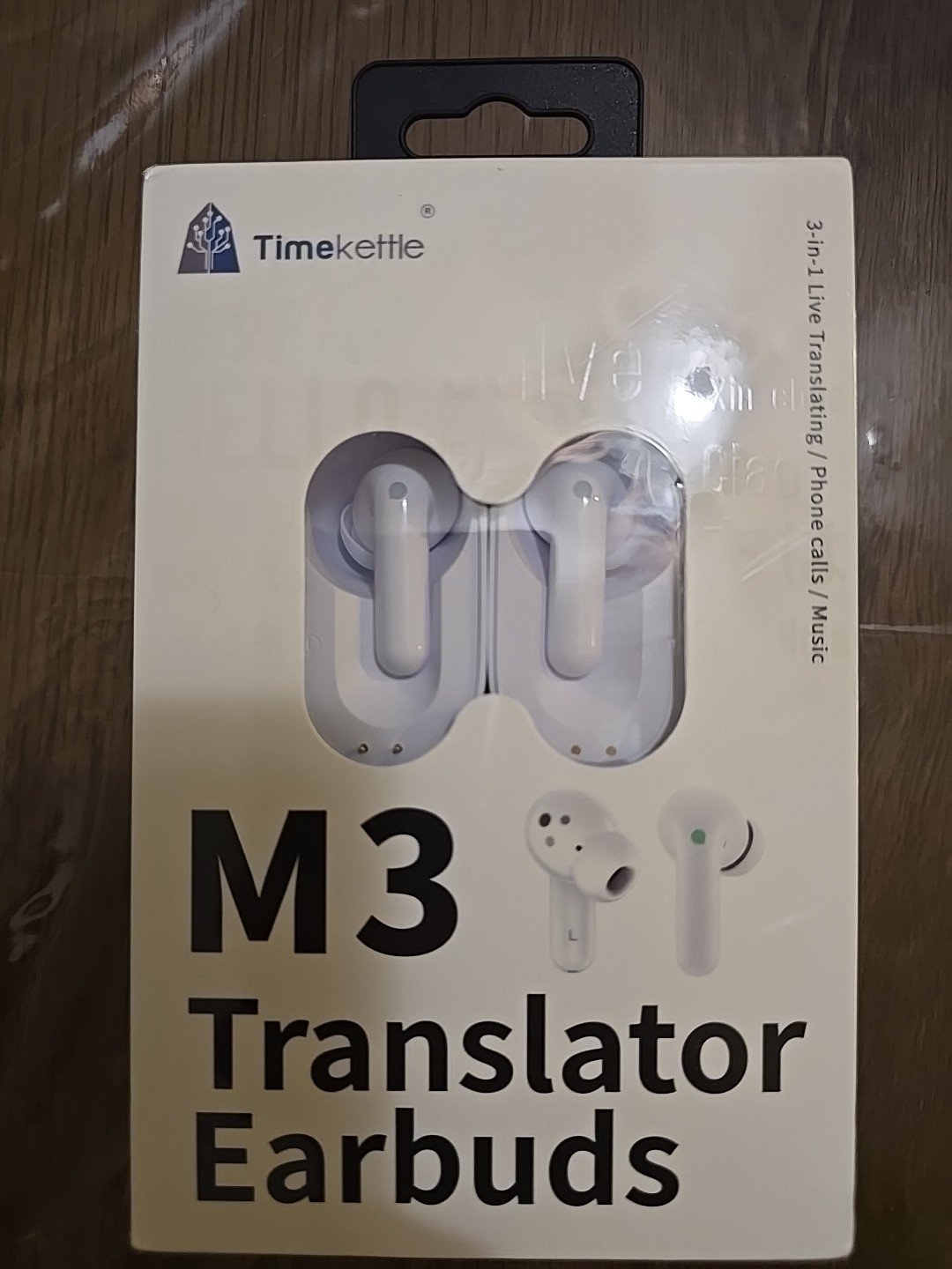
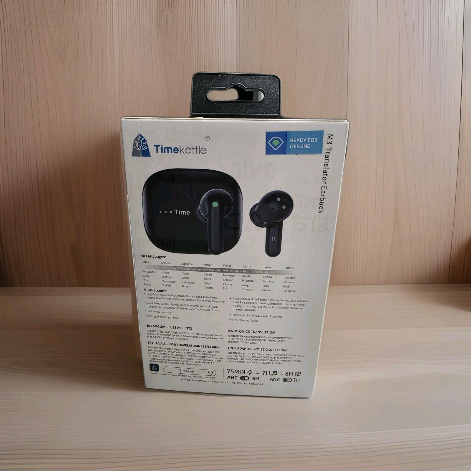
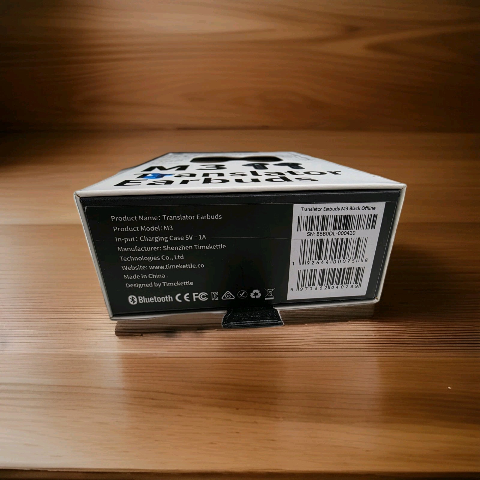
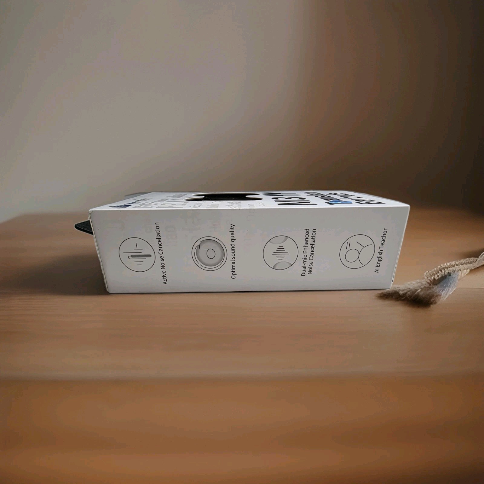
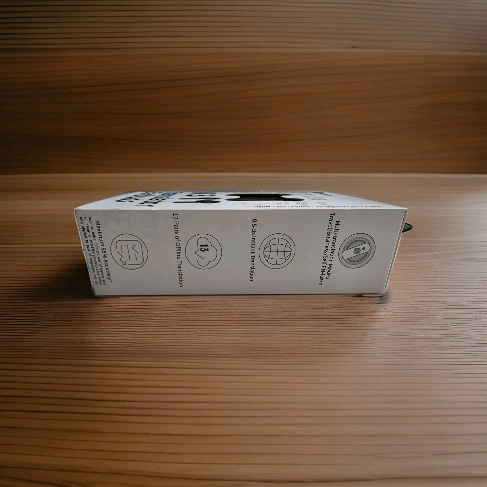
Timekettle M3 Translator Earbuds, Two-Way Device with App, 40 Languages
9wwUYdtO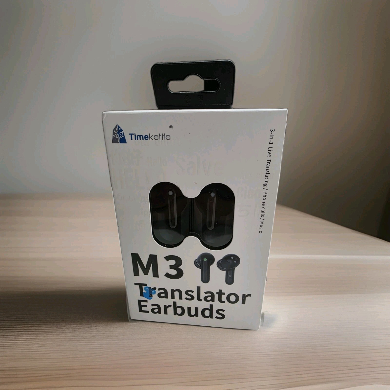
“`html
body {
font-family: ‘Segoe UI’, Roboto, Helvetica, Arial, sans-serif;
background: #f5f7fa;
margin: 0;
padding: 30px 20px;
display: flex;
justify-content: center;
}
.product-card {
max-width: 1100px;
width: 100%;
background: #ffffff;
border-radius: 24px;
box-shadow: 0 12px 40px rgba(0,0,0,0.08);
padding: 30px 30px 40px;
transition: all 0.2s;
}
h1 {
font-size: 2rem;
font-weight: 600;
margin: 0 0 8px;
color: #1e293b;
letter-spacing: -0.02em;
}
.brand-tag {
display: inline-block;
background: #eef2ff;
color: #4f46e5;
font-weight: 600;
font-size: 0.85rem;
padding: 4px 14px;
border-radius: 30px;
margin-bottom: 12px;
}
.price-badge {
font-size: 2.2rem;
font-weight: 700;
color: #0f172a;
margin: 12px 0 6px;
}
.price-badge small {
font-size: 1rem;
font-weight: 400;
color: #64748b;
margin-left: 8px;
}
.condition-badge {
background: #fef9c3;
color: #854d0e;
padding: 4px 14px;
border-radius: 30px;
font-weight: 500;
font-size: 0.85rem;
display: inline-block;
margin-bottom: 20px;
}
.gallery {
display: flex;
flex-wrap: wrap;
gap: 16px;
margin: 20px 0 28px;
}
.gallery img {
max-width: 100%;
height: auto;
border-radius: 18px;
box-shadow: 0 4px 12px rgba(0,0,0,0.04);
border: 1px solid #e9edf2;
transition: transform 0.2s;
flex: 1 1 180px;
min-width: 140px;
object-fit: cover;
aspect-ratio: 1/1;
background: #fafbfc;
}
.gallery img:hover {
transform: scale(1.02);
}
.grid-2 {
display: grid;
grid-template-columns: 1fr 1fr;
gap: 30px;
margin: 30px 0 20px;
}
@media (max-width: 700px) {
.grid-2 {
grid-template-columns: 1fr;
gap: 20px;
}
}
.specs-table {
width