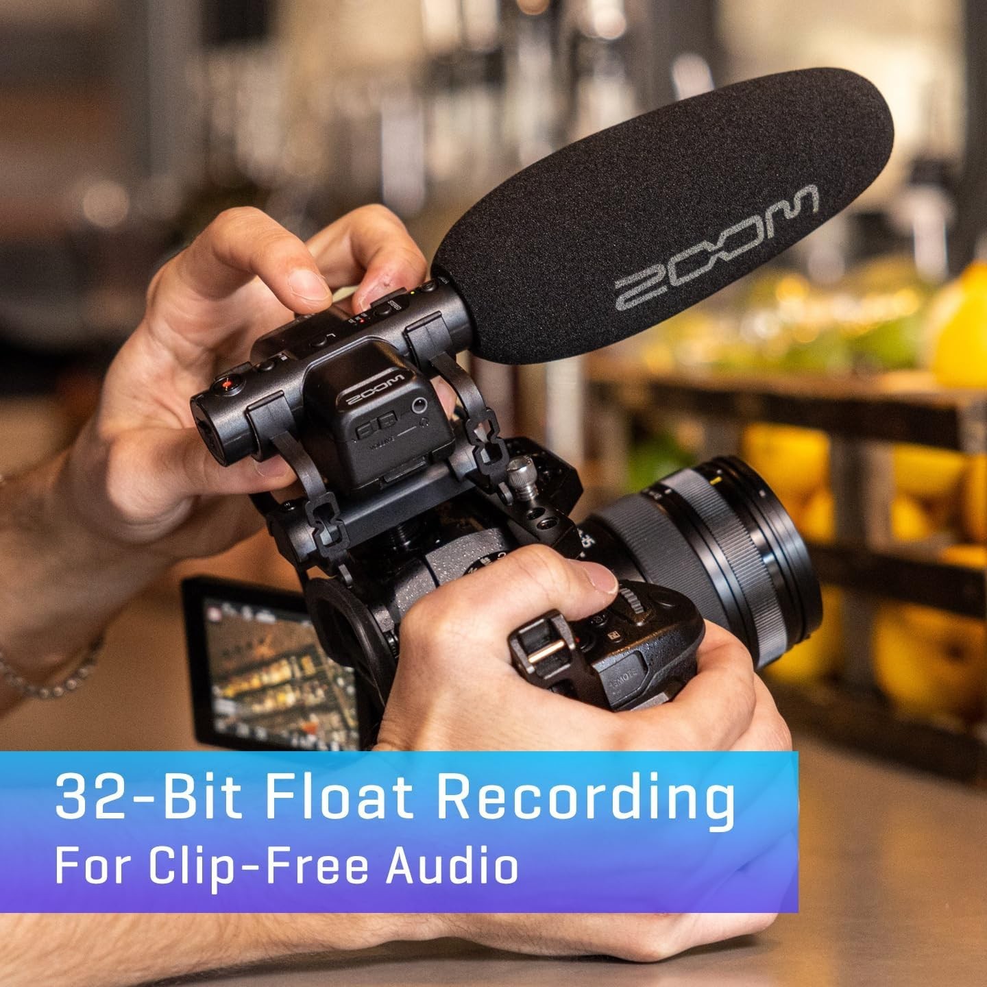
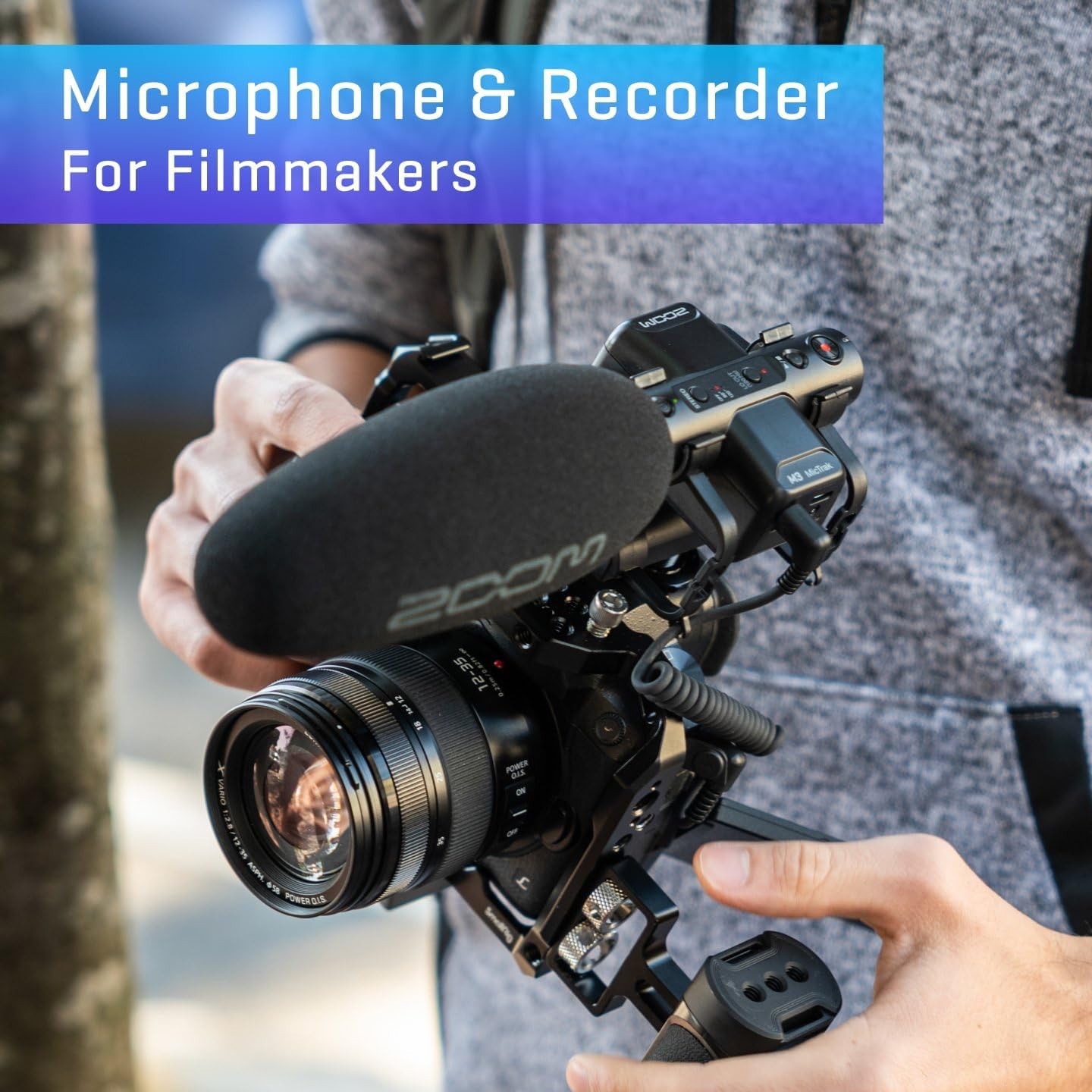
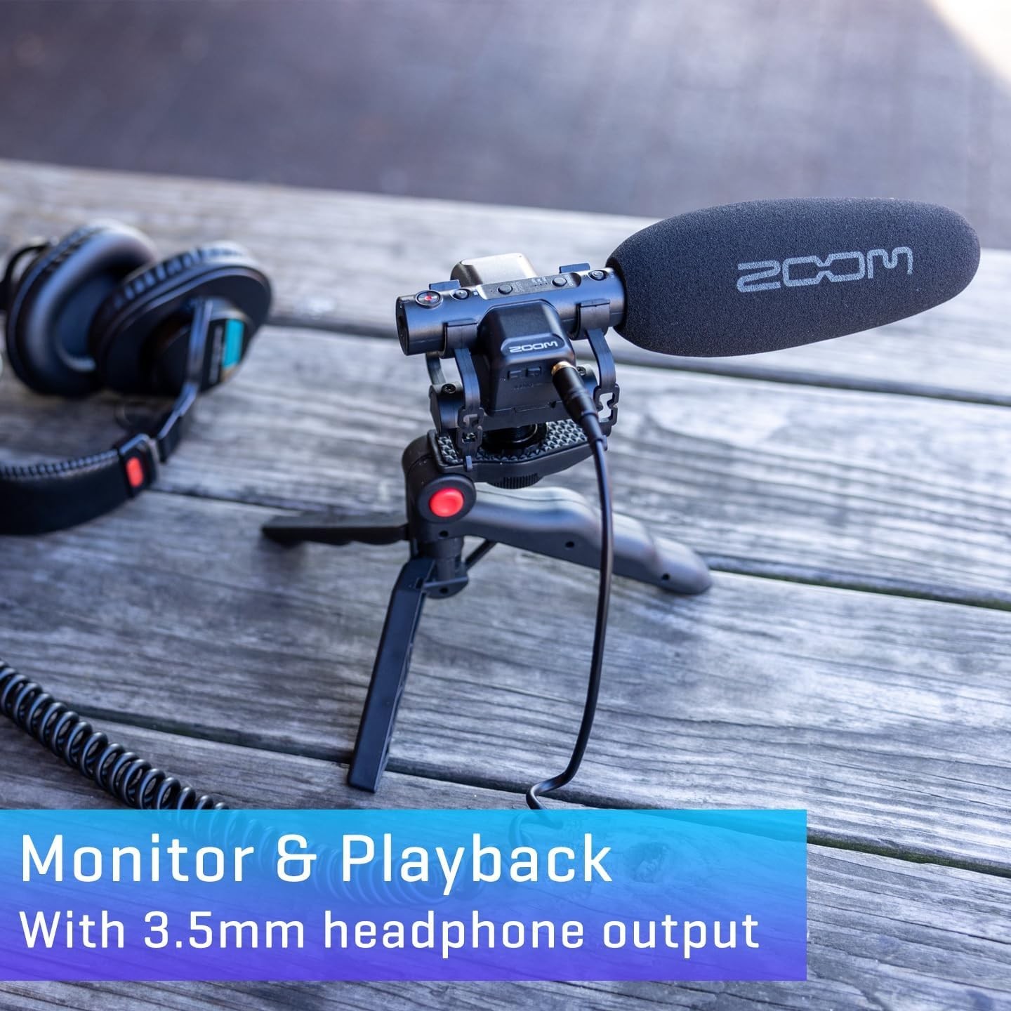
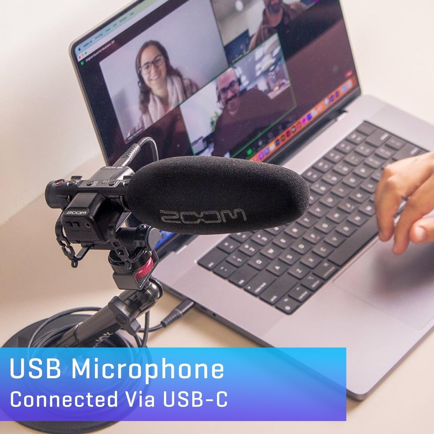
Zoom M3 MicTrak Stereo On-Camera Shotgun Microphone with 32-Bit Float NEW
bfbWVLro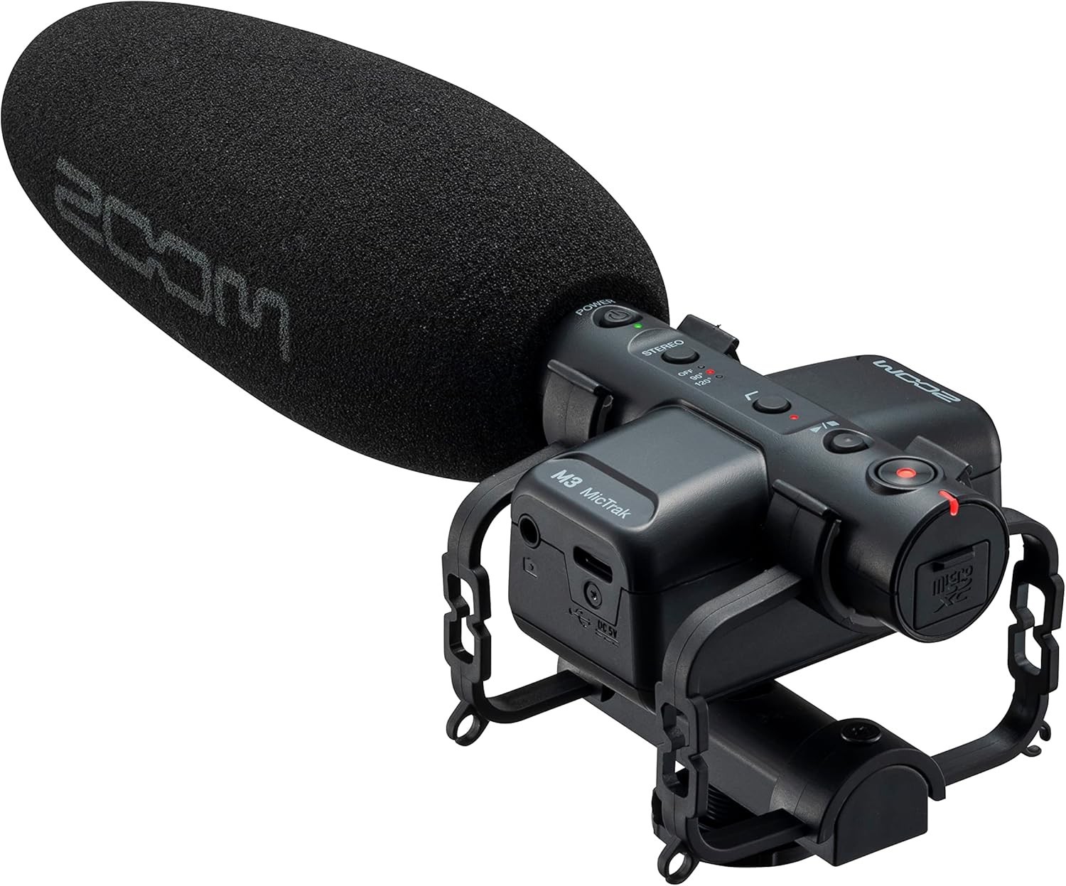
body {
font-family: ‘Segoe UI’, Roboto, Arial, sans-serif;
background: #f8f9fa;
margin: 0;
padding: 20px;
color: #1e1e1e;
}
.product-card {
max-width: 1100px;
margin: 0 auto;
background: #ffffff;
border-radius: 20px;
box-shadow: 0 10px 30px rgba(0,0,0,0.08);
padding: 30px 35px;
}
.product-title {
font-size: 2.2rem;
font-weight: 600;
margin: 0 0 10px 0;
line-height: 1.2;
color: #0a0a0a;
}
.price-badge {
font-size: 1.8rem;
font-weight: 700;
color: #2a7f2a;
background: #e9f3e9;
display: inline-block;
padding: 8px 20px;
border-radius: 40px;
margin: 10px 0 20px 0;
}
.gallery {
display: flex;
flex-wrap: wrap;
gap: 15px;
margin: 25px 0;
}
.gallery img {
max-width: 100%;
height: auto;
border-radius: 16px;
box-shadow: 0 4px 12px rgba(0,0,0,0.06);
transition: transform 0.2s ease;
flex: 1 1 200px;
object-fit: cover;
border: 1px solid #eaeaea;
}
.gallery img:hover {
transform: scale(1.02);
}
.grid-2 {
display: grid;
grid-template-columns: 1fr 1fr;
gap: 30px;
margin: 30px 0;
}
@media (max-width: 700px) {
.grid-2 {
grid-template-columns: 1fr;
}
}
.specs-table {
width: 100%;
border-collapse: collapse;
background: #fafbfc;
border-radius: 16px;
overflow: hidden;
}
.specs-table td {
padding: 14px 18px;
border-bottom: 1px solid #e9ecef;
vertical-align: top;
}
.specs-table tr:last-child td {
border-bottom: none;
}
.specs-table td:first-child {
font-weight: 600;
width: 40%;
color: #2c3e50;
}
.specs-table td:last-child {
color: #1e2a36;
}
.why-buy ul {
list-style: none;
padding: 0;
margin: 0;
}
.why-buy li {
padding: 10px 0 10px 28px;
background: url(‘data:image/svg+xml;utf8,<svg xmlns="http://www.w3.org/2000/svg" width="18"