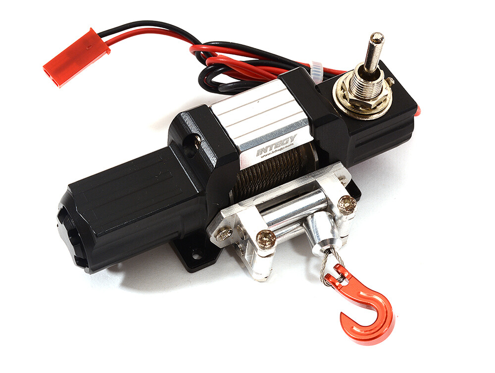
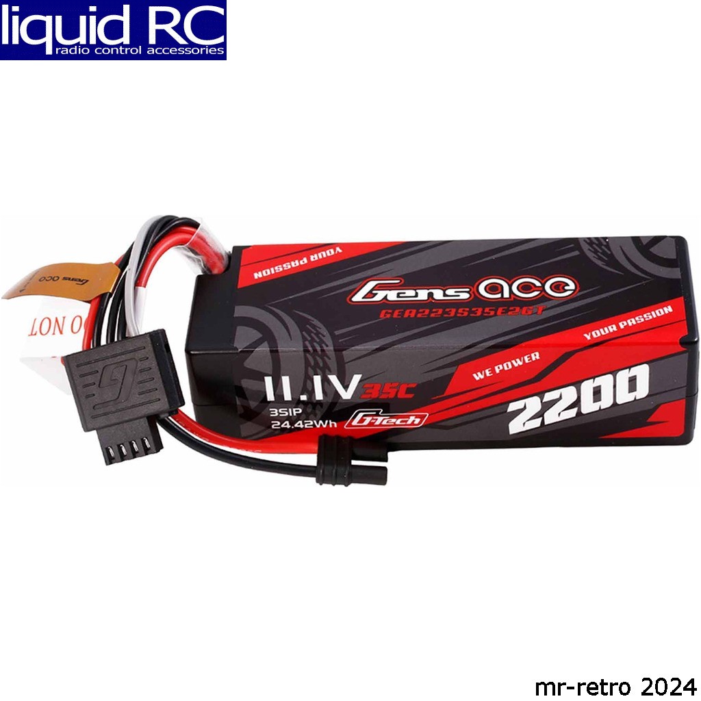
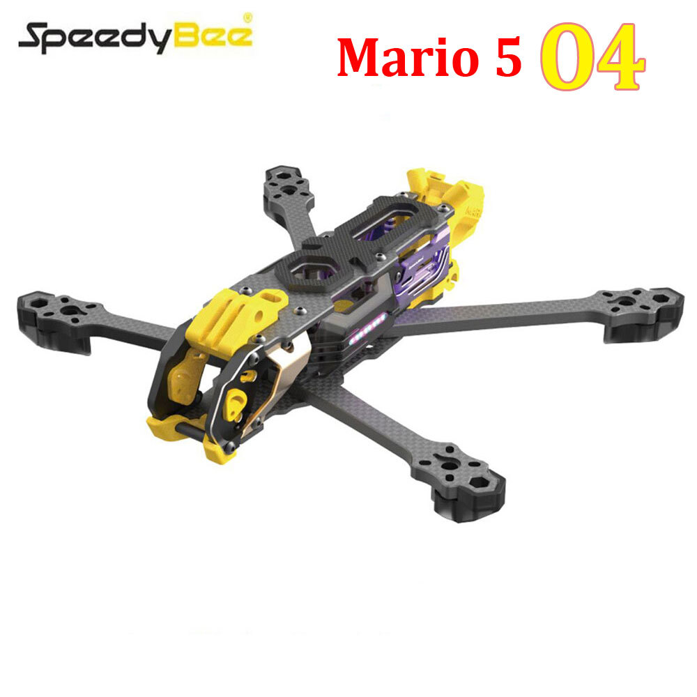
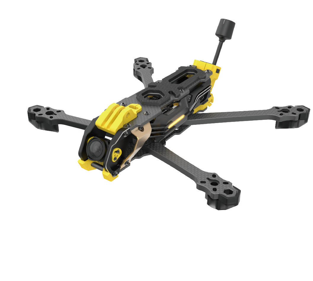
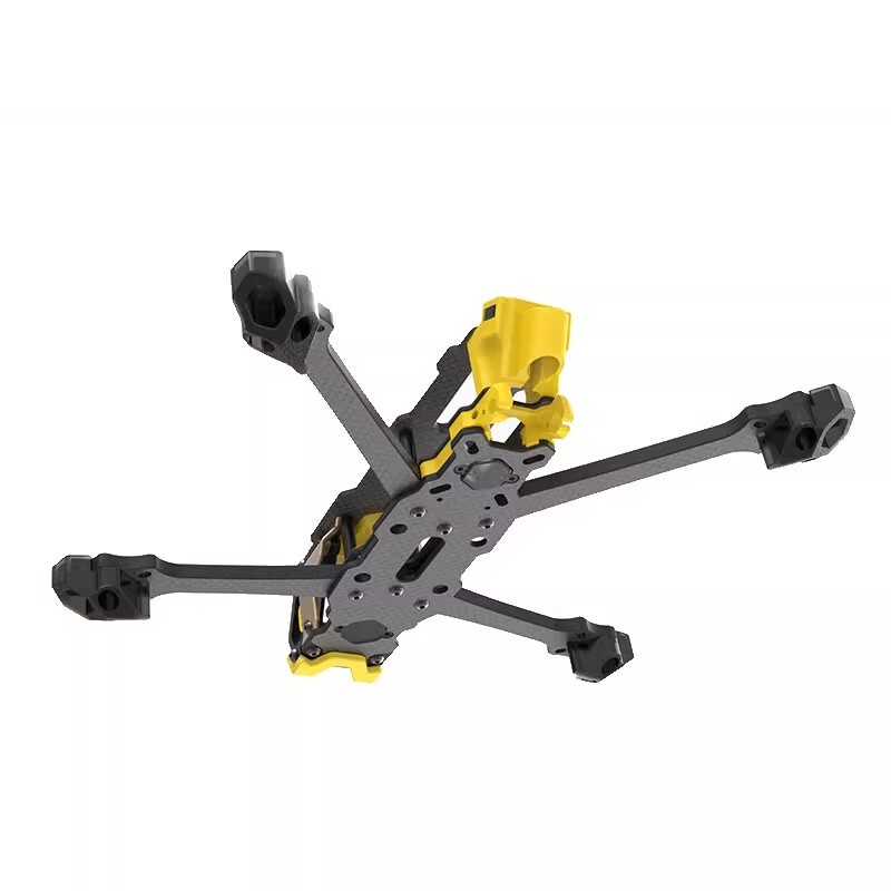
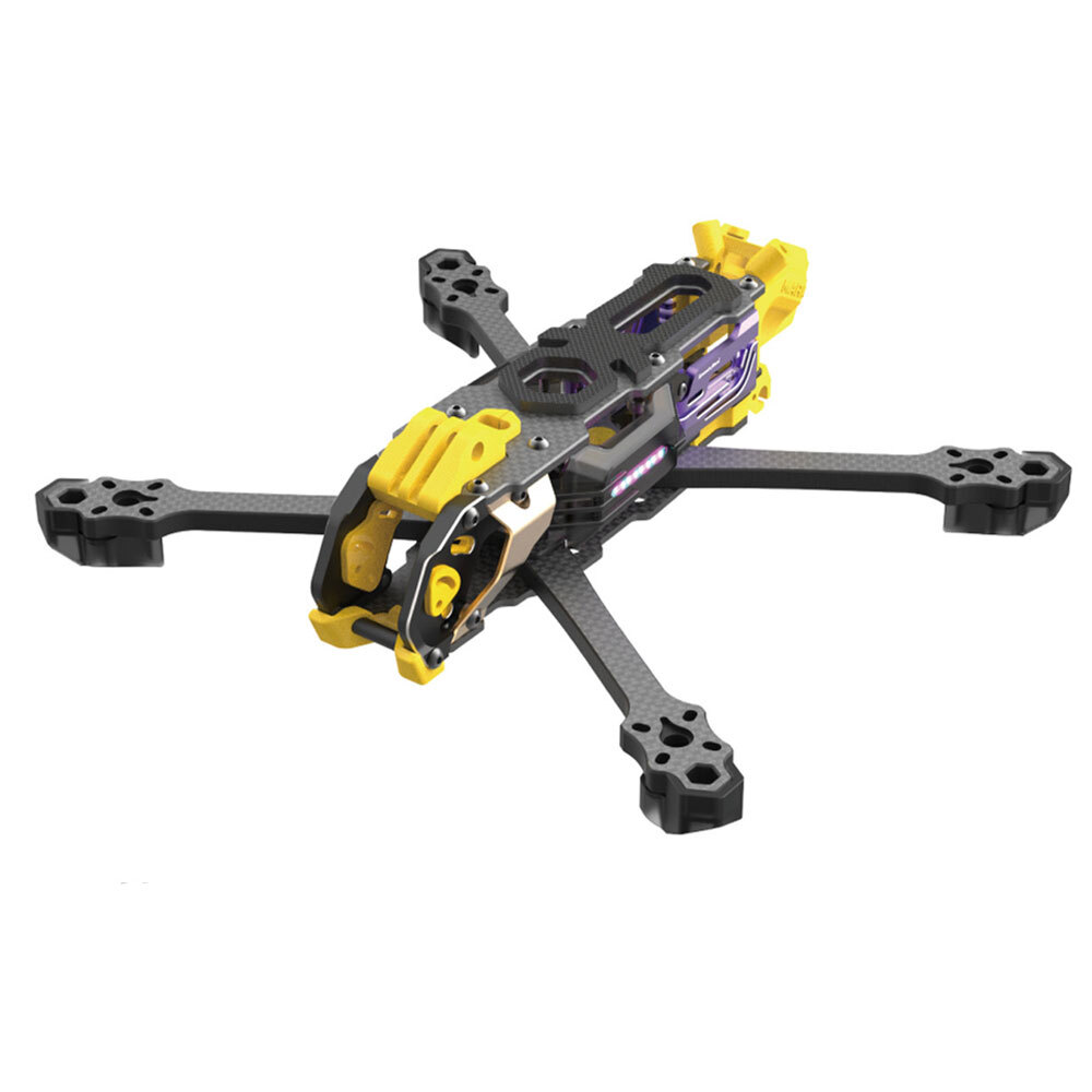
SpeedyBee Mario 5 O4 Frame Kit DC / XH Version with Carbon Fiber Plate RC FPV
jcAYHAvD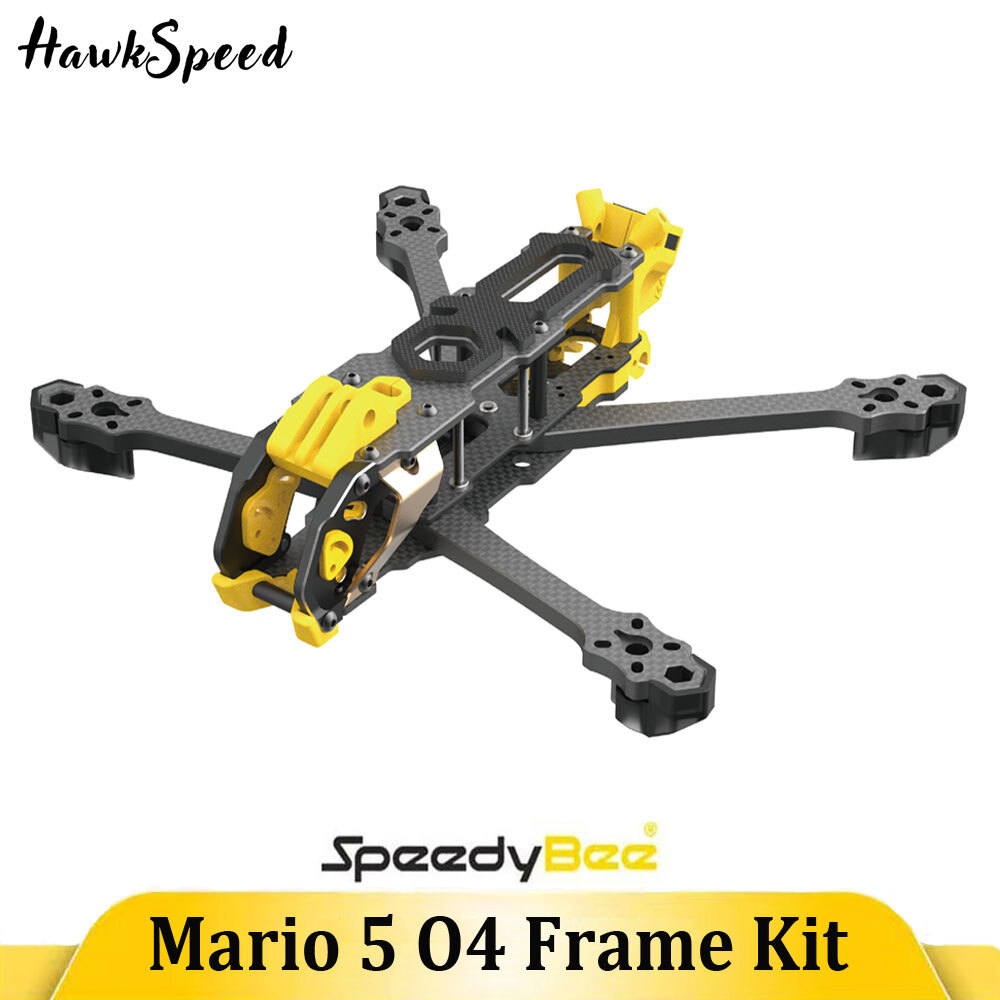
“`html
body {
font-family: system-ui, -apple-system, ‘Segoe UI’, Roboto, ‘Helvetica Neue’, sans-serif;
background: #f5f7fa;
margin: 0;
padding: 2rem 1rem;
display: flex;
justify-content: center;
}
.product-card {
max-width: 1100px;
width: 100%;
background: white;
border-radius: 28px;
box-shadow: 0 20px 40px rgba(0,0,0,0.08);
padding: 2rem 2.5rem;
transition: all 0.2s;
}
@media (max-width: 600px) {
.product-card { padding: 1.5rem 1rem; }
}
.product-title {
font-size: 2rem;
font-weight: 600;
margin: 0 0 0.25rem 0;
line-height: 1.2;
color: #0b1a2f;
}
.brand-sub {
color: #3a5a7a;
font-size: 1rem;
font-weight: 400;
margin-bottom: 1.25rem;
display: flex;
flex-wrap: wrap;
gap: 0.75rem;
align-items: baseline;
}
.brand-sub span {
background: #eef2f6;
padding: 0.2rem 0.8rem;
border-radius: 30px;
font-size: 0.85rem;
color: #1f3a57;
}
.price-area {
font-size: 2.2rem;
font-weight: 700;
color: #0f2b44;
margin: 0.5rem 0 1.5rem 0;
display: flex;
align-items: center;
gap: 12px;
}
.price-area small {
font-size: 1rem;
font-weight: 400;
color: #4b6a88;
background: #e9eef3;
padding: 0.2rem 0.9rem;
border-radius: 40px;
}
.gallery-grid {
display: grid;
grid-template-columns: repeat(4, 1fr);
gap: 14px;
margin: 1.8rem 0 2rem 0;
}
.gallery-grid img {
width: 100%;
aspect-ratio: 1/1;
object-fit: cover;
border-radius: 18px;
background: #f0f3f7;
border: 1px solid #e2e8f0;
transition: 0.1s ease;
}
.gallery-grid img:hover {
box-shadow: 0 6px 14px rgba(0,20,40,0.12);
}
@media (max-width: 500px) {
.gallery-grid { grid-template-columns: repeat(2, 1fr); }
}
.flex-row