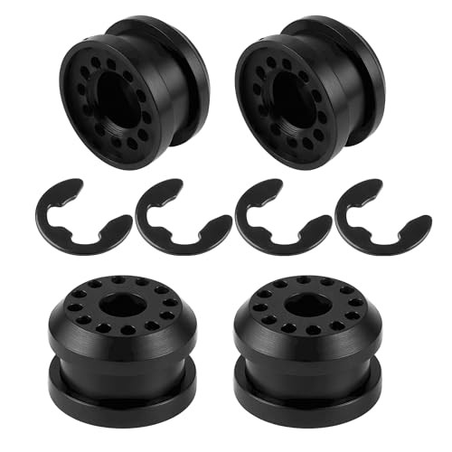
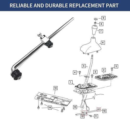
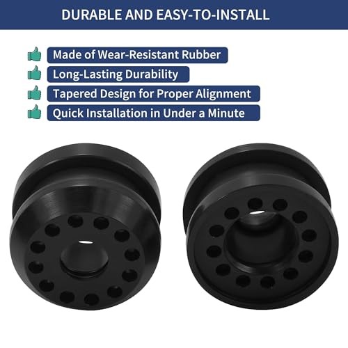
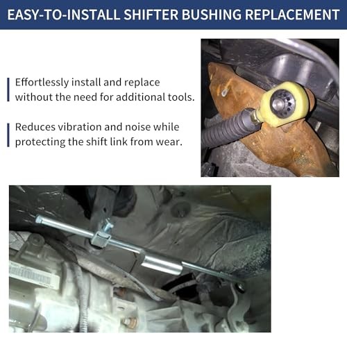
-Pack Transfer Case Shifter Linkage Control Lever Bushing Grommet with E 2
J32adnt5

“`html
* {
margin: 0;
padding: 0;
box-sizing: border-box;
}
body {
background: #f4f6fa;
font-family: ‘Heebo’, sans-serif;
padding: 2rem 1rem;
display: flex;
justify-content: center;
}
.product-card {
max-width: 1100px;
width: 100%;
background: #ffffff;
border-radius: 28px;
box-shadow: 0 20px 40px rgba(0,0,0,0.05), 0 8px 20px rgba(0,0,0,0.03);
padding: 2rem 2.5rem;
transition: all 0.2s;
}
@media (max-width: 700px) {
.product-card { padding: 1.5rem; }
}
/* breadcrumb / micro */
.breadcrumb {
font-size: 0.85rem;
color: #5e6f8d;
margin-bottom: 1.2rem;
letter-spacing: 0.2px;
}
.breadcrumb span { color: #1f2a44; font-weight: 500; }
.grid {
display: grid;
grid-template-columns: 1fr 1fr;
gap: 2.2rem;
}
@media (max-width: 780px) {
.grid { grid-template-columns: 1fr; gap: 2rem; }
}
/* image gallery */
.gallery {
display: flex;
flex-direction: column;
gap: 1rem;
}
.main-image {
background: #f0f3f9;
border-radius: 24px;
padding: 1.5rem;
display: flex;
align-items: center;
justify-content: center;
min-height: 280px;
border: 1px solid #e9edf4;
}
.main-image img {
max-width: 100%;
max-height: 260px;
object-fit: contain;
filter: drop-shadow(0 6px 12px rgba(0,0,0,0.04));
}
.thumbnails {
display: flex;
gap: 12px;
flex-wrap: wrap;
}
.thumb {
width: 72px;
height: 72px;
background: #f0f3f9;
border-radius: 14px;
border: 1px solid #e2e8f0;
display: flex;
align-items: center;
justify-content