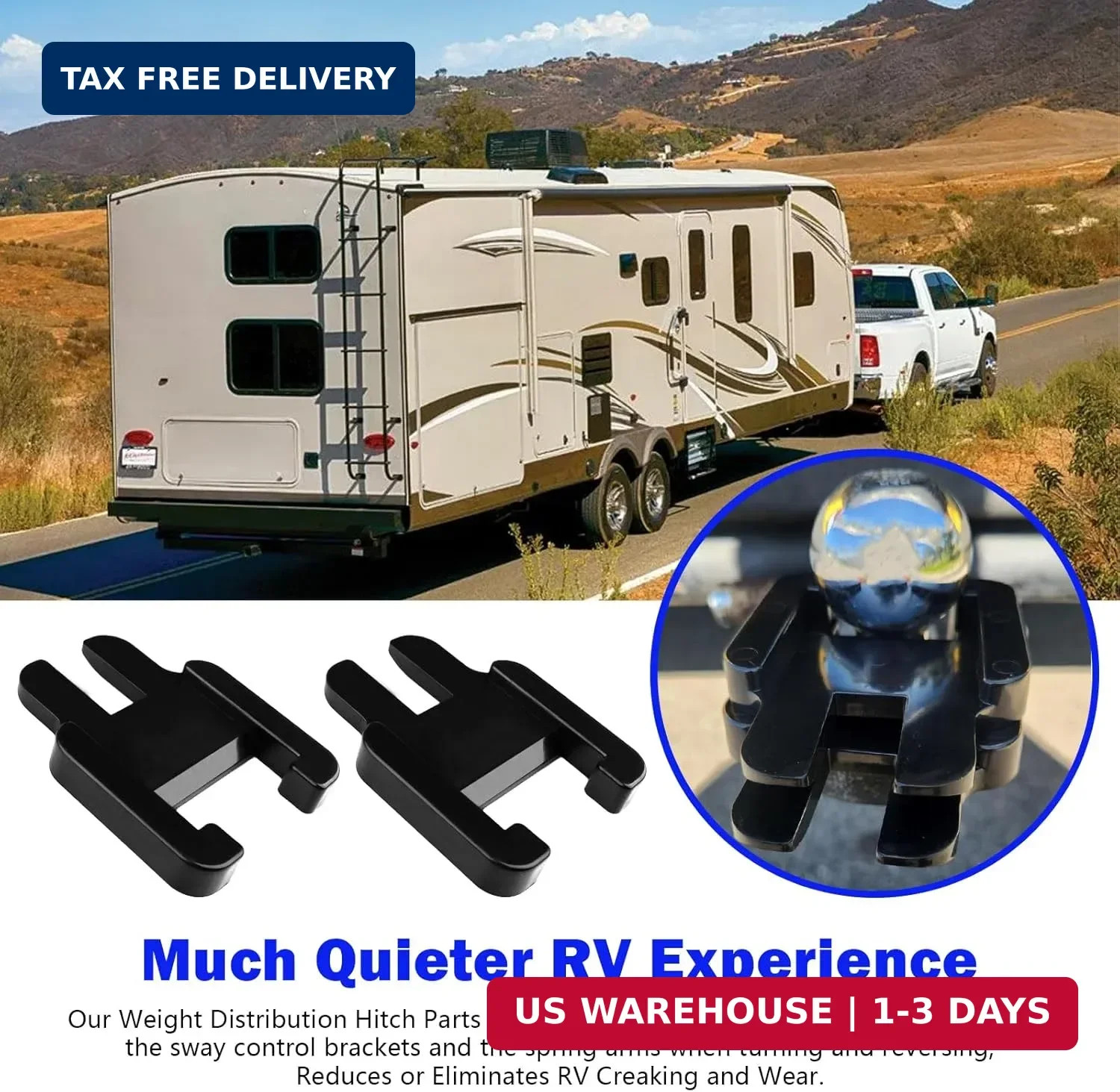
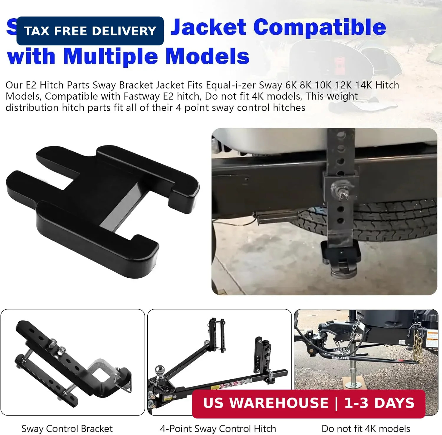
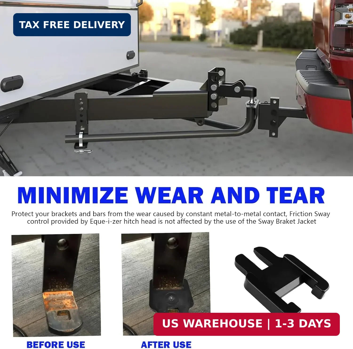
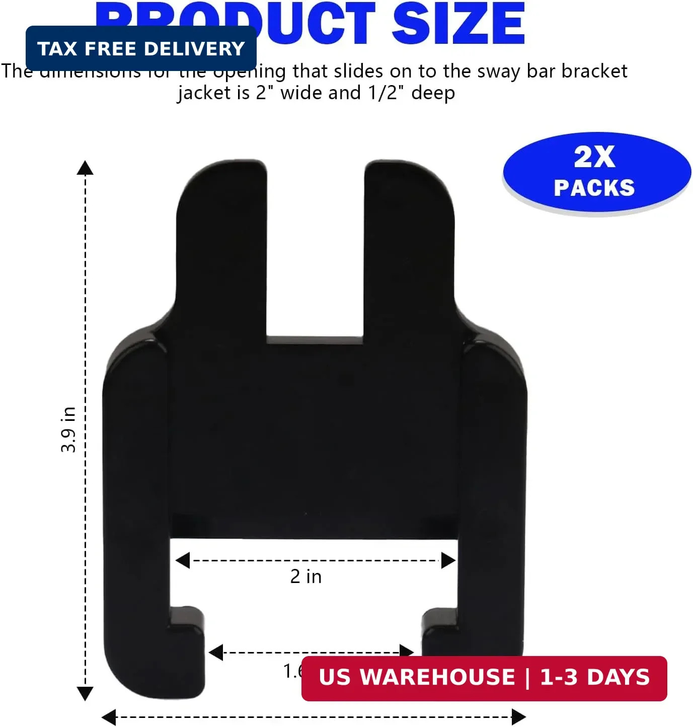
E2 Sway Bracket Jacket, Weight Distribution Hitch Parts Compatible with E2 Hitch
mTVKX5rK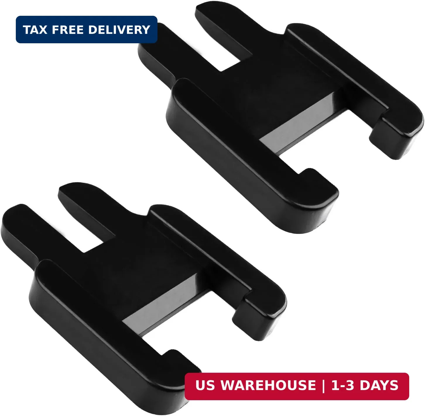
“`html
* {
margin: 0;
padding: 0;
box-sizing: border-box;
font-family: system-ui, -apple-system, ‘Segoe UI’, Roboto, ‘Helvetica Neue’, sans-serif;
}
body {
background: #f5f7fa;
display: flex;
justify-content: center;
padding: 2rem 1rem;
}
.product-card {
max-width: 1100px;
width: 100%;
background: white;
border-radius: 28px;
box-shadow: 0 20px 40px rgba(0,0,0,0.08), 0 8px 20px rgba(0,0,0,0.04);
padding: 2rem 2.5rem;
transition: all 0.2s ease;
}
/* header style (inspired by original) */
.brand-header {
background-color: #000000;
padding: 18px 20px;
text-align: center;
margin-bottom: 28px;
border: 2px solid #007bff;
border-radius: 40px;
}
.brand-header h1 {
font-size: 30px;
color: #007bff;
text-transform: uppercase;
letter-spacing: 2px;
margin-bottom: 4px;
font-weight: 700;
}
.brand-header .sub {
color: #b0c4de;
font-size: 14px;
letter-spacing: 1px;
}
.grid-2 {
display: grid;
grid-template-columns: 1fr 1fr;
gap: 2rem;
margin: 1.5rem 0 2rem 0;
}
.image-gallery {
display: flex;
flex-direction: column;
gap: 12px;
}
.main-img {
background: #f0f2f5;
border-radius: 24px;
padding: 1.5rem;
display: flex;
align-items: center;
justify-content: center;
border: 1px solid #e9edf2;
min-height: 260px;
}
.main-img img {
max-width: 100%;
max-height: 220px;
object-fit: contain;
filter: drop-shadow(0 6px 8px rgba(0,0,0,0.06));
}
.thumb-grid {
display: flex;
gap: 12px;
flex-wrap: wrap;
}
.thumb {
background: #f8fafc;
border-radius: 16px;
padding: 8px;
border: 1px solid #e2e8f0;
width: 80px;
height: 80px;
display: flex;
align-items: center;
justify-content: center;
transition: 0.2s;
}
.thumb img {
max-width: 100%;
max-height: 64px;
object-fit: contain;
}
.thumb:hover {
border-color