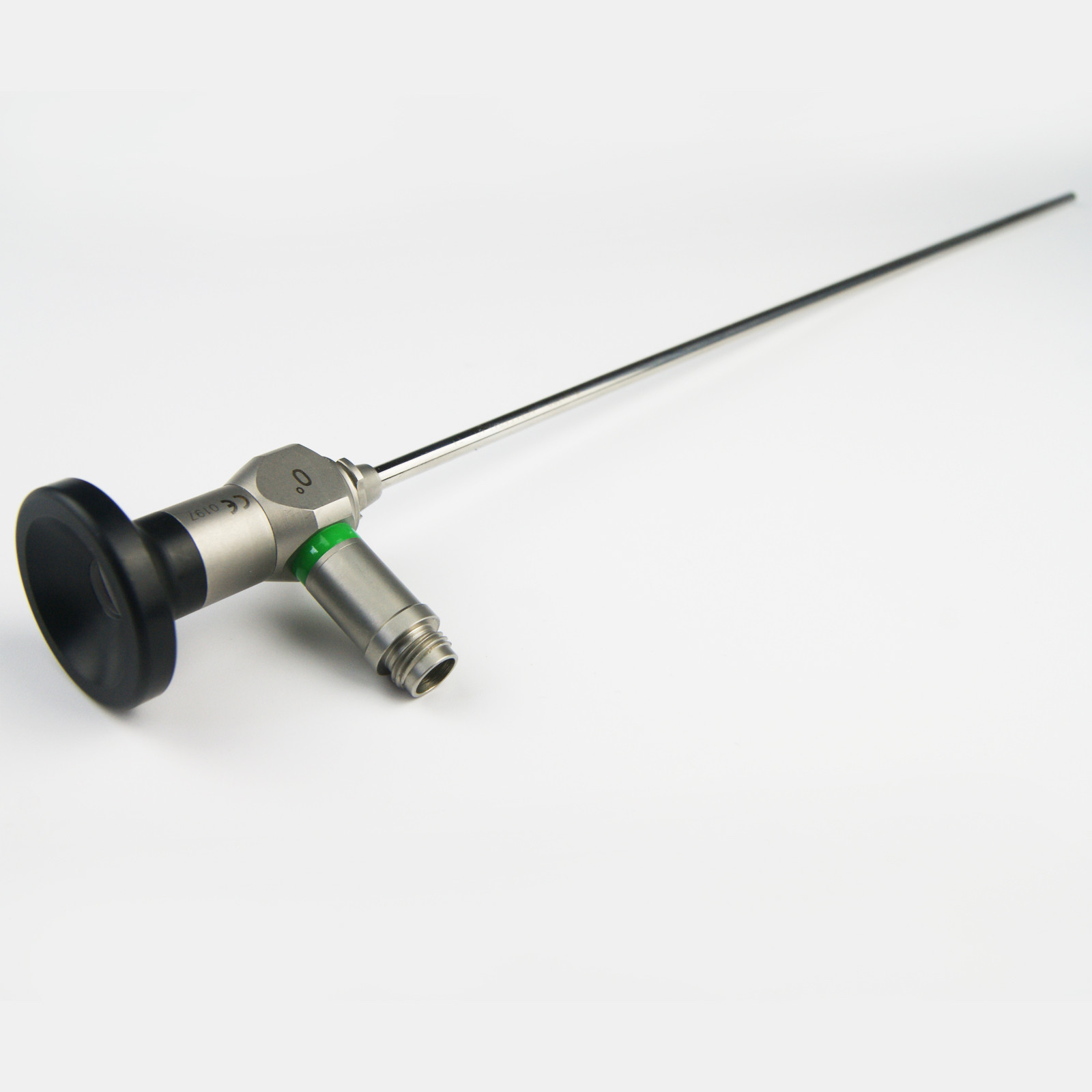
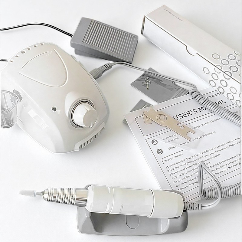
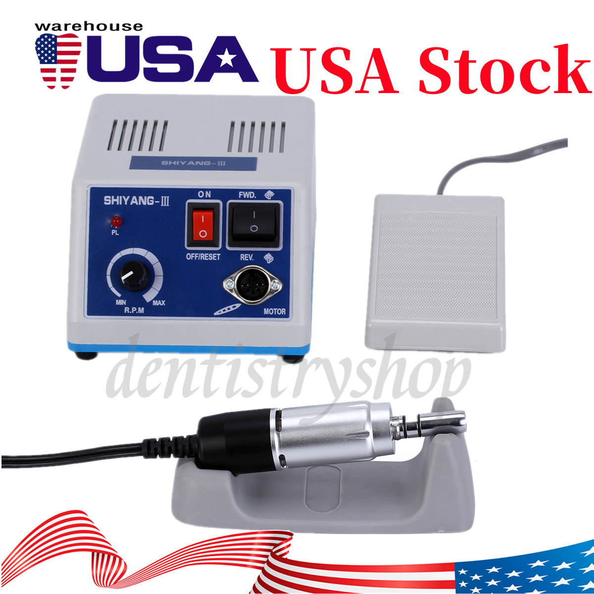
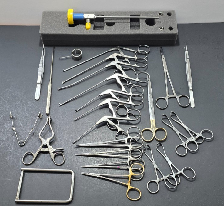
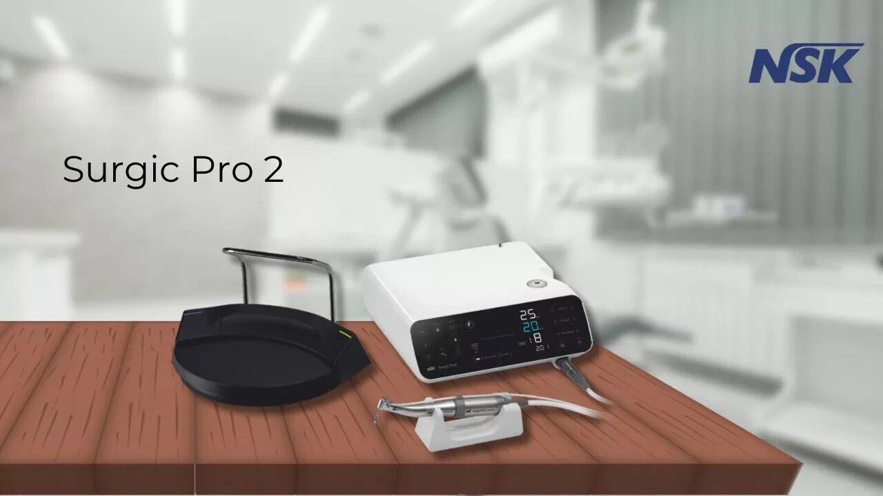
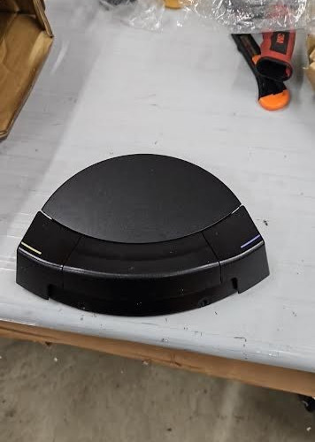
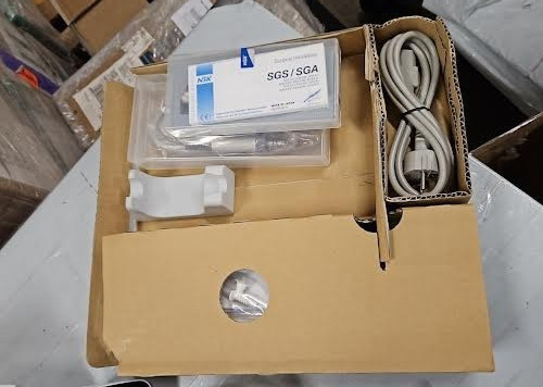
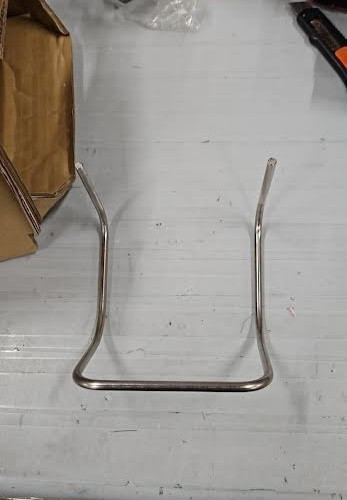
NSK Surgic pro 2 Optic With SGA E2S Handpiece
bqPDU3tQ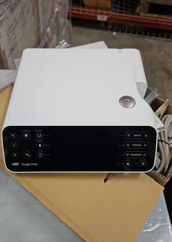
“`html
body {
font-family: ‘Segoe UI’, Roboto, Helvetica, Arial, sans-serif;
background: #f8f9fa;
margin: 0;
padding: 20px;
color: #222;
}
.product-container {
max-width: 1100px;
margin: 0 auto;
background: #fff;
border-radius: 16px;
box-shadow: 0 8px 24px rgba(0,0,0,0.08);
padding: 30px 35px;
}
.product-title {
font-size: 2rem;
font-weight: 600;
margin: 0 0 10px 0;
color: #111;
}
.brand-badge {
display: inline-block;
background: #0056a7;
color: white;
padding: 4px 14px;
border-radius: 30px;
font-size: 0.85rem;
font-weight: 500;
letter-spacing: 0.3px;
margin-bottom: 15px;
}
.price-area {
font-size: 2.2rem;
font-weight: 700;
color: #1a3c5e;
margin: 15px 0 10px;
}
.condition-tag {
background: #e9ecef;
padding: 6px 16px;
border-radius: 30px;
font-size: 0.9rem;
display: inline-block;
margin-bottom: 20px;
}
.gallery {
display: flex;
flex-wrap: wrap;
gap: 15px;
margin: 25px 0;
}
.gallery img {
max-width: 100%;
height: auto;
border-radius: 12px;
box-shadow: 0 2px 8px rgba(0,0,0,0.06);
border: 1px solid #e9ecef;
flex: 1 1 180px;
object-fit: cover;
}
.gallery img:first-child {
flex: 1 1 100%;
max-height: 380px;
object-fit: contain;
background: #f1f3f5;
}
.grid-2 {
display: grid;
grid-template-columns: 1fr 1fr;
gap: 30px;
margin: 30px 0;
}
@media (max-width: 700px) {
.grid-2 {
grid-template-columns: 1fr;
}
}
.specs-table {
width: 100%;
border-collapse: collapse;
background: #f8f9fa;
border-radius: 12px;
overflow: hidden;
}
.specs-table th, .specs-table td {
padding: 12px 16px;
text-align: left;
border-bottom: 1px solid #dee2e6;
}
.specs-table th {
background: #e9ecef;
font