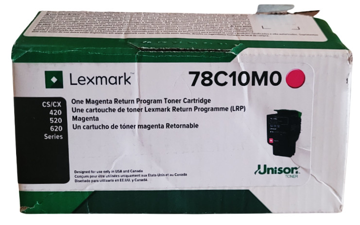
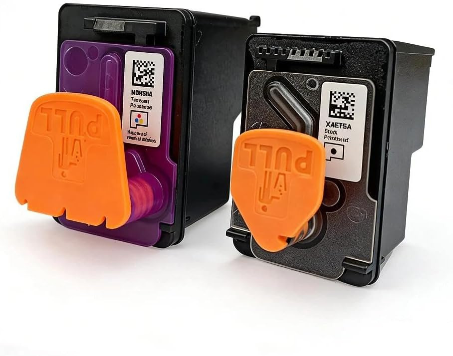
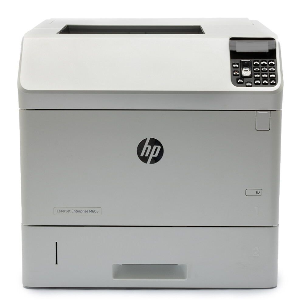
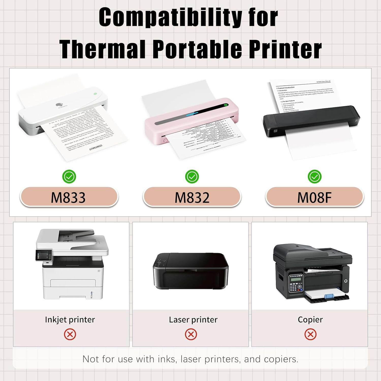
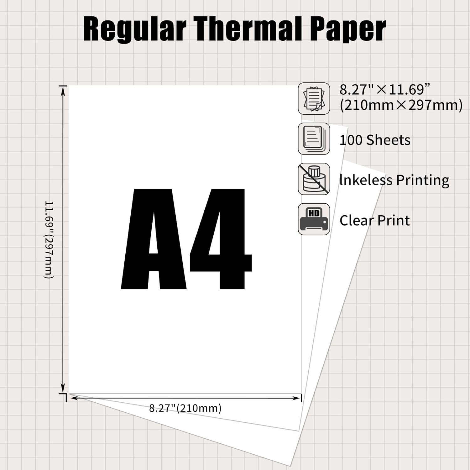
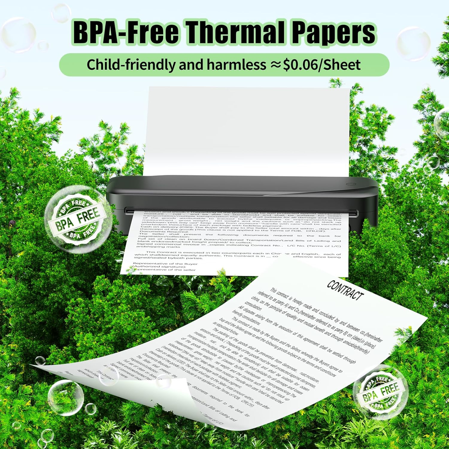
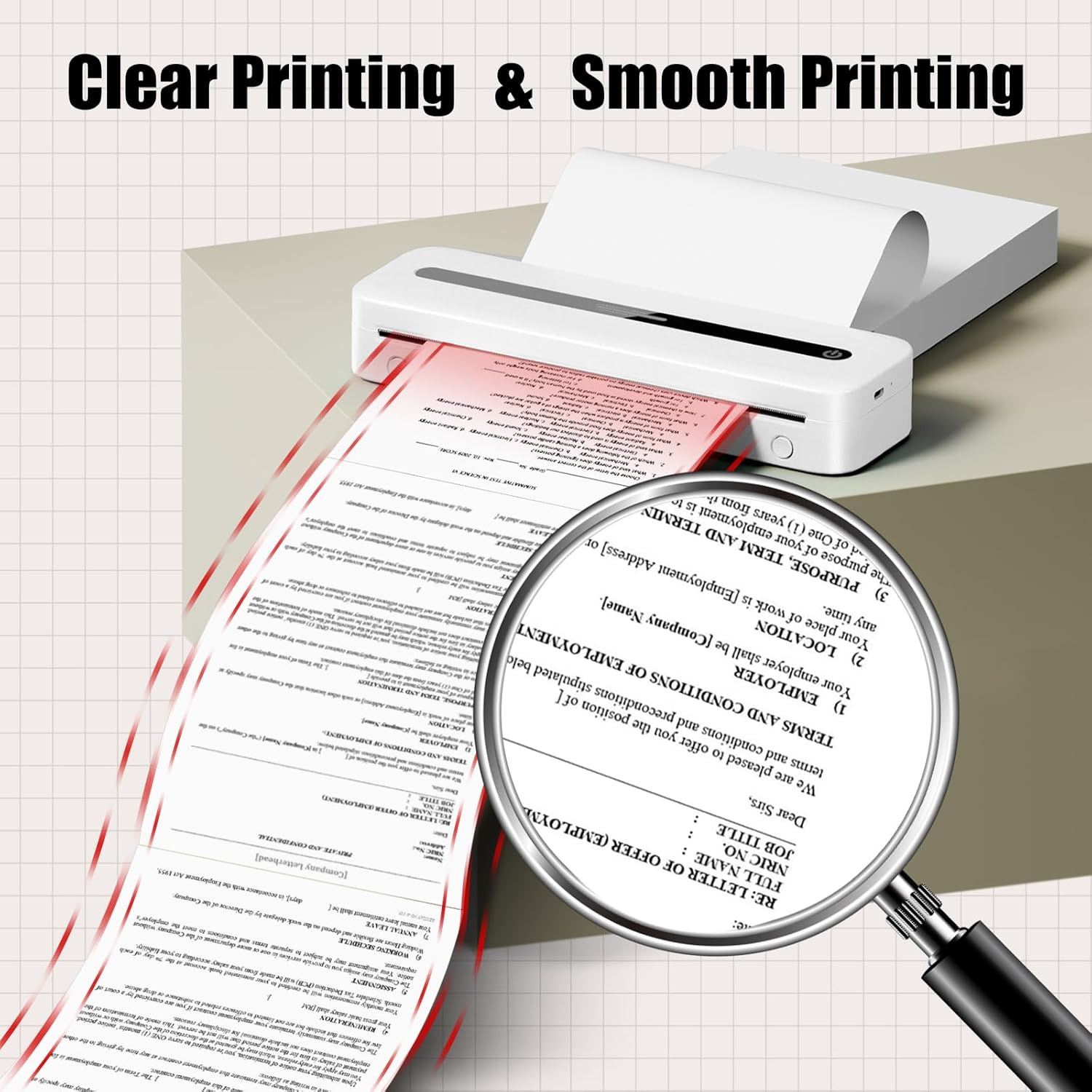
A4 Thermal Paper, Thermal Printer Paper for Portable Printer, Compatible with M0
yFEKQdqV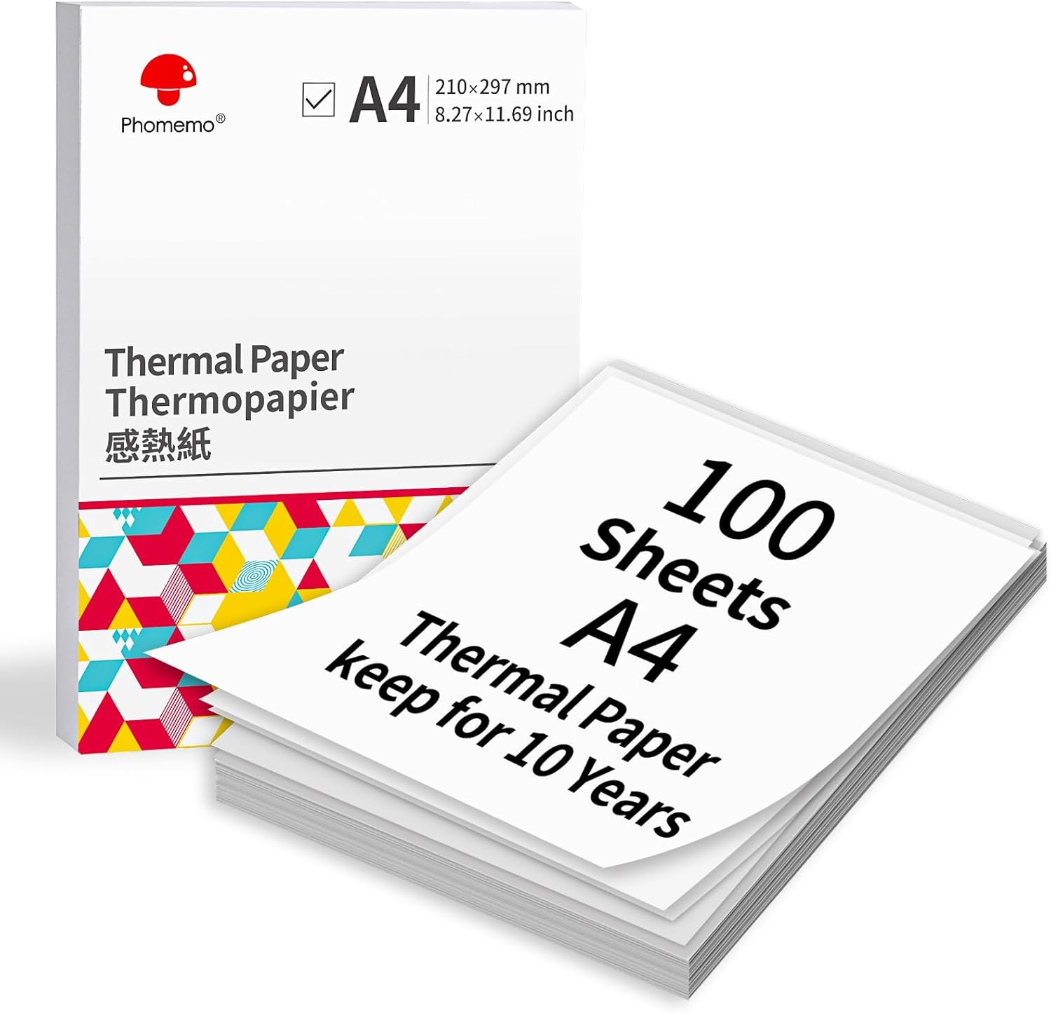
“`html
body {
font-family: system-ui, -apple-system, ‘Segoe UI’, Roboto, ‘Helvetica Neue’, sans-serif;
background: #f8fafc;
margin: 0;
padding: 2rem 1rem;
display: flex;
justify-content: center;
}
.product-card {
max-width: 1100px;
width: 100%;
background: white;
border-radius: 24px;
box-shadow: 0 20px 40px rgba(0,0,0,0.05), 0 8px 16px rgba(0,0,0,0.03);
padding: 2rem 2.5rem;
transition: all 0.2s ease;
}
@media (max-width: 600px) {
.product-card { padding: 1.25rem; }
}
.gallery {
display: flex;
flex-wrap: wrap;
gap: 1.5rem;
margin-bottom: 2rem;
align-items: center;
}
.gallery img {
max-width: 100%;
height: auto;
border-radius: 16px;
background: #f1f5f9;
box-shadow: 0 4px 12px rgba(0,0,0,0.02);
}
.main-img {
flex: 2 1 300px;
}
.thumbnails {
display: flex;
gap: 0.75rem;
flex-wrap: wrap;
flex: 1 1 140px;
}
.thumbnails img {
width: 70px;
height: 70px;
object-fit: cover;
border-radius: 12px;
cursor: default;
border: 1px solid #e9eef3;
}
.price-badge {
display: inline-block;
background: #0b2b3c;
color: white;
font-weight: 600;
font-size: 1.8rem;
padding: 0.3rem 1.2rem;
border-radius: 40px;
letter-spacing: -0.01em;
margin: 0.5rem 0 1rem 0;
}
h1 {
font-size: 2rem;
font-weight: 600;
margin: 0 0 0.25rem 0;
line-height: 1.2;
color: #0b1e2b;
}
.subhead {
color: #2c3e50;
font-size: 1rem;
border-bottom: 1px solid #e2e8f0;
padding-bottom: 0.75rem;
margin-bottom: 1.5rem;
}
.specs-grid {
display: grid;
grid-template-columns: repeat(auto-fill, minmax(200px, 1fr));
gap: 0.75rem 1.5rem;
background: #f9fcff;
padding: 1.25rem 1.5rem;
border-radius: 20px;
margin