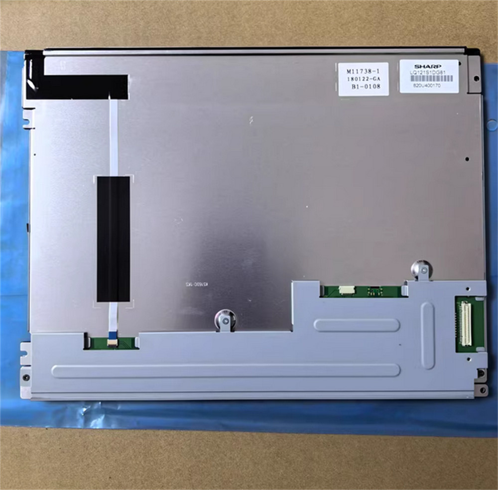
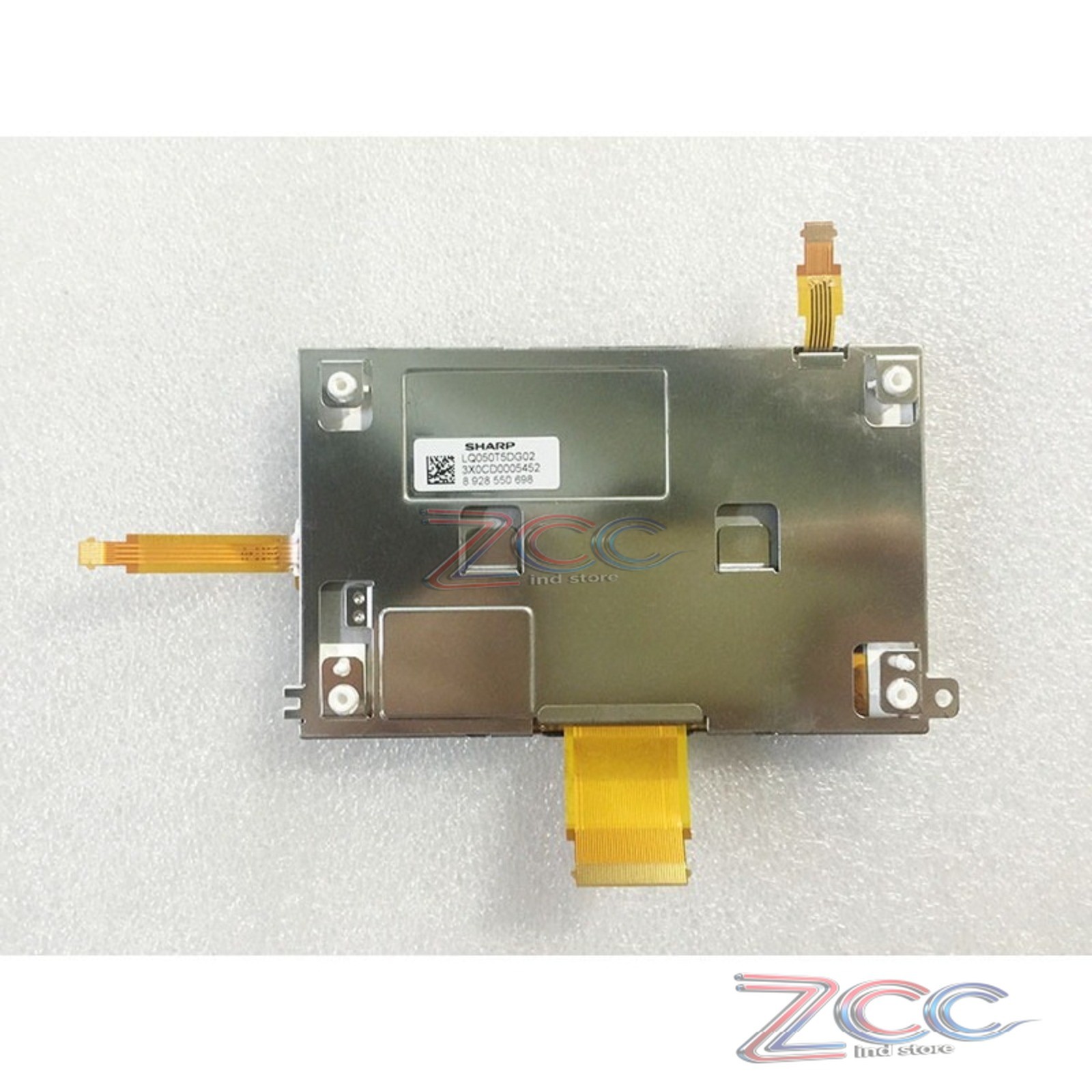
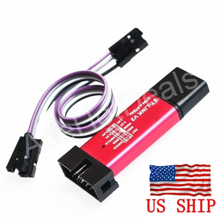
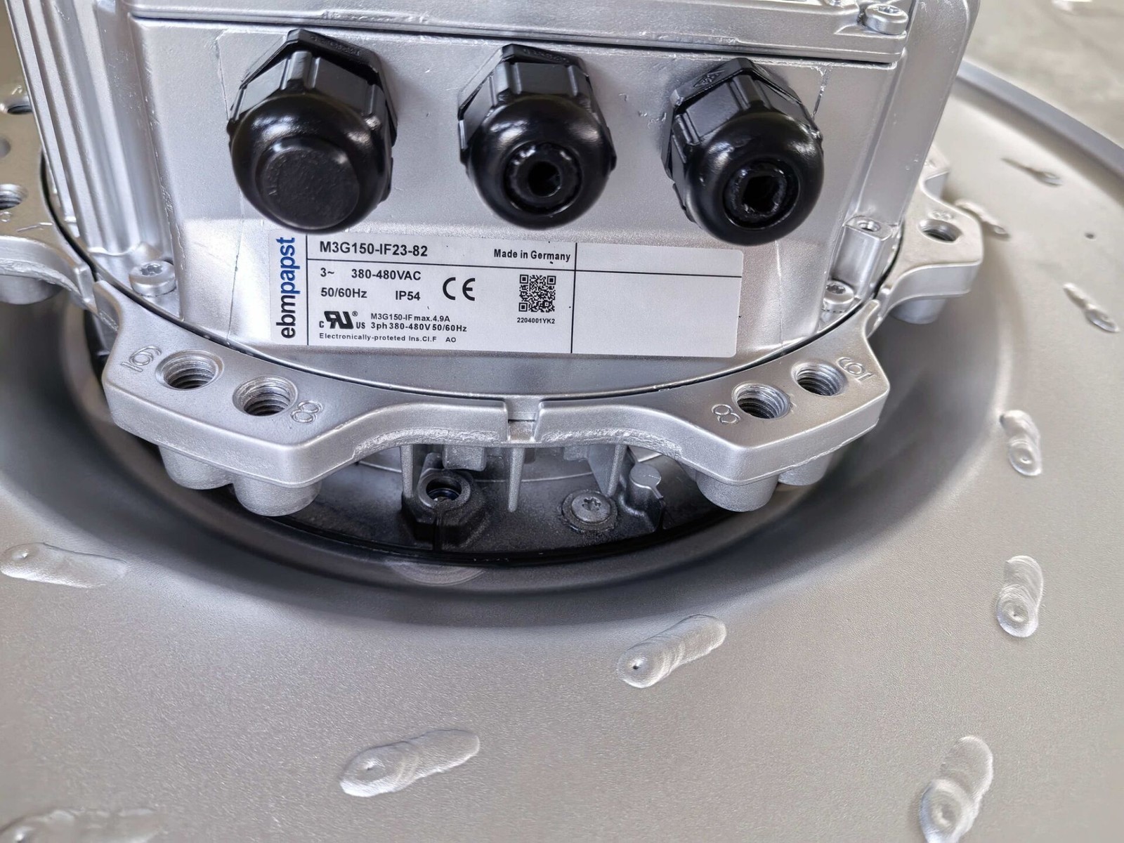
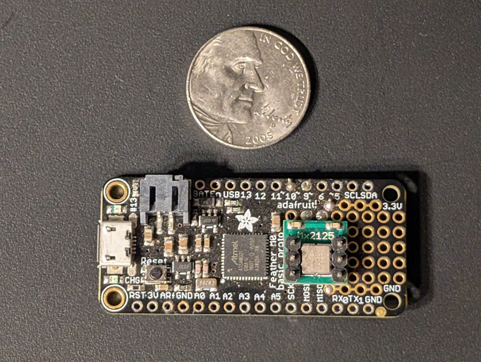
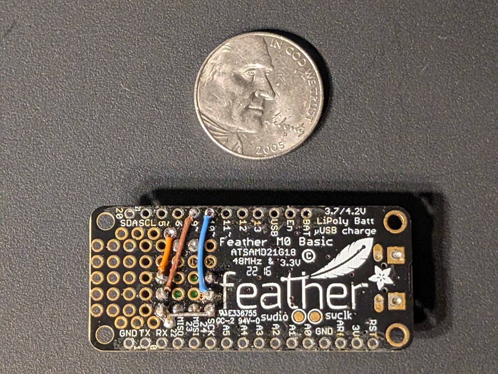
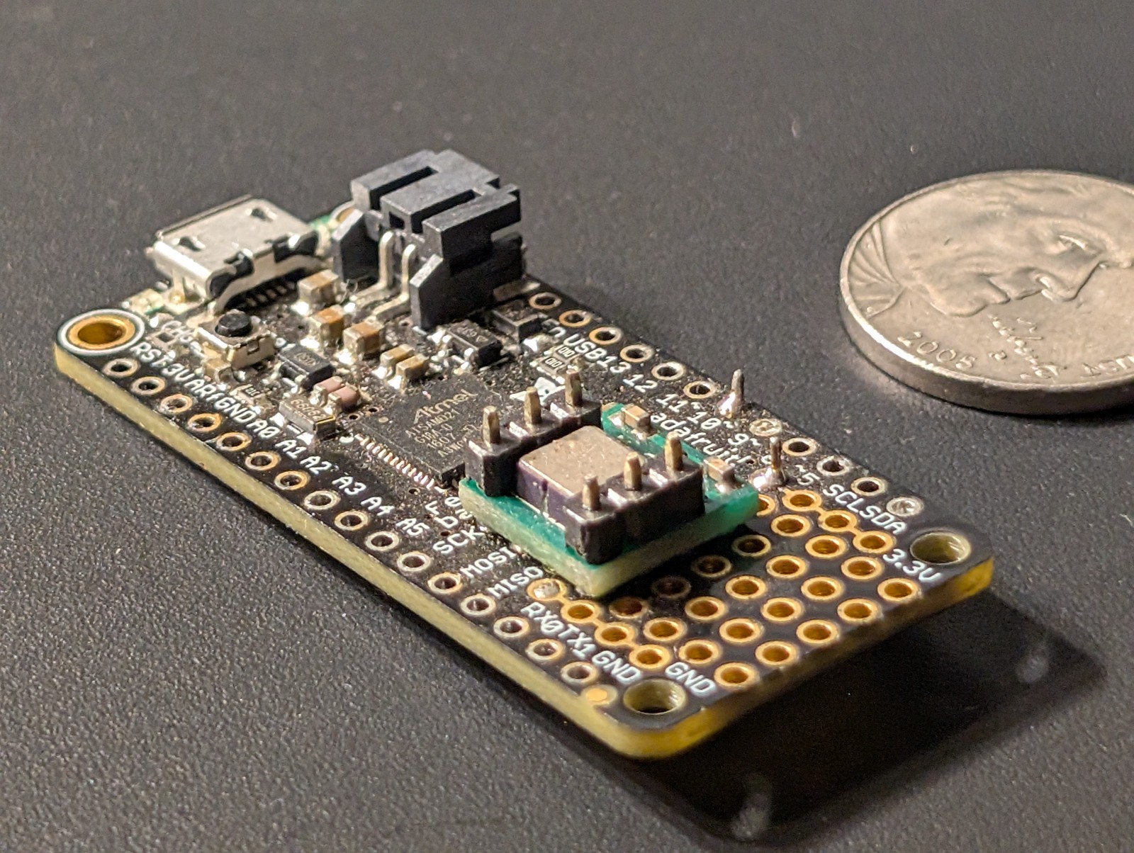
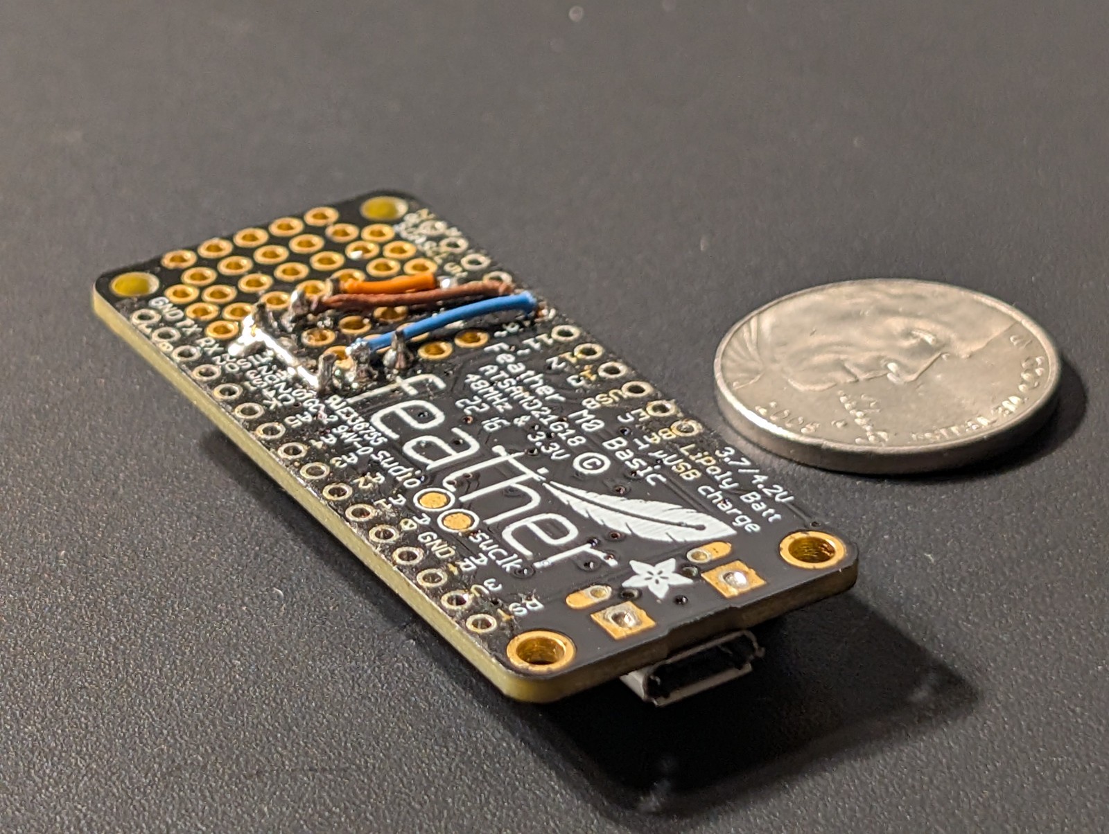
Adafruit Feather M0 Microcontroller With MEMSIC 2125 Accelerometer
0Bs3dsvu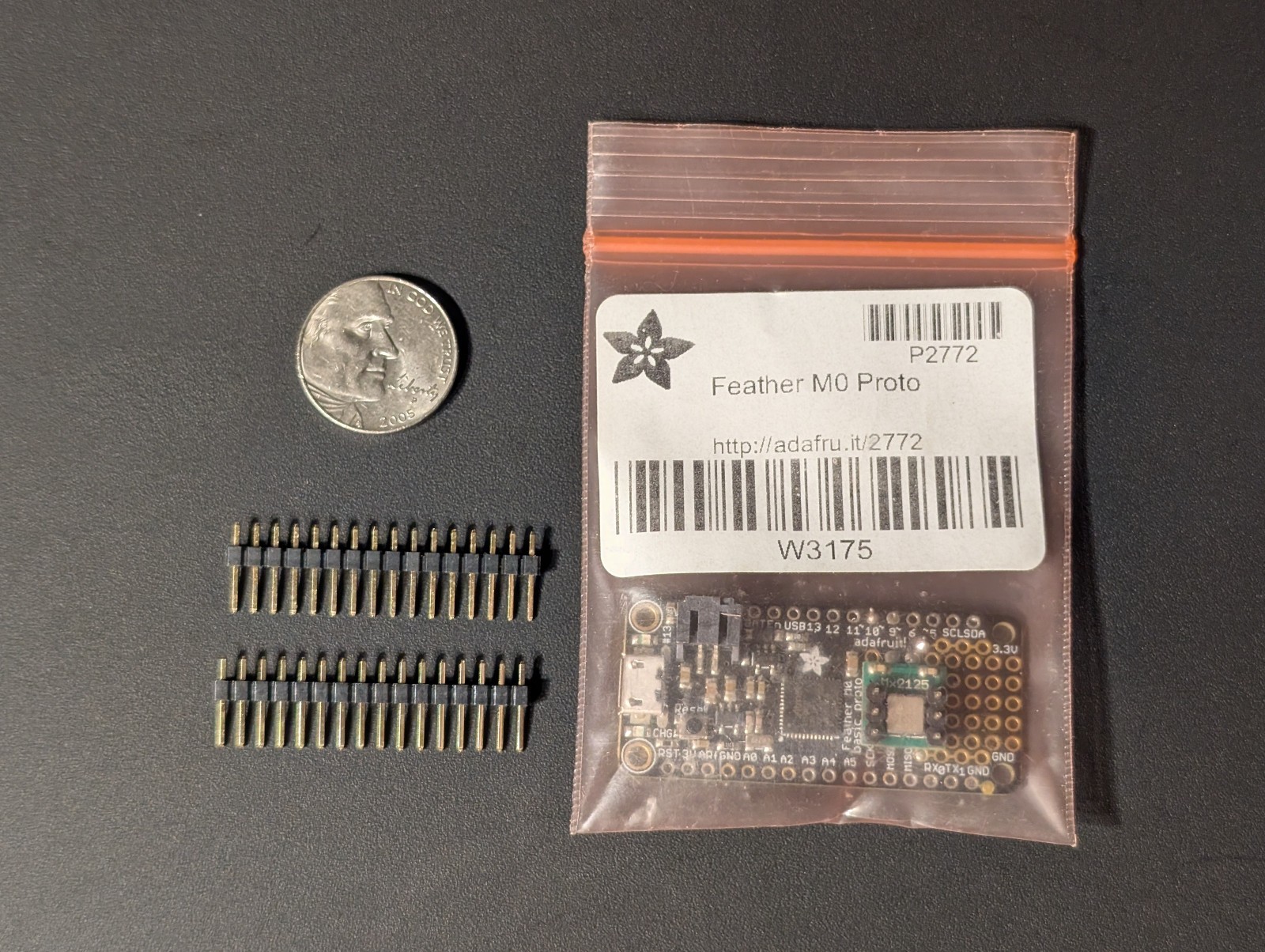
“`html
* {
margin: 0;
padding: 0;
box-sizing: border-box;
}
body {
font-family: system-ui, -apple-system, ‘Segoe UI’, Roboto, ‘Helvetica Neue’, sans-serif;
background: #f5f7fa;
display: flex;
justify-content: center;
padding: 2rem 1rem;
line-height: 1.5;
color: #1e293b;
}
.product-card {
max-width: 1100px;
width: 100%;
background: white;
border-radius: 24px;
box-shadow: 0 20px 40px rgba(0,0,0,0.08), 0 8px 20px rgba(0,0,0,0.04);
padding: 2rem 2.5rem;
transition: all 0.2s;
}
@media (max-width: 700px) {
.product-card { padding: 1.5rem; }
}
.gallery {
display: flex;
flex-wrap: wrap;
gap: 1.2rem;
margin-bottom: 2rem;
align-items: center;
}
.gallery img {
max-width: 100%;
height: auto;
border-radius: 18px;
box-shadow: 0 4px 12px rgba(0,0,0,0.06);
background: #f0f2f5;
object-fit: cover;
border: 1px solid #e9edf2;
}
.gallery-main {
flex: 2 1 320px;
}
.gallery-main img {
width: 100%;
max-height: 360px;
object-fit: contain;
background: #f8fafc;
}
.gallery-thumbs {
display: flex;
flex: 1 1 160px;
gap: 0.8rem;
flex-wrap: wrap;
}
.gallery-thumbs img {
width: 80px;
height: 80px;
object-fit: cover;
border-radius: 14px;
cursor: default;
border: 1px solid #dee4ec;
}
.product-title {
font-size: 1.9rem;
font-weight: 600;
letter-spacing: -0.02em;
margin-bottom: 0.25rem;
color: #0f172a;
}
.brand-sub {
display: flex;
align-items: center;
gap: 0.75rem;
flex-wrap: wrap;
margin-bottom: 1.2rem;
}
.brand-badge {
background: #eef2f6;
padding: 0.2rem 1rem;
border-radius: 40px;
font-size: 0.85rem;
font-weight: 500;
color: #1e293b;
}
.condition-badge