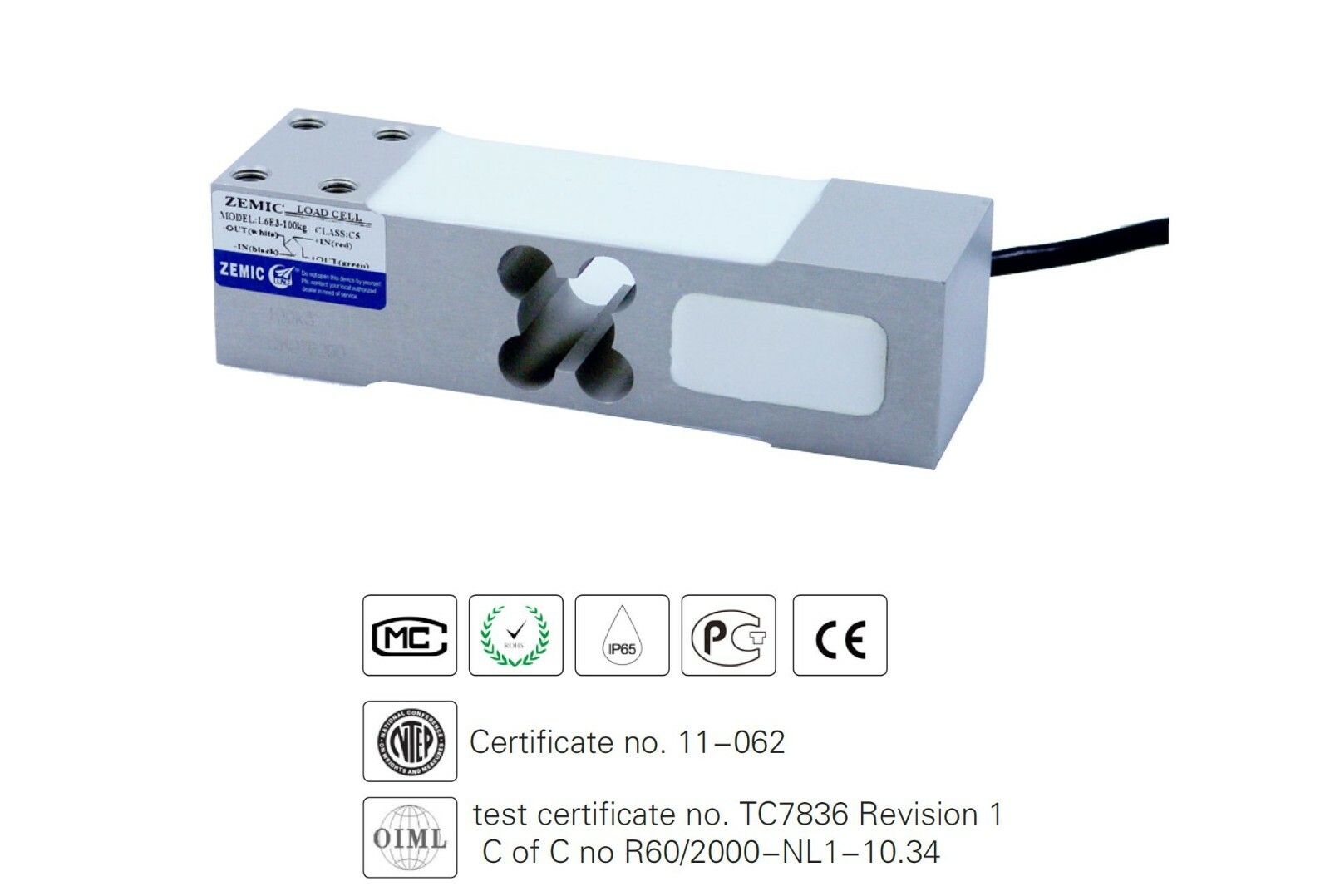
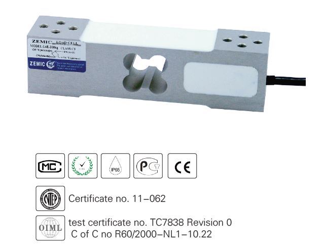
SAMD21 M0-Mini 32-bit ARM Cortex M0 core, Compatible with Arduino Zero M0
vq86vhsu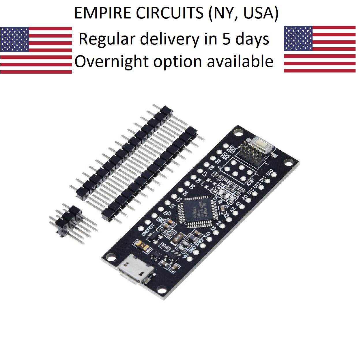
“`html
* {
margin: 0;
padding: 0;
box-sizing: border-box;
}
body {
font-family: system-ui, -apple-system, ‘Segoe UI’, Roboto, ‘Helvetica Neue’, sans-serif;
background: #f5f7fa;
display: flex;
justify-content: center;
padding: 2rem 1rem;
}
.product-card {
max-width: 1100px;
width: 100%;
background: white;
border-radius: 28px;
box-shadow: 0 20px 40px rgba(0,0,0,0.08), 0 8px 20px rgba(0,0,0,0.04);
padding: 2rem 2.5rem;
transition: all 0.2s;
}
@media (max-width: 600px) {
.product-card { padding: 1.5rem 1rem; }
}
.product-grid {
display: flex;
flex-wrap: wrap;
gap: 2rem;
margin-bottom: 2rem;
}
.gallery {
flex: 1 1 380px;
min-width: 280px;
}
.gallery-main {
background: #f0f2f5;
border-radius: 24px;
padding: 1.5rem;
display: flex;
justify-content: center;
align-items: center;
min-height: 260px;
margin-bottom: 1rem;
}
.gallery-main img {
max-width: 100%;
height: auto;
display: block;
filter: drop-shadow(0 6px 10px rgba(0,0,0,0.05));
}
.gallery-thumbs {
display: flex;
gap: 12px;
flex-wrap: wrap;
}
.gallery-thumbs img {
width: 72px;
height: 72px;
object-fit: cover;
border-radius: 16px;
background: #f0f2f5;
padding: 6px;
cursor: default;
border: 2px solid transparent;
transition: border 0.15s;
}
.gallery-thumbs img:hover {
border-color: #2b6f9c;
}
.product-info {
flex: 1 1 380px;
min-width: 260px;
}
h1 {
font-size: 1.9rem;
font-weight: 600;
letter-spacing: -0.02em;
color: #0b1a2a;
margin-bottom: 0.4rem;
line-height: 1.2;
}
.brand-badge {
display: inline-block;
background: #e6edf4;
color: #1f4a6e;
font-size: 0.8rem;
font-weight: 500;
padding: 0.2rem 1rem;
border-radius: 40px;
margin: 0.25rem 0 0.75rem