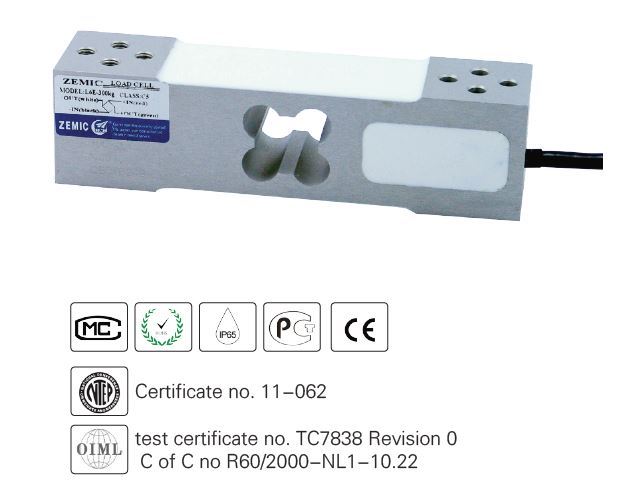
4-20mA 0-5V 0-10V RS485 Load Cell Amplifier Transmitter with Display Instrument
kMqhVHqj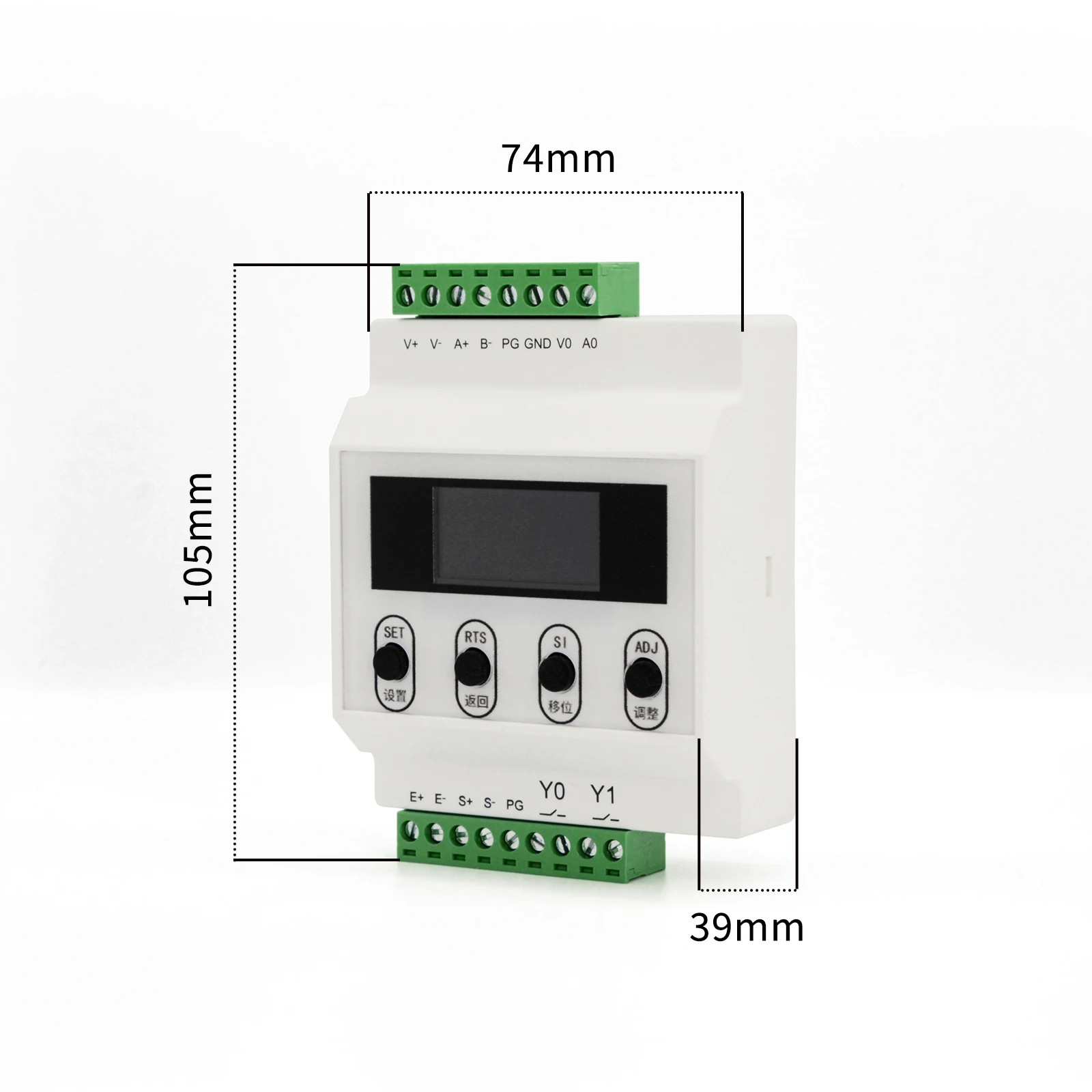
“`html
body {
font-family: system-ui, -apple-system, ‘Segoe UI’, Roboto, ‘Helvetica Neue’, sans-serif;
background: #f5f7fa;
margin: 0;
padding: 20px;
display: flex;
justify-content: center;
}
.product-card {
max-width: 1100px;
width: 100%;
background: white;
border-radius: 24px;
box-shadow: 0 12px 30px rgba(0,0,0,0.08);
padding: 30px 35px;
transition: 0.2s;
}
h1, h2, h3 {
font-weight: 600;
margin-top: 0;
}
h1 {
font-size: 1.9rem;
margin-bottom: 0.25rem;
color: #0b1a2e;
}
.brand-sub {
color: #4a5b6e;
font-size: 0.95rem;
margin-bottom: 1.5rem;
border-bottom: 1px solid #e9edf2;
padding-bottom: 0.75rem;
}
.grid-2col {
display: grid;
grid-template-columns: 1fr 1fr;
gap: 30px;
margin: 25px 0 20px;
}
.image-gallery {
display: flex;
flex-direction: column;
gap: 12px;
}
.main-img {
background: #f0f3f8;
border-radius: 20px;
padding: 20px;
display: flex;
align-items: center;
justify-content: center;
min-height: 260px;
border: 1px solid #e2e8f0;
}
.main-img img {
max-width: 100%;
max-height: 240px;
object-fit: contain;
}
.thumb-grid {
display: flex;
gap: 12px;
flex-wrap: wrap;
}
.thumb-item {
background: #f0f3f8;
border-radius: 14px;
padding: 8px;
border: 1px solid #e2e8f0;
width: 70px;
height: 70px;
display: flex;
align-items: center;
justify-content: center;
cursor: default;
}
.thumb-item img {
max-width: 100%;
max-height: 100%;
object-fit: contain;
}
.price-area {
background: #f9fafc;
border-radius: 20px;
padding: 20px 25px;
border: 1px solid #e9edf2;
}
.price {
font-size: 2.2rem;
font-weight: 700;
color: #0b1a2e;
letter-spacing: -0.5px;
}
.price small {
font-size: 1rem;