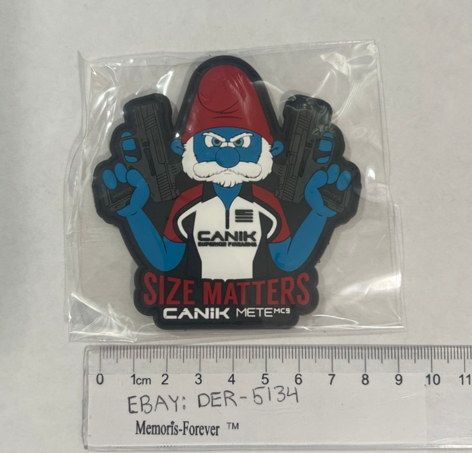
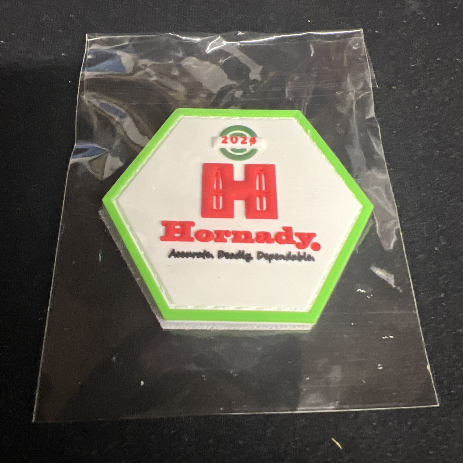
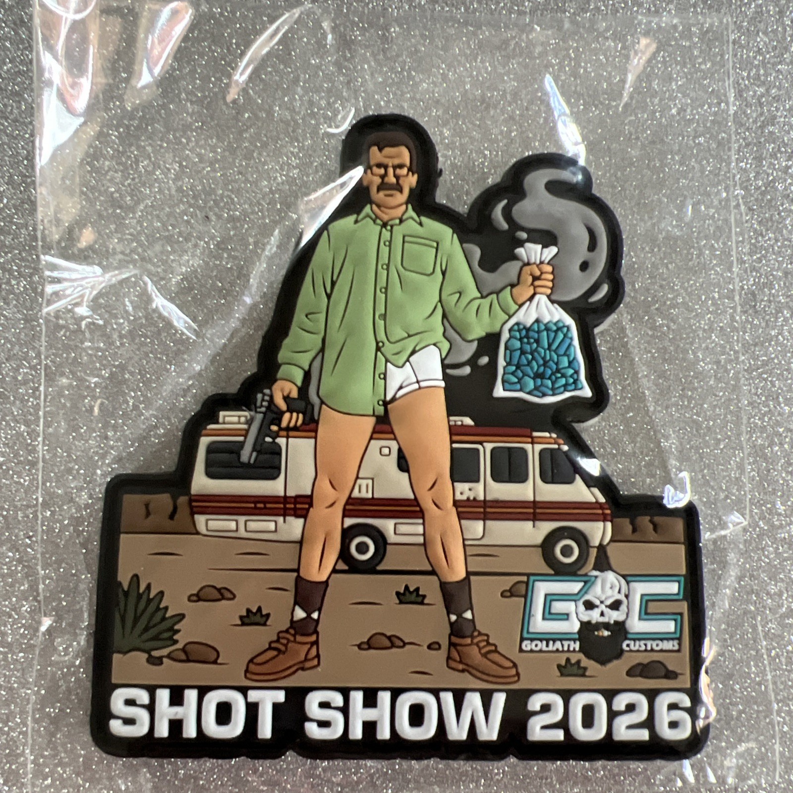
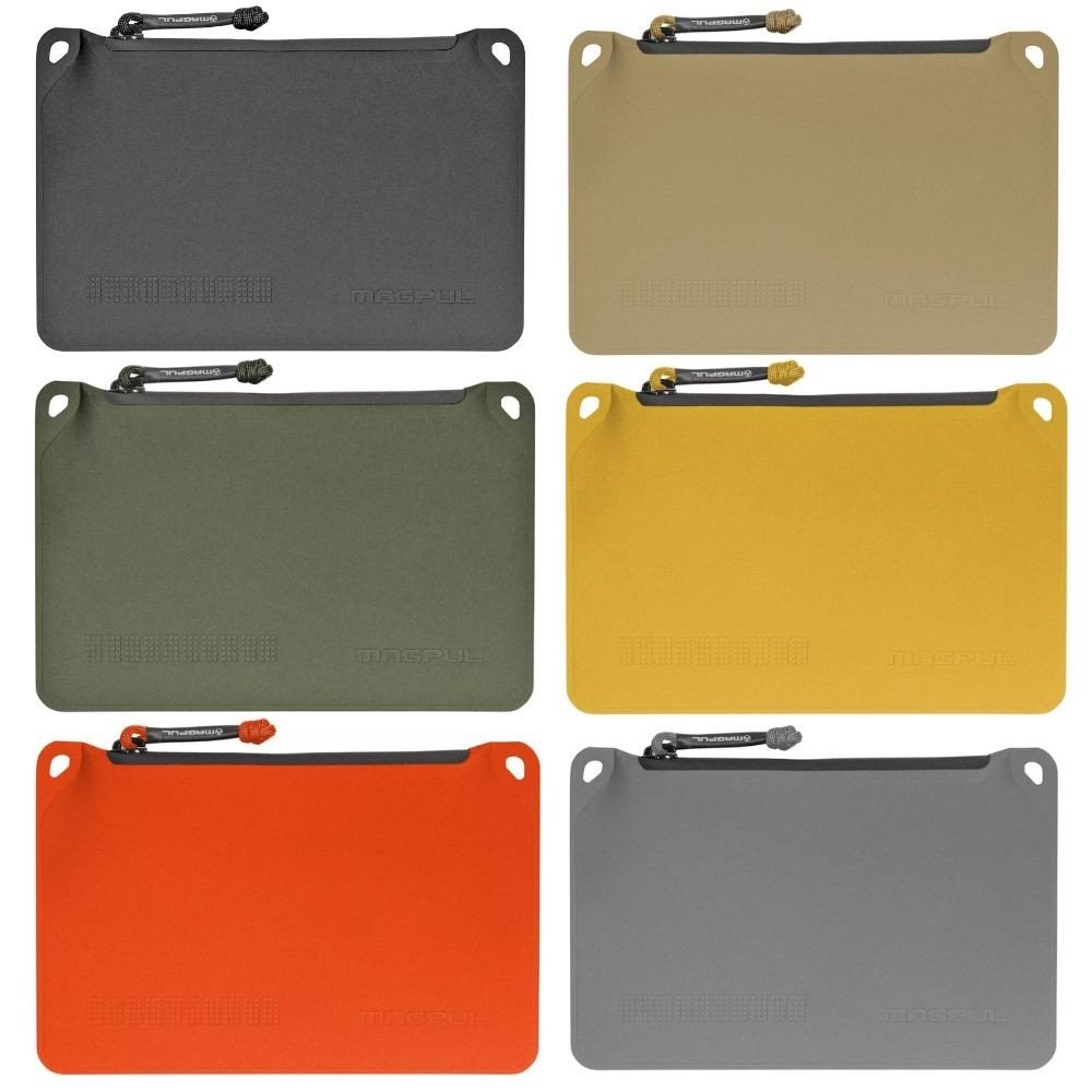
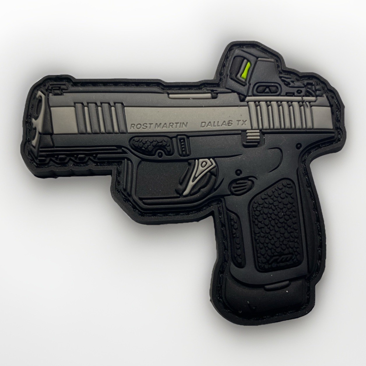
2026 shot show patch
xlVeIvqb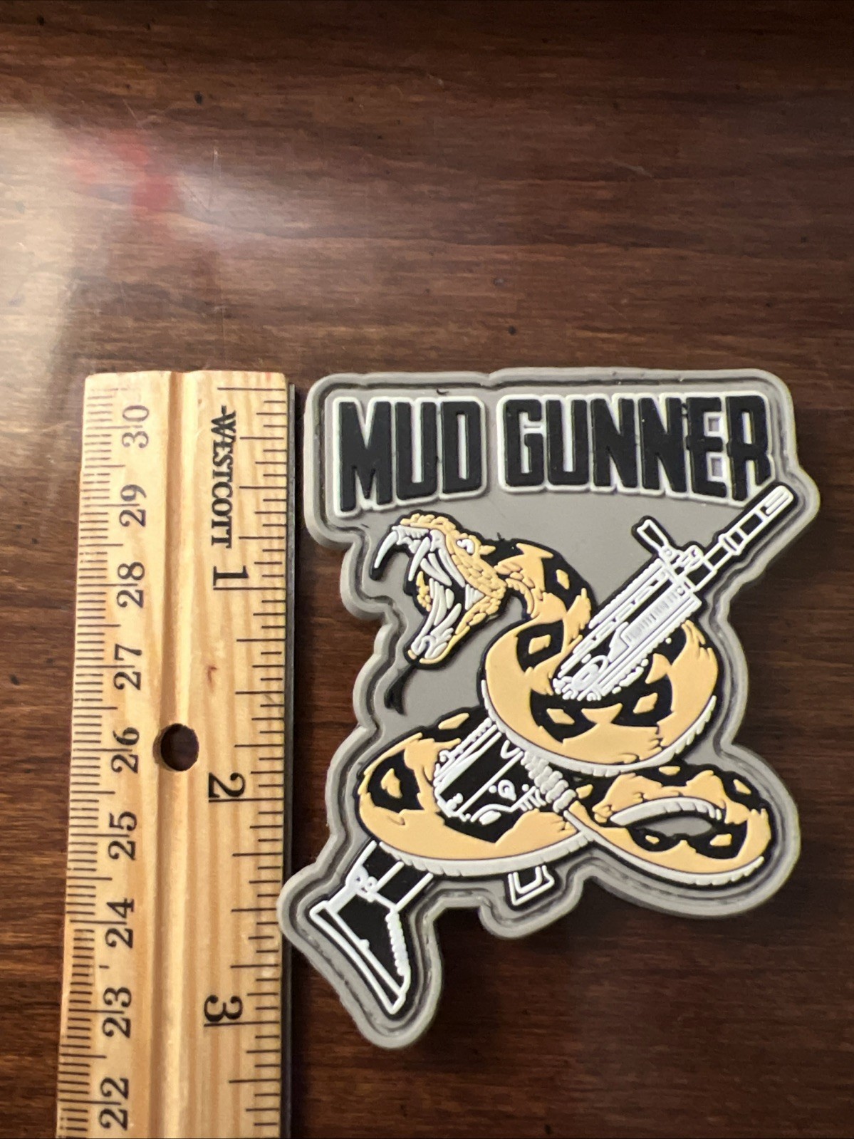
“`html
body {
font-family: ‘Inter’, system-ui, -apple-system, BlinkMacSystemFont, ‘Segoe UI’, Roboto, sans-serif;
background: #f5f7fa;
margin: 0;
padding: 2rem 1rem;
display: flex;
justify-content: center;
}
.product-card {
max-width: 1100px;
width: 100%;
background: white;
border-radius: 28px;
box-shadow: 0 20px 40px rgba(0,0,0,0.08), 0 6px 12px rgba(0,0,0,0.05);
padding: 2rem 2.5rem;
transition: all 0.2s ease;
}
@media (max-width: 600px) {
.product-card { padding: 1.5rem; }
}
.gallery {
display: flex;
flex-wrap: wrap;
gap: 1rem;
margin-bottom: 2rem;
justify-content: center;
}
.gallery img {
width: 180px;
height: 180px;
object-fit: cover;
border-radius: 20px;
box-shadow: 0 4px 12px rgba(0,0,0,0.08);
transition: transform 0.2s;
background: #f0f2f5;
}
.gallery img:hover { transform: scale(1.02); }
.gallery-item {
display: flex;
flex-direction: column;
align-items: center;
}
.gallery-item span {
font-size: 0.75rem;
color: #5e6f8d;
margin-top: 6px;
font-weight: 500;
}
h1 {
font-size: 2.2rem;
font-weight: 600;
margin: 0 0 0.25rem 0;
color: #0b1a2e;
letter-spacing: -0.02em;
}
.brand-sub {
color: #3a4b66;
font-weight: 500;
font-size: 1rem;
margin-bottom: 1.2rem;
display: flex;
align-items: center;
gap: 0.75rem;
}
.brand-sub span {
background: #eef2f7;
padding: 0.2rem 0.8rem;
border-radius: 40px;
font-size: 0.8rem;
color: #1f2a44;
}
.price-block {
background: #f0f4fe;
padding: 0.8rem 1.5rem;
border-radius: 60px;
display: inline-block;
font-size: 1.8rem;
font-weight: 700;
color: #0b2b4f;
margin: 0.5rem 0 1.5rem 0;
border: 1px solid #d9e2f0;
}
.price-block small {
font-size: 1rem;
font-weight: 400