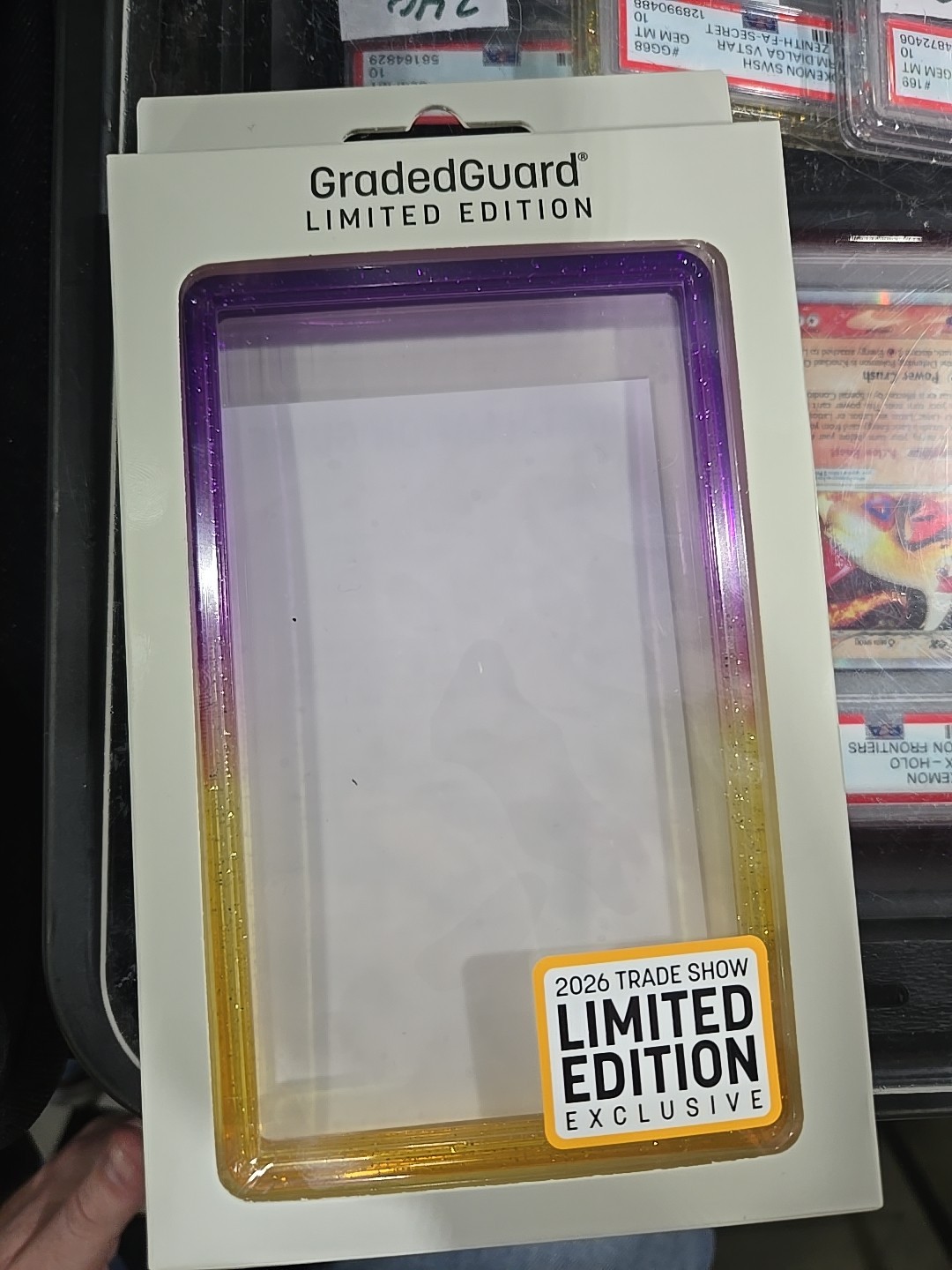
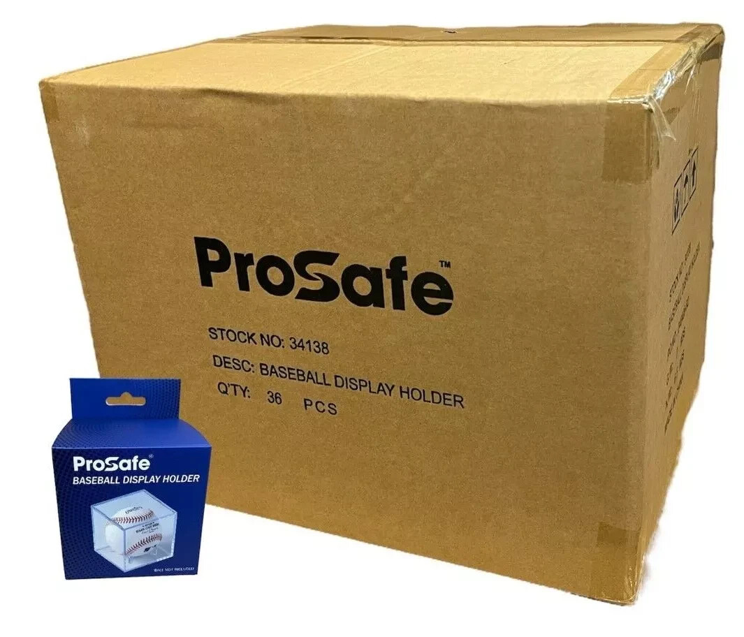
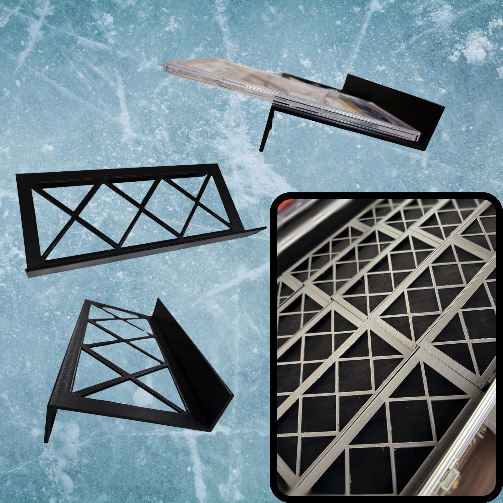
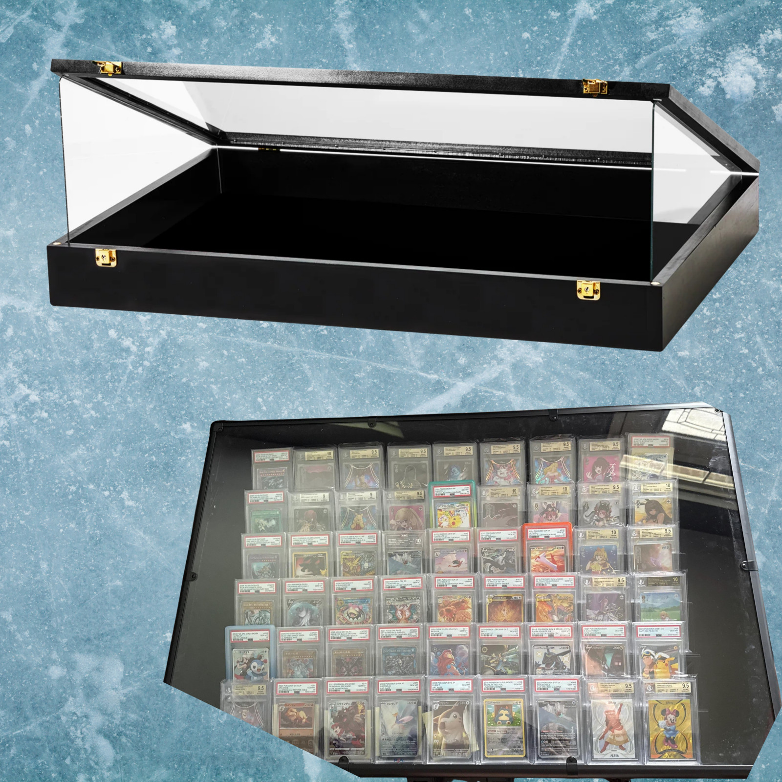
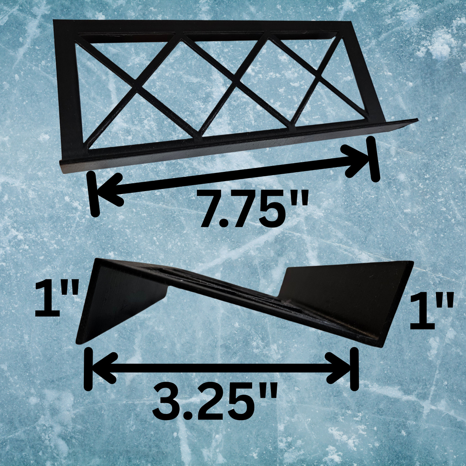
Display Case Card Riser Stands – WHITE – Perfect for 24×36 Cases- 33 Risers!
66bAo4rO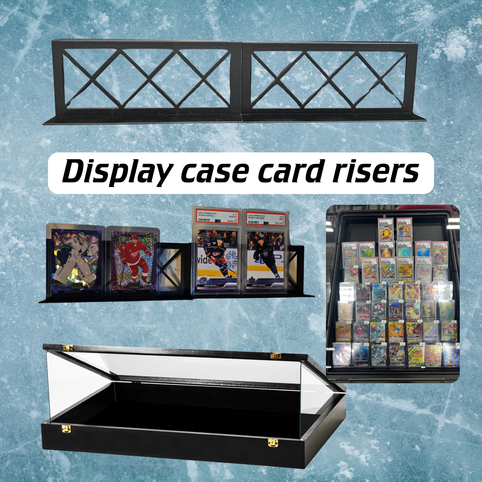
body {
font-family: ‘Segoe UI’, Roboto, Helvetica, Arial, sans-serif;
background: #f8f9fa;
margin: 0;
padding: 2rem 1rem;
color: #1e1e1e;
}
.product-card {
max-width: 1100px;
margin: 0 auto;
background: white;
border-radius: 24px;
box-shadow: 0 12px 30px rgba(0,0,0,0.08);
padding: 2rem 2.5rem;
}
@media (max-width: 600px) {
.product-card { padding: 1.5rem; }
}
.gallery {
display: flex;
flex-wrap: wrap;
gap: 1rem;
margin-bottom: 2rem;
}
.gallery img {
max-width: 100%;
height: auto;
border-radius: 16px;
box-shadow: 0 4px 12px rgba(0,0,0,0.05);
transition: transform 0.2s ease;
cursor: default;
}
.gallery img:hover {
transform: scale(1.01);
}
.gallery-main {
flex: 2 1 400px;
}
.gallery-thumbs {
flex: 1 1 180px;
display: flex;
flex-direction: column;
gap: 0.75rem;
}
.gallery-thumbs img {
border-radius: 12px;
max-height: 120px;
width: 100%;
object-fit: cover;
}
h1 {
font-size: 2rem;
font-weight: 600;
margin: 0 0 0.25rem 0;
letter-spacing: -0.01em;
}
.brand-sub {
color: #2c7a6b;
font-weight: 500;
font-size: 1rem;
margin-bottom: 0.75rem;
display: flex;
align-items: center;
gap: 0.5rem;
}
.price {
font-size: 2.2rem;
font-weight: 700;
color: #0f4b3e;
margin: 0.5rem 0 1rem 0;
}
.price small {
font-size: 1rem;
font-weight: 400;
color: #5f6b6a;
margin-left: 0.5rem;
}
.condition-badge {
background: #d4ede6;
color: #0b4a3c;
padding: 0.2rem 1rem;
border-radius: 40px;
font-weight: 600;
font-size: 0.9rem;
display: inline-block;
margin-bottom: 1.2rem;
}
.specs-table {
width: 100%;
border-collapse: collapse;
margin: 1.8rem 0;
background: #f4f7f6;
border-radius: 16px;
overflow: hidden;
}
.specs-table td {
padding: 0.9rem