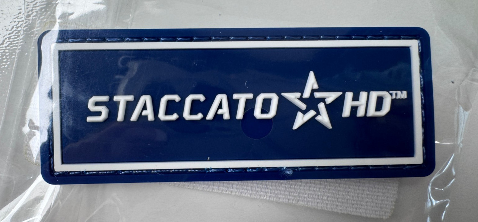
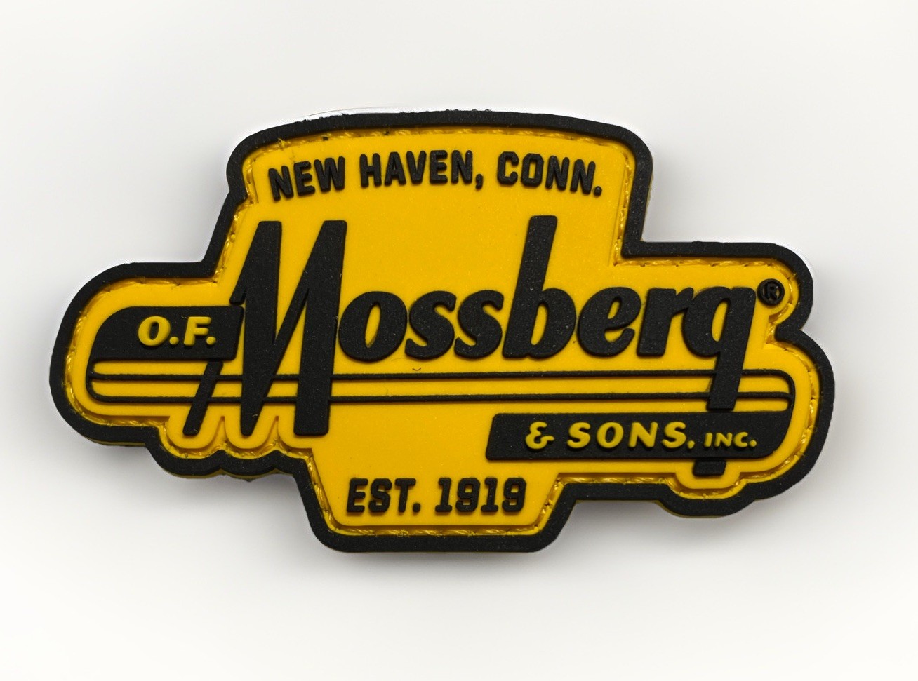
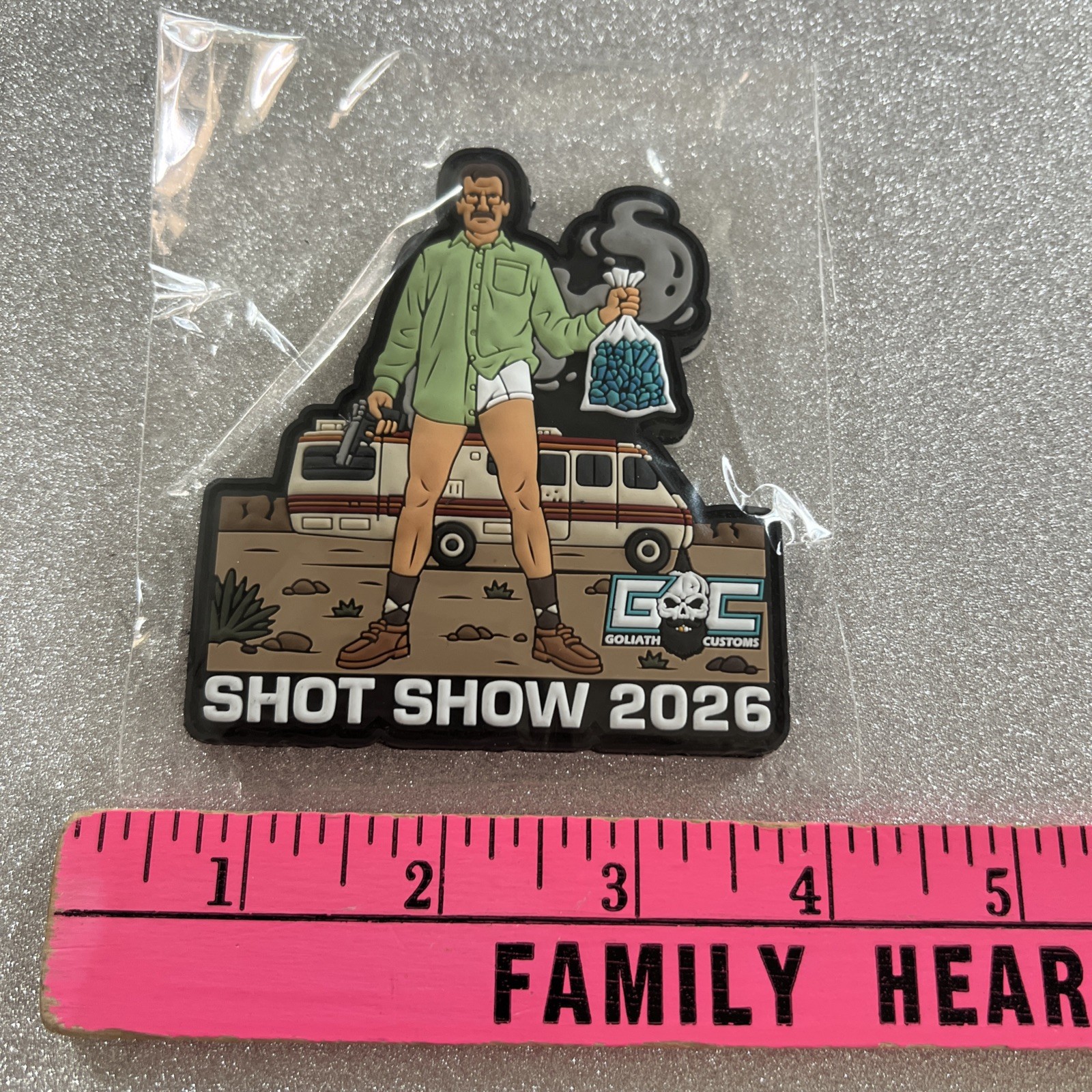
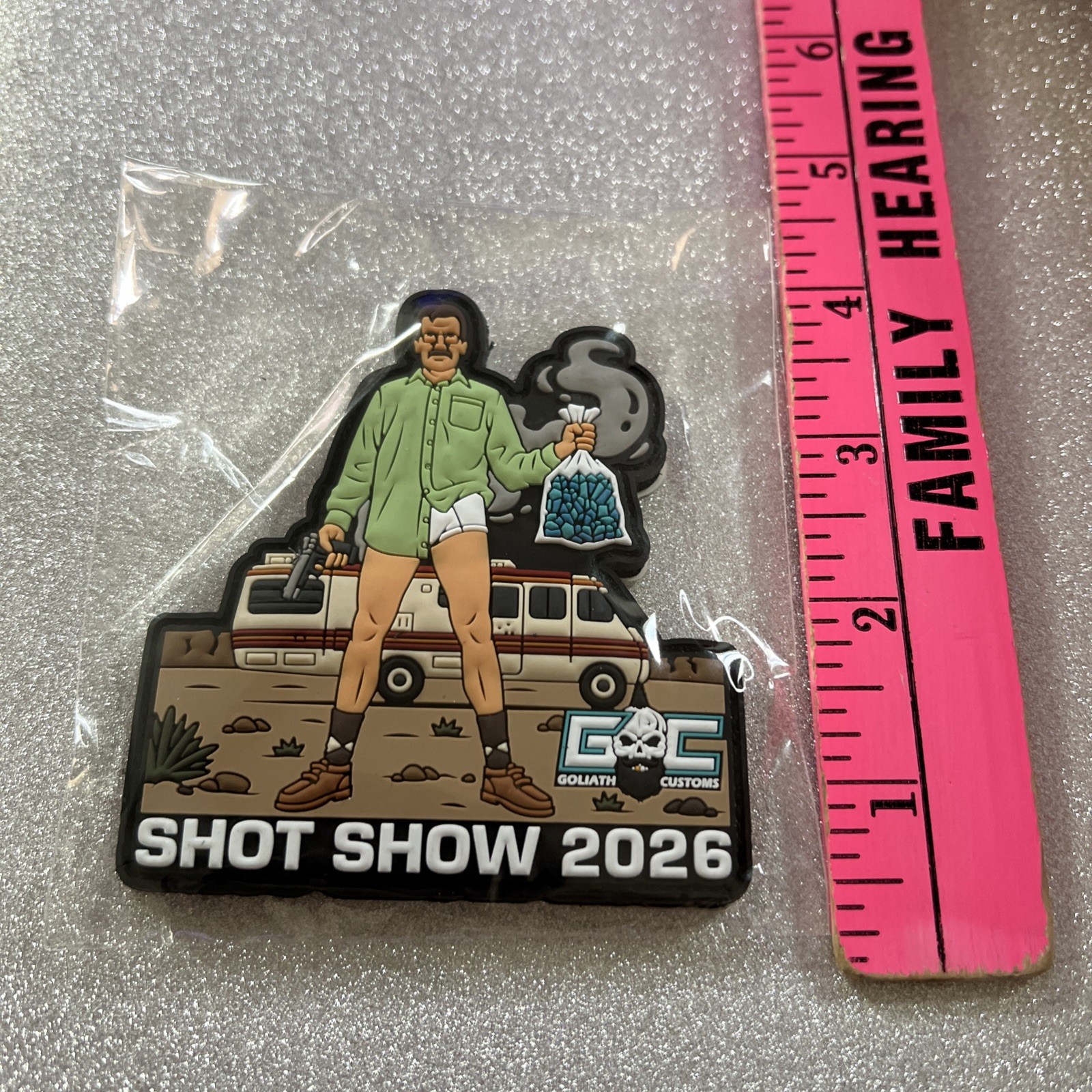
2026 shot show patch
ZveXHvq4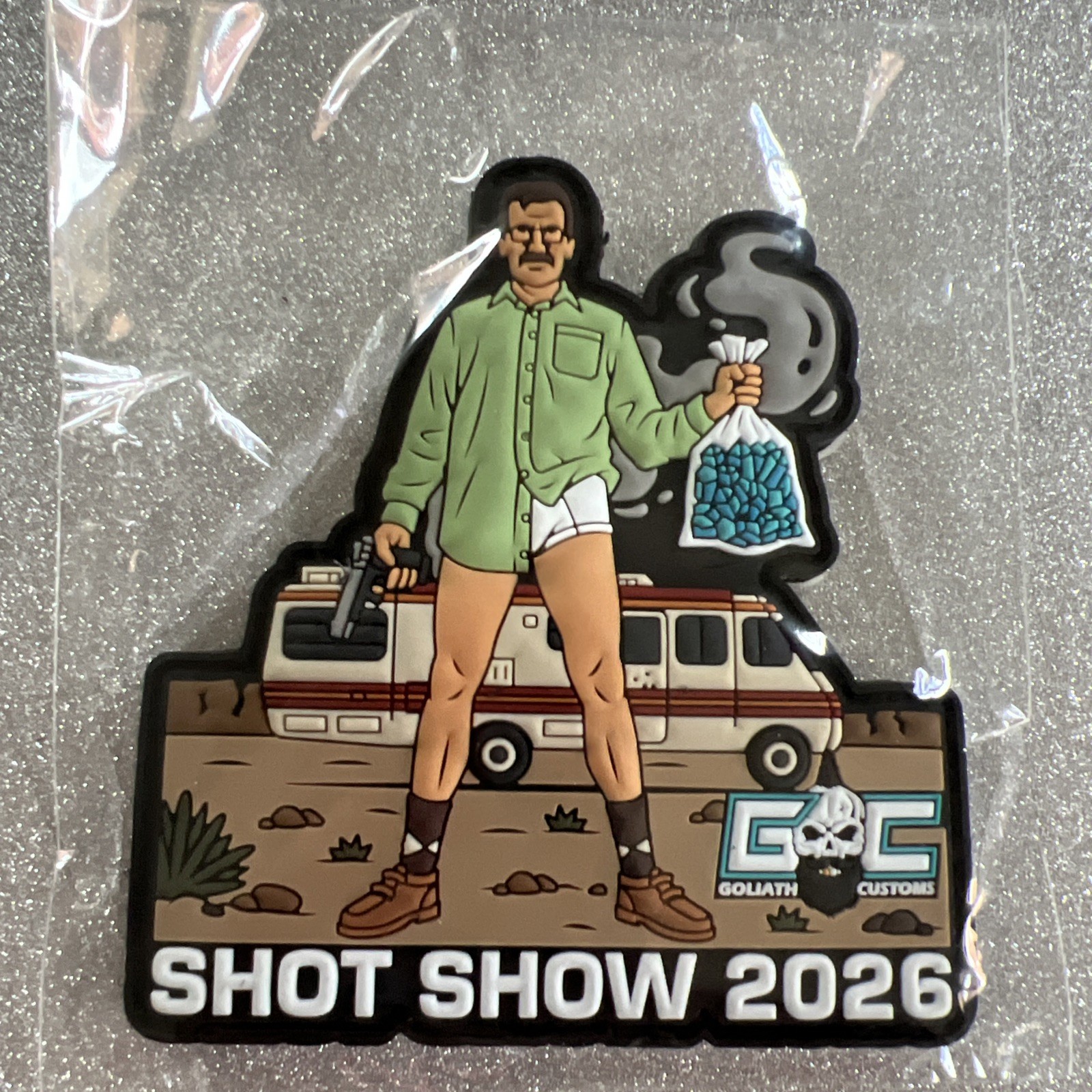
body {
font-family: ‘Segoe UI’, Roboto, Helvetica, Arial, sans-serif;
background: #f5f7fa;
margin: 0;
padding: 2rem 1rem;
display: flex;
justify-content: center;
}
.product-card {
max-width: 1100px;
background: white;
border-radius: 24px;
box-shadow: 0 12px 30px rgba(0,0,0,0.08);
padding: 2rem 2.5rem;
transition: all 0.2s ease;
}
h1, h2, h3 {
font-weight: 600;
margin-top: 0;
}
h1 {
font-size: 2rem;
border-bottom: 2px solid #eef2f6;
padding-bottom: 0.5rem;
margin-bottom: 1.5rem;
}
.grid {
display: flex;
flex-wrap: wrap;
gap: 2rem;
}
.gallery {
flex: 1 1 280px;
min-width: 240px;
}
.gallery img {
width: 100%;
height: auto;
border-radius: 20px;
box-shadow: 0 4px 12px rgba(0,0,0,0.06);
margin-bottom: 1rem;
background: #f0f2f5;
display: block;
}
.gallery .thumb-group {
display: flex;
gap: 12px;
flex-wrap: wrap;
}
.gallery .thumb-group img {
width: calc(33.33% – 8px);
min-width: 70px;
border-radius: 14px;
cursor: default;
border: 1px solid #e9edf2;
}
.main-info {
flex: 2 1 400px;
}
.price {
font-size: 2rem;
font-weight: 700;
color: #1e2a3a;
margin: 0.5rem 0 1rem;
}
.price small {
font-size: 1rem;
font-weight: 400;
color: #6b7a8a;
margin-left: 8px;
}
.specs-table {
width: 100%;
border-collapse: collapse;
margin: 1.5rem 0;
background: #f9fafc;
border-radius: 16px;
overflow: hidden;
}
.specs-table td {
padding: 12px 16px;
border-bottom: 1px solid #e6eaef;
}
.specs-table tr:last-child td {
border-bottom: none;
}
.specs-table td:first-child {
font-weight: 600;
color: #1f2a3f;
width: 38%;
}
.desc-box {
background: #f8faff;
padding: 1.5rem 1.8rem;
border-radius: 20px;
margin: 1.8rem 0;
border-left: 4px solid #2c3e50;