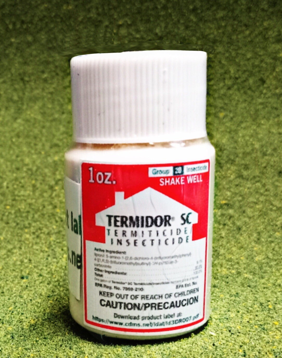
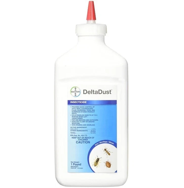
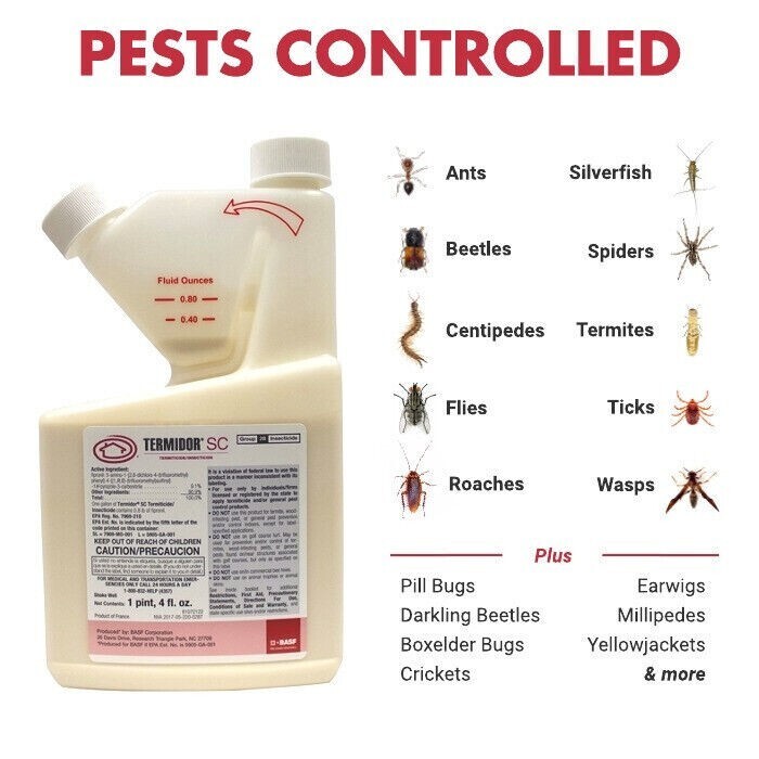
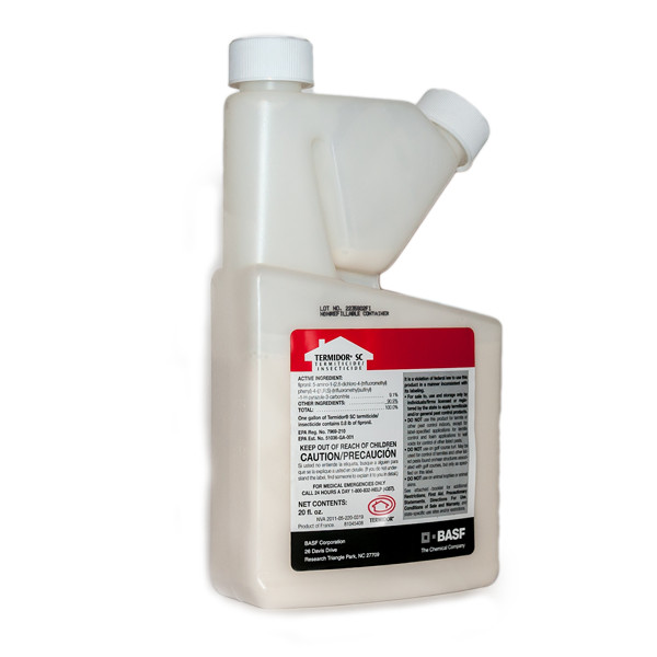
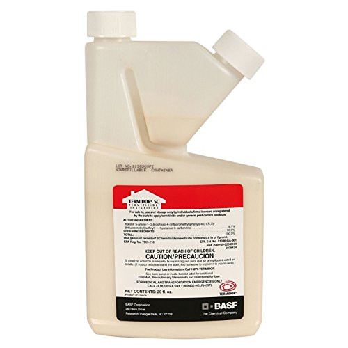
Termidor SC 20 oz. Termite Ant Control BASF Termiticide
y0pRVbtw
“`html
body {
font-family: ‘Segoe UI’, Roboto, Helvetica, Arial, sans-serif;
background: #f5f7fa;
margin: 0;
padding: 30px 20px;
display: flex;
justify-content: center;
}
.product-card {
max-width: 1100px;
width: 100%;
background: white;
border-radius: 24px;
box-shadow: 0 12px 30px rgba(0,0,0,0.08);
padding: 30px 35px;
transition: 0.2s;
}
h1, h2, h3 {
margin-top: 0;
font-weight: 500;
color: #1e2a3a;
}
.flex-row {
display: flex;
flex-wrap: wrap;
gap: 30px;
margin-bottom: 30px;
}
.gallery {
flex: 1 1 280px;
min-width: 240px;
}
.gallery img {
width: 100%;
height: auto;
border-radius: 20px;
box-shadow: 0 4px 14px rgba(0,0,0,0.06);
background: #f0f2f5;
}
.gallery-grid {
display: flex;
gap: 12px;
margin-top: 12px;
flex-wrap: wrap;
}
.gallery-grid img {
width: calc(33.333% – 8px);
min-width: 70px;
flex: 1;
border-radius: 14px;
cursor: default;
border: 1px solid #e9edf2;
}
.main-info {
flex: 2 1 400px;
}
.price-brand {
display: flex;
align-items: baseline;
gap: 15px;
flex-wrap: wrap;
margin: 10px 0 15px;
}
.price {
font-size: 2.2rem;
font-weight: 600;
color: #0b2b4a;
letter-spacing: -0.5px;
}
.brand-badge {
background: #dce5f0;
padding: 6px 16px;
border-radius: 40px;
font-size: 0.9rem;
font-weight: 500;
color: #1f3a5f;
}
.specs-table {
width: 100%;
border-collapse: collapse;
background: #f9fafc;
border-radius: 18px;
overflow: hidden;
margin: 22px 0 18px;
}
.specs-table td {
padding: 12px 16px;
border-bottom: 1px solid #e6eaef;
font-size: 0.95rem;
}
.specs-table tr:last-child td {
border-bottom: none;
}
.specs-table td:first-child {
font-weight: 500;
color: #1