Coyote Ugly Shirt Vintage Movie Poster Retro 90s Unisex Heavy Cotton Tee
TkW6Errp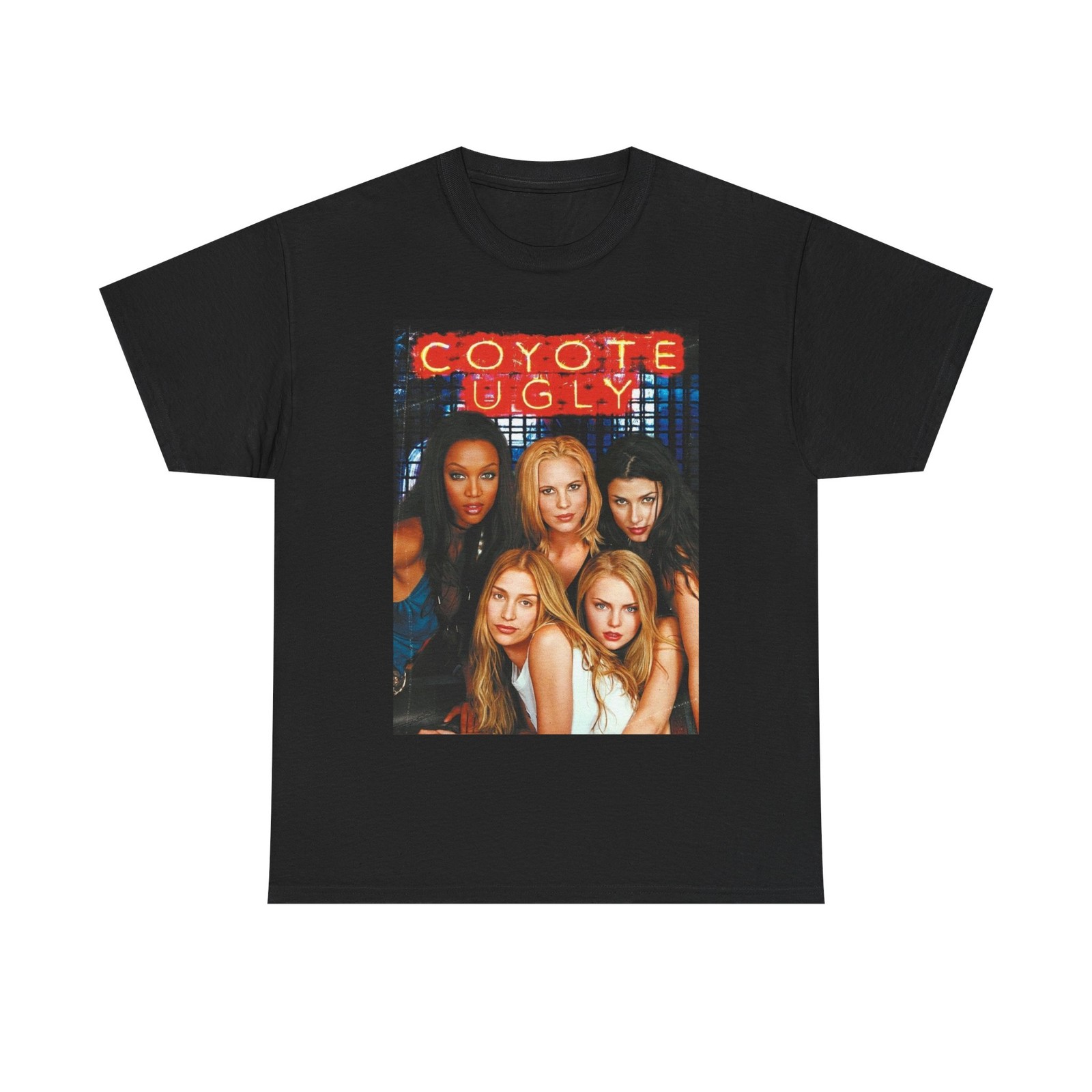

body {
font-family: ‘Segoe UI’, Roboto, Helvetica, Arial, sans-serif;
background: #f5f5f5;
margin: 0;
padding: 30px 20px;
display: flex;
justify-content: center;
}
.product-card {
max-width: 1100px;
width: 100%;
background: white;
border-radius: 24px;
box-shadow: 0 12px 30px rgba(0,0,0,0.08);
padding: 30px 35px;
transition: 0.2s;
}
h1, h2, h3 {
font-weight: 600;
margin-top: 0;
}
.grid {
display: flex;
flex-wrap: wrap;
gap: 30px;
}
.gallery {
flex: 1 1 45%;
min-width: 280px;
}
.gallery img {
width: 100%;
height: auto;
border-radius: 20px;
box-shadow: 0 4px 14px rgba(0,0,0,0.06);
display: block;
margin-bottom: 15px;
}
.thumbnails {
display: flex;
gap: 12px;
flex-wrap: wrap;
}
.thumbnails img {
width: 80px;
height: 80px;
object-fit: cover;
border-radius: 14px;
cursor: default;
border: 2px solid #eaeaea;
}
.info {
flex: 1 1 48%;
}
.brand {
color: #4a4a4a;
letter-spacing: 0.5px;
font-size: 0.9rem;
text-transform: uppercase;
margin-bottom: 4px;
}
.title {
font-size: 1.9rem;
font-weight: 700;
line-height: 1.2;
margin: 6px 0 10px;
}
.price {
font-size: 2rem;
font-weight: 700;
color: #1e2a3a;
margin: 12px 0 10px;
}
.price small {
font-weight: 400;
font-size: 1rem;
color: #5f6b7a;
margin-left: 8px;
}
.condition {
background: #e6f0e9;
color: #1f5e3a;
padding: 6px 16px;
border-radius: 40px;
display: inline-block;
font-weight: 500;
font-size: 0.85rem;
margin: 6px 0 12px;
}
.specs-table {
width: 100%;
border-collapse: collapse;
margin: 18px 0 10px;
background: #fafafc;
border-radius: 16px;
overflow: hidden;
}
.specs-table td {
padding: 12px 16px;
border-bottom: 1px solid #eaeef2;
}
.spec