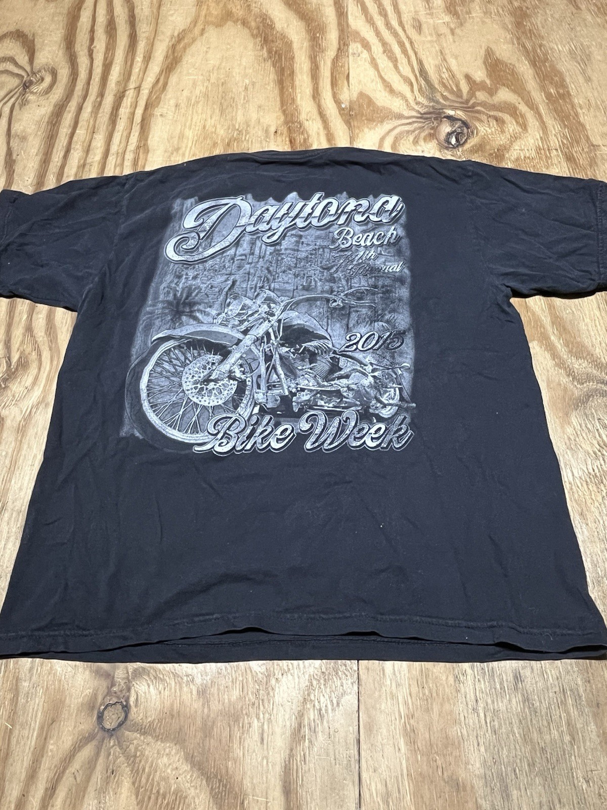
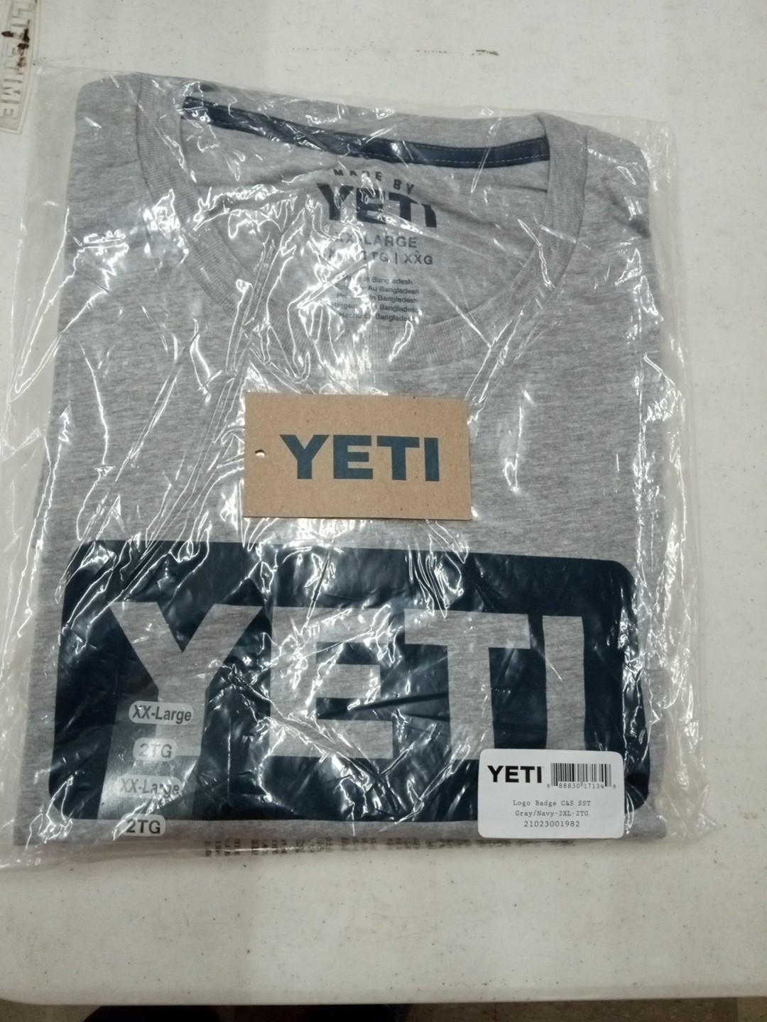
yeti t shirt xxl
lHROasvB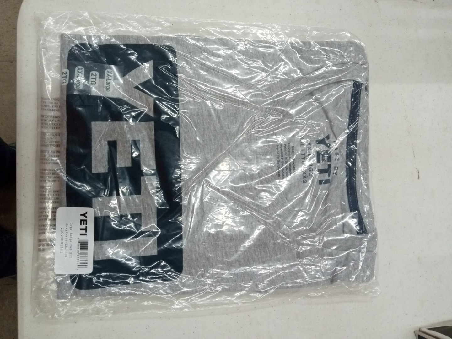
* {
margin: 0;
padding: 0;
box-sizing: border-box;
}
body {
font-family: system-ui, -apple-system, ‘Segoe UI’, Roboto, ‘Helvetica Neue’, sans-serif;
background: #f8f9fa;
color: #1e1e1e;
padding: 2rem 1rem;
display: flex;
justify-content: center;
}
.product-card {
max-width: 1100px;
width: 100%;
background: white;
border-radius: 24px;
box-shadow: 0 12px 30px rgba(0,0,0,0.08);
padding: 2rem 2.5rem;
transition: all 0.2s ease;
}
@media (max-width: 640px) {
.product-card { padding: 1.5rem 1rem; }
}
.product-grid {
display: flex;
flex-wrap: wrap;
gap: 2.5rem;
}
.gallery {
flex: 1 1 380px;
min-width: 280px;
}
.gallery-main {
background: #f2f4f7;
border-radius: 20px;
padding: 1.2rem;
display: flex;
justify-content: center;
align-items: center;
margin-bottom: 1rem;
min-height: 320px;
}
.gallery-main img {
max-width: 100%;
height: auto;
display: block;
object-fit: contain;
border-radius: 12px;
}
.gallery-thumbs {
display: flex;
gap: 0.8rem;
flex-wrap: wrap;
}
.gallery-thumbs img {
width: 80px;
height: 80px;
object-fit: cover;
border-radius: 14px;
border: 2px solid transparent;
background: #f2f4f7;
padding: 4px;
cursor: default;
transition: border 0.1s;
}
.gallery-thumbs img:hover {
border-color: #2c3e50;
}
.product-info {
flex: 1 1 400px;
min-width: 280px;
}
.brand-tag {
font-size: 0.8rem;
letter-spacing: 1px;
text-transform: uppercase;
color: #5b6f7e;
font-weight: 600;
margin-bottom: 0.3rem;
}
h1 {
font-size: 2rem;
font-weight: 700;
line-height: 1.2;
margin-bottom: 0.5rem;
}
.price {
font-size: 2rem;
font-weight: 700;
color: #0b2b3b;
margin: 0.75rem 0 1rem;
}
.price sup {
font-size: 1rem;
top: -0.5em;
}
.condition-badge {
background: #d4edda;
color: #0f5132;
font